Back to Parent

Outcome


Ansel Adams

Adams gives us a profound and mystic view of the natural world, as one views it. He was an early proponent of 'Straight Photography', which refers to photography that attempts to depict what the artist saw at the actual scene. In other words, portraying that scene in a realistic and object manner. Adams mostly used large-format view cameras (cameras with large-format negatives) throughtout his life, even with smaller and easier cameras available. Adams also used the feature of the view camera to be able to adjust the relationship between the plane of the lens and the plane of the film. In other words, he had more control over the depth of field, simply by adjusting the film and lens planes. This depth of field control is exhibited in quite a few of his more famous works as well. Adams also used filters early on to render certain components of the image as he visualized them.

Ansel Adams - Mount Williamson

Ansel adams   mount williamson.thumb
Show Advanced Options

In this image, my eyes were instantly drawn to the one rock at the very forefront, almost seeming like a leader of the all other rocks behind it. The two mountains in the background were also positioned such that the narrow valley between them fell in the center of the photo. With the most visible rays of sunlight, and the large clouds positioned directly over that valley as well, it makes that valley look like an entrance or exit to another world of sorts.

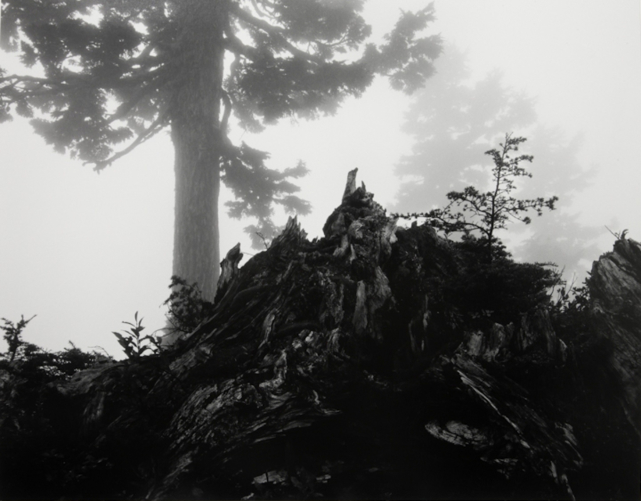
Ansel Adams - Tree, Stump and Mist

Ansel adams   tree  stump and mist.thumb
Show Advanced Options

Honestly, without the trees shrouded in mist and some of the smaller plants near the ground, this would almost have fooled me into thinking this was a photo of a hill taken from far away. He chose just the right angle and vantage point to achieve this effect. The misty trees actually add to this rather than detract from it, giving a more surreal feeling to the image. 

Ansel Adams - Zabriski Point, Death Valley National Monument

Ansel adams   zabriski point  death valley national monument.thumb
Show Advanced Options

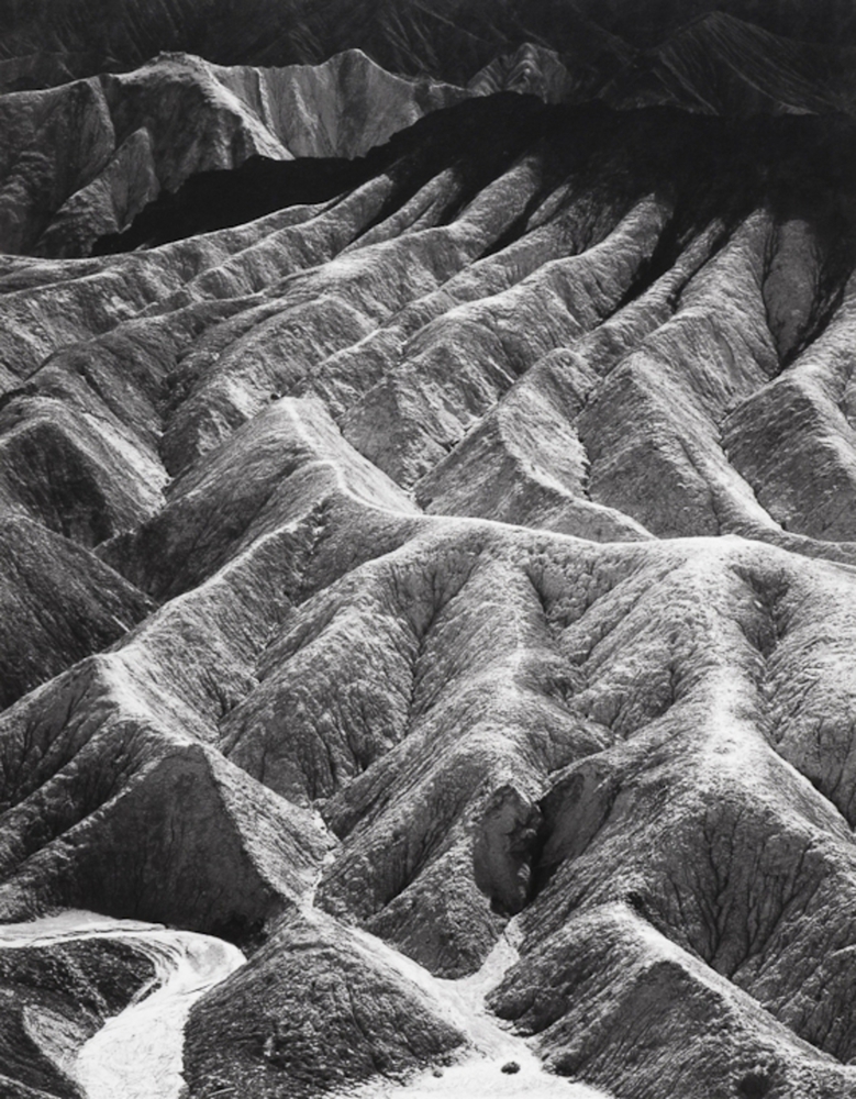
This photo has a really interesting pattern. The sand dunes almost look like a farmer's field after plowing it with a tracker or horses. Adams took it from the right vantage point such that the foreground of the photo starts with one end of the sand dunes, the pathways for people. The other end is shrouded in shadows; Whether due to clouds, or by using filters, the overall effect is one of the unknown, a path disappearing off into the distance.

Img 6785.jpg.thumb
Show Advanced Options
Img 6792.jpg.thumb
Show Advanced Options
Img 6819.jpg.thumb
Show Advanced Options

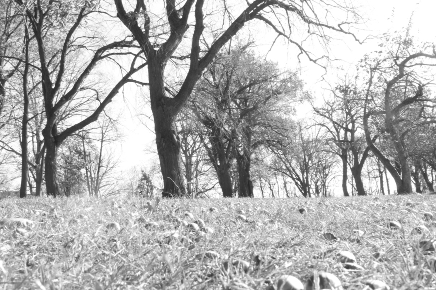
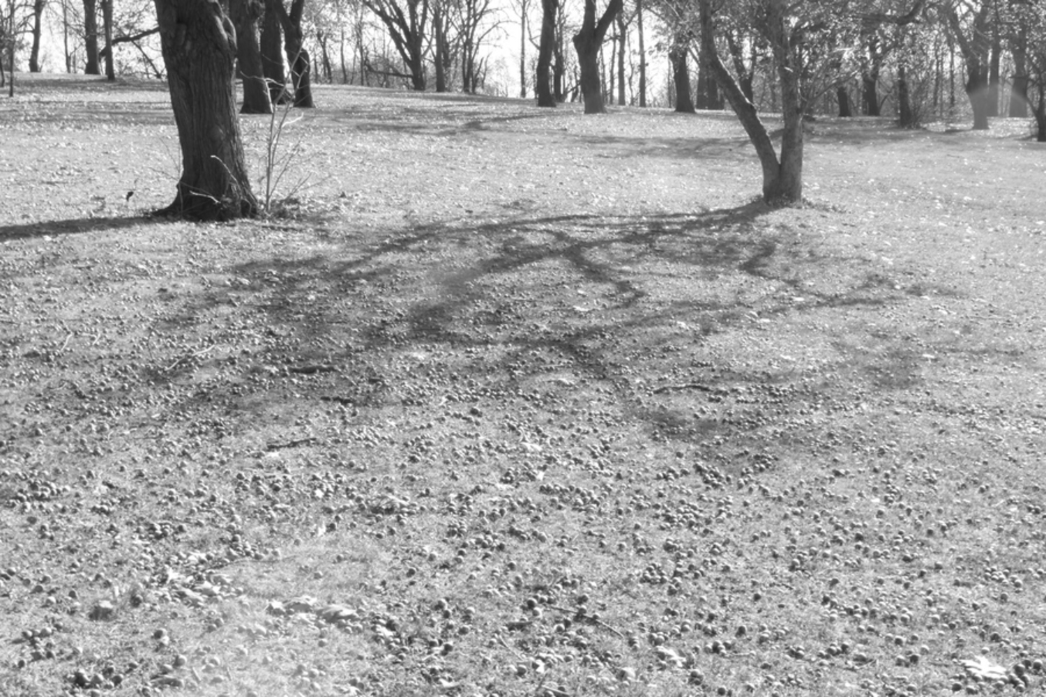
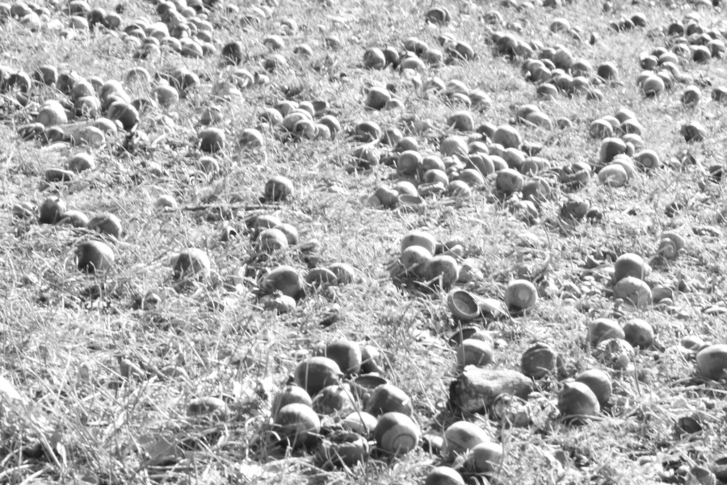
The above 3 photos were my attempt at emulating Ansel Adam's style in his photo of Mount Williamson. Without an abundance of rocks in the area, I opted for acorns instead. The first out of the 3 is when I tried to actually take it from a similar vantage point, with the  camera at the same height as the acorns. However, all the photos I took from this position had the same problem in that most of the acorns were hidden by the blades of grass. Only a small fraction of them were visible. My aim with this photo was to represent the acorns as a smaller part of the tree, similarly to how the rocks are part of a mountain, so instead, I decided to go with a different vantage point in the second photo. The vantage point from above also symbolizes how the acorns fell from the trees. Moreover, in Adam's photo, he had rays of light focused in the center but I decided to focus on the shadows in the center instead. The last shot was to show how the distribution of acorns on the ground looks evenly spread out from afar, but as you analyze smaller components of the ground, it is not quite so anymore. Some piles are clearly larger than others, and there are also more empty spots. 


Img 6749.jpg.thumb
Show Advanced Options
Img 6754.jpg.thumb
Show Advanced Options

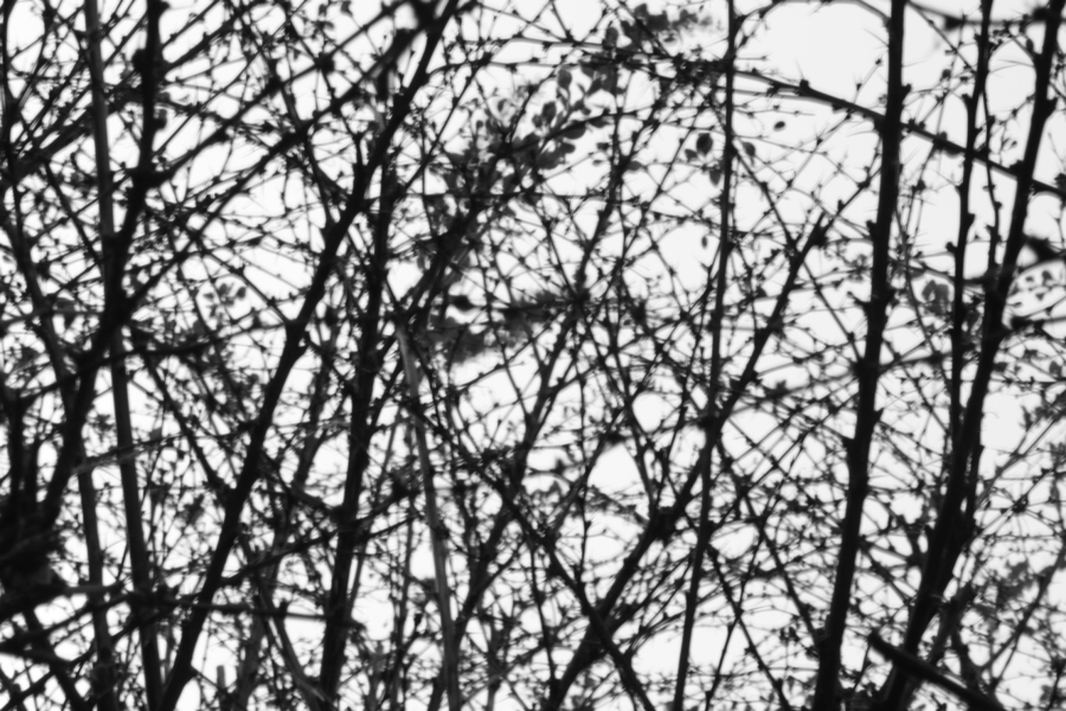
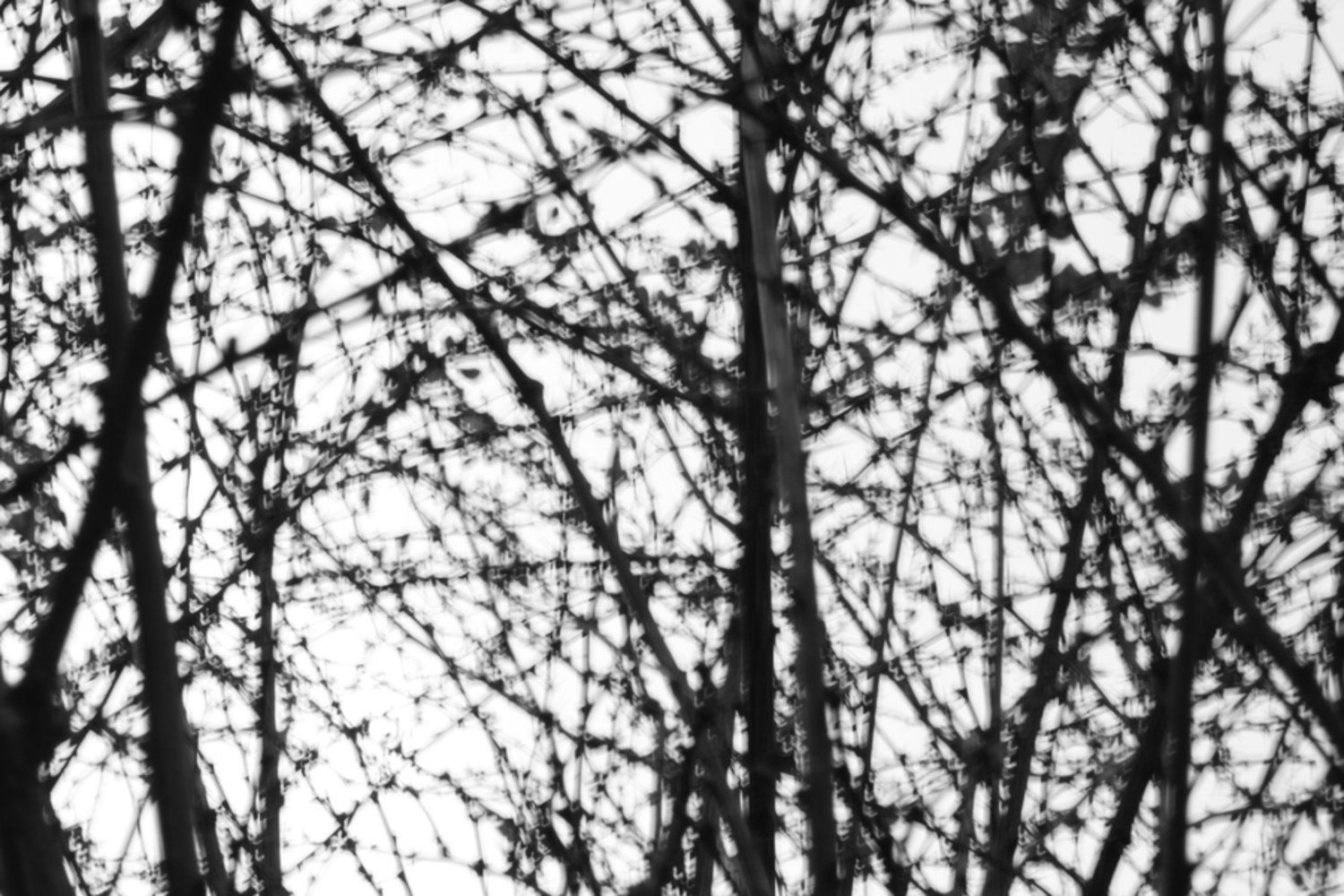
Quite a few of Adams photos try to find symmetrical balance of the physical nature. This was my attempt at finding such a pattern. I took dozens of shots, but it was pretty hard to get the right settings for depth and focus. The above two are not perfect, but they were my best ones. I found it amazing that this seemingly random spread of branches and twigs interleaved together into an intricate web so seamlessly. I also took these from a lower vantage point, to make it seem like this web was on top, and not behind like it actually is. This effect is a bit more pronounced in the first photo, because at the bottom of the photo, the branches don't just seem to fall off the photo as they do in the second photo. In the second photo, I went for a bit more openings at the forefront of the photo, in order to contrast the open area on the bottom left, with the closed off area on the bottom right. Also, the branch in the center had the effect of splitting this photo in two halves, and there was another branch in each of these halves, which once again split them into two - the top and bottom. If you look at these 4 parts from left to right, and bottom to top, each part seems to grow in thickness as well. 

Img 6762.jpg.thumb
Show Advanced Options

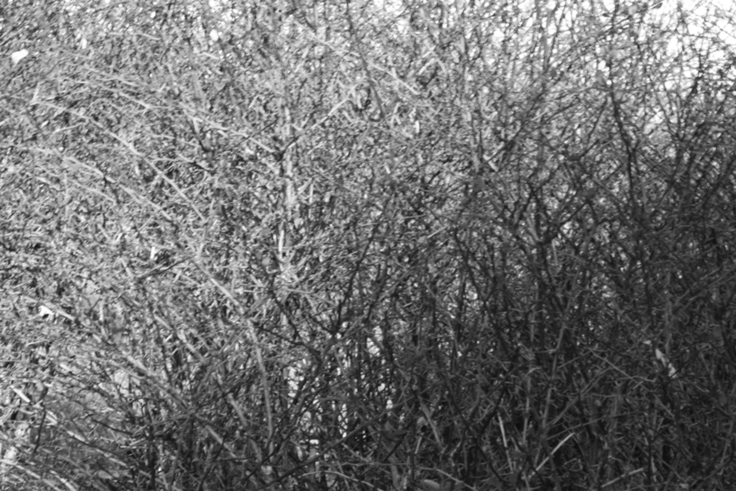
Adam's used the contrasting effect of light and shadows in his photo of Death Valley, So I tried to do something similar. I wasn't able to find a settings that enshrouded the right part of the photo in complete shadows like Adams did though. Still, I tried to keep it in balance by effectively splitting the photo diagonally into the light and dark parts. Also, I'm hoping that viewers perceive a north-east direction in the photo, as I tried to find the right boundaries for this shot such that the top-right corner is the only one which has a thinner foliage than the other parts. By making the contrast in light diagonal, I'm hoping viewers will have their eye wander along this invisible diagonal line till they reach the top-right corner.

Img 6261.thumb
Show Advanced Options
Img 6250.thumb
Show Advanced Options

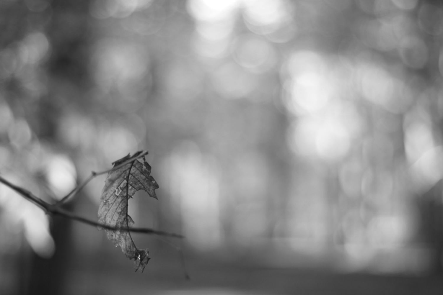
What the above 2 photos have in common is that their subject matter is much more singular in nature. The first show is simply that of a torn leaf, hanging on by a thread to a small twig. I wanted to focus on the leaf because it was already in a state of decay. An live leaf would be symbiotic with its surroundings but not leaves in fall, hence the blurred surroundings. At this point, its still hanging on and I felt this was very symbolic of nature. Even in the harshest environments, living  things still try their best to survive till the end. 

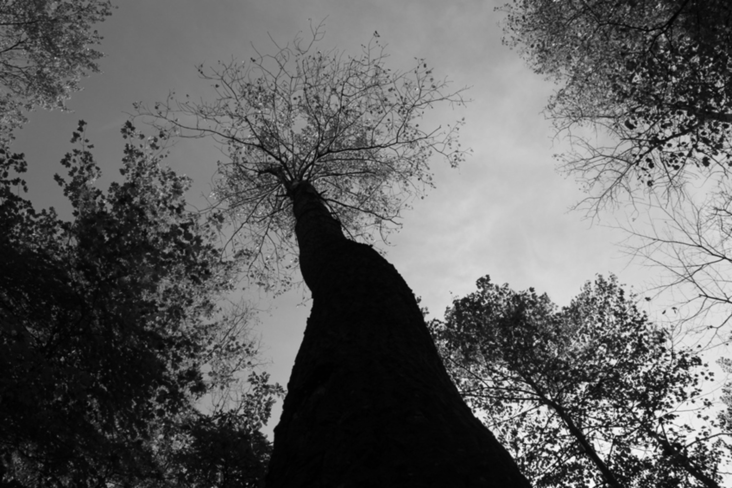
The second photo was my attempt at emulating Adam's style in his photo, 'Tree, Stump and Mist'. I shot from many different angles but this angle had the effect that the trunk of the tree was a path leading to the branches on top. The lighting also went best in this shot, since there were dark clouds right above this tree near the top, but lighter clouds in the distance. From this angle, I was able to have the lighter sky close to the bottom of the trunk and the dark clouds near the top, which is ironic since the trunk is in darkness from the shadows of the trees around it. I also chose this particular tree because all the trees around it still had a lot of foliage but this one didn't. 

Drop files here or click to select

You can upload files of up to 20MB using this form.