Back to Parent

Outcome


Cecil Beaton

Beaton became famous for photographing royals, such as Queen Elizabeth, her sister Princess Margaret, and the rest of the royal family. He was also knowing for photographing celebrities, such as Marlon Brando, Marilyn Monroe, and Elizabeth Taylor. He eventually went on to set design and won the Academy Award for his costume and set designs for My Fair Lady and Gigi. Barton suffered a stroke in 1974 that forced him to develop cameras that would allow him to continuing photographing. He died in 1980 in Wiltshire, England.
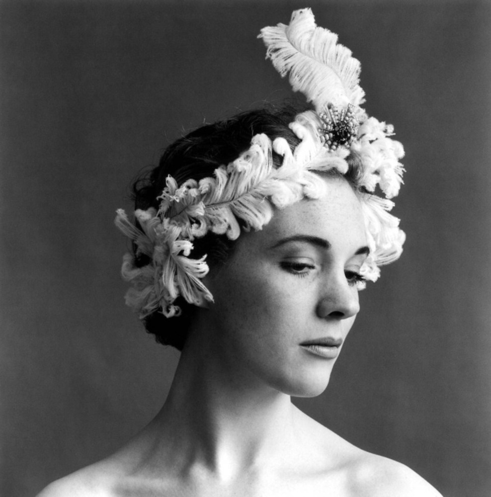
Julie andrews by cb.thumb
Show Advanced Options

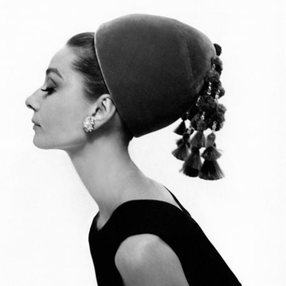
A young Julie Andrews is pictured above, wearing a striking headpiece that creates a theatrical look Beaton is famous for.

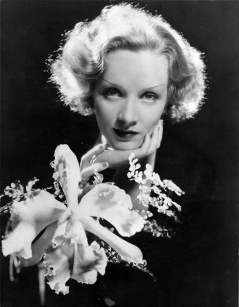
Marlene2bdietrich2bby2bcecil2bbeaton2bflower2b2.thumb
Show Advanced Options

His Work

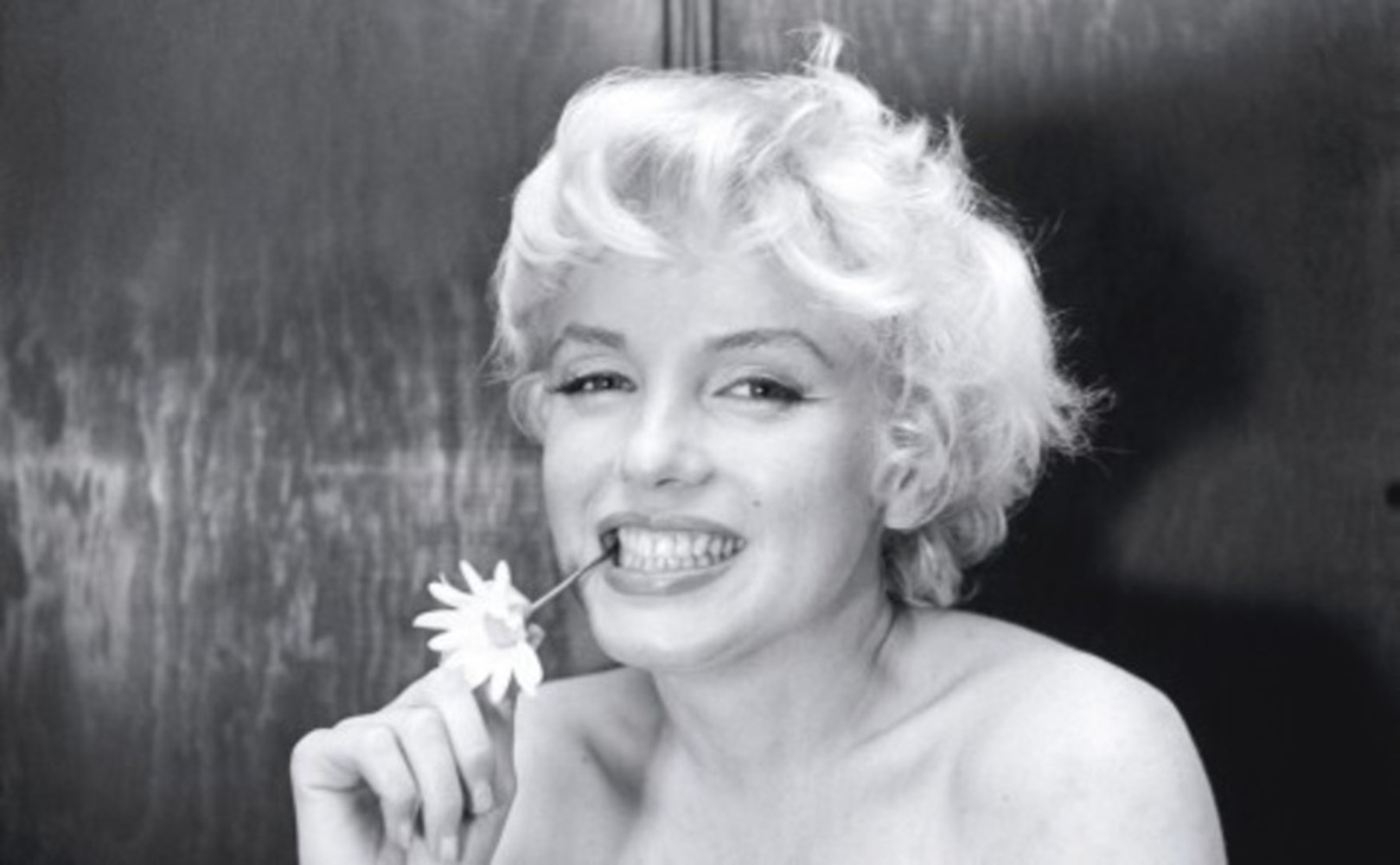
Not only was Beaton known for photographing the most famous people of his era, he was known for photographing them in strange and unique situations, such as surrounded by suspended flowers or under a glass dome. However, he had a knack for making the subject feel at ease, which showed through in his work, for they always looked as though they had been sitting in that pose or surrounded by those objects for ages. Beaton’s love of set and clothing design also showed through in his work, for he paid special attention to the surroundings and clothing pieces, such as hats and pieces of cloth, in his photographs.

He became famous for his staged style of photography, for he posed his subjects with all kinds of objects to create a more theatrical look. Many of his photographs appear to incorporate natural objects, such as branches and flowers, in positions that had the air of defying gravity, created a dramatic flair to his photographs. Furthermore, his emphasis on the set, incorporated with the subject, allowed for his works to tell a snippet of a story.

2208618484.thumb
Show Advanced Options

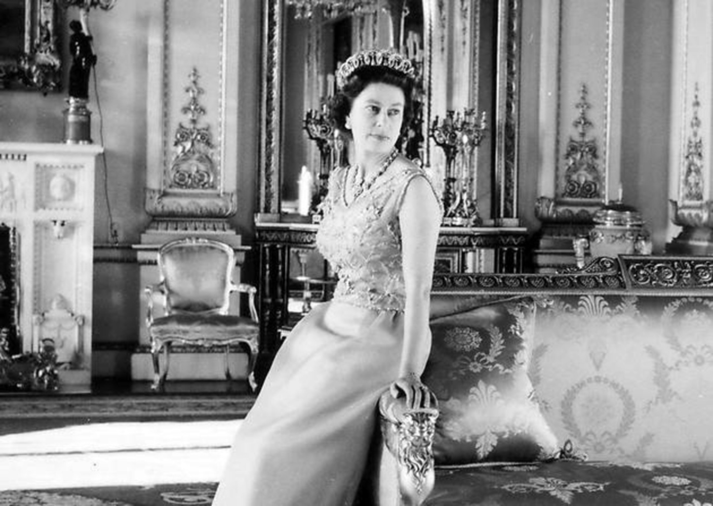
 Cecil’s most famous work is that of Queen Elizabeth wearing her royal jewelry, pictured above. His interest in the set, along with the subject, is clear in this photograph by the sheer amount of furniture in the room and by the location of the couch, right next to Elizabeth, making it seem just as important.

Audreyhepburn1.thumb
Show Advanced Options
Image.thumb
Show Advanced Options
 mg 5993.jpg.thumb
Show Advanced Options

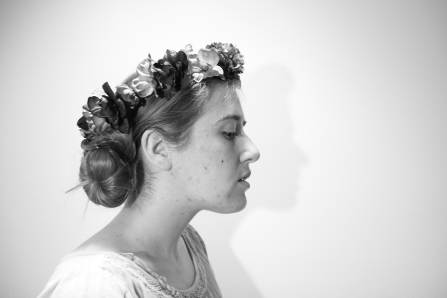
I think this picture came out rather successfully. I tried to recreate the theatricality of Beaton’s works by increasing the contrast between the bright and dark parts of the picture. I also tried to create a more staged portrait, much like Beaton’s, by adding extra accessories and adding a light source behind me to shine on my subject, making the portrait feel more theatrical. I tried posing her to face the other way, but the weight felt off, so I chose the one with her facing to the right. While not perfect, I think it does emulate parts of Beaton’s signature style of photography.

 mg 6019.jpg.thumb
Show Advanced Options

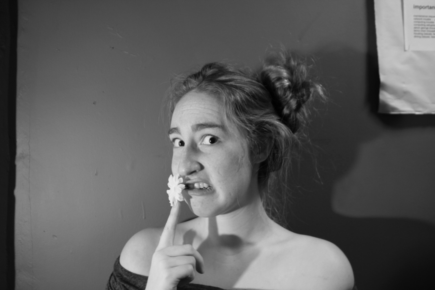
I like how this picture turned out in regards to composition and brightness. I like how her white skin stands out against the dark wall, although I think it would have turned out better if there a more intense contrast. Like the previous portrait, I put a light source behind me, but I think it would have turned out better if I moved the light closer and made the picture brighter. However, I do like how the picture is framed around her, with her face being the general center of the portrait and her hand gesturing the viewer to pay attention to the face.

Soph.thumb
Show Advanced Options

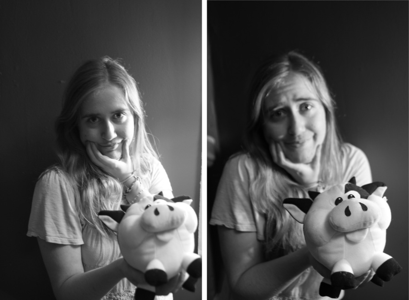
I couldn’t chose which picture I liked more of the two because neither came out as perfect as I would have liked. I think the one on the left has better lighting because it creates more contrast and thus amps up the theatricality. But I think the one on the right is also interesting because there is more emphasis on the toy cow and there is a more difference in depth between her and the cow.

 mg 6058.jpg.thumb
Show Advanced Options

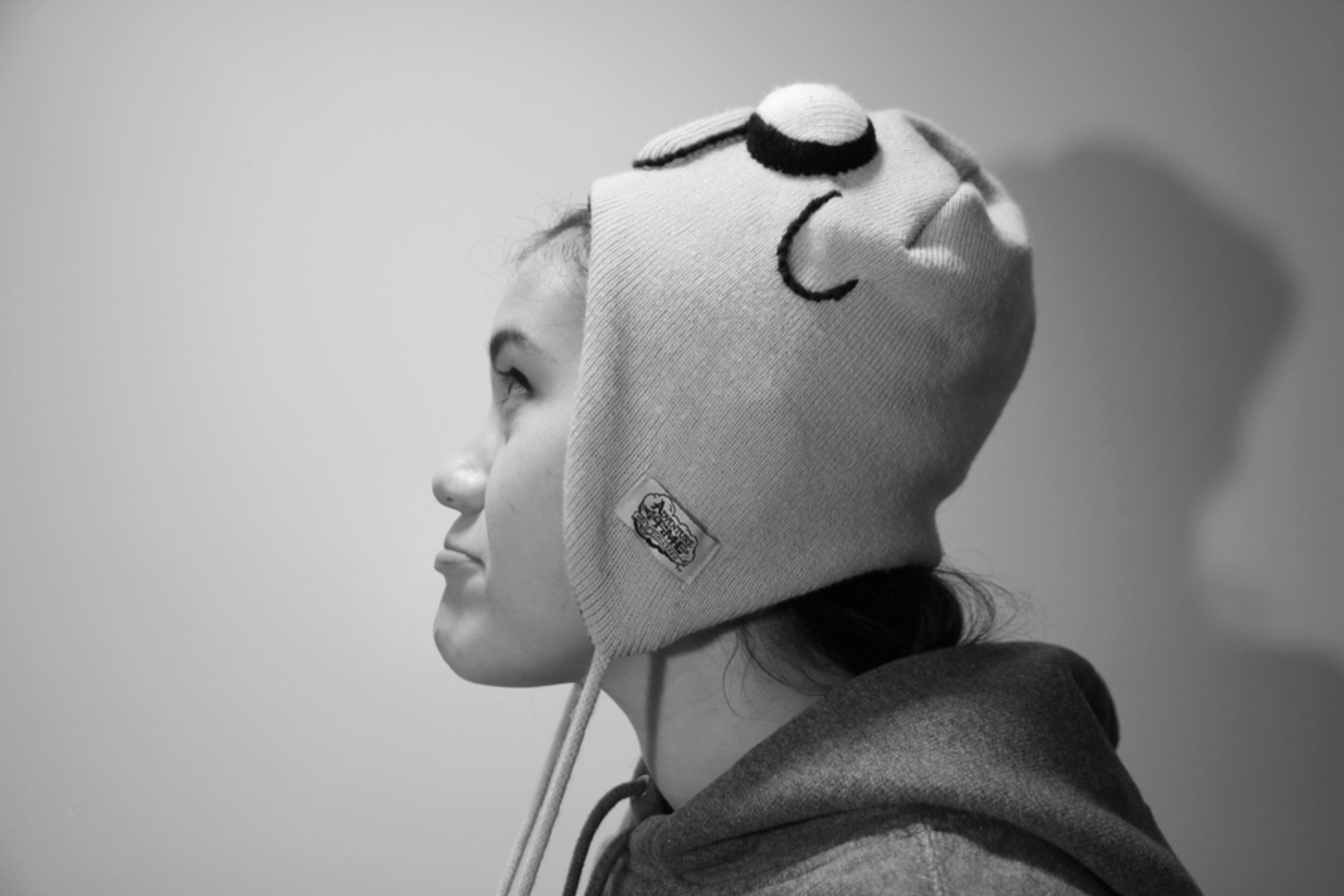
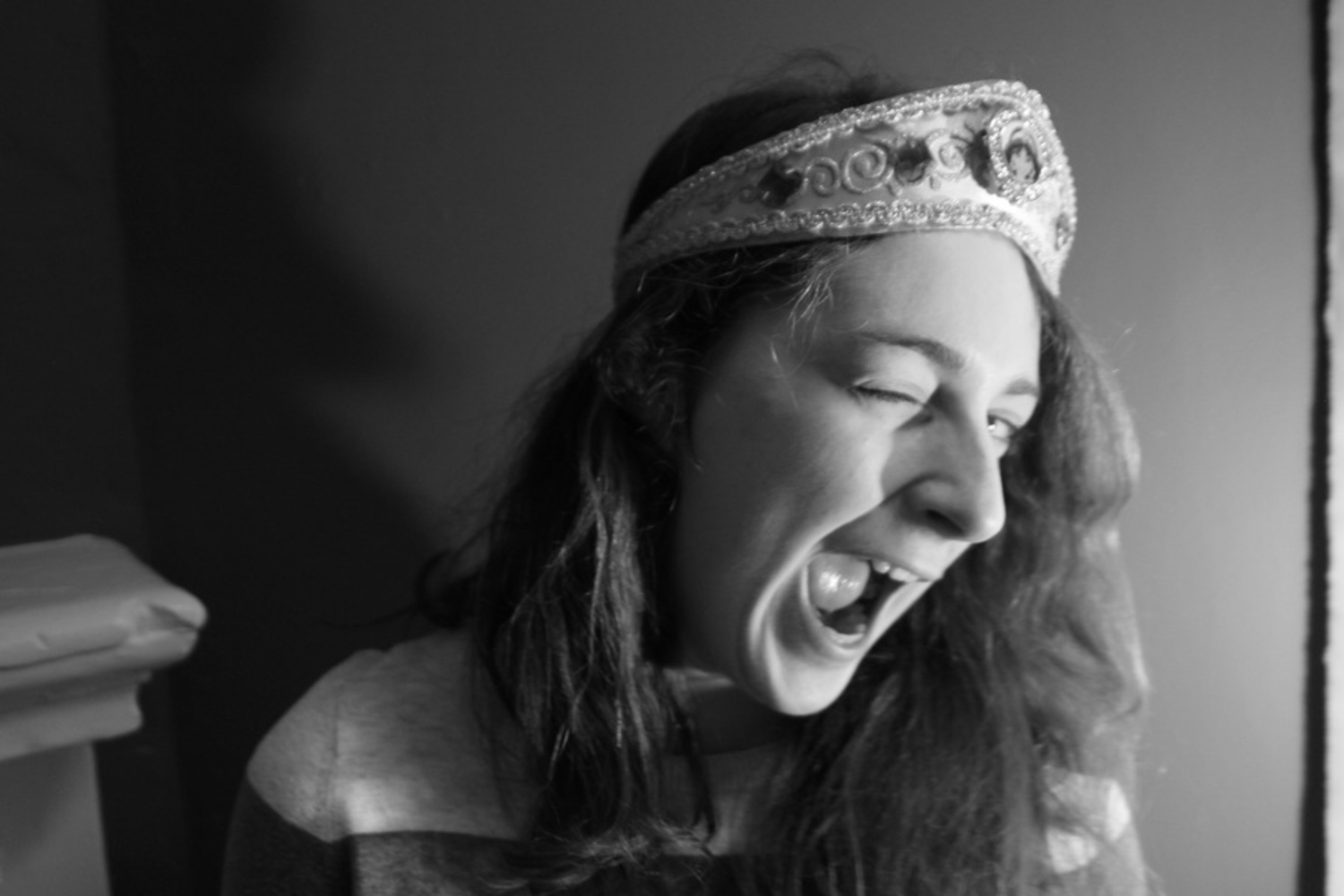
I think that this one is the least like Beaton’s photos because there is not much contrast between the different objects, such as her skin, the wall, and the hat, which makes everything seem flat and less staged and intense. I think the picture could have turned out better if I had moved her to a brighter spot, thus making the wall whiter, and giving her a darker hat to wear.

 mg 6078.jpg.thumb
Show Advanced Options

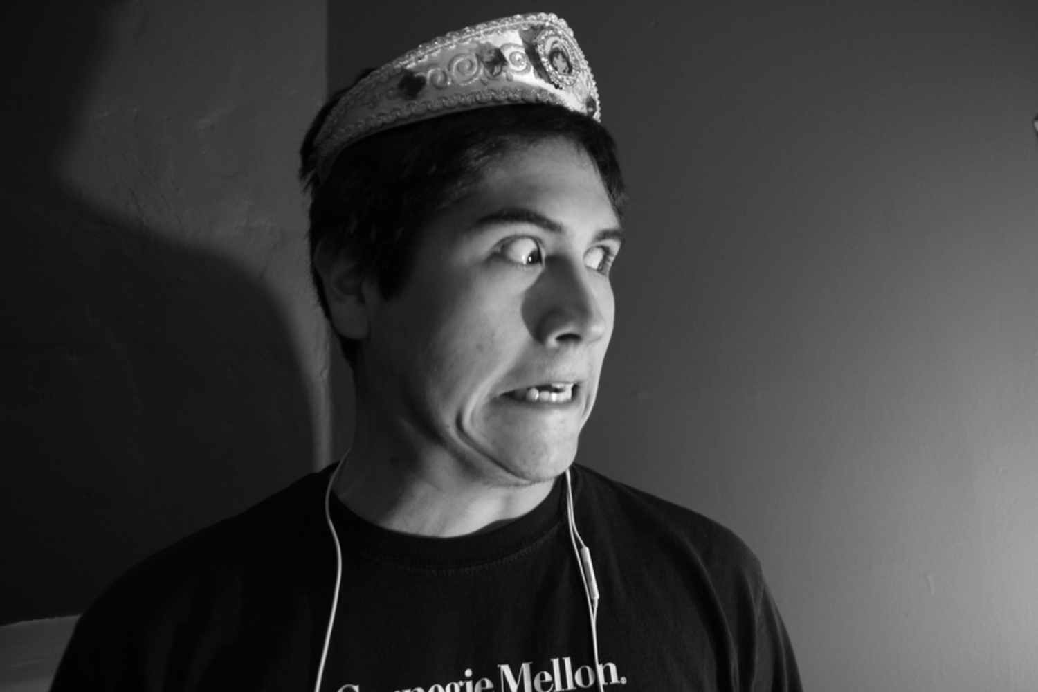
I don’t think this picture was as successful, either, because there is not enough theatricality to the photo. His expression is amusing, but in terms of composition, he doesn’t fit into the center of the photo, so there is no feeling of the photo being staged and thought about for a long time before being taken. Furthermore, I don’t think the contrast between his skin and the wall is intense enough in some areas, thus reducing the theatricality of the photo.

 mg 6090.thumb
Show Advanced Options

I think this one came out better than the previous because there is a lot more contrast between the different objects in the picture and thus the whole picture looks more intense and interesting. Furthermore, while she is leaning towards the right side of the photo, her body is located in the center of the picture, which causes her to be framed in the photo and for it to seem staged, like Beaton’s.

Drop files here or click to select

You can upload files of up to 20MB using this form.