Back to Parent

Outcome


An Egg

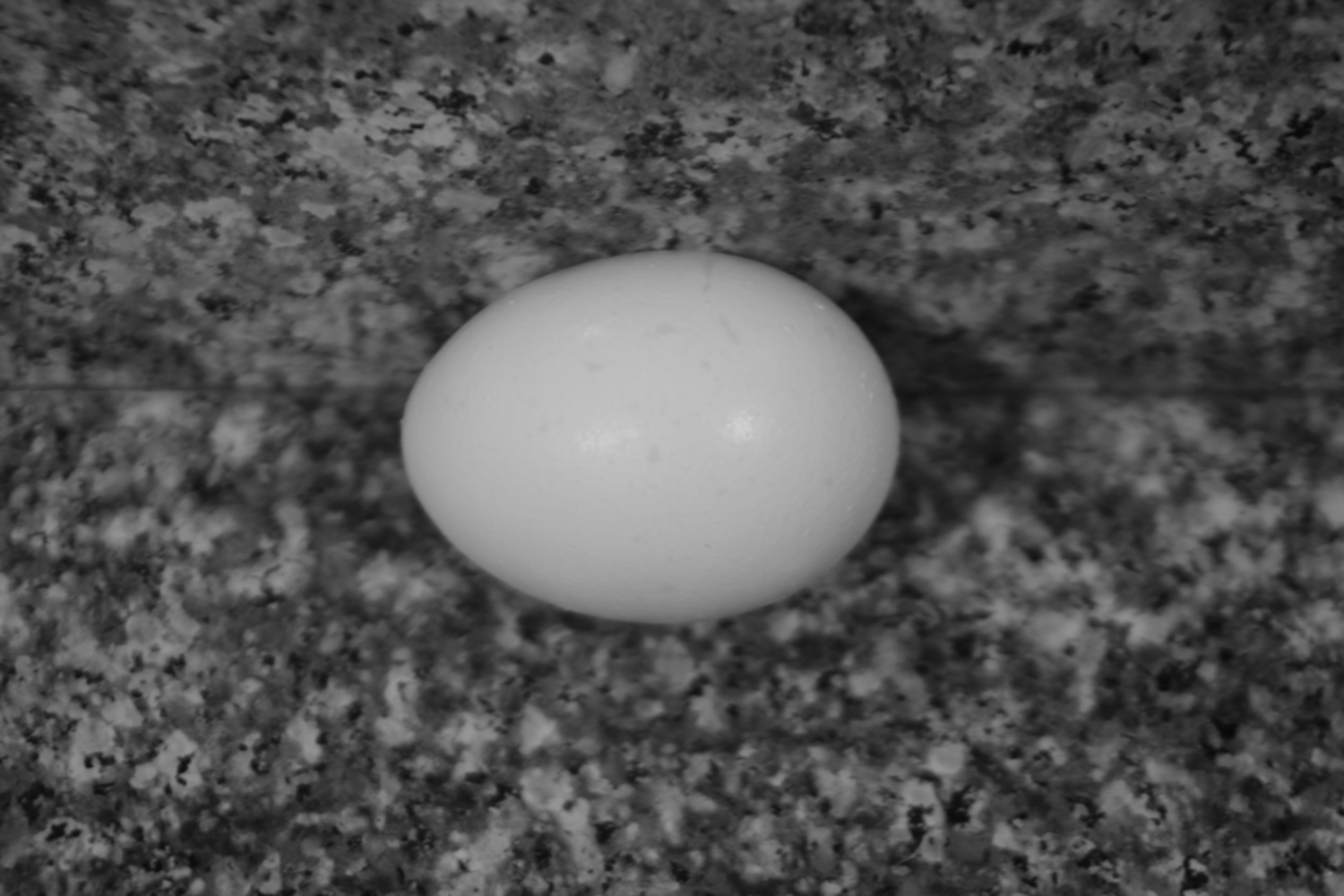
Of each of the categories, I probably spent the greatest amount of time, and took the largest number of pictures, for this one.  I thought that this was funny since an egg is such a simple object.  But maybe that's the reason why.  

I wanted to take a picture that would draw a viewer's attention entirely to the egg and its texture.   For this reason, I chose a granite counter top for the background, which I felt complemented the bright white of the egg.  I spent a great deal of time making sure the egg was centered, and that the edge between the counter and the wall was straight.

I like how this photograph turned out so that the granite pattern in the counter top is clear along the edges of the image, but is more blurry around the egg, while the egg itself is more clear as well.  This gives a sense of depth to the image that I think really draws in a viewer.  However, I think the image would turn out better with better lighting, and I think that the egg's texture could have been captured more clearly.
 mg 5955.jpg.thumb
Show Advanced Options

A landscape

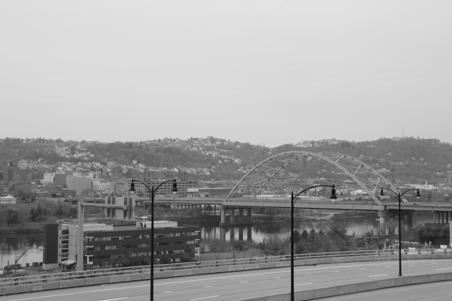
For this category, I chose one of my favorite views: looking out over the river.

I think that this vantage point works well, despite the bridge putting more weight on the right side of the image, because of the building to the bottom left which helps balance it out.  Also, the mountain cutting horizontally across the center does a great deal to balance the content of the image.  A few of the other images I took were shifted upward more, so that the top of the mountain reached a point lower in the picture; this resulted in a very bottom-heavy image which did not give me the result I wanted.

I also feel that this image is not cluttered, despite the amount of things it captures, since its main subject seems to be the river and the bridge, and the colors and brightness of the rest seems much more subtle.

However, I do wish that I had been able to get a good picture without those streetlights in the way (I had trouble finding a better vantage point).  Those lights throw off the balance of the image a bit since they are so dark, and are not placed in a way that they balanced each other.


 mg 5922.jpg.thumb
Show Advanced Options

A man made object or structure

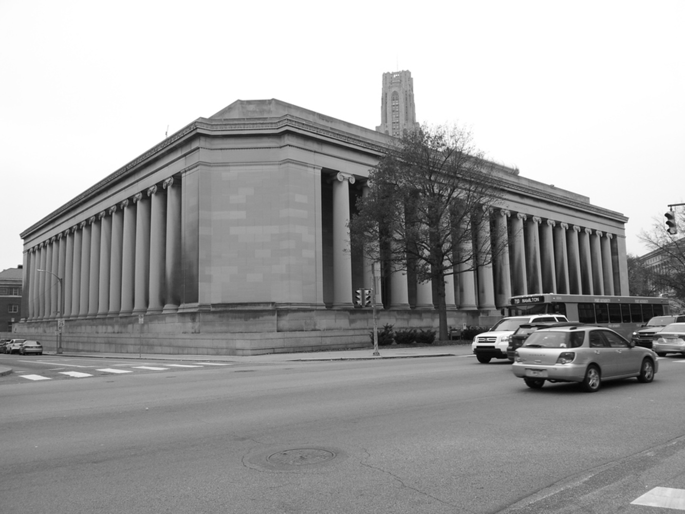
I chose to take a picture of this interesting vantage point of the Mellon Institute.

I like the depth that this image captures as you see the two sides of the building sloping backward. Instead of making the building seem almost flat, as an image that is straight on can do, this gives the feeling of just being able to step into the picture.

I struggled with making this picture balanced while still keeping this interesting view point. I believe that the result is a little heavier on the left, but this is semi counteracted by the great deal of traffic to the right of the image which weights it down on that side. In addition, the shadowing between the pillars is more visible on the right which draws your attention to that side.

I think this picture could be improved if there was less traffic (to make it more simple), and perhaps if it was slightly more centered to give a more balanced result.

20141116 132223.thumb
Show Advanced Options

The human body in motion

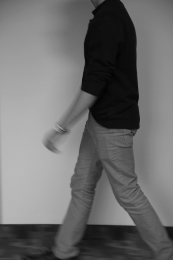
This category also provided a challenge, as the camera constantly gave a very blurred result. The image I have chosen (probably the least blurred on the ones I took) is of the subject walking.  His arm, swinging as he walks, and the area around his ankles are the most blurred.

I found this very interesting, because it reminded me how the camera captures a window of time; not just a split second.  So the camera captures movement in this way.  From this image, I can see how the subject's arm will continue to swing as he walks.

I chose this vantage point since it allows me to see the subject's movement forward from the best angle. Also, I chose a blank background so as to not draw any attention away from the subject and his movement.

It would greatly improve this picture if I learned techniques for capturing movement in a clearer way.


 mg 5913.jpg.thumb
Show Advanced Options

A human emotion: nervous

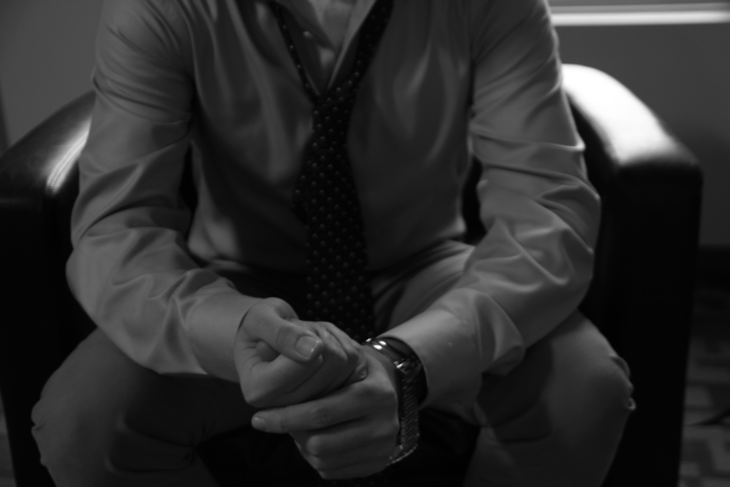
Of each of the categories, I enjoyed this one the most.  Setting up the image and the lighting to enhance the nervous feeling was very interesting. 

I like how the subject is not perfectly centered in the image; this gives an off-balance effect which adds to the nervousness.  The lighting, darker on the subject but bright on the armrests, also gives the impression of something unknown looming in an unseen part of the image.  The subject's hands are clasped, and he appears disheveled, also adding to the nervous feeling.  Seeing the subject's body but not his face also adds to the feeling of mystery and anxiety.  In addition, it may also cause a viewer to image himself in that same position.

Of each of the images I took of this scene, I chose this one because the lighting seemed the best.  The other images had a lighter quality which lightened the mood; I really wanted to capture nervousness as much as possible. I also felt that this is the best vantage point, since it gives the feeling of someone else looking down at his hands, and being struck with the subject's nervousness.


 mg 5961.jpg.thumb
Show Advanced Options
Drop files here or click to select

You can upload files of up to 20MB using this form.