Outcome
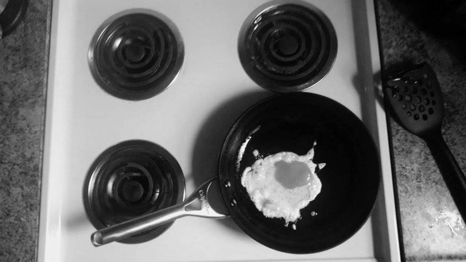
For this photo, I decided to think outside the box a little and photograph a cooked egg instead of a raw one. What I love about this photo is that everything man-made is very circular (the stove tops, the pan, the holes in the spatula, etc.) which the egg is this organic mess that looks so out of place amidst its very well-structured surroundings. I really like the lighting in this piece, as the white stove and white egg contrast sharply with the black stove tops and black pan. However, I would have liked it more if the angle of the picture was perfectly perpendicular to the counter, as it seems like I took it at a slight angle.
A Landscape
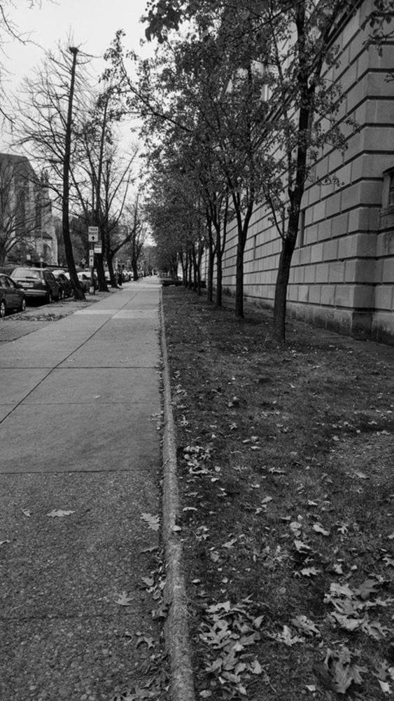
I actually was not originally planning on using this photo. I had already taken a landscape photo when I walked down this street and realized that the trees here seemed to curve outward, as if they were hugging the street. I've walked down this street many times before, and I have never noticed that! Maybe photography really is about learning to see.
I chose to photograph this street because I loved the way the trees on either side seemed to to be alive. The biggest challenge on this photo was finding a way to accentuate the trees' curves. In this picture, the curvature of the trees on the left side is apparent, most likely because of the bright background. The ones on the right, however, are harder to see because the stone background is just a bit too dark. Ideally, I could have increased the contrast in this photo to bring out the silhouette of the trees.
A Man-Made Object or Structure
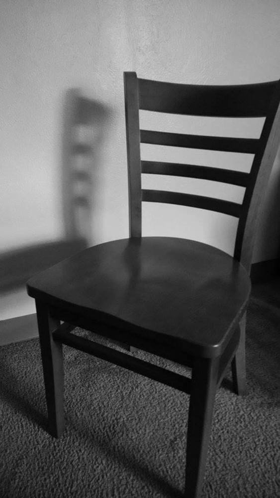
Maybe I am being influenced by all the Paul Strand photographs I've been browsing through (Paul Strand is the photographer I chose for the other project). Strand liked to play with shadows cast from man-made objects, so I thought I would do the same in this composition. I chose an object that is not completely uniform so that it would cast an interesting shadow. I really liked how the shadow came out, but I wished the shadow could have been a bit sharper like the shadows in Strand's photographs. I totally did not factor in the weather conditions, and in retrospect I could have picked a sunnier day for sharper shadows. I also could have put more thought into the surroundings, since there is not much going on there. An idea I had played with was placing the chair at an empty table that is set for dinner, and making sure there were sharp shadows being cast from the chair and table. If I had more time, I would probably test out that idea.
A Human Emotion (Stressed)
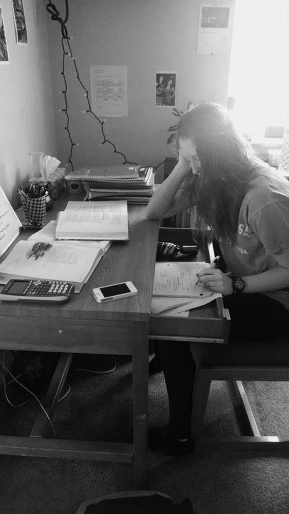
This is probably an emotion that every CMU student knows well. I like how the objects on the desk are set up (very scattered, which creates a lot of intersecting lines) and I like that my subject's face is mostly covered by her hair, which makes the photo more anonymous and relatable. I think I could have played with the lighting a little more though. This emotion would probably fit best in a nighttime setting with dim lights. Hence, the current composition does not convey the emotion of stress accurately enough. In addition, I wished there were parts of this composition that I had left out (like the Christmas lights hanging from the wall, and the half-a-backpack lying on the floor) because those parts seem too distracting from the overall message of the photo.
A Human Body in Motion
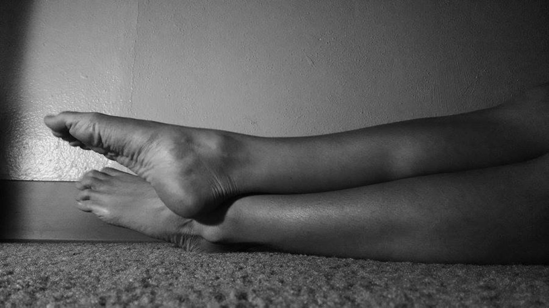
My goal in this piece was to capture my subject's muscles working when she pointed her toes. This shot took us many tries because I wanted to really get the outline of the calf muscles right, and so we had to time the shot perfectly so that the camera went off right when she started pointing her toes. I think if I had extra time, I could have chosen a subject with more define calf muscles (like, someone who is actually a dancer) so that this picture could have a more dramatic effect. In addition, although I really like the angle of this shot (I like how the carpet is sharp close to the subject and gets more blurry closer to the camera), I wish I had put more thought into the background. I'm not really a fan of the dark band at the very bottom of the wall, especially because I wanted the light to hit the wall and reflect back right about where that band was.
You can upload files of up to 20MB using this form.
