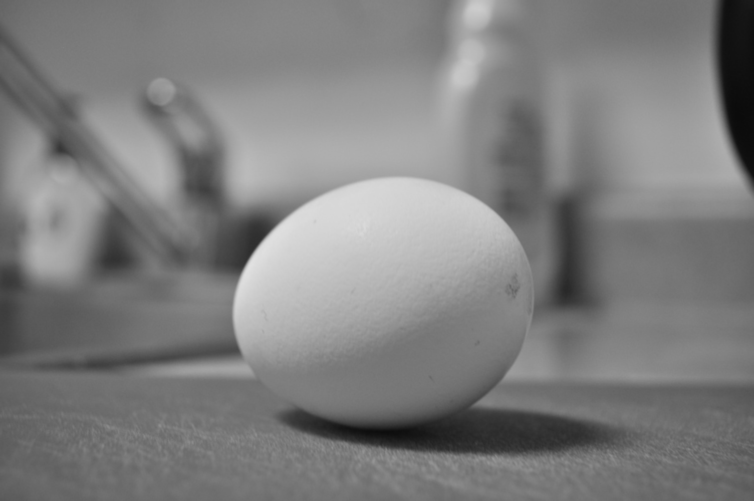
An egg:
Outcome
This photo is taken with a shutter speed of 1/10, aperture of F4.8 and ISO 320. I chose this photograph because it places the white egg in high focus, whereas everything else in the background is blurred due to the small aperture. The shutter speed makes the egg to not be overexposed or the background to not be darkened. The cutting board the egg is sitting creates a contrast in texture with the egg. The cutting board divides the lower third of the photo from the upper two-thirds. I placed it as such to make viewers look towards the horizontal line there, where the egg and its shadow is also placed near. I feel like it was successful, but I would probably have a more contrasting background if I were to take this photo again. I feel like the top of the egg is not very distinct because the background is also very light in color.
A man-made object:
This photo is taken with a shutter speed of 1/8, aperture of F9, and ISO 320. The main focus of this photo is the Android toy. I chose this photo because it has good contrast between the focus and the background, whereas some of the other photos I took seem to make the background too light. Because the toy is mostly symmetrical, I tried to frame the photo so everything is about mirrored by the middle lines, including where the edge of the table is and how the toy and the sofa is placed. I tried placing the light at different locations, and this photo showcases the smooth, glossy texture of the toy the most. I do not think this photo is particularly successful looking back because I feel like it can be further simplified to put more focus on the toy. The corner of the wall is particularly distracting for me because the shade suddenly changes at that point, creating interest to the eyes.
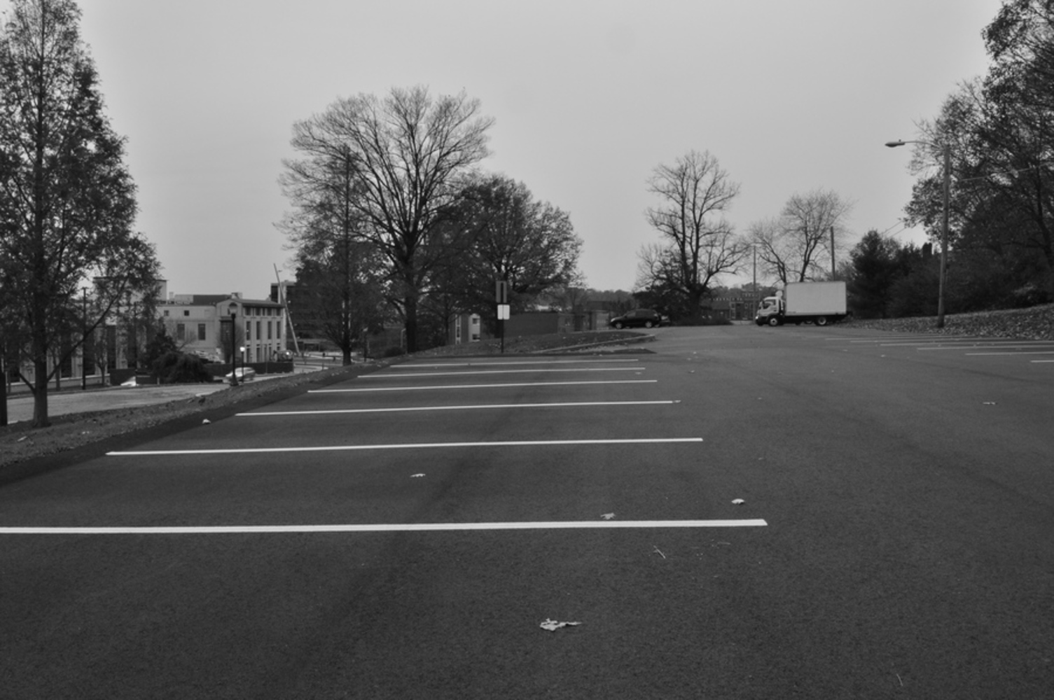
Landscape:
This photo is taken with a shutter speed of 1/20, aperture of F22, and ISO 320. I mixed balancing the photo from the middle with the rule of thirds. The photo is divided into halves horizontally for the sky and the ground, but I also used the rule of thirds to separate the road, the parking spots, and the driveway of the parking lot. I really like how majority of the photo consists of simple horizontal lines, which contrasted with the messiness of the trees. I took this photo at 5PM in the afternoon, and the sky has been cloudy for the entire day, so it was difficult to get the right setting that makes the photo bright enough without losing details in the photo. In retrospect, I would have preferred the photo to be brighter in the background to create more contrast.
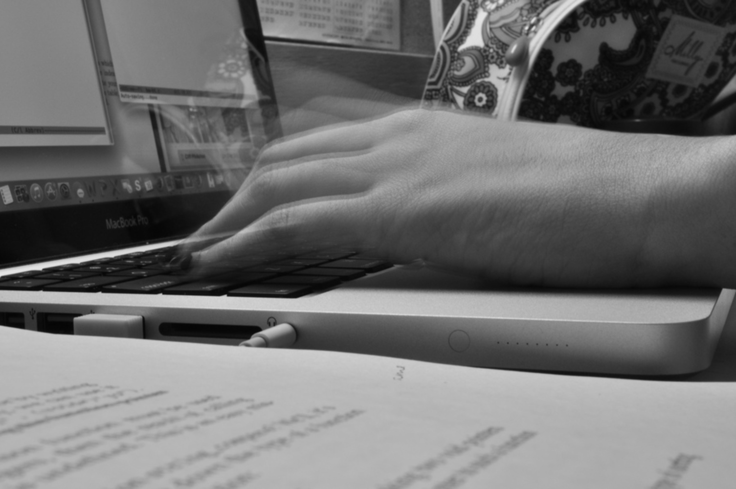
The human body in motion:
This photo is taken at a shutter speed of 1/1, aperture of F25, and ISO 320. The focus of this photo is the typing hand. When I attempted to take the photo at different shutter speeds, I found that 3 seconds make the photo really blurry rather than showing movements, and 1/2 seconds make the photo not as blurry as I want it. While I like the photo for showing motion, I did not like how the photo is composed. I felt like there are too many objects in the frame, and the hand position in the photo seems awkward. I would probably remove a lot of the objects and give more room for the arm, putting the hand at the intersection between the line dividing the left third from the rest and the line dividing the bottom third from the rest.
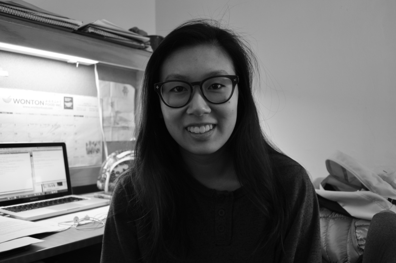
A human emotion (happy):
This photo is taken with a shutter speed of 1/10, aperture of F4, and ISO 320. I especially enjoyed taking photos for human emotions, because I think the little details of a person's facial expression can tell a lot about how the person is feeling. The photo focuses on the girl's facial expression; the background is out of focus. I lined her eyes with the line dividing the top third from the rest as suggested by the rule of thirds, making her eyes a point of interest. Her body divides the two sides of the photo, which are very different in terms of simplicity. I feel like this creates a lot of interest in the photo, although I would have preferred the photo to be simpler. Overall, I found this photo to be successful because it is really easy to focus on the subject.
You can upload files of up to 20MB using this form.
