Back to Parent

Outcome


EGG 1:

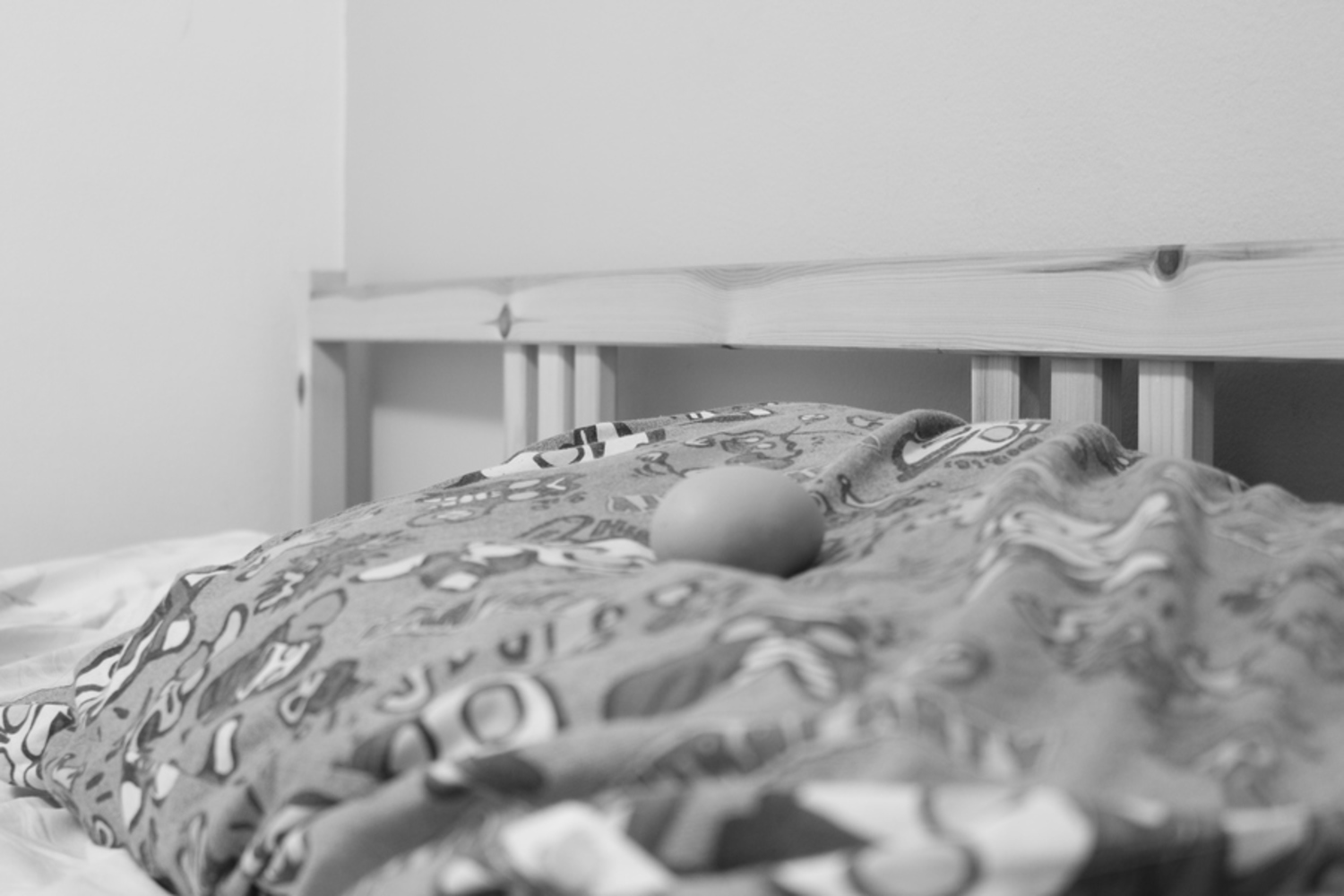
I thought of this idea because my pillow case features Ultraman and my mom used to call him "Egg Man" (translated) because his eyes looked like egg yolks. The idea is that the egg is sleeping, dreaming about "Egg Man", just like children dream of their heroes like Superman. 

I think a problem may come from the fact that not that many people will be able to relate, and if they had no prior knowledge the somewhat out-of-focus pictures on the pillowcase would be indecipherable. 
Img 2227.jpg.thumb
Show Advanced Options

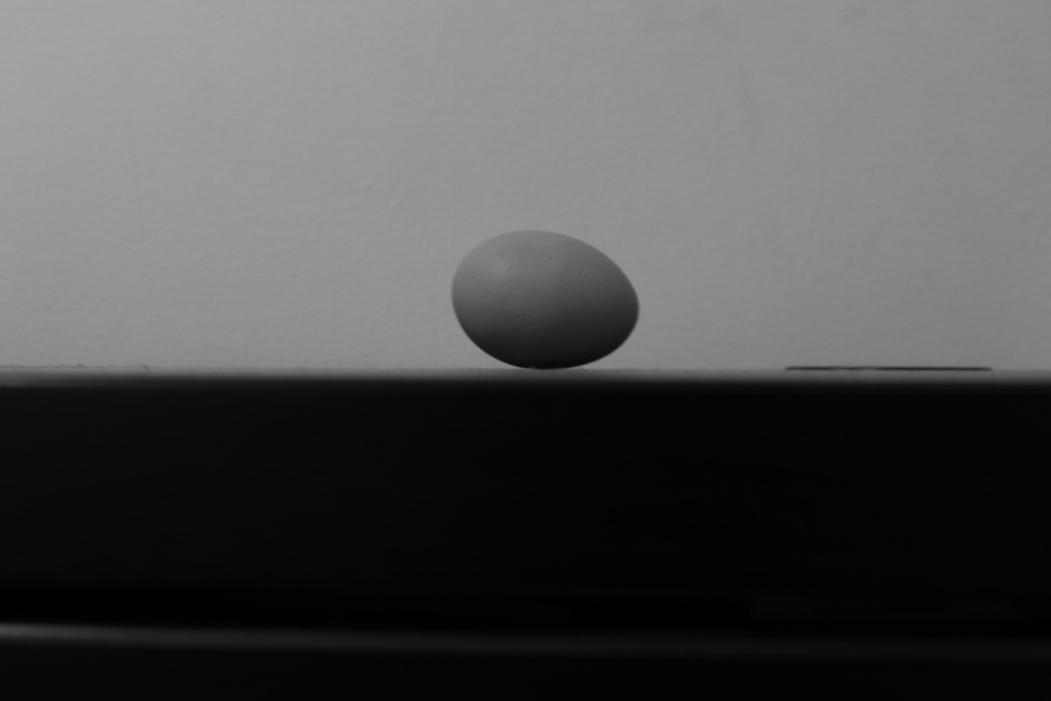
EGG:

For this image, I chose to take the image at the same height level as the table surface. This provides a nice contrast because the dark surface also makes the bottom half of the eg darker, splitting the image in half at the center of the egg.

Unfortunately my desk has a slide-out drawer, and that created  the white line at the bottom of the photo which kind of takes away from the balance of the photo.

Img 2231.jpg.thumb
Show Advanced Options

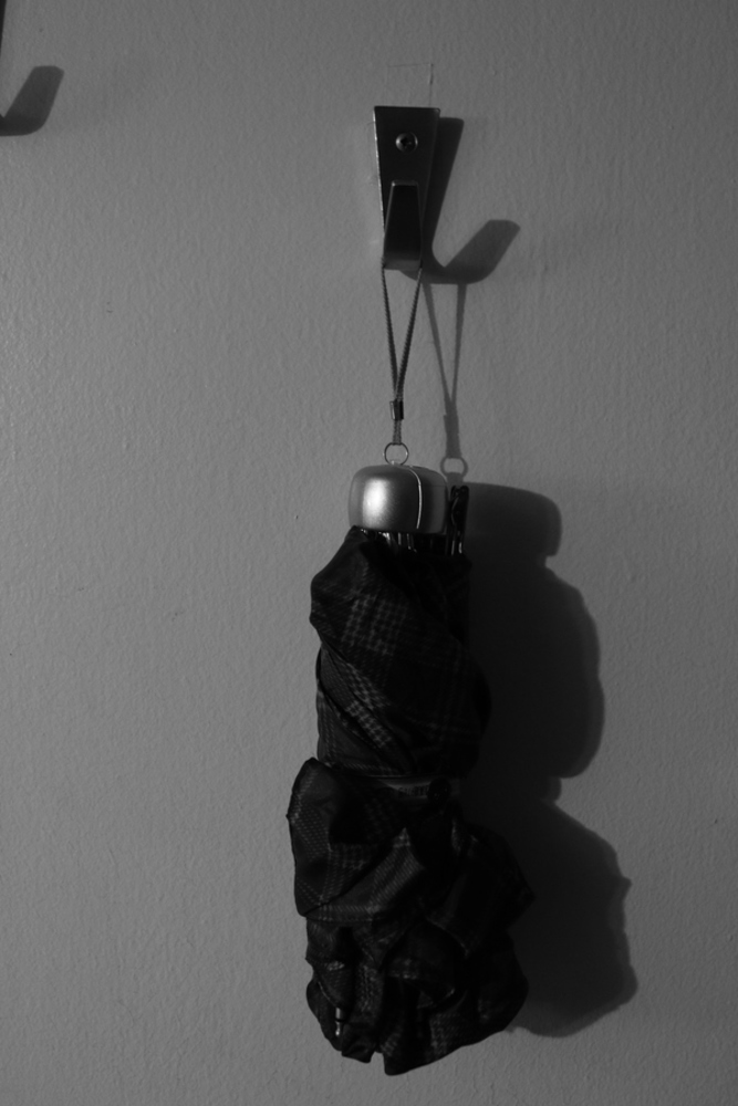
MAN-MADE:

The original subject of the photo was actually three umbrellas, all hanging on the wall in descending height, but as I took photos of them I realizes that there wasn't any good way to get a good angle to incorporate all three (the hallway is very narrow). I was about to move on but then I noticed that the umbrellas themselves kind of looked like humans - the belt in the middle separating upper and lower body, and then the handle is analogous to the head. I thought this was interesting - man made product looking like man. 

I feel like I could have done a bit more to twist the shadow into looking more human if I had decided that that was what I was going to go for. 

Img 2243.jpg.thumb
Show Advanced Options

Landscape: 

I chose this picture because I thought it was interesting how two different sides of the same street looked so different. I also really like the setting - there is a high vantage point, but the road goes down and then back up in elevation, allowing more vision of the street. I feel like this helps more with the contrast because the viewer can see that the left side is illuminated and the right side is left in darkness for the whole stretch. 

I think I could have zoomed further in to the street and captured less of the current foreground because it doesn't add that much to the photo, and more focus would help make the contrast more clear.

Img 2250.jpg.thumb
Show Advanced Options

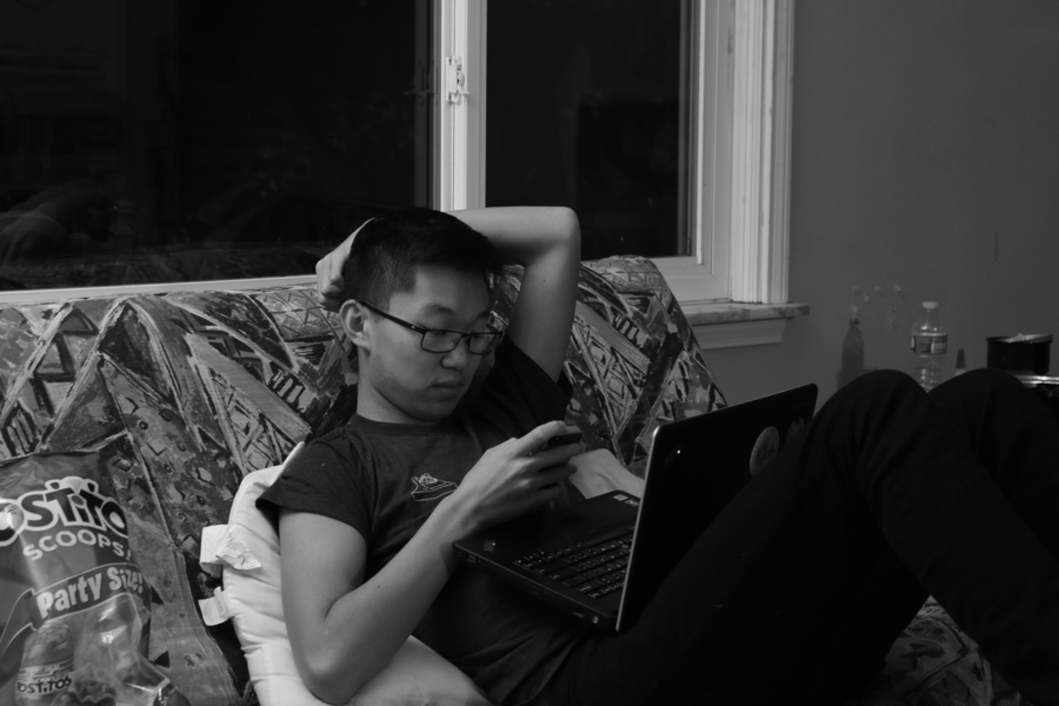
I took this picture because it shows relaxation in it's natural state. I know that he has just finished one of the hardest homework assignments of the semester and slept in for the first time in weeks. He had just eaten lunch and sat down on the couch to watch the TV shows that he follows. 

Img 2251.jpg.thumb
Show Advanced Options

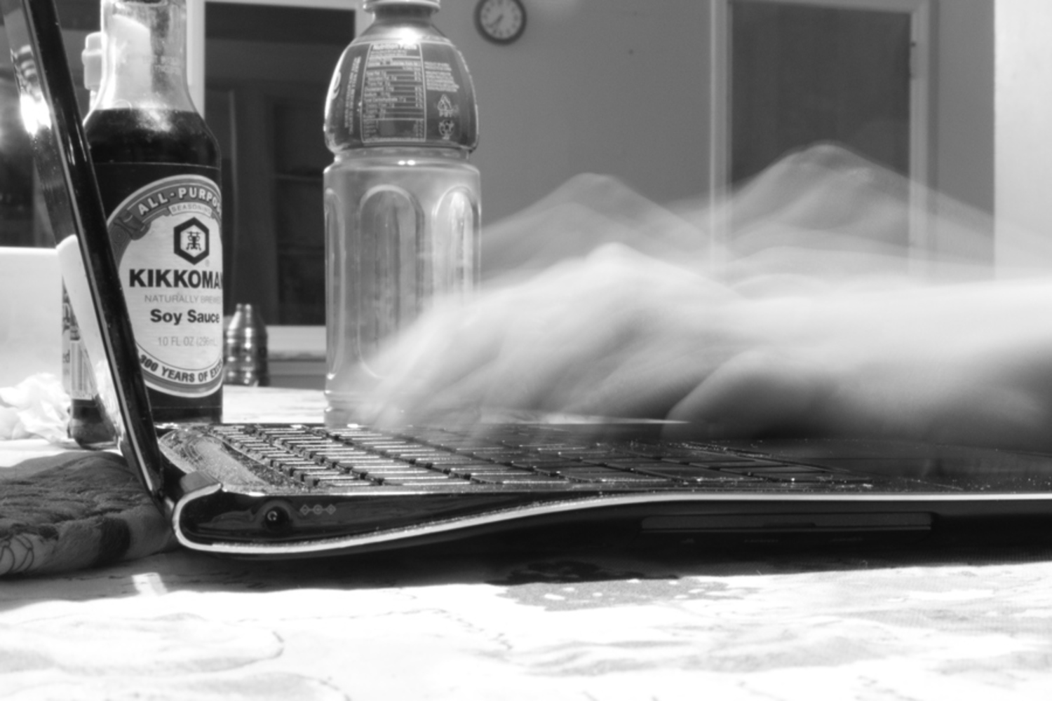
Human Body in Motion:

I tried a few other movements before, but nothing really turned out the way I wanted it to. I knew that I wanted to use a longer shutter speed to emphasize the movement, but I didn't have a tripod so the the camera would shake as I held it. I had to resort to resting the camera on a table, and it just so happened that my friend was working there on her laptop.

I think the photo is a success in the way it reflects on modern life and the focus on technology. There is a stillness in everything except the hands, kind of like how when we are absorbed into our technology the outside world ceases to be alive and full of movement for us. 

Img 2255.jpg.thumb
Show Advanced Options
Drop files here or click to select

You can upload files of up to 20MB using this form.