Outcome
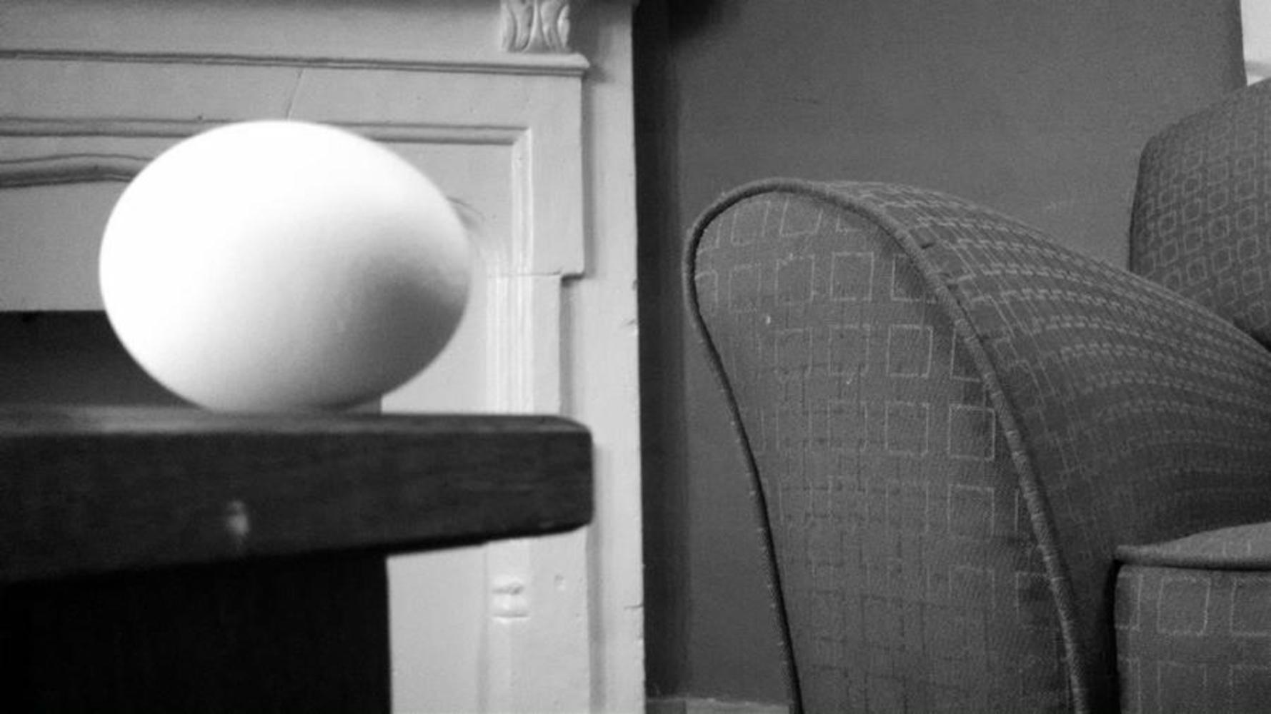
My first thought when photographing the egg was, “This thing is kind of bland.” So I tried to create an interesting vantage point and composition to make up for the boringness of the egg, itself. I took multiple shots from different angles before deciding that one from a slightly lower angle was the most effective. While I do think aspects of the picture are interesting, I don’t think it is particularly successful overall because the couch is not out of focus enough to put emphasis on the actual subject matter, the egg. Therefore, I think it makes the piece a bit more confusing because the viewer would not be able to easily tell what the subject matter is. I think I could improve the picture by ensuring that the background behind the egg is darker, so that the white egg would stand out more, and the couch was more out of focus or more noticeably in the background.
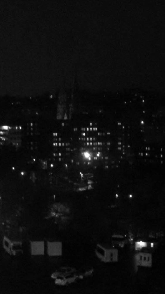
When composing the photograph, I tried to put the brightest building in the middle so that the viewer’s eyes would move towards the center of the picture. I took other pictures with bright spots of light scattered throughout the image, but that made it seem off-balance, and so I settled on one single concentration of bright light in the center of the picture. I don’t think the piece is particularly successful because the vantage point is strange. I think that if it was taken again from a slightly less bird’s eye level view, it would turn out better.
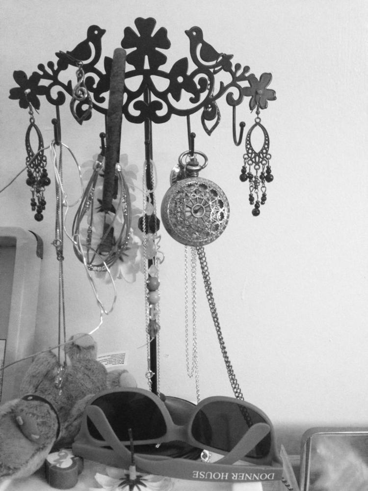
When taking the picture of the jewelry tree, I decided that the best composition for it would be to follow the rule of thirds and place the “trunk” of the tree on the 1/3 line. I took different pictures from different vantage points and from putting the “trunk” on the 1/2 and 2/3 line, but the former was too boring and the latter made the tree look like it was going to topple out of the frame. I think this piece is rather successful. My only problems with it are that the tree is a bit crooked and the trunk is not perfectly on the 1/3 line.
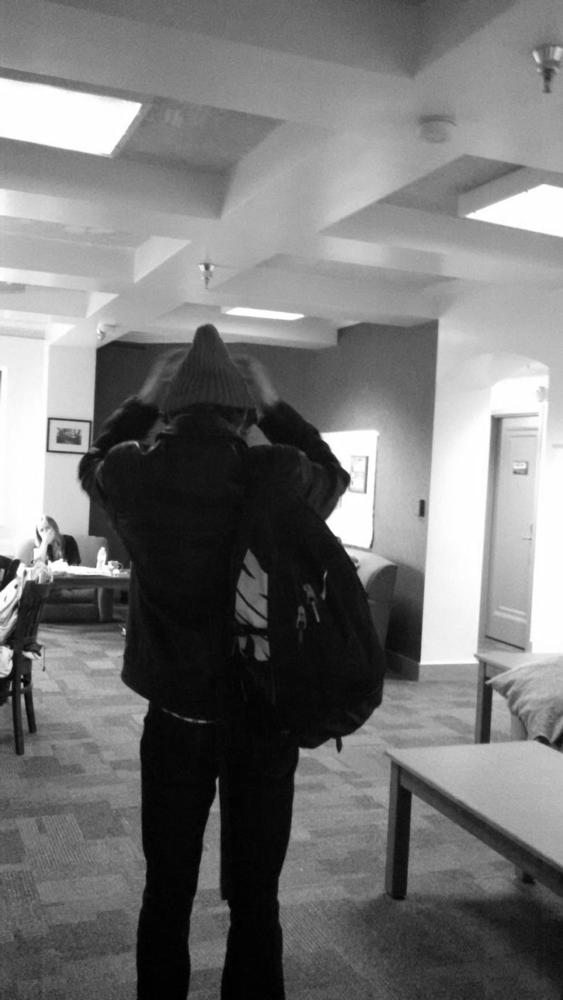
I told my friend, Ben, to move about the lounge as I took pictures of him in motion. There were multiple ones that I took, including a few where our other friend tried to tickle him. However, none of them came out as nicely as this one. This picture happened completely by accident, as I was just toying around with the camera on my phone when I took it. However, I think the piece came out quite nicely because of how Ben is placed in the frame, where is just off to the side but not so much that it is out of balance. Additionally, I thought that the all black outfit on Ben makes him stand out more and creates a stronger picture.
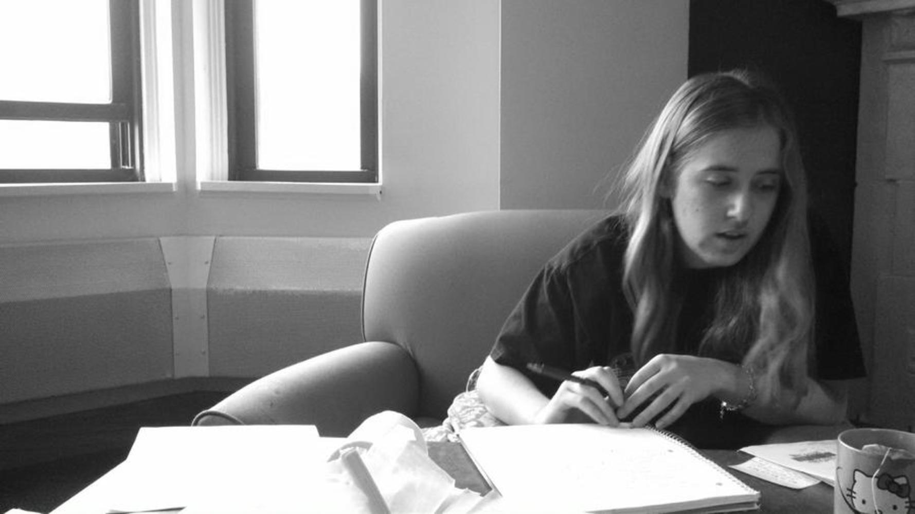
Like the human body in motion, this picture came out completely by accident. It was the first one I took, as so I was messing around with the phone and continuously taking pictures of my roommate while she studied for an exam. I didn’t give much thought to different vantage points or rules of composition as I took this picture because it happened by accident. But I think it came out quite successfully because even though my roommate alone looks out of balance and though she will topple out of the picture frame, the bright windows on the other side add weight to the left side and balance her out. I also like how the picture is partially cut in half by the wall that juts out, placing the bright white winds on one side and the dark wall and my roommate with her dark shirt on the other side.
You can upload files of up to 20MB using this form.
