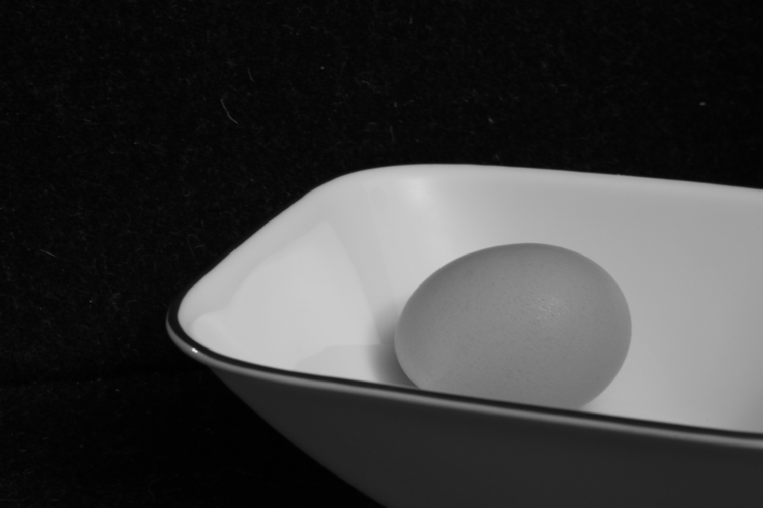
The subject here is the egg. I worked with contrasting brightness and textures in this photo. The three intensity levels (dark, light, and egg) balance well with each other, as do the textures of the egg, bowl and chair. When trying different angles, I found that I liked this one the best because it split the photo relatively evenly. With a higher angle, the bowl dominated most of the photo, while with a lower angle, the dark chair took up most of the space. This way, the egg is not overpowered by the other objects in the picture.
Outcome
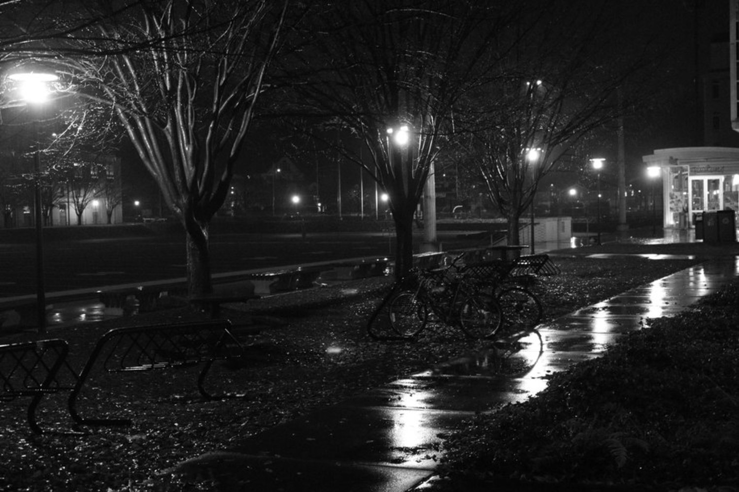
The subject here is the walkway. I was able to take this picture as it was raining, allowing me to capture the soft light from the lamps and the reflection on the ground. There are also a lot of vertical lines in this picture, which serve to guide the eye across the picture. I took a series of pictures around campus, but I felt that this one had the best sense of foreground/background, while maintaining a focus on the space rather than a single object.
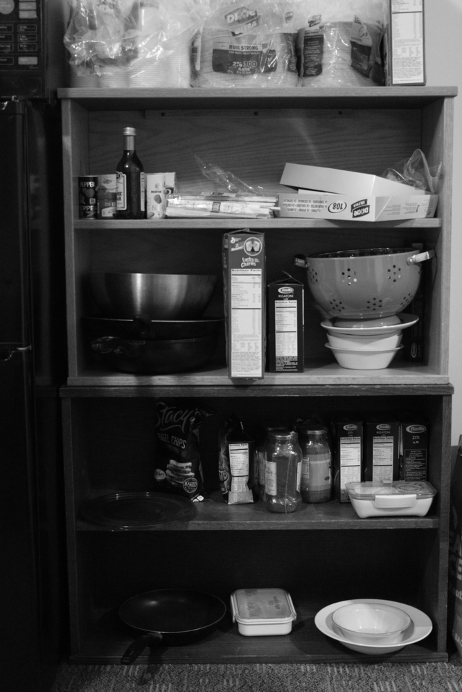
For my man-made object/structure, I chose this shelf. The order/tidyness of the picture was very pleasing to me, so I simply tried to capture this by taking a front-facing shot. It took me a lot of tries to get it as straight as possible, but enlarged on the computer, I see that it is still a little crooked. . The variety of shapes and textures and the clear divide between the top and bottom (light shelf, light-colored objects vs. dark shelf/dark objects + shadows) were all things I considered in the composition of this photo.
You can upload files of up to 20MB using this form.
