Back to Parent

Outcome


Intention: 

Our intent is simple: we want to help you wake up, get out of bed, and start your day in a positive mental state. We want to change your relationship with sleep by changing your mental state when you wake up through exposure to data streams. 

This device is about our relationship with time. Often, devices interrupt us at the wrong moments. This device intervenes precisely when you need it - in the right context for the need you have in the moment. In this case, in the moment when you wake up, when you’re groggy, when you need a little nudge of your mindset to get you up (your desired behavior). This is an example of calm design. It’s about respecting the attention of the user. 

We think of this as an ‘enchanted object,’ which connects ordinary objects with a bit of technology that adds magic. Our magic is the random live counts of something that’s happening in the world, that allows the user to tie the seconds and minutes to an impact outside of themselves, and thus change their internal state. And thus, get out of bed and begin their interaction with the world. 

Approach

Going through the iterations of our design process, we zeroed in on the space between your hitting the snooze button on your alarm clock in the morning and when you get up. Many people struggle to get up and start their day, and we wanted to explore how we could intervene in that mental space with an IoT device to help motivate people to get out of bed and start their day right. Our device functions as a regular alarm clock - until you hit snooze and don’t get out of bed. The 'Conceptual Design' segment explains how it works. 


Context

Situate the design proposal based on at least three references to past works. References to concepts, theory and methods introduced in class should also be made. These should be well-cited and illustrated.

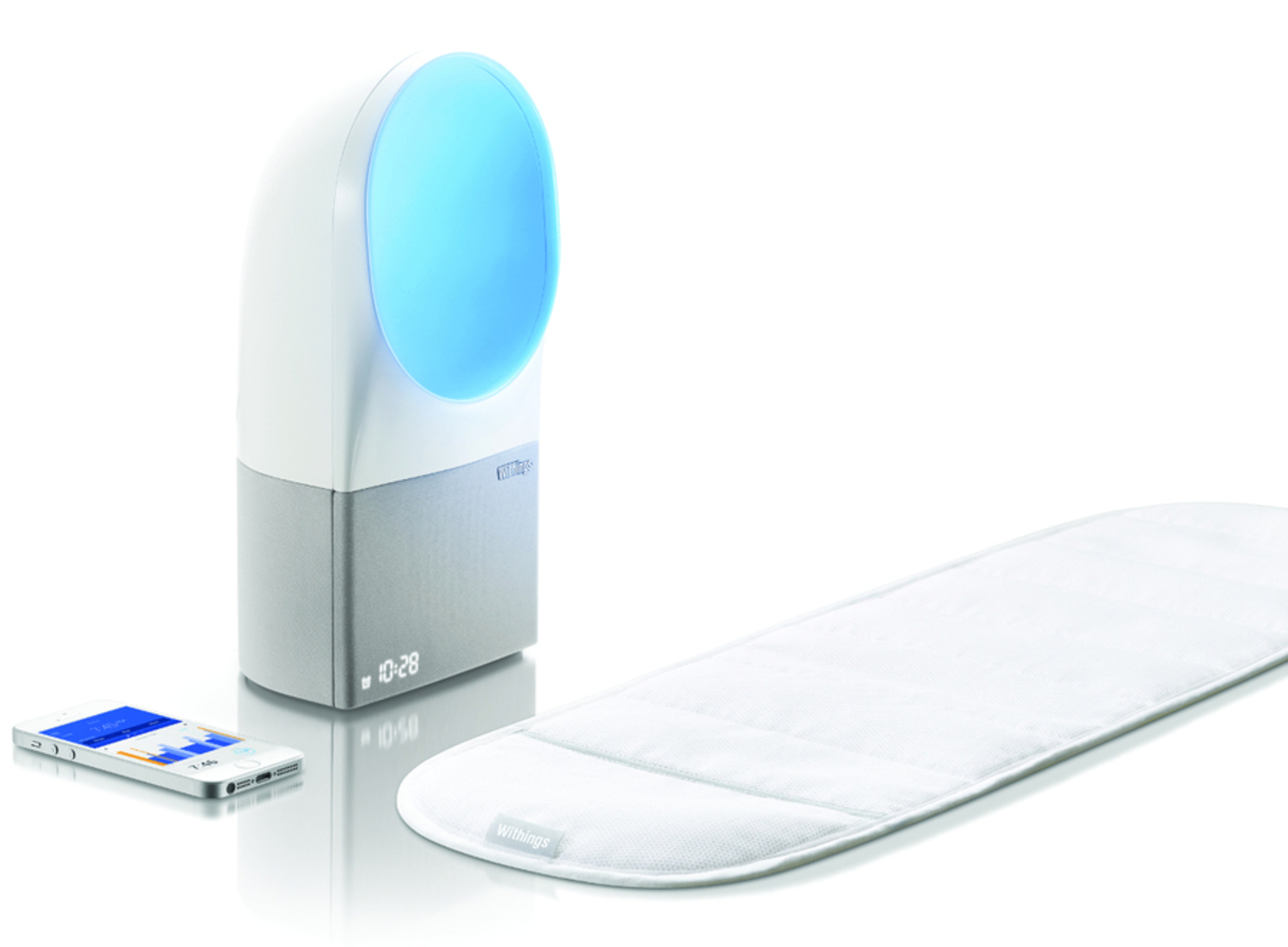
The first picture below is the Withings Aura, an IoT alarm clock that uses light and sound to wake someone up. We were inspired the light aura as well as the pressure sensor that only turns the alarm off after the person has gotten out of bed. 

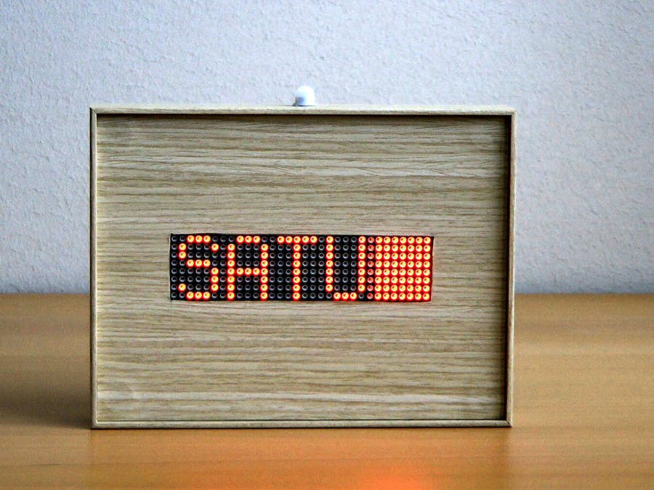
The second picture below is the Arduino LED Matrix Info Display. We were inspired by the LED Matrix; it's large and easy to read, and can display multiple types of information (time, day of the week, weather). It is also a form factor that we could use. 

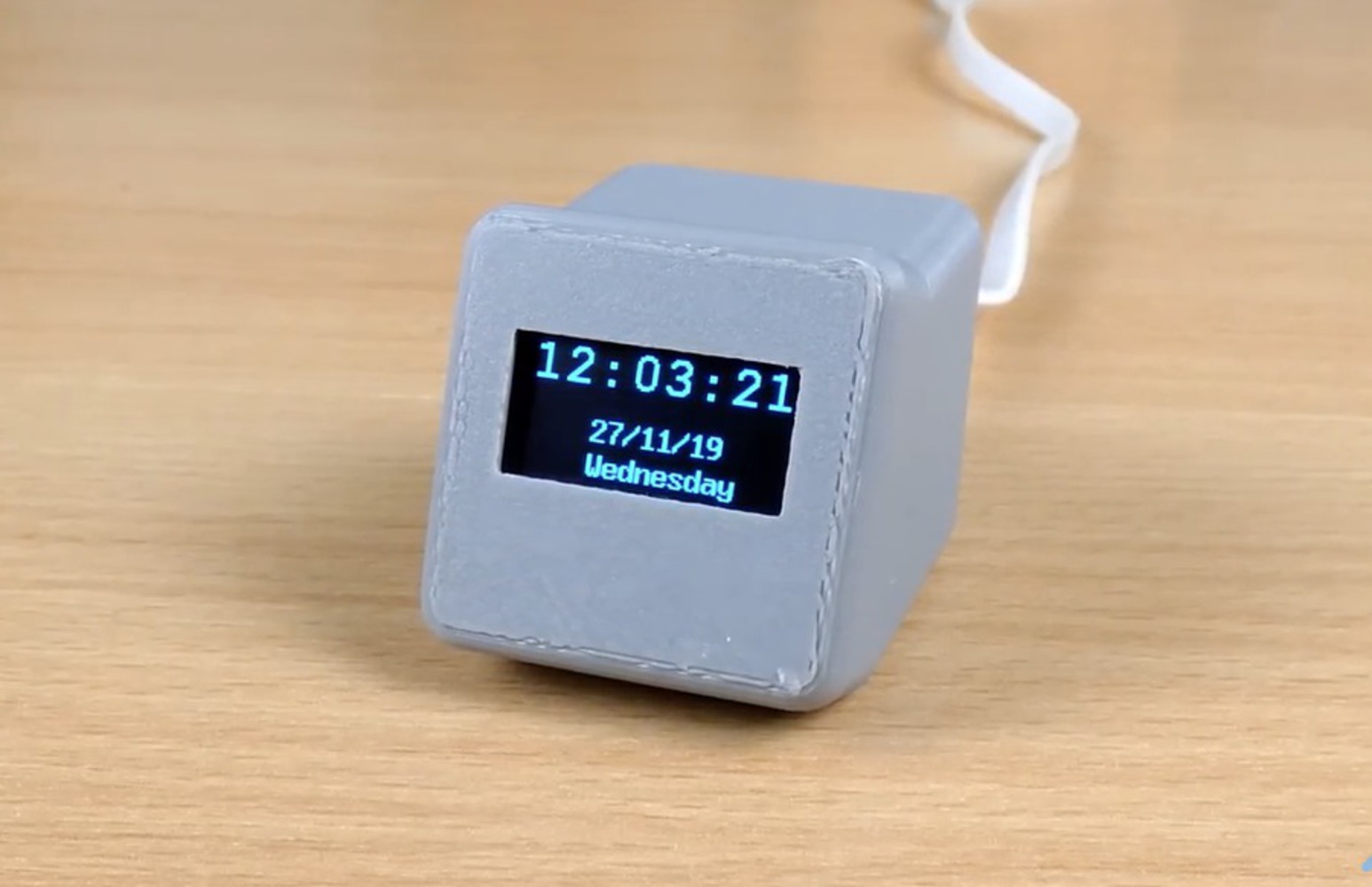
The first picture below is the Network Clock with OLED Display. Here we were inspired by the ability to display multiple pieces of information at the same time. It also showed us we can use the internet to set the time, so it always shows the right time, including daylight savings. 

Withings.thumb
Show Advanced Options
Matrix clock   easy to see.thumb
Show Advanced Options
Clock.thumb
Show Advanced Options

Conceptual Design

You wake up, groggy, and hit that snooze button. When you do, the digital clock face snaps from showing the time to showing 00:00, while ambient lighting on the device lightly starts glowing. The device pulls a randomized data stream about an event in the world that has a count (e.g. number of birds migrating north, births in an area, packages delivered). This data stream becomes a count, and each time an occurrence happens (e.g. each time someone is born in an area) the counter goes up by 1 (00:01, 00:02, 00:03), accompanied by a subtle pulse of light. The person waking up thus connects the extra minutes they spend in bed to wonderfully-random events happening in the world; in real-time. The nature of counting forward brings the person waking up to encounter more instances of these events the longer they stay in bed, hopefully motivating a headspace that is conducive to waking up and starting the day.

The user may be too tired to look at the count directly, but he or she will still be aware of the pulses of light with each count. This may even prompt curiosity on what is being displayed on this particular day, which can help motivate the urge to look over and see, and from there feel more connected to the outside world, and - hopefully - a greater desire to get up and be a part of it. 

In the prototype, we only use a dummy data stream. More on this in the process section. 

If we had more time, we would have used an LED display where we could display both the count and what data is being represented. 

Sketch and Storyboard 


Process

We went back and forth on what data stream to use, of if we should use multiple. We decided to demo with one, but ideally this would be a random data stream about the world. We decided this to prevent the user from becoming numb to seeing only one thing every day (no matter how interesting that thing is). Variable rewards are powerful motivators for humans. 

We couldn't figure out how to get the live webhook to work. So, we created a google sheet and connected it to the Particle Cloud. In the future, this sheet would be live updated with various data streams. 

No matter what we tried, we could not get the LED display to output. So, we pivoted to the two 12-LED neopixels as a way to display both the time and the count. 

Model Process


Choosing materials: 

There were a few criteria to choosing materials: 

- something sturdy enough to hold the screen and button

- something with enough transparency to allow light to flow through, but in an ambient way (so not too harsh either) 

We experimented with foam core as the sturdy material and printer paper and this rougher bristol paper for the remainder of the form. Challenges included constructing seamlessly so that light illuminated the product naturally, and didn't leak or highlight seams. 

There was also the challenge of where the light would glow; if the screen and button had to be secured, the face[s] they were on would have to be sturdy enough and therefore probably made of a harder material -> then, the light could not be coming from those surfaces. We also had to debate whether it made most sense to but the screen on the front or top, and what direction to secure the button as well to make it ergonomic to press. There was one point where we thought the screen would be in the front-face and the button would be at the top, which left the question of where it would make sense for light to come out of. We then considered how light would interact with a dark bedroom as a space as a whole, and considered ideas such as having the light "beat" out of the back face, reflecting off the walls. 

Determining Form:

In determining the form, we wanted to make it something that prototyped the idea well (so containing light well), contained all the electronics, and still looked visually pleasing. 

Final Form: 

The final form we decided on was a rectangular prism, based on the measurements of the breadboard (we switched to a larger one) and the height of the wires. 


By this stage, it was decided that the clock face would be shown through neopixels instead, which would be at the front of the face of the clock. The button would be on top. All sides of the form would be made of foam core. 

While making the holes for the neopixels, I ran across the question of how to cover the middle of them so that there wasn't a harsh hole looking into the box. I then realized to put tracing paper there, which would also serve to dilute light and help convey that "heartbeat" light effect through the front when the clock turned off. 

The button was secured as the top with two layers of foam: one layer on the inside holding the button up, and a second at the actual cover of the box to make a lid. The button was also eventually covered with tracing paper as well to make it flow with the rest of the object better. 


We also ended up cutting out a small slab in the bottom side face to let the wires come out.

Craft:

To construct the foam core, I carved out channels so that no pieces of foam had to be glued together and the entire box could be built without seams. I also carved out channels on the base and lid pieces so that it could be fit into the box easily. Also, since it was so easy to take apart and put together, this made meeting with the rest of the team to fit all the technology inside easier. It was also something that the rest of my team could easily learn to build around or fix if we ever split the work up again. 

Show Advanced Options

Prototype Video and Pictures

Show Advanced Options
Img 0484.thumb
Show Advanced Options
Img 0485.thumb
Show Advanced Options
Img 0483.thumb
Show Advanced Options

Prototype

Bill of materials:

  • Full-size breadboard + Particle
  • Force-sensor
  • 16-LED Neopixel
  • x2 12-LED Neopixels
  • Pushbutton
  • Peizo Sound Output
  • Power and power adapter
  • Paper and cardboard to house the device
Show Advanced Options
20211208 214707.thumb
Show Advanced Options
20211208 200807.thumb
Show Advanced Options
Screen shot 2021 12 08 at 2.15.49 pm.thumb
Show Advanced Options
Screen shot 2021 12 08 at 2.15.05 pm.thumb
Show Advanced Options

Reflection and Critique

One thing we could have done better is to get on the same page about the purpose of this project. We never quite made it out of the ideation phase and each of us had a slightly different idea of what this was for. I think our idea could have been more refined if we figured this out earlier. 

The biggest thing we would have liked to do differently is land on the right data stream to present to the user. We never quite got there. In addition, we think that sound may have been a better way to transmit that information rather than light flashes. 


Acknowledgements: 

Daragh Byrne

Kishore Kumar Perumalsamy

Drop files here or click to select

You can upload files of up to 20MB using this form.