Back to Parent

Outcome


Paul Strand's Life and Works


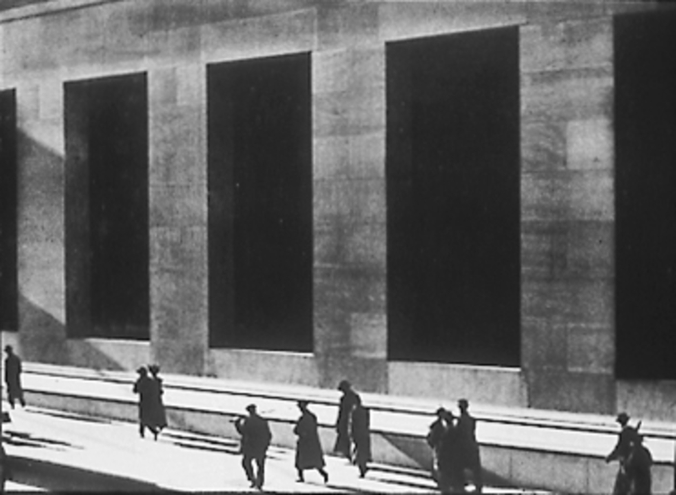
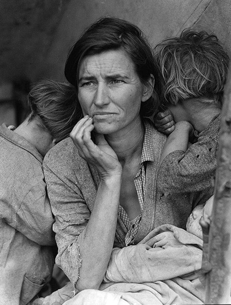
Paul Strand was an American photographer whose passion was capturing both poverty and technology with the hopes that he could tell a story about his era. He grew up in New York City, where he was exposed to both the newest industries and technologies of the era, and to the abject poverty that defined the lives of many factory workers. For that reason, Strand began using photography as a tool for social reform. He hoped that by capturing the dichotomy of America's wealth and its people's poverty, he could spark a change in the way we view our nation. This, for example, is one of Strand's iconic images from the early 1900s:
P1.thumb
Show Advanced Options


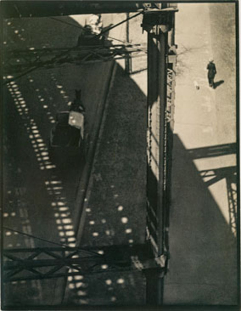
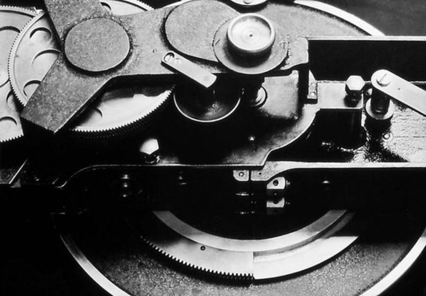
Despite the poverty that was dominant in many of his photos, Strand still held an optimistic view of America's future. The following photos, for example, tell a story of a nation that is driving the technology of the future:


P2.thumb
Show Advanced Options
P3.thumb
Show Advanced Options

Strand also had a hand in establishing photography as an art form. He does a great job using lines and shadows to create beauty in his works. The following pictures, for example, clearly use lines and shadows to enhance their message:


P4.thumb
Show Advanced Options
P5.thumb
Show Advanced Options
Strand1.thumb
Show Advanced Options

Reflection

The goal of this composition was to experiment with lines and shadows, and practice Strand's photographic techniques. I used Strand's photo of a video camera (above) as a template for this photo. Like Strand's work, my photo centers on a round object that has various shades. I put an extra spin on this photo by filling the cup with water, which magnifies and distorts the image on the other side, and even reflects the image onto its shadow. You can see the shadow on the window in the background within the shadow of the cup, which is an effect that I really like. Overall, I think I did a nice job replicating Strand's photographic techniques, although my photo does not carry as much weight as his. I think if I had chosen a subject that is more representative of the modern era, then I could have stayed truer to Strand's intents. 


Pstrand2.thumb
Show Advanced Options

Keyboard

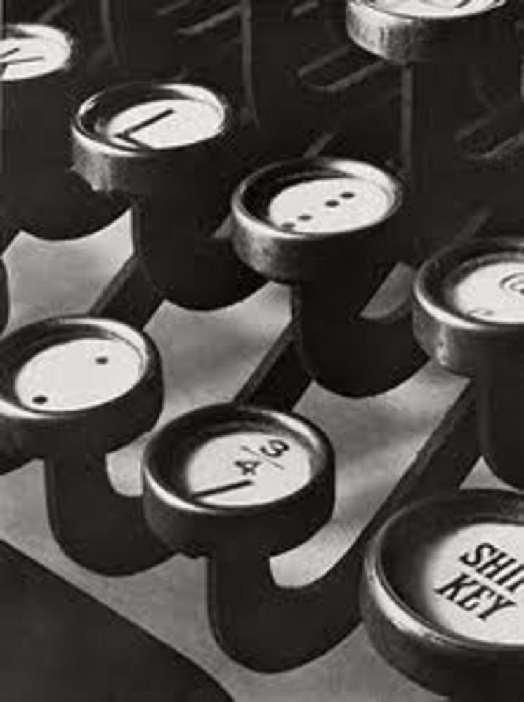
This piece is a modern analogy to Strand's closeup of a typewriter (above). I made sure that my frame centered on the same few keys as Strand's does, so that the audience can draw parallels between the two and thus see the progress of technology from then to now. I made one stylistic change: while Strand's photo is very sharp (meaning it was shot with a small aperture), I chose to widen my aperture to blur out keys in the background. I made this decision because the modern keyboard has many more options than the typewriter did (ex. the F1 - F12 keys, that are at the top of this photo), and some of those extra options made my photo seem too distracting and unfocused. Because of this, I blurred out some of the keys in the background in hopes that the audience will immediately focus on the eyes right in the middle. However, I wish I had paid more attention to the lighting in Strand's composition, which contrasted the white of the keys with the black of the background very nicely. To improve on my own piece, I could take the same shot in more direct sunlight, which could brighten up the background to make it contrast more sharply with the dark keys.


Dsc 0082.jpg.thumb
Show Advanced Options

Railroad

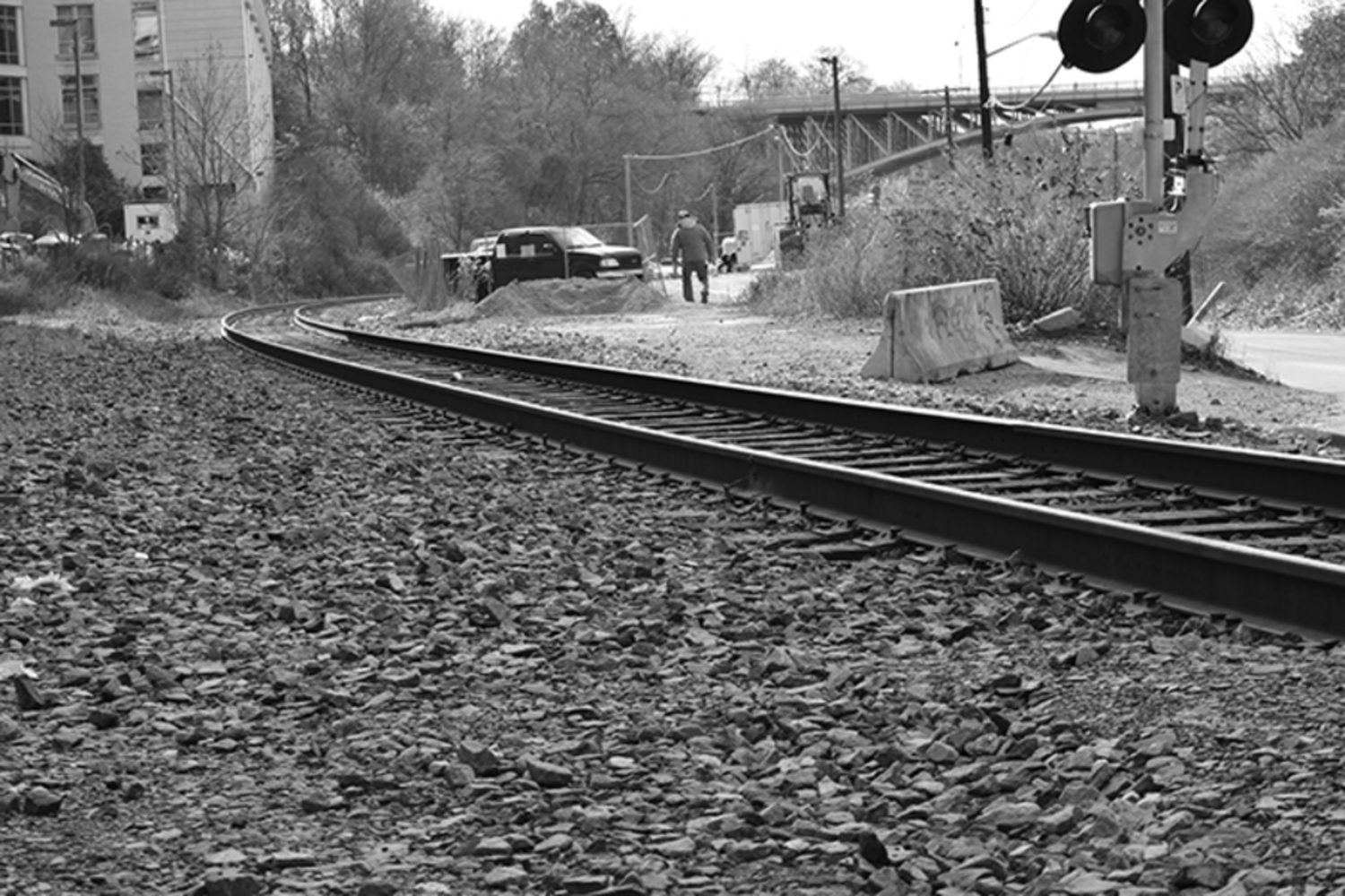
Instead of capturing the technology of this era, the piece captures how the technology during Strand's era (namely the railroad) has evolved. The message of this photo is that even though the railroad itself has evolved (ex. it is sturdier, shinier, etc.), the poverty that is associated with railway workers has not. I especially picked out this piece of the railway because it is in a poorer looking area and is situated under a bridge so I was hoping I might get some cool shadows. (I got unlucky with the weather, so alas...no shadows.) In retrospect, one thing I would like to have changed is the angle of this shot. I noticed that Strand angles most of his compositions so the audience can clearly see any lines. I would like my composition to be angled so that you can see the tracks more clearly. I think changing the angle would also give more weight to the composition, as the audience would be able to see the strength of the railway compared to the drabness of the worker in the background.


Dsc 0073.jpg.thumb
Show Advanced Options

Windows

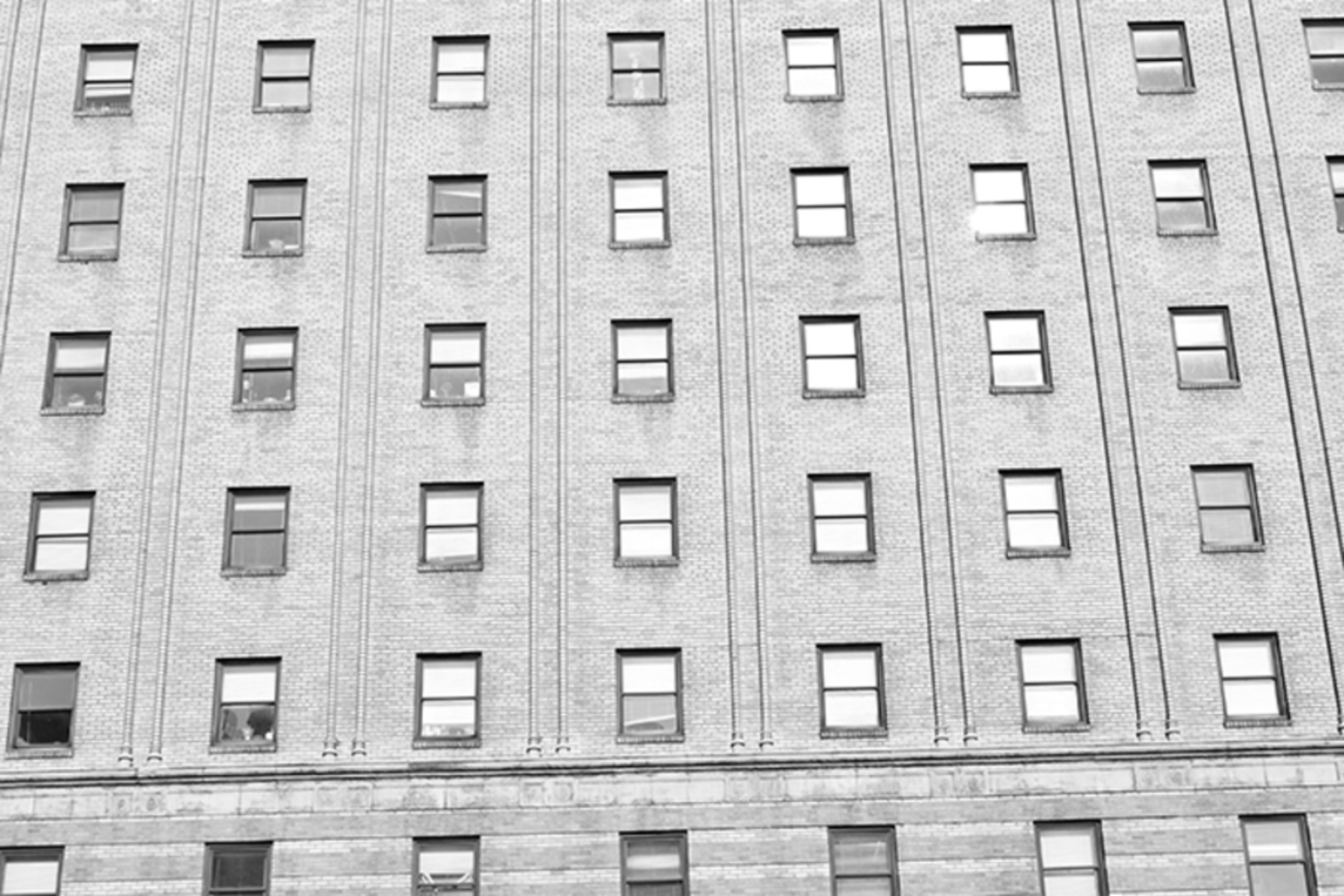
I did not intend to take this picture initially, but as I was walking by this building (which, by the way, is a building I walk past almost every day), it struck me as a building that had many features Strand would have looked for. The building is extremely flat and very gridlike, particularly because of the way the windows are spaced out and the vertical lines running between them. The only thing think composition is really lacking is shadows (or any darker component), which is something that is present in most of Strand's works. I think if I had increased the shutter speed, I could have made the windows look a bit darker, which would resemble Strand's photo of Wall Street above. 

However, I think the biggest improvement for this piece would be to choose a building in a poorer neighborhood. Although this photo follows Strand's photography style, it does not have the same message as his photos since this building is not a cheap apartment. If I had more time, I think I would have tried to find an apartment building that has windows and lines similar to this one, except with a older and cheaper feel to it.


Dsc 0064.jpg.thumb
Show Advanced Options

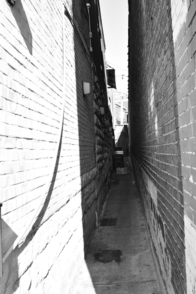
This image depicts a poorer area of Pittsburgh. I chose this particular shot because I think the lines in the brick are similar to the lines present in many of Strand's works. I also love how the alley is plunged in darkness, while in the distance there is sunlight. This could represent how little we pay attention to America's lower class, since they seem to be hidden under this fascade of America wealth.

One thing I wish I had done was step farther into the alley so that the bright band on the left side would be cut out. I think the brightness there is a bit distracting and makes the audience focus on the wrong part of the composition. Other than that, I really like how this piece turned out and I think it really reflects some of Strand's techniques. The lines on the bricks and the vertical lines that define the two walls definitely make this piece seem very Strand-esc. I personally love that the bricks on the left pop out a little, which makes this narrow alley seem even more narrow and constricting.

Drop files here or click to select

You can upload files of up to 20MB using this form.