Josef Albers was a great artist, but more than that, he was a great educator. He was a teacher and mentor to many skilled artists. He is most known for his experimentation with both color interaction and geometric shapes.
Outcome
From the 1950's onwards, Josef Alber's spent most of his time on the series of artwork that is now known collectively as 'Homage to the Squares'. Many of his paintings might have looked similar in terms of the shape and structure, but Alber wanted to focus on the color relationships within a similar format of squares. However, few people know that his first great works were works of art in glass. They fall under a category called glass assemblage. He starting making these around the 1920s and stopped in the early 1930s. Still, even his early works and later works are similar in that they both explore the contrasting effect of colors. The work below is called “Untitled”. It is a glass assemblage composed of metal wires, broken glass and bottles from the city dump in Weimar.
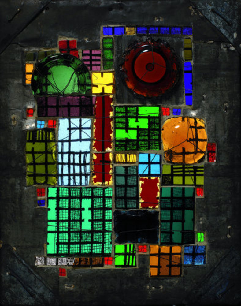
One of Alber's most famous quotes is this: “In visual perception a color is almost never seen as it really is — as it physically is. This fact makes color the most relative medium in art”. Alber asserts that color deceives our perceptions continually and that the same color can evoke innumerable readings. Distinct color effects are made from the contrasting effect of color.
In this artwork, Alber groups different colors together into a sub-component, and then places sub-components of different colors next to each other in order to obtain a contrasting effect. In many of his works, he explores the various color relationships and this idea is central to this assemblage as well. He doesn't group the same color together but instead places some contrasting color between them. Throughout his artworks, he has been experimenting with that contrast but at the same time, he tries to depict order by making sub-components. It is especially interesting how a color affects the intensity and hue of its adjacent colors. For example, the maroon color between the two teal colors near the bottom right. The maroon has a lighter shade and it causes us to perceive the teal as a darker shade than it normally would be. But then, the long strip of maroon in the center seems to have a lighter shade than its counterpart, and this is due to its adjacent light yellow, blue and green colors.
Two main aspects of this work are also the wires placed over the square glass, and the round pieces of glass surrounding by square pieces. The wires are used to cover certain parts of the glass, while leaving others open. While this might seem random at first sight, Albers placed them strategically to give a certain order to the image. Firstly, the wires end up giving the effect of turning the square glasses into grids of sorts. Then, Alber purposefully left some grid squares uncovered, while covering others. For example, the green square in the center has uncovered squares that end up connecting two of its adjacent colors via a path. Another example is the bottom left lightish teal color. The outer wire ring of squares has less thickness while the inner wire squares has a greater thickness. This makes the glass under the inner ring appear darker, due to the effect from the black color of the wires.
Then, we have the 3 round glasses. Notice that none of them are directly surrounded by square glasses of the same color. This once again points to how Alber is aiming to experiment with the contrasting effect of color. The red glass is surrounded by relatively lighter shades of colors, giving it a darkish hue.
In general, I believe Alber hoped to portray a sense of order and experimentation through his glass works. A large part of Alber's life was related to teaching and nurturing students and perhaps he hoped that his visual compositions would be able to allow sensitive viewers to retain those characteristics and ingrain them into their own lives and relationships, thus making the world one giant classroom.
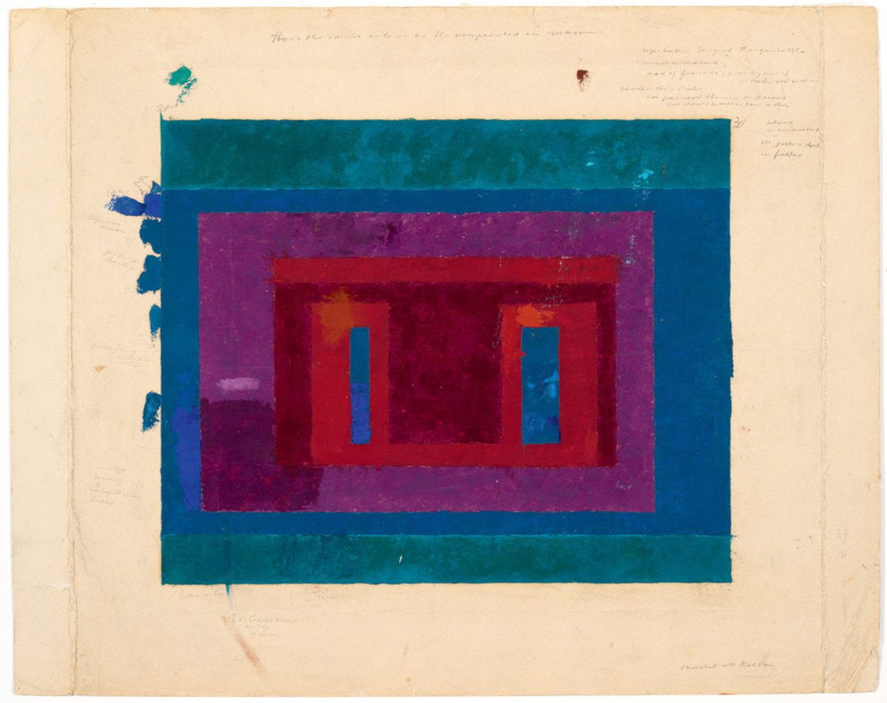
I decided to study Josef Albers’ “Color Study for a Variant” for this assignment. I was initially drawn to this piece because while it is almost completely geometrically shaped and clean, there are certain noticeable, and most likely intentional, imperfections to it that make it all the more interesting. Sources about Albers suggest that he created the piece by taking paint straight from the tube and spreading it onto the paper using a palette knife. The most interesting part about the composition, to me, is not the arrangement of the different rectangles next to each other, but the spots of blue on the right side of the paper that make the rectangle imperfect. The spots lead the eye from the center of the image, which appears to be the same color as the large rectangle on the outside, and creates a sense of motion from the inside to the outside. The bright and dark reds surrounding the two small blue rectangles seem to create a sense of unrest, since the two colors don’t appear as though they are harmonious. It also creates a sense of depth, since the small blue rectangles are so much brighter than the red rectangles, they seem to come out of the page. Furthermore, the plum square separating the larger blue rectangle from the red squares balances them all, making the piece seem complete and balanced, but active at the same time. Finally, I think the turquoise bands on the top on bottom, which acts as the foreground of the entire piece, frames all of the other rectangles in the picture.
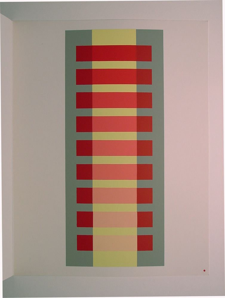
This piece is one of many color plates from Albers' educational text, Interaction of Color, which aims to impart the rules Albers discovered through his experimentation. Albers was very interested in how people perceive light intensity/value between different hues, and would regularly ask his students which of two colors seemed darker.^1 This painting shows the effects of that consideration. The reds to either side of the yellow band are the same from top to bottom, but where they overlap it, they mix with it more and more going down the canvas. The topmost bar seems to hover in front of the yellow, while the bottommost appears to pass beneath it (though the yellow is somewhat translucent). At what point does it switch? Why does it seem that way? Do they merge at some point in the middle? These questions are useful for learning artists to ponder, as they help relate the components of an image to the perception of it as a whole. Even changing just the blue of the background can change where the other objects appear to fall in relation to one another. For me the bars seems to be receding as my eye goes down the canvas, an effect I would have to attribute to the visual cue of occlusion, though in this case neither object completely obscures the other.
1 Source: http://elizabethahunt.wordpress.com/2013/01/13/interaction-of-color-by-josef-albers/
You can upload files of up to 20MB using this form.