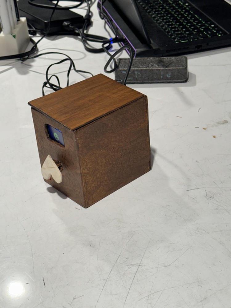
Back to Parent

Outcome


Intention

Our group found the reading on calm technology very interesting and persuasive. When brainstorming ideas we all talked about our dislike of notifications that basically yell at you to pay attention to them and how the different ways that can negatively affect you – jarring sound if you’re not expecting it, a clear disruption from your focus on something else. So one of our main areas for a potential use case was how can we use calm technology to improve on some current design and/or notification system.

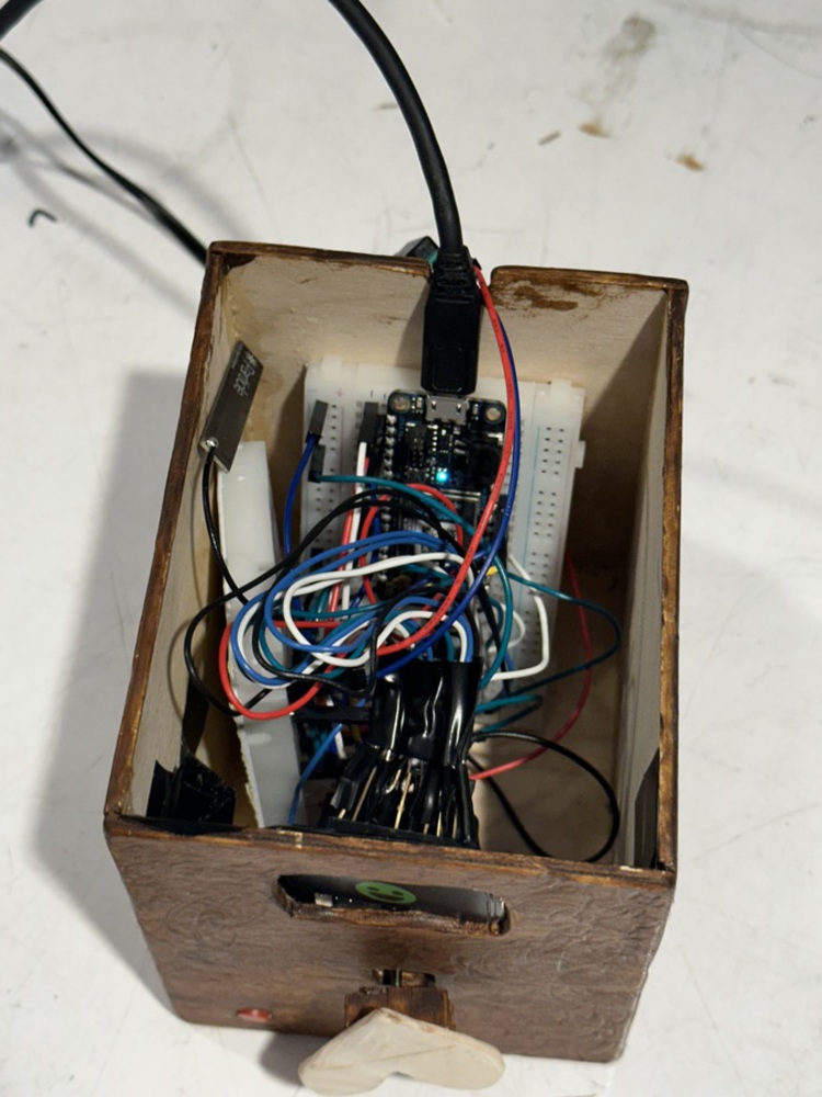
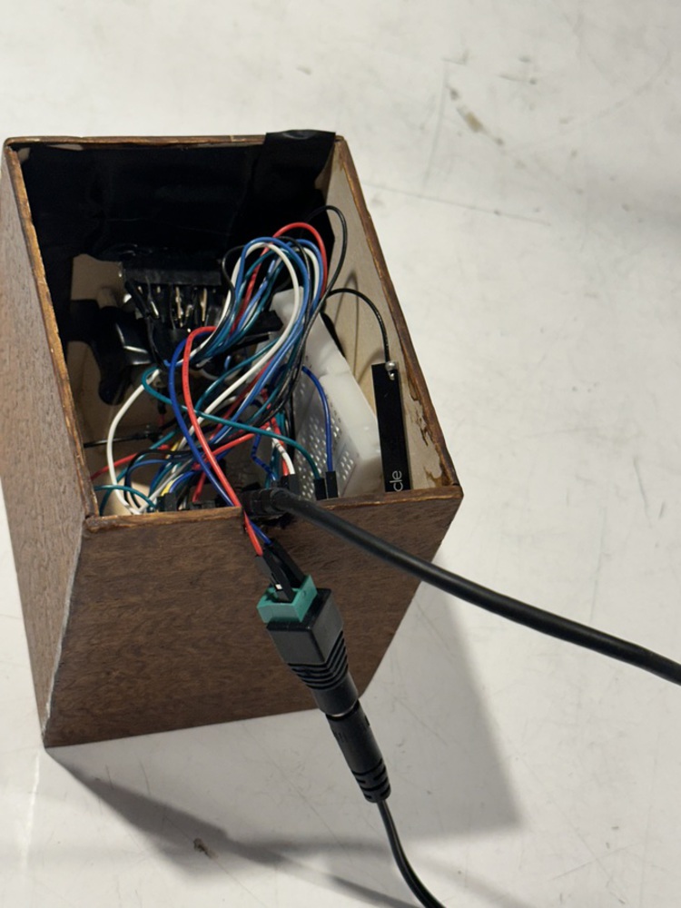
From there we settled on coming up with a less intrusive way to message other people. We all preferred texting over phone calls, but the fact you have to use your phone to receive / look at messages when you get them opens you up to a whole slew of other distractions when you’re checking the message. It also requires you to keep your phone nearby, which puts you at risk of being distracted by notifications for other apps as well.

We considers other options as well, but several of the other ideas took us in directions that we thought would be too complex for our level of understanding and the time available to create the project. We talked about smart blinds, smart glasses, and even how to design a google home / Alexa that would incorporate more light options for notifications instead of just sound notifications. 

Historical Case

We selected the LoveBox because it was an example of an IoT device that implemented SMS messaging while also being ambient. It serves as a great alternative to the other connected devices that users need to be consistently engaged with to be effect, like normal sms. The LoveBox provides an example of calm technology influencing communication apps, but still allowing for meaningful and timely communication in the future of ubiquitous computing. Users still have all the connectedness of a regular phone, but carry much less propensity for distraction and/or disruption. We believe this increases the emotional or sentimental value that is attached to messages by refocusing all the emphasis on the actual message instead of it being split across several different potential distraction points.


Approach

The approach involved studying the Lovebox's design, functionality, and user experience. We aimed to replicate its core features while incorporating our own twist. We didn’t divert too much from the original design of the box. Only making alterations that would get us to a proof of concept sooner. We removed the lid and added a button, as we thought this would make the development of the box much simpler. We’d seen buttons on other similar devices that we’d researched, and they seemed to be a positive addition to the overall concept that created a simple but meaningful way for users to engage with the device and notify the sender they’d received the message.

We tried to revive the device's essential features. We mainly focused on the integration of the LCD screen as well as the unique feature of the spinning heart, which acts as the notification signal that a message has been received. We thought it created a delightful and engaging experience for the user and was one of the most important aspects of the device. 

Process

The journey began with a detailed analysis of Lovebox mechanics. We then sketched out our prototype, iterated on design, and implemented the chosen features. We went through a few different ideas on how to incorporate the main parts, if we’d be able to figure out the screen, what the size of the box would be, and how we’d create the box. But overall our initial ideas were what we followed through on.

Experimentation involved moments of success, such as achieving the spinning heart effect, as well as challenges, such as fine-tuning the mechanism for optimal performance. It was tough at first to get the screen to work and we needed some support with figuring out the right code for it. We also were unsure of which motor would be the best to use. We chose to use a DC motor but eventually were told other options would likely have been better because they’d have provided a more options when programming.

Initial plans underwent adjustments, particularly in the choice of materials for the spinning heart mechanism, based on real-world testing. At first we weren’t sure how to design the heart or how to attach it, but after a few trials we figured out what we thought would work best for the prototype.

Prototype

Regarding code, the first thing worked on was the screen. Getting images to display accurately was the first real test. Then the work shifted to adding the motor and button that triggered the images onto the display. Regarding the design, the first thing worked on was measuring out the box the device would be housed in and then deciding what material would be used and how to cut it. From there the box was cut, stained and pieced together.

The biggest challenge was the wiring of all the components because they needed to be packaged in a tight box. This meant that wires would often come out slightly and it would be very hard to diagnose where the problem wires were. On the design side of the physical space we didn’t run into many problems. We were unsure however about how the motor would stay in place to spin properly but we were able to resolve that when designing the box itself.

If we were doing this again we would try to work on a better way of packaging the device and find a better way to cleanly connect components to the breadboard with less jump cables. How we went about it worked, but it was very congested. We’d also work to create a better experience regarding interacting with the device to inform it the message has been received. The button we were using turned out to be cumbersome and placed in an inconvenient location.

Show Advanced Options
Img 0157.thumb
Show Advanced Options
Img 0159.thumb
Show Advanced Options
Img 0156.thumb
Show Advanced Options

Reflection and Critique:

Our team acquired knowledge in mechanical design, microcontroller programming, user experience considerations in IoT, and what goes into designing an meaningful and effective physical space for a product. The professors who engaged with us on pitch day also provided lots of tips on how to improve on our design that most of us had not thought of before. 

Future steps may involve enhancing connectivity, exploring mobile app integration, and refining the design for a market-ready product. Other things would be to consider different ways of interacting with the box other than through the button. We got some good comments about touched based interactions as well as knocking interactions. This would make interacting with the box more intimate than using a button.

Acknowledgements:

Professor Byrne provided us with libraries to use to get the screen up and running. 

Zhenfang helped us make the initial steps with the tft screen and allow us to start designing the emojis for the project.

Drop files here or click to select

You can upload files of up to 20MB using this form.