Back to Parent

Outcome


Introduction

George Tice said in an interview that “Most of my pictures are about place. I would say the Urban Landscape work is what is most distinctive about me.” This is the book of pictures I picked up in the library, which immediately captured my attention. A place can tell you so much about people. Whether it’s a sign, a storefront, or a landscape, it gives you a great deal of insight into what the people living there see and think about each day, and what their attitudes and interests are. I like that many of his pictures are on the edge of human activity; you can just imagine someone walking out of that doorway, or stepping through the side of the frame. This offers a very interesting perspective: thinking of people by their surroundings, not by the people themselves.

It is also interesting to note that Tice says that “The bulk of my photographs are of New Jersey,” where he was born. In this way, he is seeking to describe the people who he grew up with, and probably greatly identifies with. Through the lens of his camera, he can also see how his familiar environment has changed over time; something not usually obvious without documentation. Tice usually takes fairly simple photographs, with one subject centered in the image. He is also very skilled at maintaining balance in his images; my eyes usually are drawn to a point in the center.

I chose to imitate the ideas in Tice’s work Urban Landscapes by taking pictures around areas of Pittsburgh such as downtown and the Strip District, both of which have similar environments to his photographs: very common and every day, with a touch of nostalgia.
Tice's Work

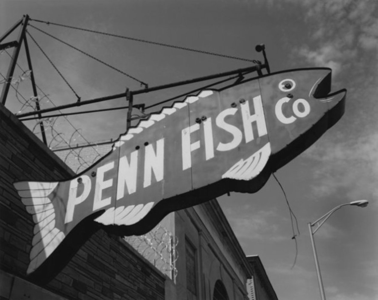
Penn Fish Market, Camden, New Jersey, 1997 

Penn.thumb
Show Advanced Options

This first image features a worn sign for a fish company. In the background you can see the edge of the roof of the building, as well as a nearly cloudless sky and a street light. The image is centered on the sign, but has it slanted, the way you would see it if looking up from in front of the building. This photograph is very simple, focusing just on the sign. This is an everyday type of image, but probably not one that we spend a great deal of time thinking about. We see signs for stores almost every day, but how often do we stop and really look at them and notice how they reflect the store or company, the neighborhood it is in, and the people it serves? They give insight into how old a business is, how profitable it is, the personality of the owners, and so on. 


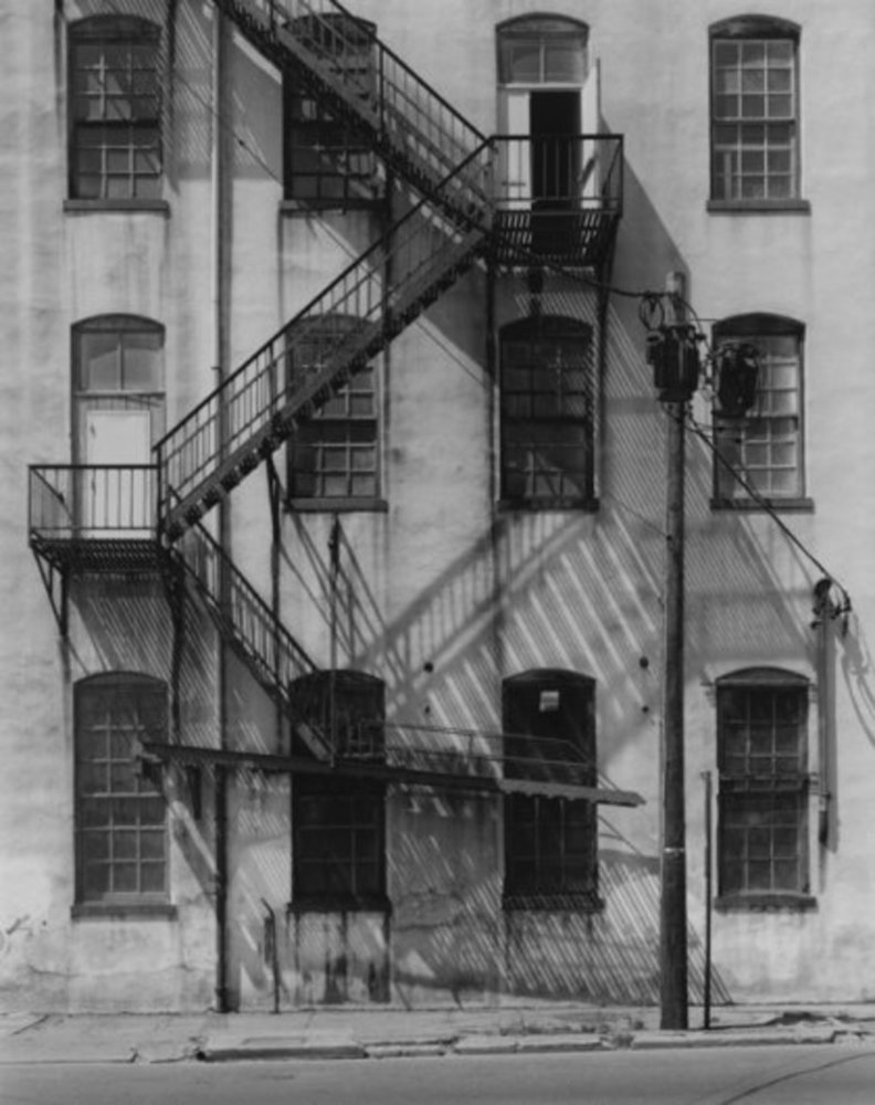
Factory Facade, Spruce Street, Paterson, NJ, 2003

Factory .thumb
Show Advanced Options

The second image features the fire escape on the side of a factory. There are no people in the image, and it appears to have been taken from across the street. This photograph is also simple, featuring something common in daily life, but without the bustle of people. However, there are signs of activity, such as the door left open on the third floor. This leads to questions such as “Who was/is here?”, “Why did they leave that door open?” This picture is the starting point of a story that forms in our mind which causes us to think about people and their lifestyles.

It is also interesting to note that this photograph seems to be carefully planned, as the shadows of the steps form very interesting patterns on the side of the building.


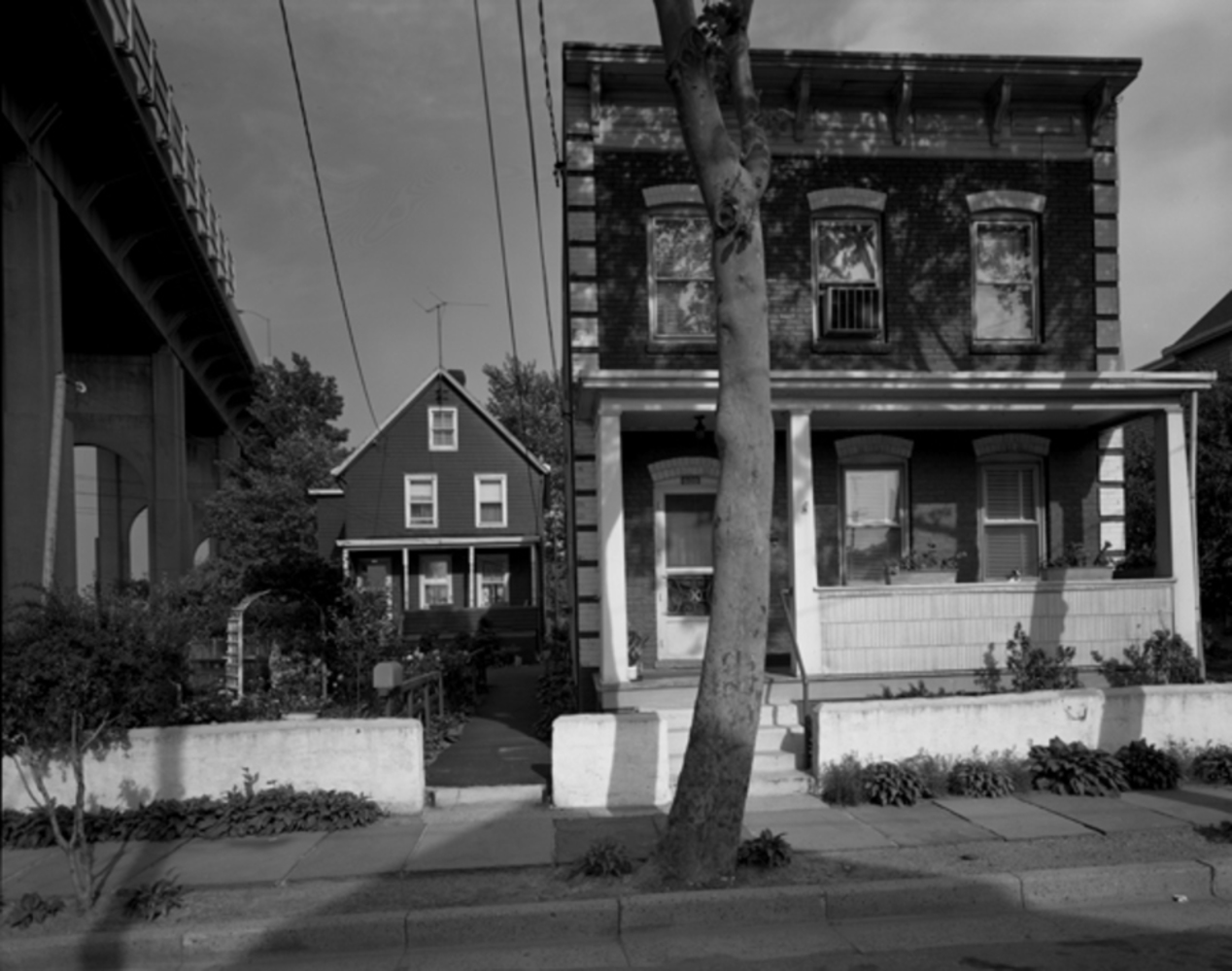
Below Rte #440 Overpass, Gadek St., Perth Amboy, NJ

Below route 440 overpass gadek street perth amboy nj 1972 web.thumb
Show Advanced Options

The third image I chose to look at features a couple of homes located next to an overpass. The left side of the image shows the overpass, but in a way that you cannot see any activity on it. This image, too, does not show any people, but shows a scene that is common in daily life; homes located next to a (most likely busy) road. The point of view of this image seems to be from the road. This photograph is slightly less simple than the previous two-- it has more than one focus: two homes and an overpass. However, it still feels peaceful and uncluttered.


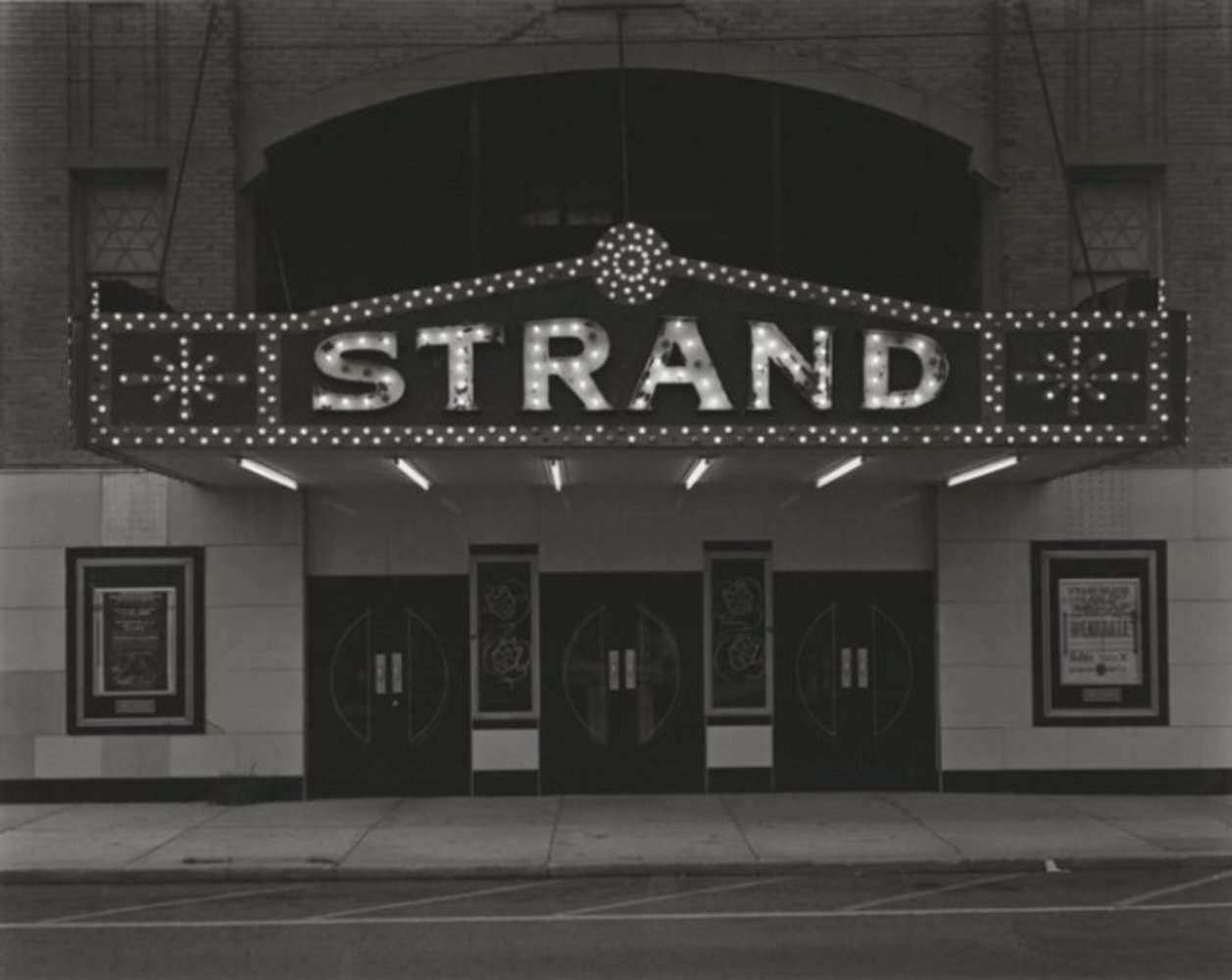
Strand Theatre, Keyport, NJ, 1973

Strand 3.thumb
Show Advanced Options

Originally, I presented the first three photographs as the style of Tice's photography that I would like to emulate.  However, I later observed that the third image had a very different feeling than the first two in terms of the environment.  The first two have an industrial or downtown type of feeling, while the third is more residential.  The first two feel as though they are in an area that should be busy, but Tice just happened to capture a moment of calm, while the third seems as though it would almost always have this calmness to it.  So, I looked at more of Tice's work, in search of another photograph that seemed to better match the theme of the first two.  This photograph, though it does not have the industrial feeling, does strongly say "downtown" to me, and also captures an instance of calmness in front of what seems like it should be a busy theater.

This photograph is very interesting, as it shows a theater that one would expect to be bustling with activity. It is noted that this theater is certainly not abandoned since the sign is lit. Perhaps he shot this picture during a show so that everyone was inside; during the calm between the flow of people into the theater, and the excited rush out after a show. I can just imagine people beginning to burst through those doors at any moment. This picture is well balanced; the entrance is well centered, and the sign is located just above the middle of the photograph, to balance the lighter wall in the lower portion of the image, and the darker wall in the upper portion. The contrast between the background of the sign and the lights is very nice; it causes the sign to pop, drawing a viewer’s eyes to it at first glance. Though this photograph is very simple, it leads the viewer to imagine the background behind it; as in all of Tice’s photographs, it causes the viewer to think.


My work

 mg 5865.jpg.thumb
Show Advanced Options

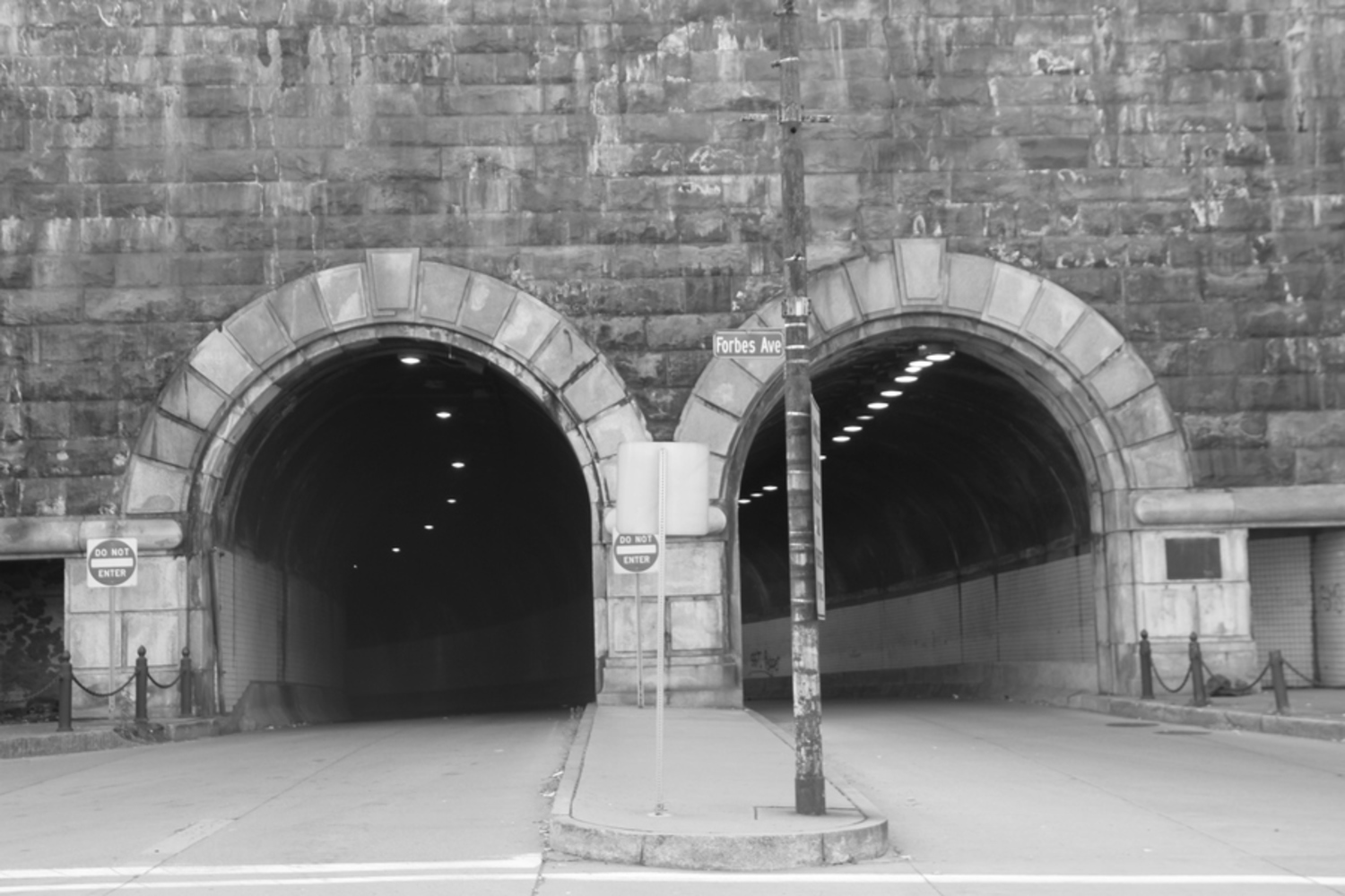
These tunnels grabbed my attention as being something slightly different than Tice’s photographs, while still capturing the same feelings of daily activity without the activity, in the rare moment that cars were not passing through. Also, I feel that tunnels really give a sense of Pittsburgh, in that there are many of them around the city since the area is so mountainous. While Tice captured life in New Jersey, I tried to capture life here.

I like the symmetry that the two tunnels create in this picture, keeping the photograph very balanced since there is a similar amount of light and dark on the left and right. I also like the contrast between the tunnel and the surrounding wall, and the depth captured in the tunnels by the lights on the ceiling. Though the pole located in front of the right tunnel throws off the balance slightly, I do not feel as though it is an issue since it makes the image less boring and gives it some character with the street sign.

 mg 5866.jpg.thumb
Show Advanced Options

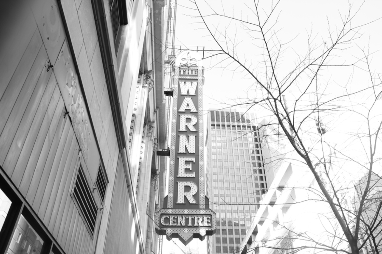
This sign captured my attention because of the nostalgic air surrounding it; it reminds me of an old fancy theater.

I like how the sign is centered in this image, and the point of view from the sidewalk, as someone would see this sign if looking up normally.

However, I do feel that this picture is a bit unbalanced. The darker shades on the left are much different than the lighter shades on the right, and this throws off the weight. Having the dark tree and medium-shade building to the right help, but still do not completely counteract the left side. I also think that this picture would be much more striking if the contrast in the sign was greater.

 mg 5876.jpg.thumb
Show Advanced Options

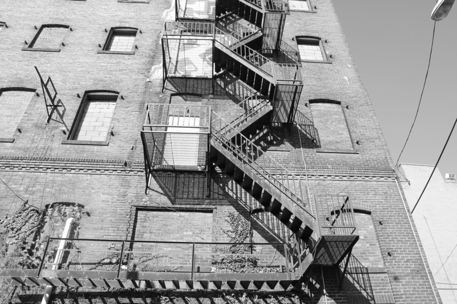
This photograph is a tribute to Tice’s Factory Facade, Spruce Street, Paterson, NJ, 2003. Though the shadow patterns from the stairs are different than in his photograph, I found that these shadows were perfect as well. They line up with the stairs and highlight them, making them stand out from the building, forming a great contrast.

Of the photographs I took of this scene, this was the point of view I liked the best, lining up the horizontal stairs at the bottom with the base of the picture. This point of view draws a viewer’s eyes up the building, an effect I find very interesting. The main subject, the staircase, is centered and though the building cuts off on the left, the sky is a similar enough color to not throw off the weight on that side a great deal. I feel that this image is very focused, and contains a lot of clear detail, such as shadows between individual bricks and underneath the ivy.

Though this point of view was the best photograph I took of this scene, I would have liked to get a better one, like Tice’s. However, I was limited by the space in the alleyway where I took this. Also, I feel as though a scene with less ivy and graffiti would have had a greater effect, since these draw a viewer’s attention away from the main subject, the fire escape.

 mg 5880.jpg.thumb
Show Advanced Options

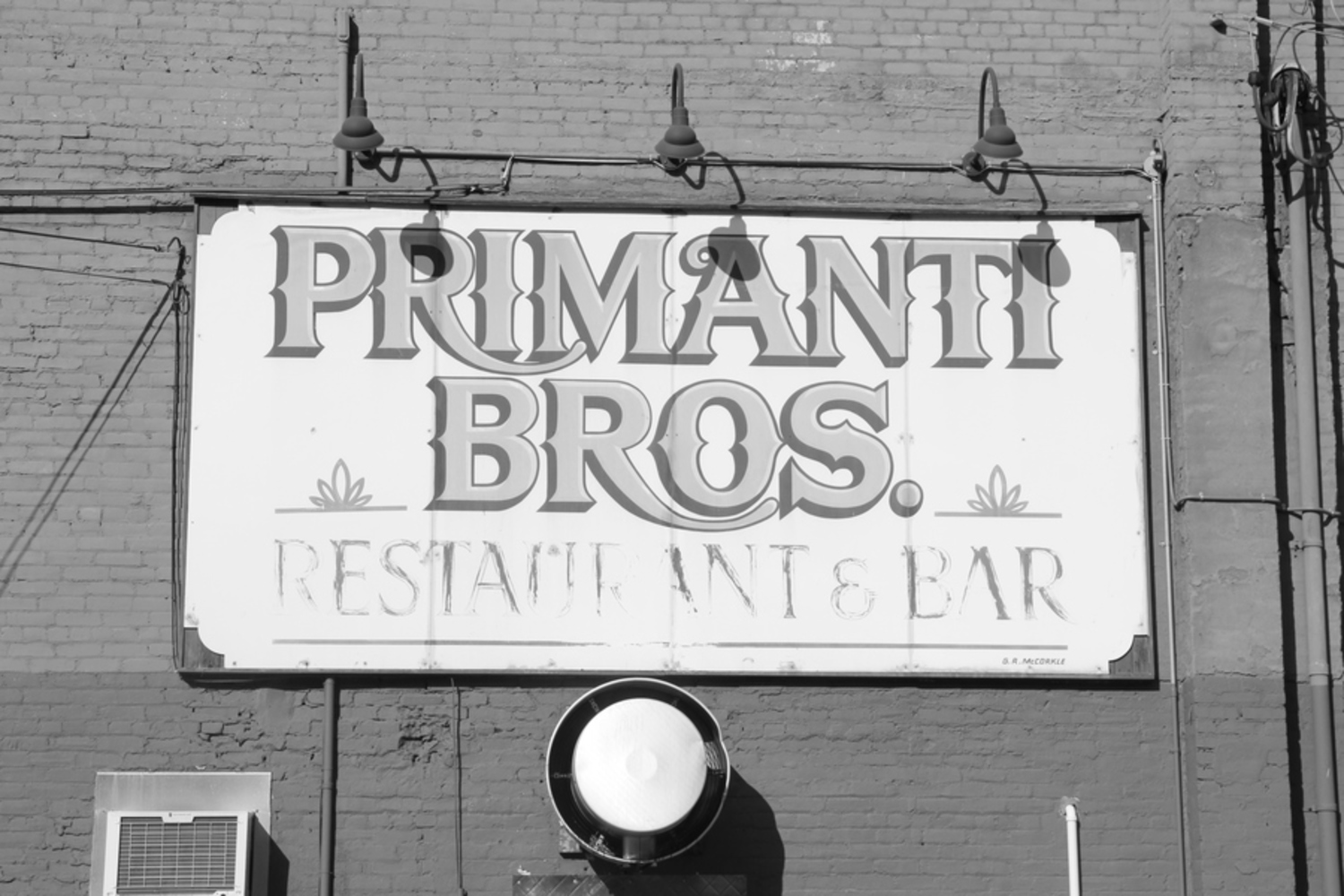
I like the rustic and aging feel of this sign, which shows how long the Pittsburgh tradition Primanti Bros. has been open. As I pointed out when analyzing Tice’s photograph Penn Fish Market, Camden, New Jersey, 1997, a sign can tell a great deal about a business and its surrounding neighborhood and people. This picture, again, is an attempt to capture more of Pittsburgh’s essence.

I think that the contrast between the brick and the sign could have been more pronounced, and the same between the wording on the sign and the background. This would have the effect of the words and sign popping out of the image. 

 mg 5890.jpg.thumb
Show Advanced Options

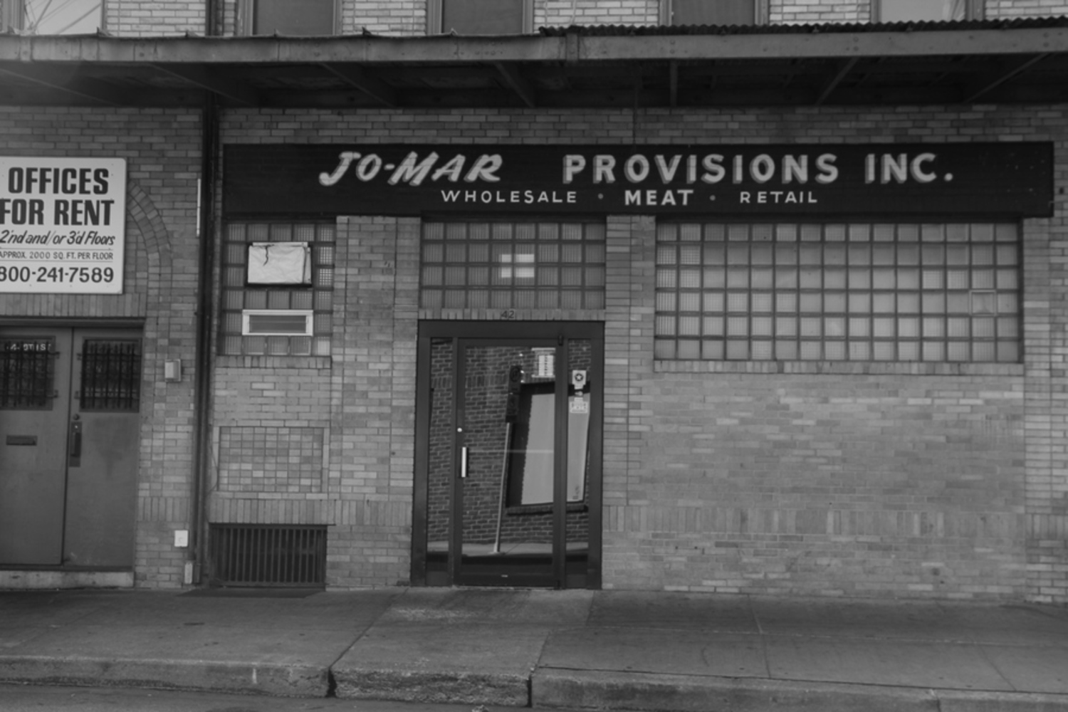
This photograph reminds me of many of Tice’s images of storefronts. This building looks at least a few decades old, with an older style sign. The style of the windows is also an older style one. If a viewer didn’t know better, he or she may think that this photograph is from years ago. It is interesting how photographs can provide perspectives that almost transport us to the past.

Also, note that the recurring theme of storefronts and signs giving insight into the surrounding people is one that can be seen yet again in this photograph.

It would have been nice to get the lighting better in this picture, and also to get a better point of view. Originally, I was more centered but realized my reflection could be seen in the door. Moving off to the side resulted in the lopsided sidewalk that can be seen across the bottom. Looking, back, it also would have been great to get more of the building to the left. I really like the “Offices for Rent” sign, and think it would have added some character to the image.


Conclusion

Overall, I think I was fairly successful (for a beginner) at imitating Tice’s work. Though my photography and composition skills are of course not even close to his, I think that I made a good start at emulating how Tice tries to capture the atmosphere and people of a place without actually bringing many people into his work. Of course, I focused on life in Pittsburgh while he predominantly focused on life in various places in New Jersey.

In my opinion, some of my photographs were more successful than others in taking the image itself (in balance, contrast, lighting, and so on), and some were more successful in capturing the essence of Tice’s work (perhaps the picture of the tunnels is one of my better photographs in this respect). I do feel that Tice’s work has a greater impact than mine; he is more skilled in both taking photographs and finding perfect scenes to capture, but I feel as though I progressed in the right direction. During this process I learned what to look for to see people, without actually looking at them. I feel as though this is something Tice would greatly approve.

Source of quotes can be found here.

Drop files here or click to select

You can upload files of up to 20MB using this form.