I found that when trying to correct a bad habit (such as slouching) I would correct the issue when it was pointed out to me, but promptly forget when thinking about other things. Days would pass where I would not do anything to correct the behavior. I felt if I could see at the end of the day my average posture for the day, I might get a better idea of how bad it really was. I also know when a coach corrects a placement of a joint, it is hard to see if over time I am still maintaining correct form.
My project will record points on the users body throughout the day as they go through their daily routine. Then, the user could get an idea of what positions they tend to favor and can correct unhealthy habits. This could also help doctors or physical therapists, since occasionally stress is placed on one region of the body as a result of a problem in a different area. For example, your back might hurt because you are favoring your ankle because of a stress fracture. Similar to the galaxy map, a macroscopic view of lots of data might offer fresh insights that only looking at the problem area might conceal.
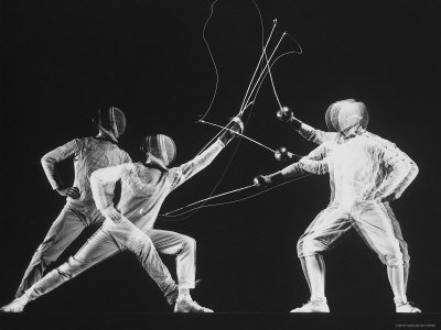
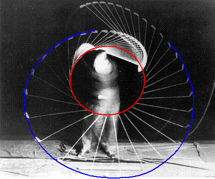
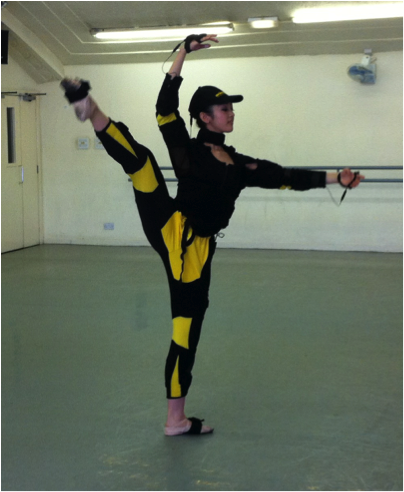
.png?1410632428) Overall, the user will see where the body is throughout the day. Similarly to Marey's motion capture suit or a simpler version of the modern day gyroscopic capture suit, the user will have small sensors attached to the major joints of their body. As they move it will save data about the points relation to each other throughout the day. At the end, a program will be able to overlay all these data points on top of each other. This will result in high density of points where your joints spend the majority of their time. On the interface, the user can select when the start and end times should be for the display (ex. 10:30 am - 3:00 pm) so that they can see where their body is at that time. Like Watternburg and Viegas, I would like to consider my presentation to be a 'living portrait' that changes based on the times and days selected. I think that, like a data map, they only way to present this information dependent on space and time is as a picture since it can carry the volume of data that will be collected.
Overall, the user will see where the body is throughout the day. Similarly to Marey's motion capture suit or a simpler version of the modern day gyroscopic capture suit, the user will have small sensors attached to the major joints of their body. As they move it will save data about the points relation to each other throughout the day. At the end, a program will be able to overlay all these data points on top of each other. This will result in high density of points where your joints spend the majority of their time. On the interface, the user can select when the start and end times should be for the display (ex. 10:30 am - 3:00 pm) so that they can see where their body is at that time. Like Watternburg and Viegas, I would like to consider my presentation to be a 'living portrait' that changes based on the times and days selected. I think that, like a data map, they only way to present this information dependent on space and time is as a picture since it can carry the volume of data that will be collected.
The presentation of the data will aim to be as simple as possible, since many data points will be presented at the same time and a simple presentation will keep from distracting from the data. So the background will be black, and the points represented as white, semi-transparent points. The points will be semi-transparent to enhance the effect of many points in the same place.Similar to an X-ray. Thin lines connecting the joints as they would be on a human body will make it easier for the user to see the points as their body and determine where specific joints are. To prevent the selection of a very long about of time (say two days) from becoming too cluttered, anomalies(one backflip you did) will be removed and the entire image will be averaged a little to create a cleaner and less messy presentation. This might mean the points are made even more transparent to make the high density areas more distinguishable. This will allow the design to follow ideas of graphical excellence and present the data in an easy to read format for the user.
Cleaning the data in this way does violate the normal data gathering rules, but since we are attempting to present the normal placement of joints over time to examine habitual posture, the extreme will not be conductive to the representation. For example, if you and your physical therapist are trying to determine why your hip has been hurting for weeks, it is unlikely that the cause of it was three days ago when you jumped in a bouncy house. The removal of such points will help the user see the aggregated conclusion more clearly.
If I wanted to create a more interpretive look at the data, we could look at the data over the longest period of time available. Then we could add colors and have different panels of different days or different months. This would show the users life as their body, similar to Laurie Frick's work. I am unsure if it would be helpful to present this as a sort of time series, since Tufte pointed out that time series are not useful for things with little variability. I have no idea how much our posture and habits change over years, so perhaps after data is collected, it can be examined to determine its variability. Or it could be animated so that you could see the change in stance over time, which could be very interesting in growing children.
My group was helpful discussing what uses they would use such a project for and what presentation form would help them the most. They brought up the idea of being able to select times for your data.
Disclaimer: this is in no way intended to actually diagnose real problems. Its meat to be helpful to improving athletic performance and posture. If something is wrong with you go see a doctor.