Back to Parent

Outcome


Image00.thumb
Show Advanced Options
Dsc 0073.jpg.thumb
Show Advanced Options
Dsc 0076.jpg.thumb
Show Advanced Options
Dsc 0078.jpg.thumb
Show Advanced Options
Dsc 0080.jpg.thumb
Show Advanced Options

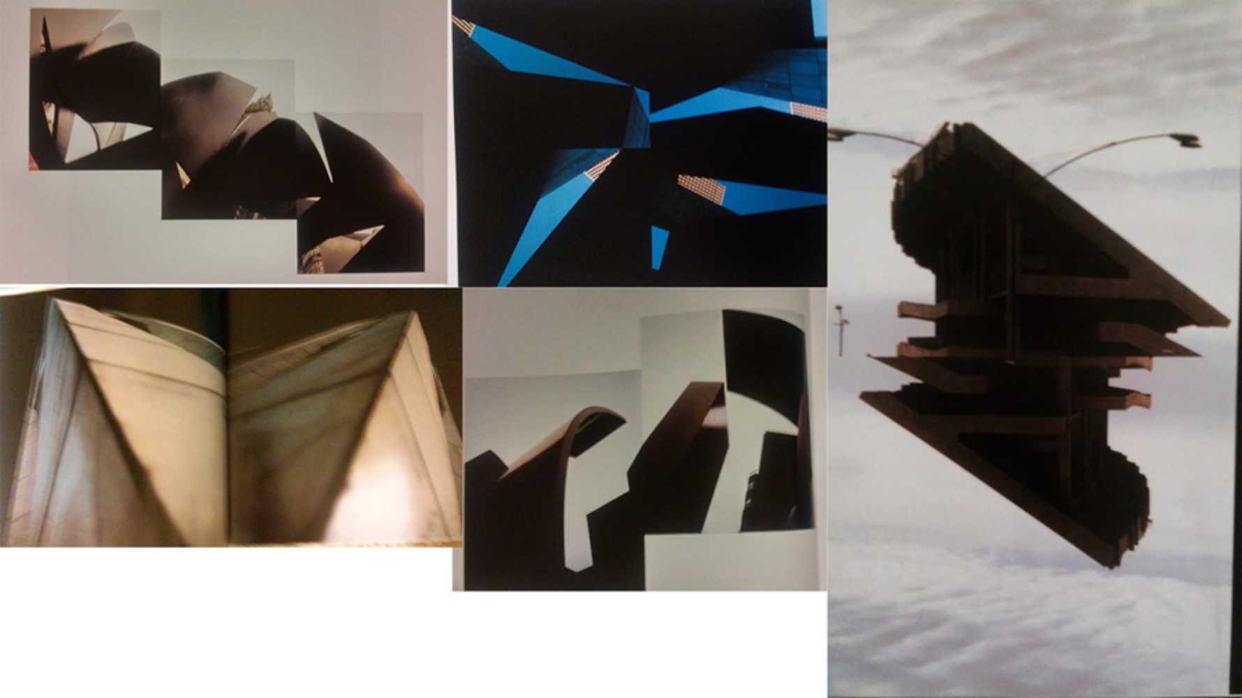
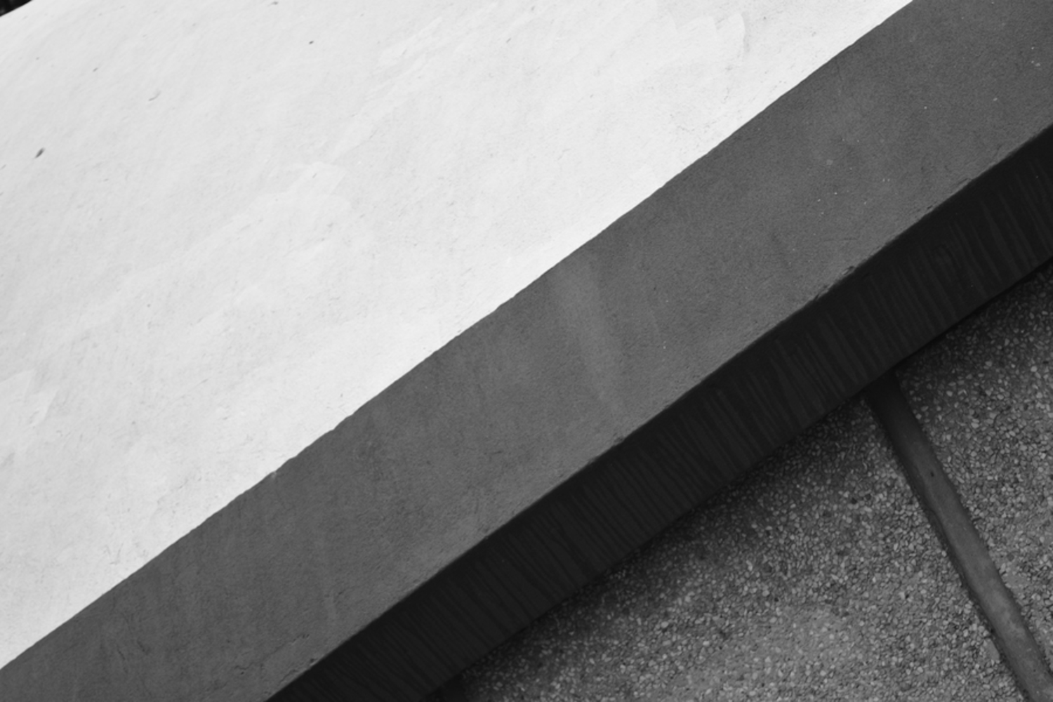
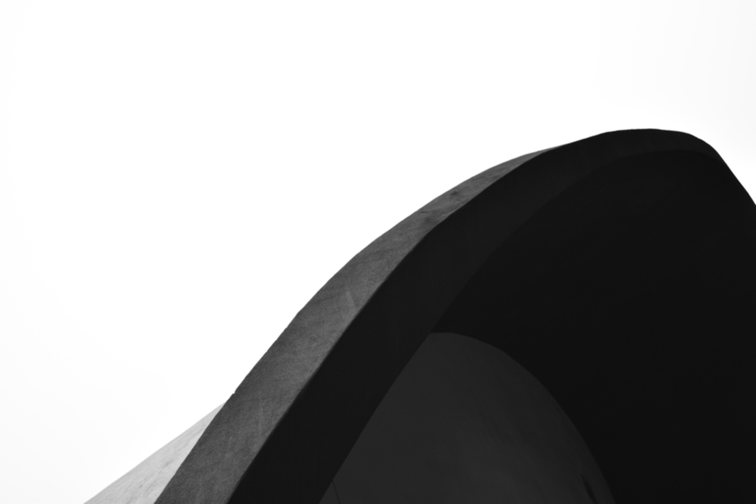
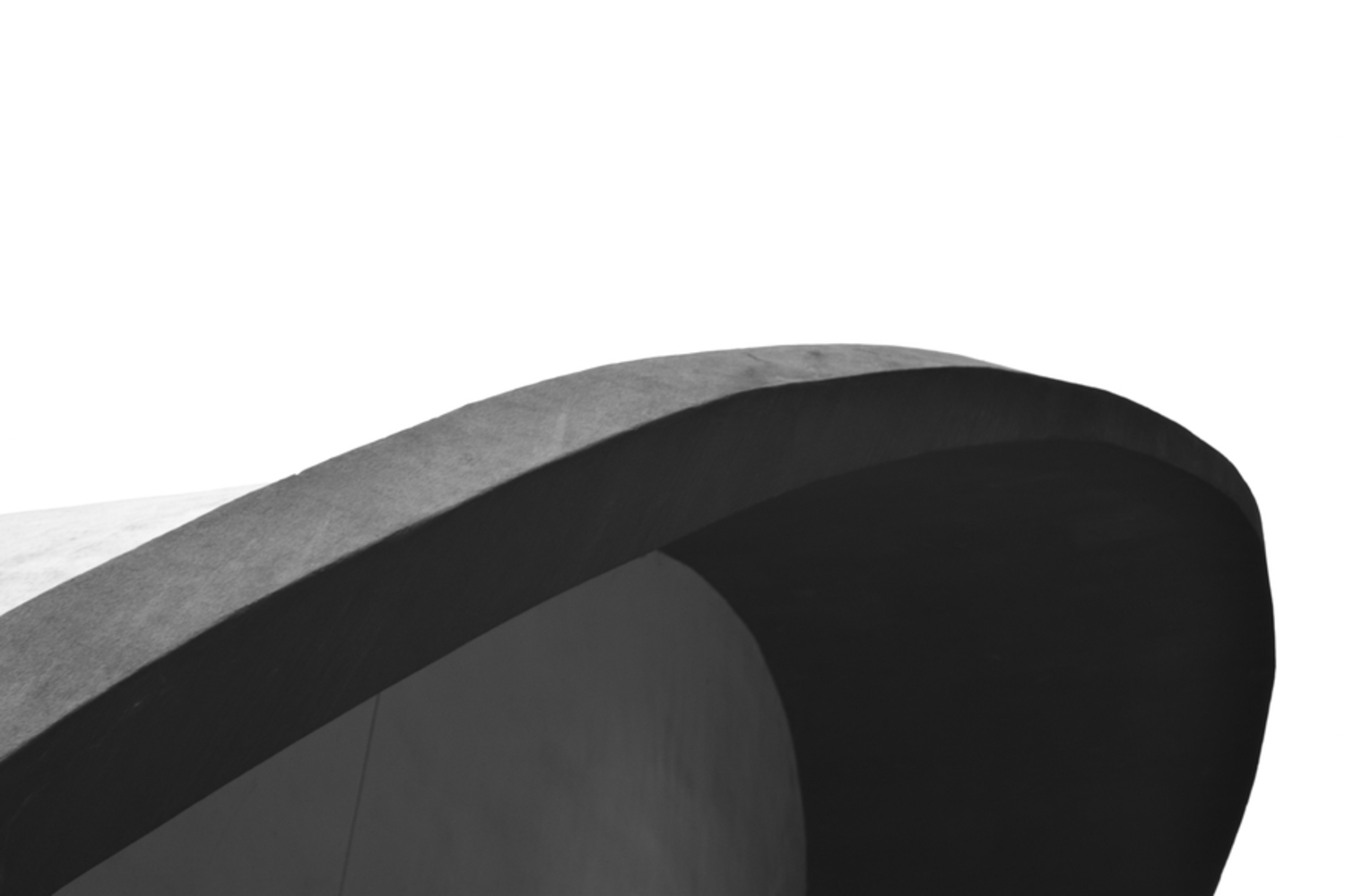
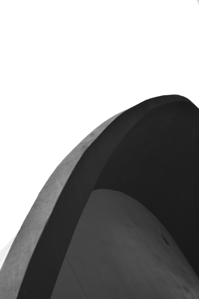
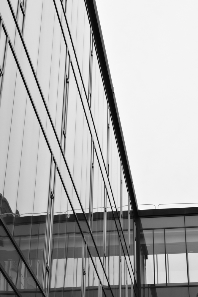
As suggested in class I took the idea of series for these. I decided to focus mostly on shape and balance for the composition. The lighting was excellent for this, as it was completely overcast so the light was very soft. Keeping everything else out of the frame was a bit of a challenge, though, and it limited the photographs I could take.

Dsc 0109.jpg.thumb
Show Advanced Options

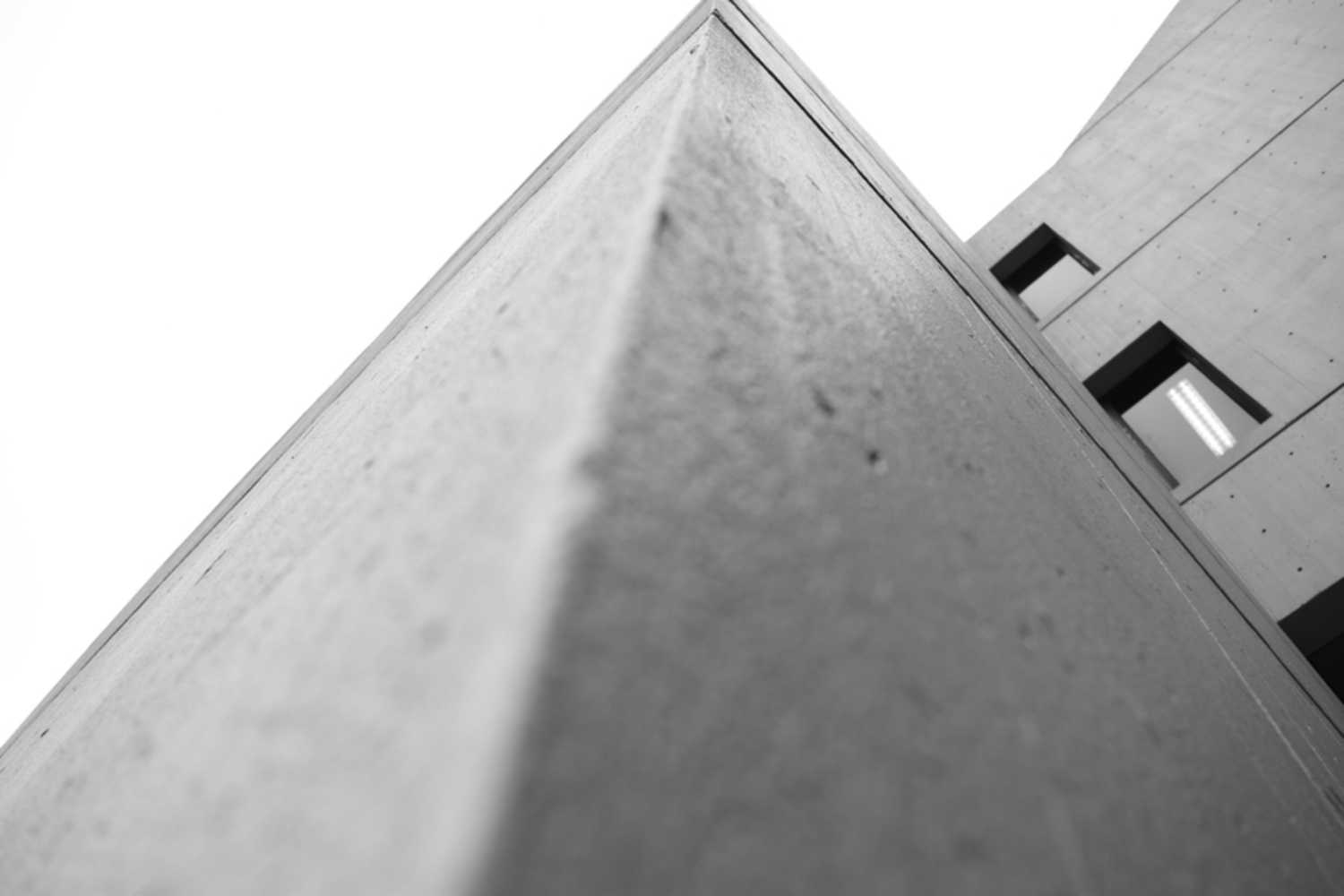
For the most part I like this one, but I wish I could have gotten the camera to focus closer. However, the camera had to be almost right against the wall to get the shape I wanted.

Dsc 0111.jpg.thumb
Show Advanced Options

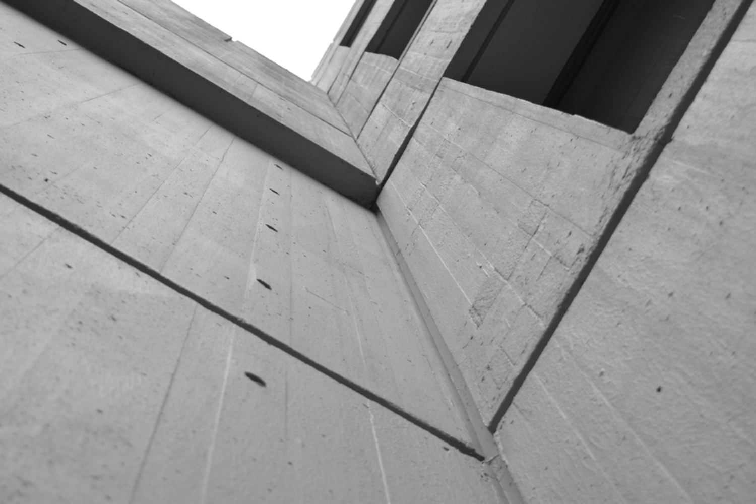
Here I wanted to take the same idea as the previous photograph, but put a spin on it. So, I took an inside corner instead of an outside one, and tried to see how that changed composition. It ended up sharper since it wasn't as close to the wall, but I struggled with balance here.

Dsc 0128.jpg.thumb
Show Advanced Options

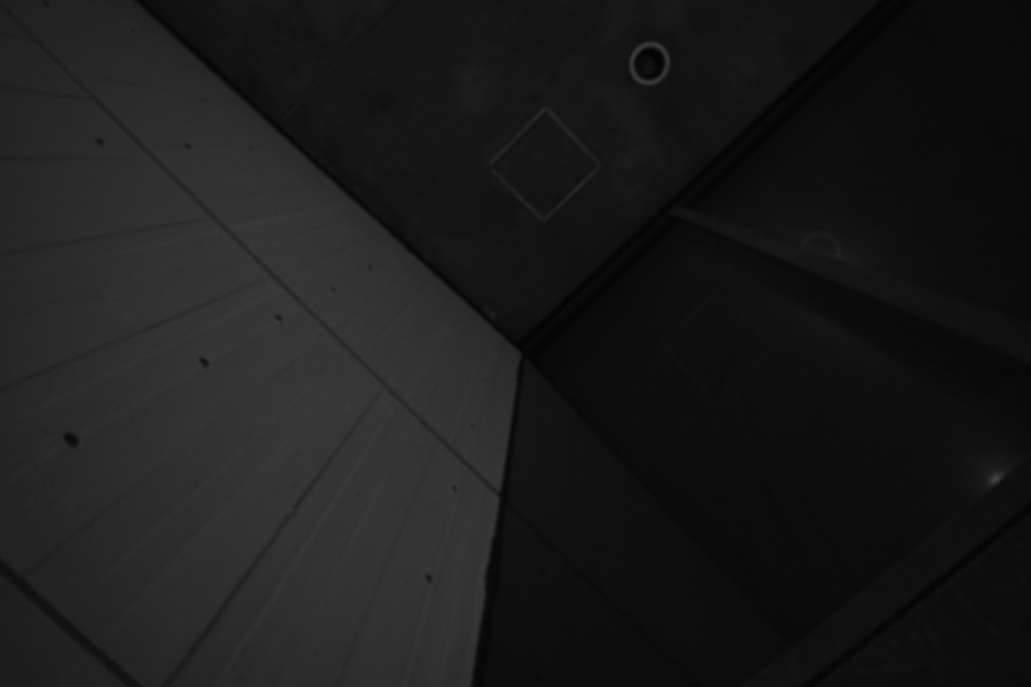
Here I was looking at shape and balance again, but this photograph didn't have nearly as much contrast as I thought it did when I took it. I definitely wish I would have gotten this one in a couple different exposures.

Dsc 0147.jpg.thumb
Show Advanced Options

Here I was playing with reflection, though I could only do so much without post processing. I really like how the reflection creates the illusion that the walkway continues further than it actually does, but I wish I could have gotten better balance.

Drop files here or click to select

You can upload files of up to 20MB using this form.