Outcome
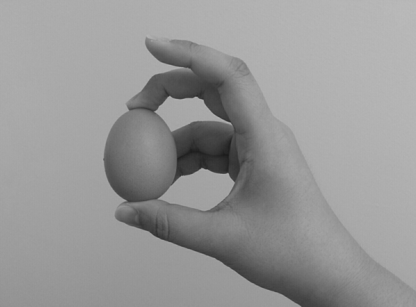
Initially when I thought about the egg, I wanted to use some harsh lighting to create a more interesting composition. However, I felt that even with harsh lighting, it didn't make the egg look very interesting so I then thought about how I would make the egg the focal point or draw the most attention to it. I picked it up and held it between my fingers which made is seem like I was handling it with care/inspecting it so I thought I should try taking the photo of the egg in this fashion. I didn't want anything distracting in the background so I initially chose my dark carpet as the background and photographed it so it would have a consist and dark texture. However, the texture f the carpet was a bit distracting so I then used my white wall as the background. I took a number of photos holding the egg at slighting different angles so the shadow of my fingers were different in each picture. I chose this photo because of the minimal amount of shadow on the egg which made it look the cleanest and also because my wrist was in the pictures. In other photos the bottom of the frame awkwardly cut off right above my wrist which make it seem like the base of my hand was spreading outwards and was unnatural.
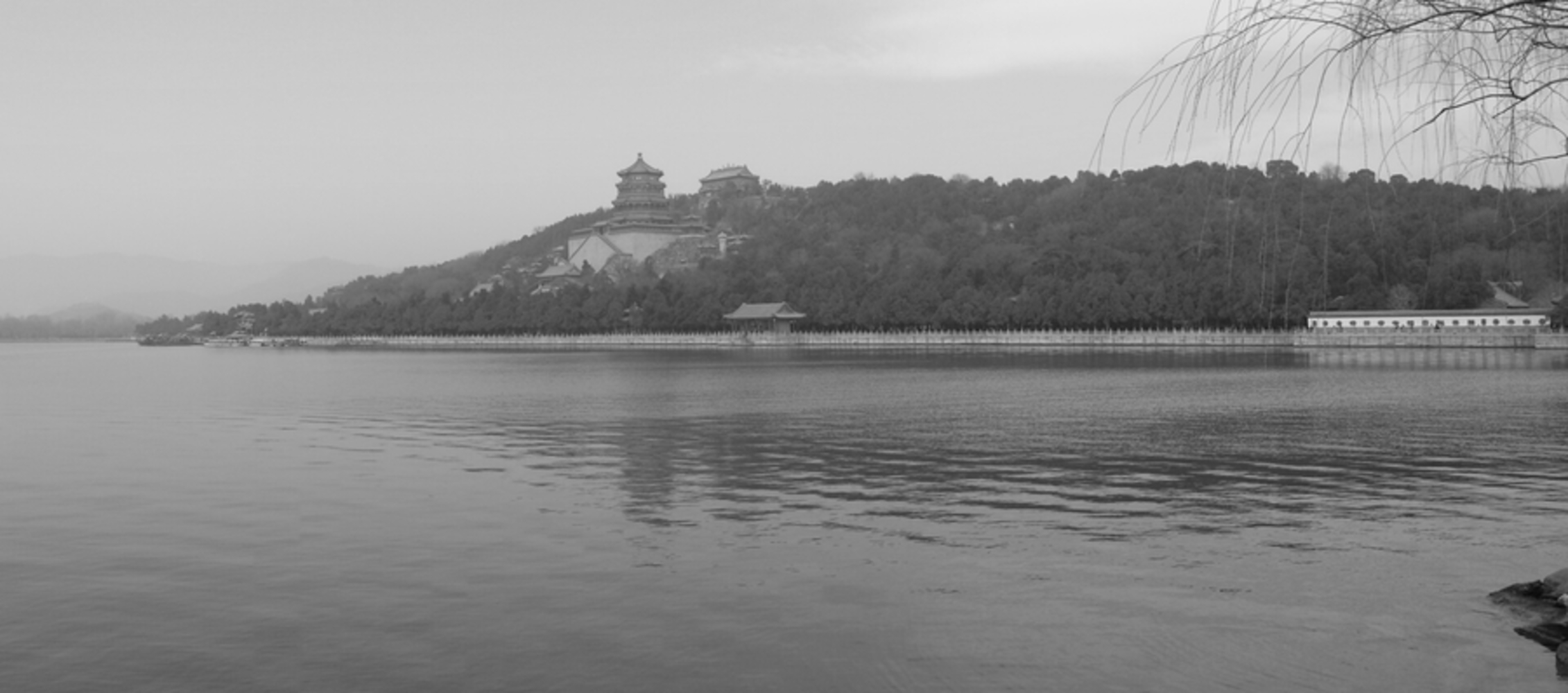
This photo was taken on my phone camera (which explains why it is so wide) when I was visiting China this past spring. I know it's not a recent photo but I think this is one of the better photos I had of landscapes. When taking this photo, I must have taken at least 20 different photos because the light kept changing. Everytime I was satisfied with a photo, the sun with shine a little brighter or would get covered. In other versions of this photo, I had the rocks I was standing on in the foreground of the photo which still made a nice photo but because the rocks were black, it competed for attention with the mountain in the back. In terms of the composition of this photo. The horizon line rests just above the midplane of the photo. I had a photo where it was lower so you could see more of the sky but because the mountain wasn't very high it left a bit too much sky in the photo. I also liked how the left side of the mountain tapered off at the end and I still had some room in the let hand side of the photo so it wasn't too tight. The tree in the foreground also grounds the view but it's not distracting to the photo overall.
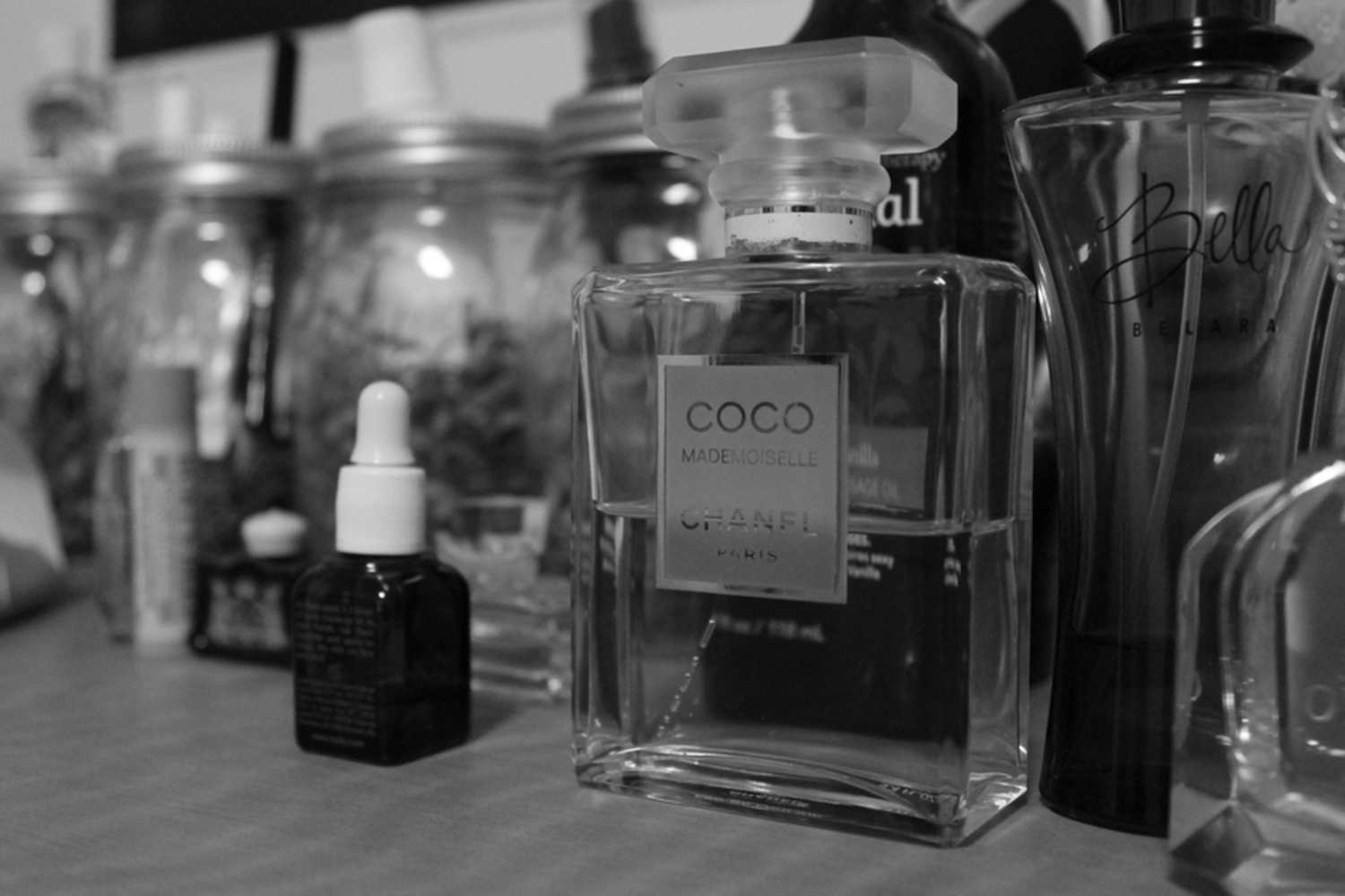
For this photo, I chose my roommate's perfume bottles for two reasons: 1) because she had laid them out neatly, and 2) because I wanted to play with the transparency of the object. Here I chose the Chanel perfume as the main subject of the photograph. I moved closer to the bottle and focused on the label so the other bottles would not be as in-focus. I took a number of photos in this manner with the bottle in different space of the photographs (slightly more to the left or right) but this felt like the most balance shot. Having the bottle in the center made the photograph feel a little stale. I also tried to take the photo with the camera lens lower to the surface of the drawer so it would looking up at the bottle. It had a nice of established a "overbearing" presence of the bottle but it also did the same for the bottle to the right (the one called Bella) so I chose this photo in the end.
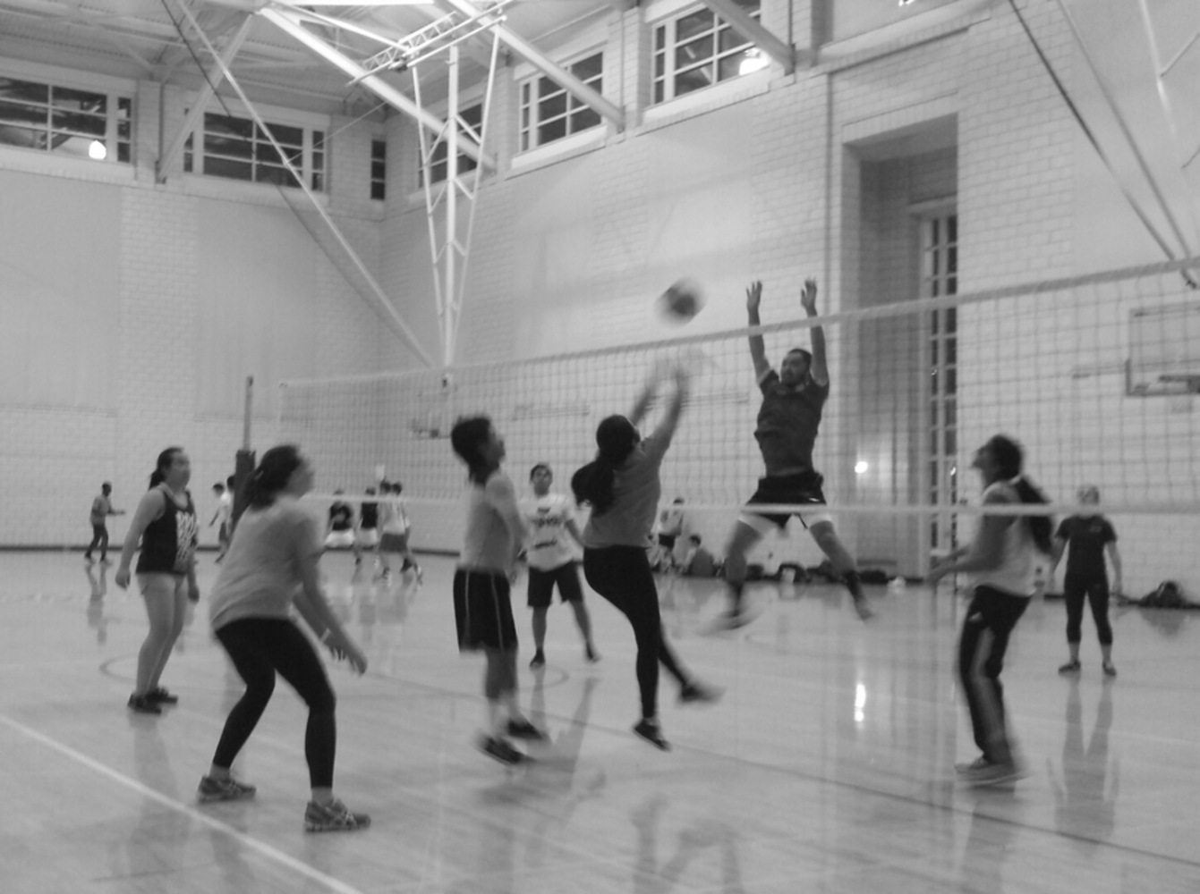
All I can say for this photo is that I just took as many pictures as I could as fast as I could. It was difficult to predict how the players of the game would be moving so it was difficult to focus on a specific person. In the end, I chose this photo because it gave the effect I desired: to have the moving part of the body blurred and the stationary parts in focus. The girl in the center has her feet and arms blurred because of the motion but her torso is relatively in focus. The same could be said for the player to the right in the picture who's legs are parted in mid air. If I could redo this picture, I wish I could have focused on just those two people. Especially because the ball's movement is really between them. I would have gotten closer so that they were the main focus of the pictures instead of having all the other players distributed in the photo. I would also crouch a bit lower so you eye would move up in an arc in from the girls legs up to her outstretched arms to the movement of the ball and down the receiving player.
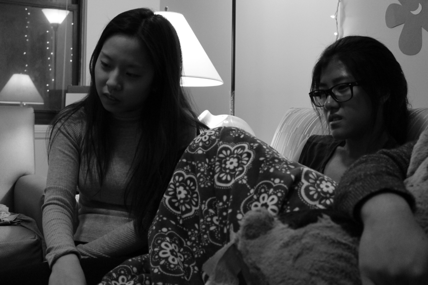
For this photo, I wanted to convey that the subjects were interested or drawn into whatever they were looking at. Initially I took the photo from behind the laptop they were looking at so that I could have a foreground and to give the picture some context but I didn't like how the subjects were placed in relation to the laptop. It didn't look like the image was well composed. Even though there is no context for what they are looking at in the photo, both subjects have their heads tilted towards the point of interest. Also, because the photo was taken below their eye level closer to where the laptop was and because there is a blurred arm in the lower right corner, there is a directionality in the photo from the subject's eyes down to the bottom left corner where the laptop actually was.
You can upload files of up to 20MB using this form.
