Dots and Lines
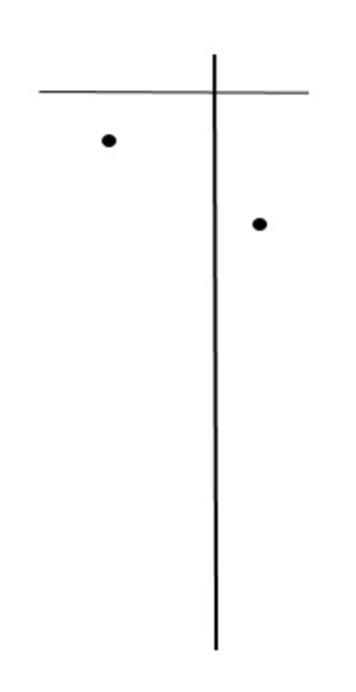
A Manmade Structure
I chose to compose the picture in this way because the manmade structure I took a picture of was rather simple, and so I wanted the composition using dots and lines to be simple, as well. While the vertical stand of the object was to the left in the original picture I took, I chose to invert it and put the vertical line to right in the composition, for placing the line on the left made the composition look like it was going to fall over towards the right side, just as Arnheim suggested in our reading of pictures from “left to right.” Furthermore, following Arnheim’s suggestions for balance, I chose to make the horizontal line thin so that it didn’t make the picture top-heavy and have the dots balance the horizontal line out. The dots also create a slight movement downwards that represents the hanging jewelry in my manmade structure.
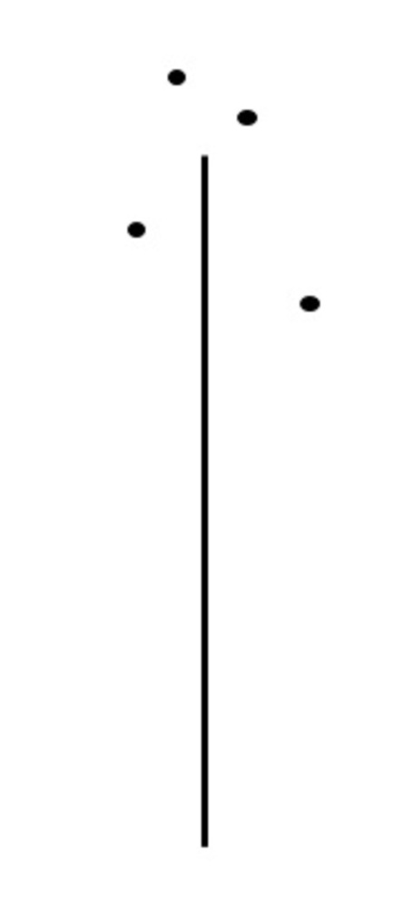
The Human Bodily Form
With the human bodily form, I chose a similar composition for the vertical line as the manmade structure; the vertical line is there to ground the object. Because in the original picture, the subject is so dark and noticeable against the lighter background, I made the vertical line rather thick and noticeable. I also tried to convey a sense of motion by only placing the dots at the top of the composition. I tried to imitate Kandinsky’s style by making the dots closer together near the top, making it appear as though the dots are moving towards the top of the frame.
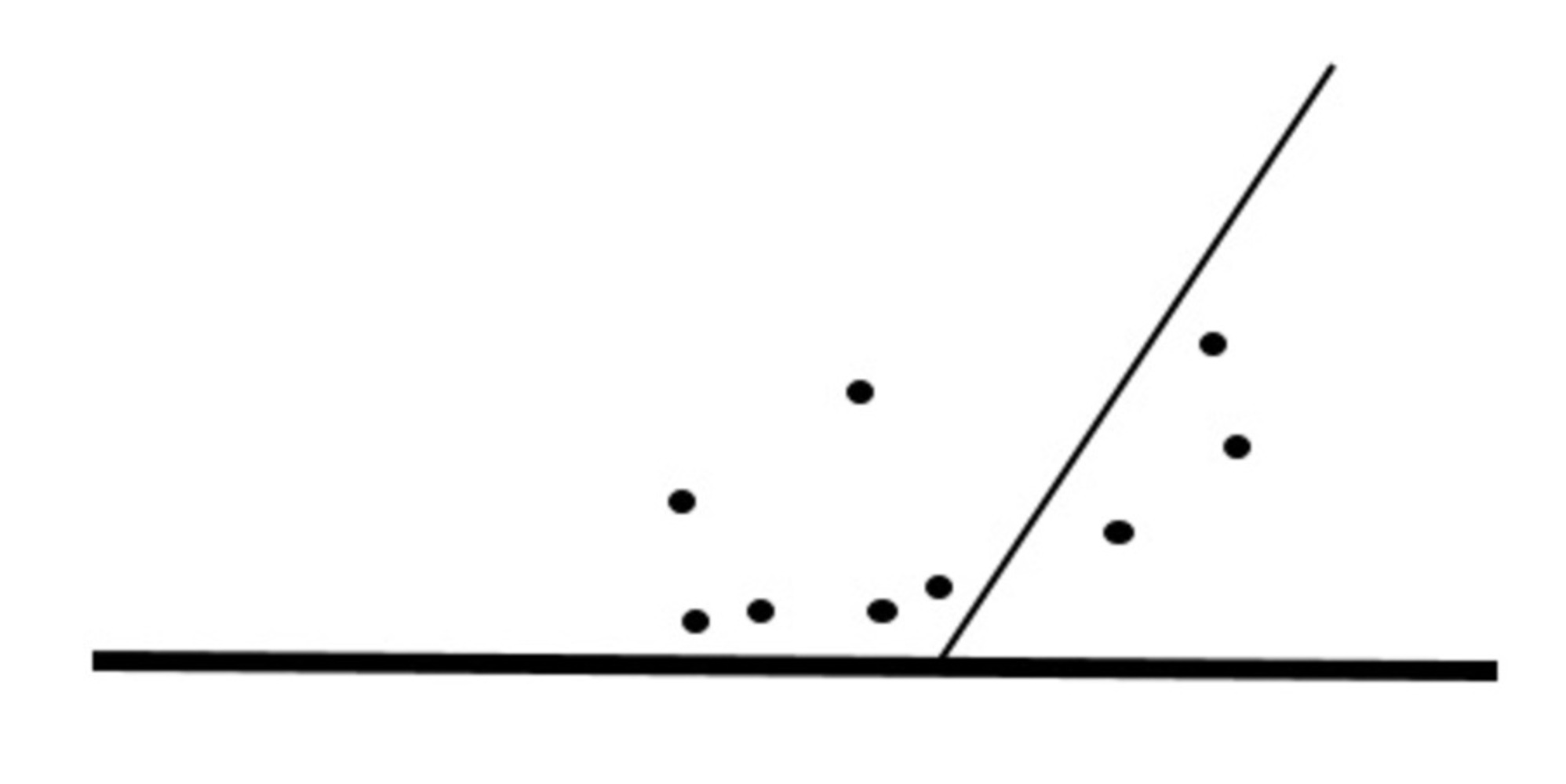
The Human Emotion
With the human emotion, I tried to convey a sense of distractedness and frustration in my composition. I created a thin, diagonal line that points to a corner of the frame to portray the subject and put most of the motion, through my placement of the dots, away from the subject to show that the important things are happening out of the subject’s field of vision, to further create a sense of distraction/ frustration. I also made the horizontal line extremely thick to ground the diagonal line and dots to the bottom of the frame. The density of the dots and the thickness of the horizontal line makes the picture seem as though it is all moving towards the bottom of the frame, similar to how Kandinsky would make his works seem to have motion by making certain aspects seem bolder or condensed than others. The downwards motion also pulls away from the subject, who is near the top, thus creating a sense of discord between the subject and the rest of the objects, further increasing the feeling of distraction and frustration.
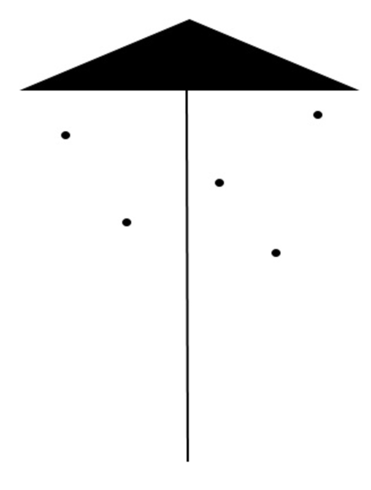
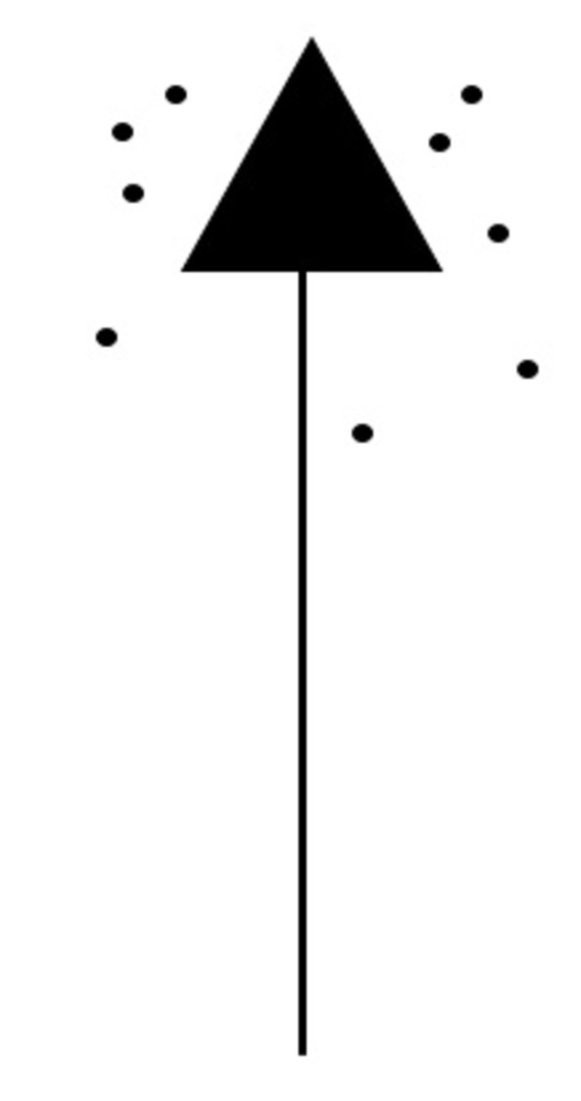
The Manmade Object
As we observed with the Kandinsky works, an upwards triangle makes the work appear though it is moving upwards. I added an upwards triangle to convey the correct shape of the manmade object I had photographed. However, since the object I had photographed came out appearing extremely stagnant, I added dots underneath the triangle that appear to be moving downwards in order to counteract the upwards motion of the triangle. The dots also add a sense of balance, as Arnheim suggested to consider, for it keep the composition from becoming too top-heavy and allows for some weight near the middle, as well.
The Human Bodily Form
Like with the previous composition, I chose another upwards triangle that conveys a sense of upwards motion. However, for this composition, I chose to keep that upwards motion and not allow for it to become stagnant in order to portray the motion of the human body in the picture I had originally taken. And similar to my first composition of the body in motion, I chose a strong vertical line to ground the composition and make it stand out, just like the subject in my original picture had done. I used the dots to surround the triangle and create a further sense of motion by placing them all in random areas that made the dots seem dynamic. I once again tried to recreate Kandinsky’s techniques by making the dots near the top seem more condensed, thus creating a motion upwards. I also arranged the dots on the left half in a noticeably different way than the right half and chose a different number of dots for the two halves so that while the picture looks balanced, it does not confuse the viewer and make them wonder as to whether the two halves should be different or not, as Arnheim suggested.
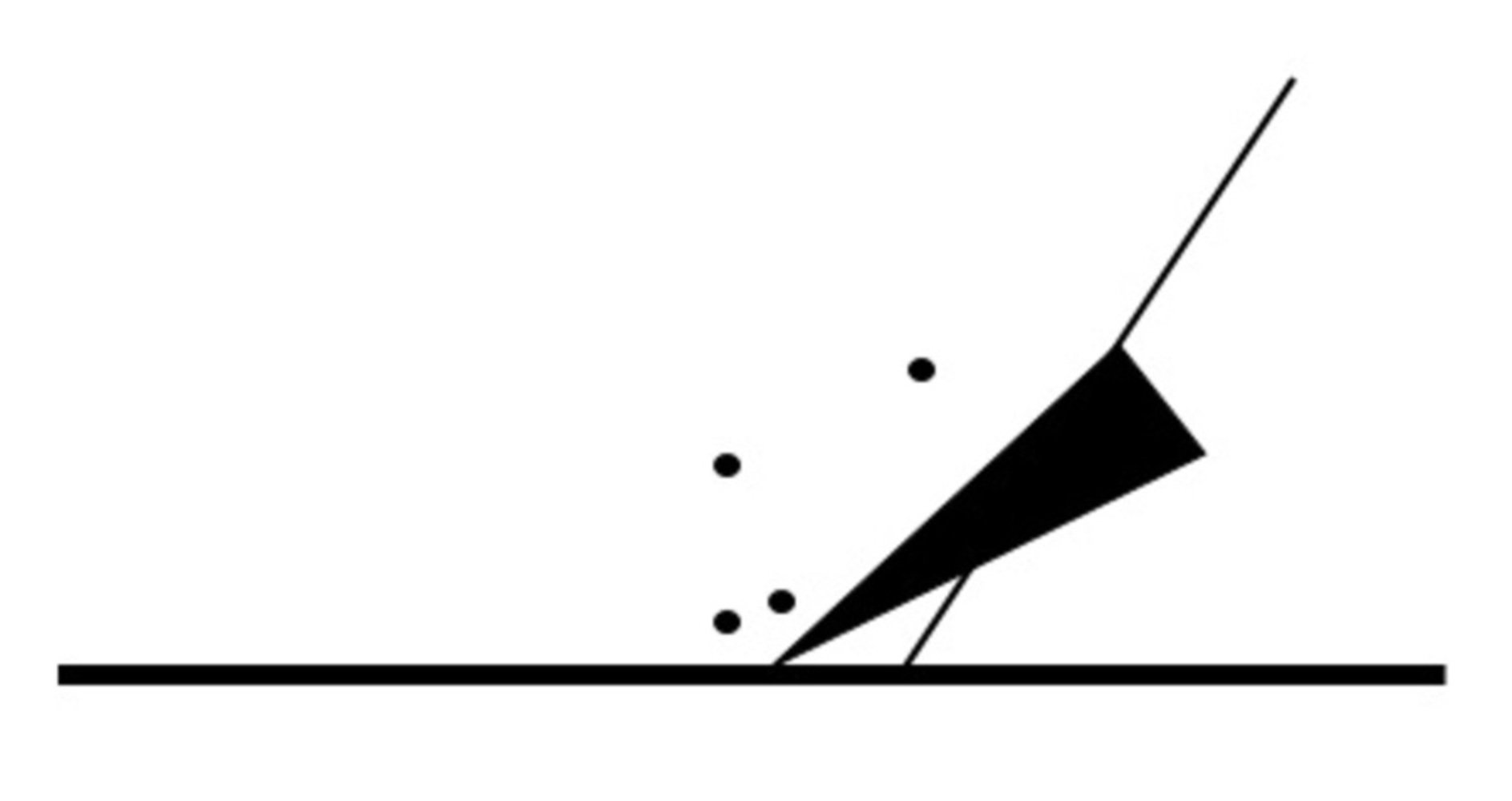
The Human Emotion
The second composition for the human emotion came out similar to my first one; the diagonal line representing the subject and the thick horizontal line at the base remained the same in order to make the subject seem weaker and more disconnected from the other objects in the composition. This time, though, I added a downwards-facing triangle that added more motion towards the bottom of the frame, thus further separating the subject from the rest of the work and making the subject look more distracted and frustrated. And in order to counteract the motion towards the left side of the frame the triangle caused and create a sense of balance, I added dots to the left of the diagonal line, thus making both halves look balanced and only allowing for a downwards sense of motion.
You can upload files of up to 20MB using this form.