Outcome

Thoughts:
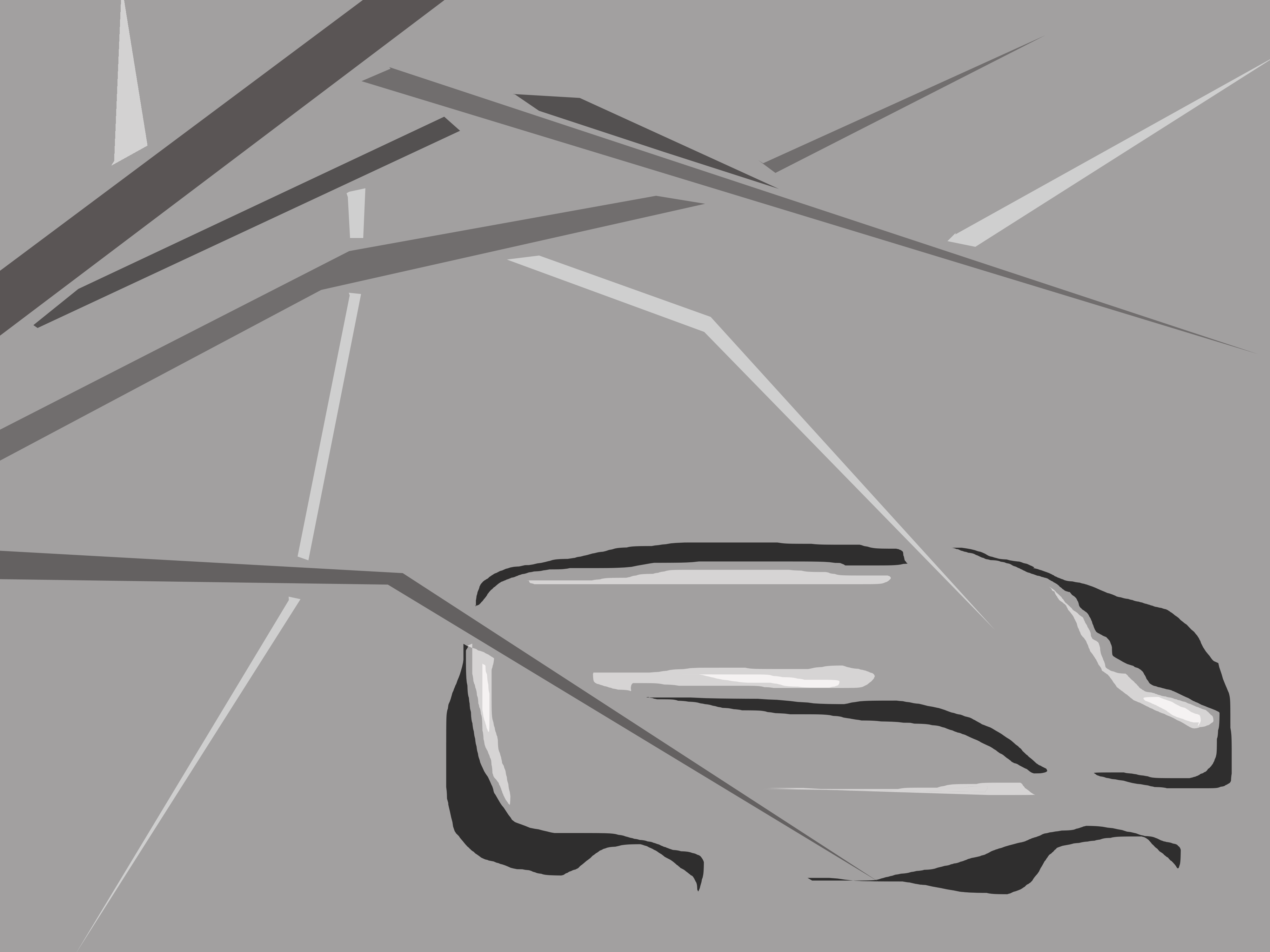
I tried to balance the lightness of the balance with the brightness of the light in the left hand corner. I think between the two different compositions, I struggled with finding a good range of tones for the piece. In the first I think that My colors were all too dark or too light, leaving it hard to distinguish between some shades and overall contributing to a visually confusing piece. In the second composition, I think all of my tones are clustered too close to one another in the middle, making it hard to determine the focal point of the image. Also the contrast between the hard lines and soft lines, while I intended them to show movement, I think ended up making the soft lines seem very out of place in the composition overall. Perhaps if these lines weren't quite as soft they might have blended in better.
Thoughts:
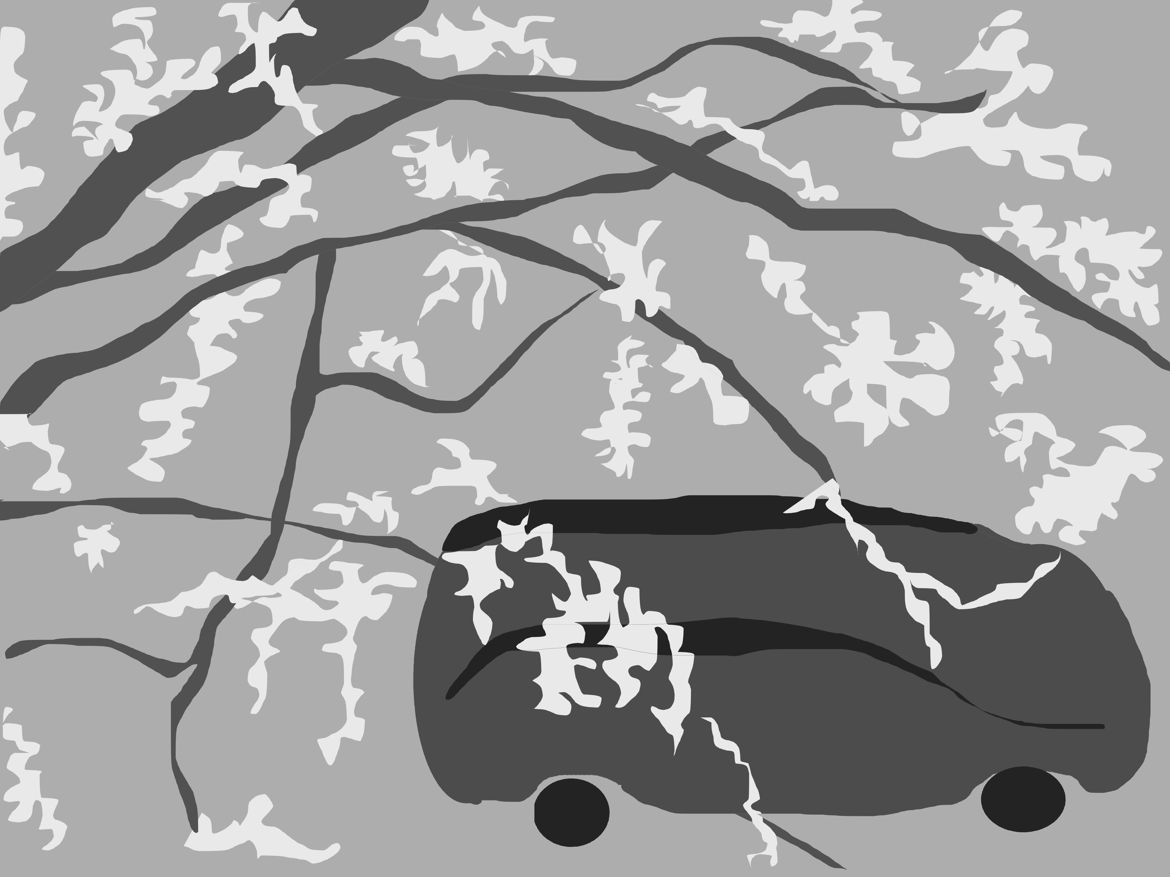
I actually like these pieces the most, the first one in particular. I think the first has a good contrast between the two objects in the piece, the branches and the car. The car is much darker and its shape is much more free form than then the branches, which are tonally lighter and similar and have sharp edges. I think it is easy for the viewer to clearly separate the two types of lines, and group them accordingly into two different objects because of the differences. Compositionally I think it is balanced because the weight of the dark car in the bottom right is balanced by the quantity and size of branches in the top left.
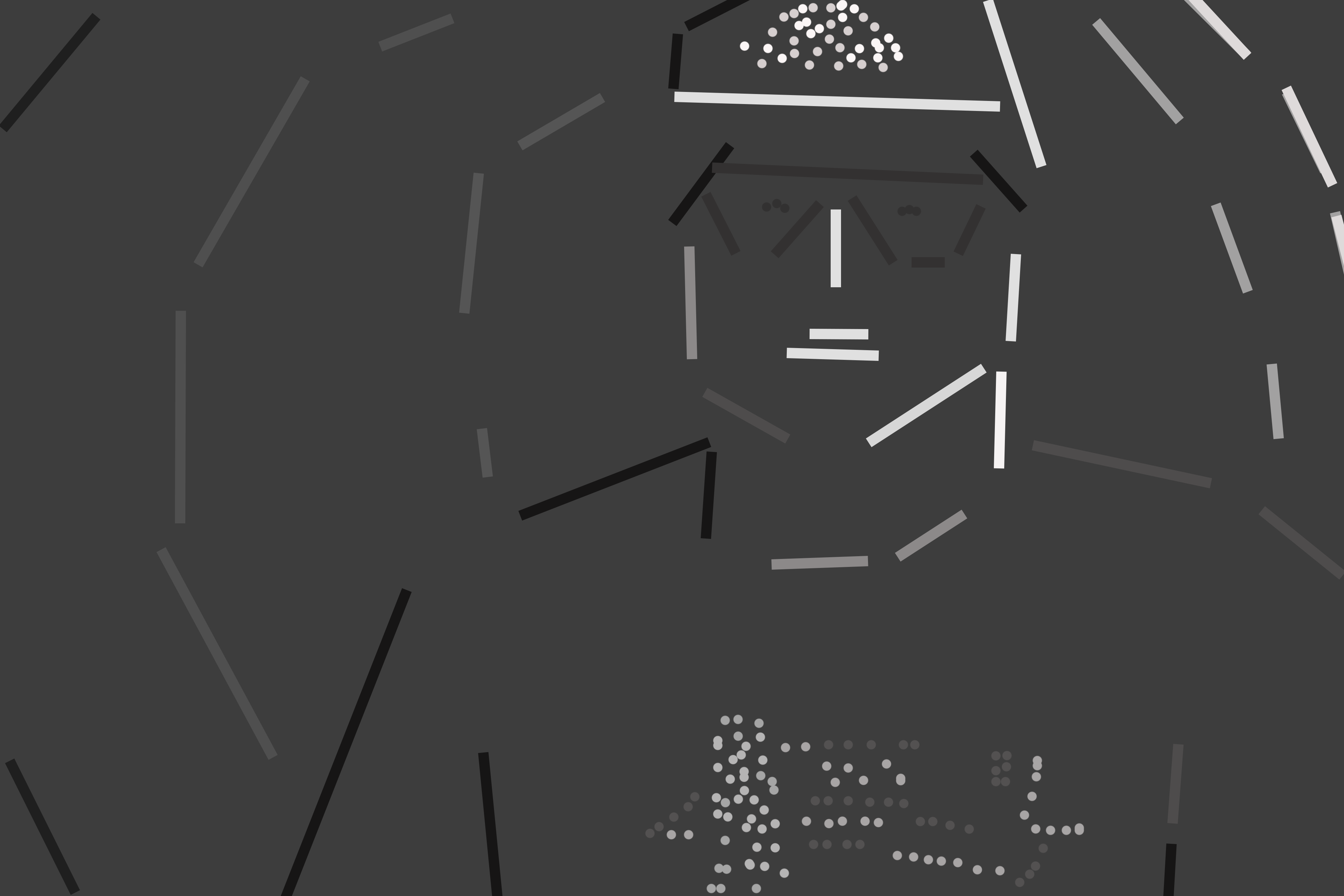
The second image doesn't have to deal with grouping separate objects as much because the shapes are bigger and more clearly connected. Because of this I tried to play a little bit by making the branches and car a very similar color, with the attributes they have (leaves and wheels respectively) more defining characteristics of the object. Overall I feel like between the clear geometric shape of the wheels and the more free form leaves it is easy to distinguish the car as man made and the tree a natural occurrence.
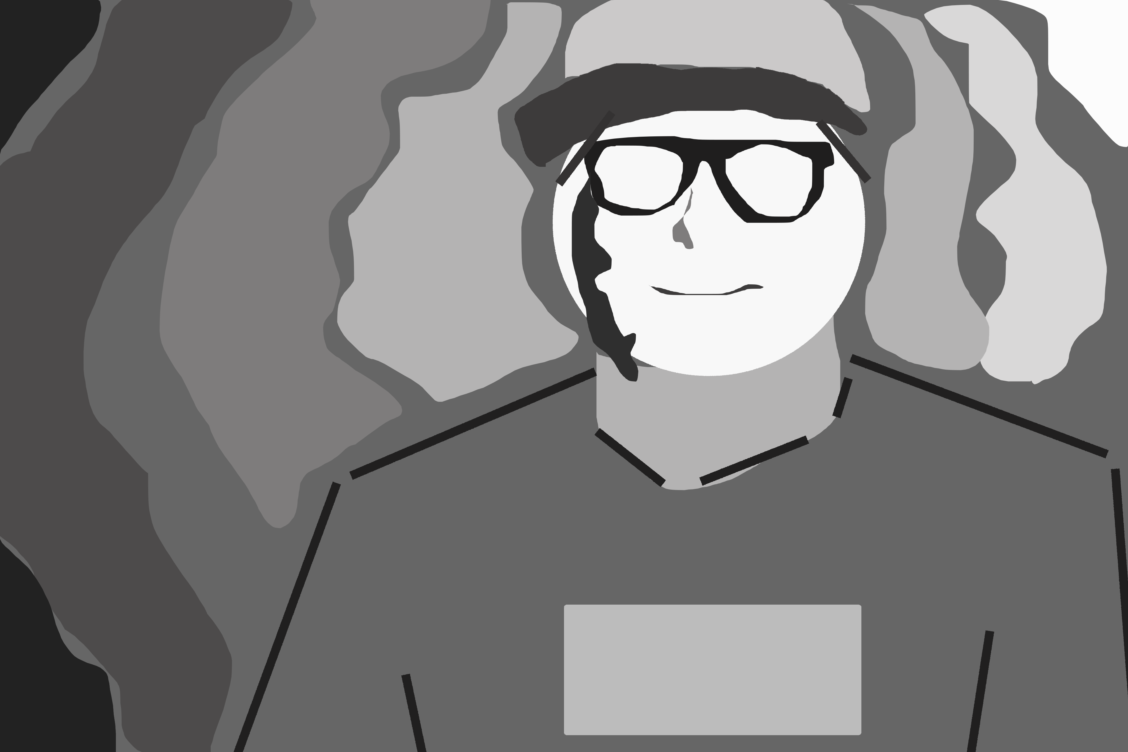
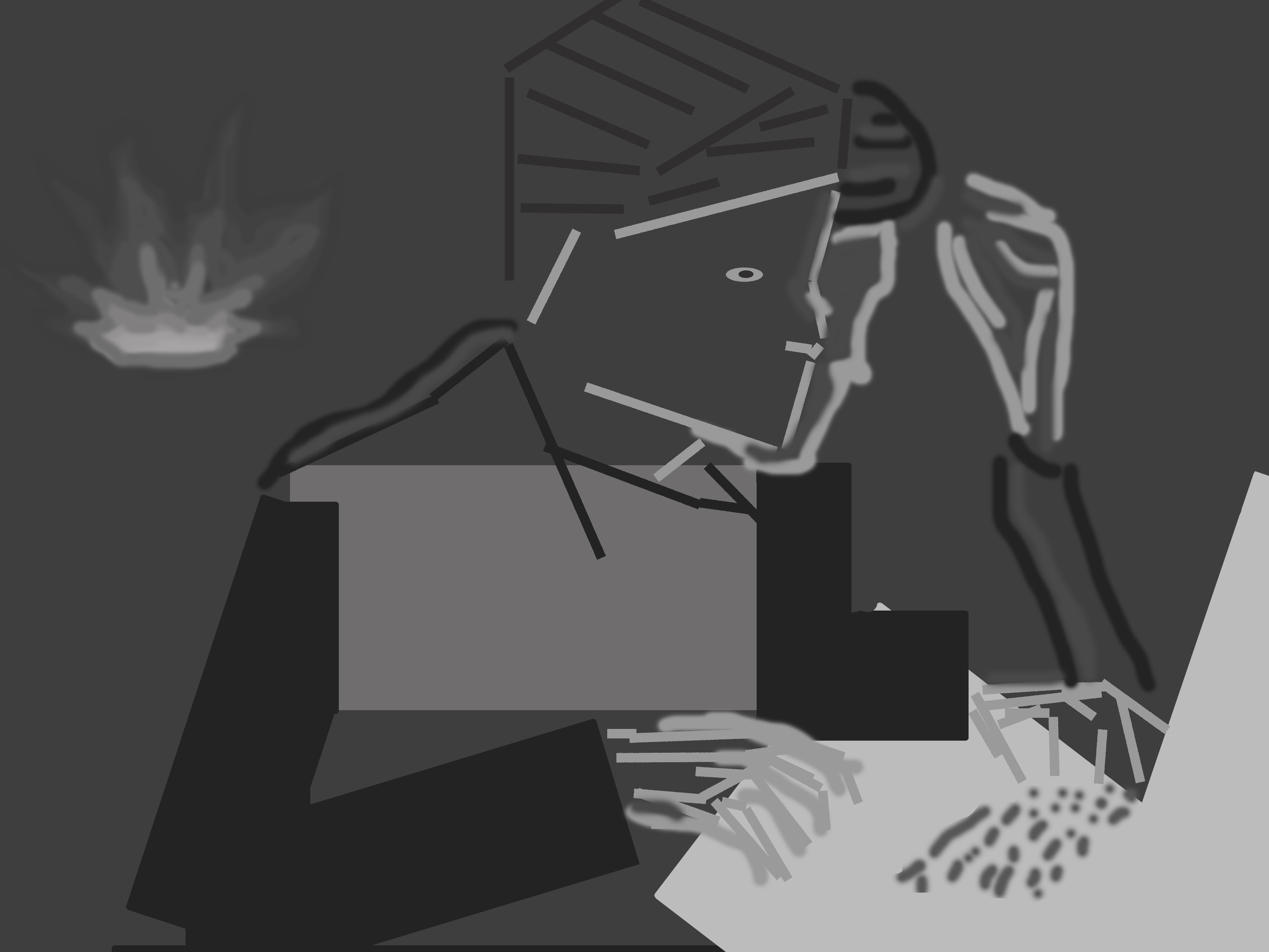
Thoughts:
I think the second piece of these two captures the intent of the original photo much better than the first. While the first gives a general impression of the photograph, there is little distinction in tones to create a feeling or emotion in the viewer(for me). I think the variety in the second piece, between hard lines and flowing shapes are diverse enough to engage the audience and draw the viewers eye to the lightest part of the piece, the face. I think then it is easy to see the quiet joy apparent in the original picture.