For these compositions, I took photos around campus and my neighborhood and then chose my favorites for each subject.
Outcome
Landscape 1
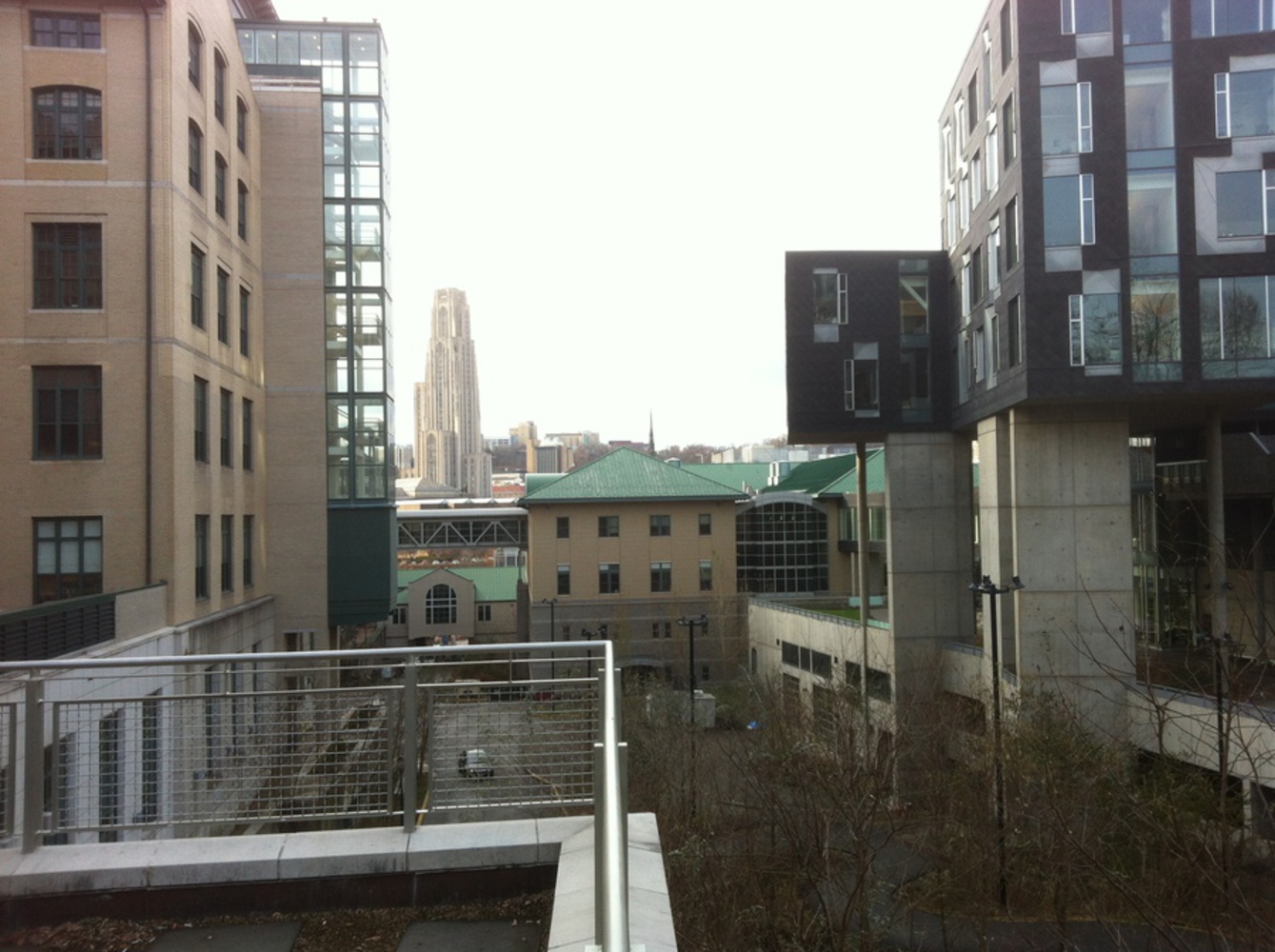
It annoys me that this is slightly tilted; I didn't mean for it to be angled and I didn't think it was when I took it. Ignoring that, though, this was my favorite of several shots I took of the Cathedral of Learning. At first I tried to shoot it from the Gates 6th floor balcony, but there was nothing particularly interesting about that perspective. From this garden, the various buildings neatly frame the Cathedral, with lots of interesting lines among them. I would have liked to have the Cathedral more in focus, with the other buildings blurrier and darker around it, as if the viewer were looking through a window from a dark room to the bright sky beyond. The Cathedral is also roughly a third from the left of the frame, following the rule of thirds.
Landscape 2
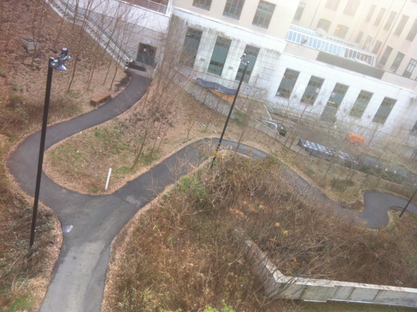
This would be nicer if it weren't late autumn and we could see the awesome variety of greenery they have on and around Gates, but as it is the dead, tangled brush provides a fairly interesting contrast to the bold, manmade poles springing up like trees from the earth. I angled the shot a bit to follow the slope, which exaggerates the already slightly odd perspective from the Pausch bridge. My high school drawing teacher always said that people tend to "enter" a piece from the lower left and move up through the middle, so I gave them a starting point at the road, an interesting choice at the fork, and then one path continuing upwards with the other meandering off to the right. The light kind of washed out the building in the background, which works since it wasn't the focus of the composition.
Manmade object or structure
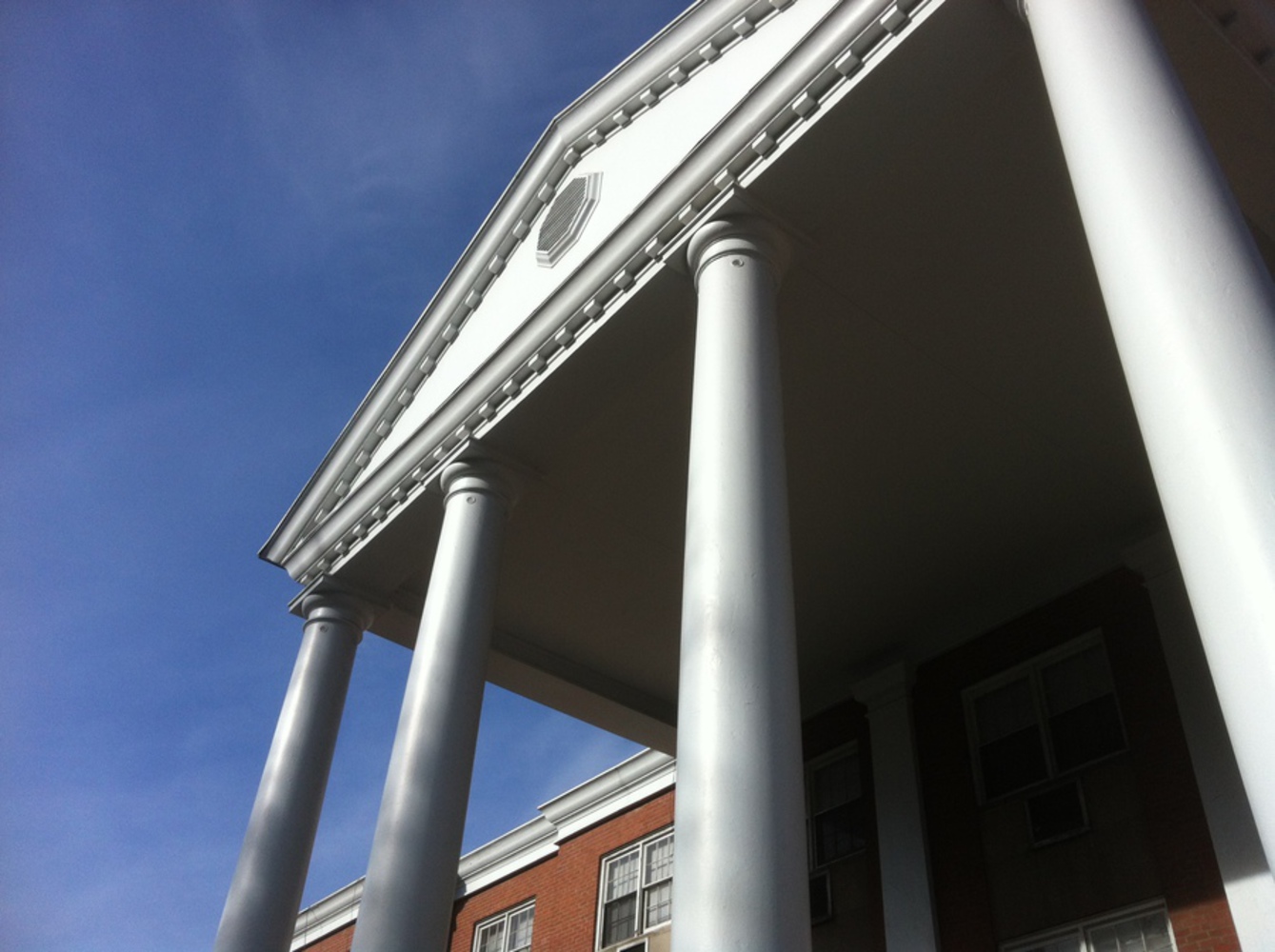
I really liked the dramatic perspective standing at the base of these pillars, but I took a lot of shots trying to set up the photo in an interesting way. In particular, I wanted to get a view from the other side that included a tree so that there would be some contrast for the rigid, structural element, but it ended up being too busy, so I ended up just going with this first shot instead. It's fairly simple, with a lightly textured sky in the background and only the close-up of the building's front in the foreground. The imposing columns stand between the calm blue sky in the left third and the deep, shadowed darkness of the building in the right third. Each column is also half in light and half in shade. The result is a nicely balanced piece.
Egg
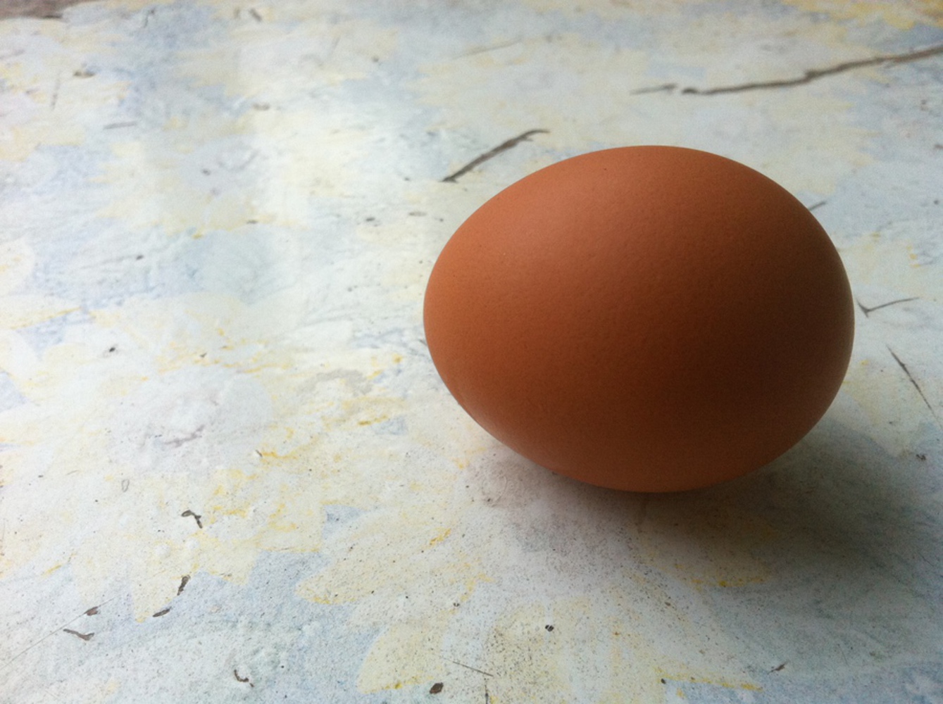
We have an old chair behind our house that I knew I wanted a closeup of. It's got this blue and yellow sunflower pattern that has almost completely faded in the actual sun, and it's been nicely weathered and thus acquired some interesting textures and details. In this shot, the seat looks very rough while the egg is very soft, with a soft shadow that shows its slight texture. The flowers look like bursts from elliptical centers, and the scratches around the egg suggest motion lines as if it were about to crack and break, so the whole context is subtly suggesting breaking, putting in in conflict with the solidly whole shape of the egg itself. I also tried "nesting" the egg in some plastic bags but their blue color tinted the light in a really unpleasant way.
Human body in motion
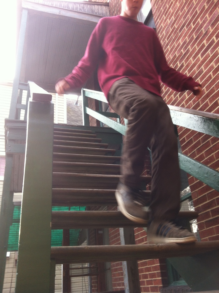
I chose this perspective for the shot because for one thing, it's as low as I could get at the base of the stairs, making their rise as dramatic as possible; and for another, I wanted to shoot the person coming towards the camera, and having them descend towards it calls more attention to their motion than having them climb towards it (you pay more attention to something falling towards you than what's creeping up on you). Furthermore, the figure appears almost at the end of the lines coming from the left, and at the beginning of the lines on the right (in the brick wall), putting him at the critical juncture. And of course I chose a shot in which his eyes were just cut off because people focus on faces, and the subject here is meant to be the motion instead. I'm happy I was able to get the slight blur effect to show that as well.
Human emotion
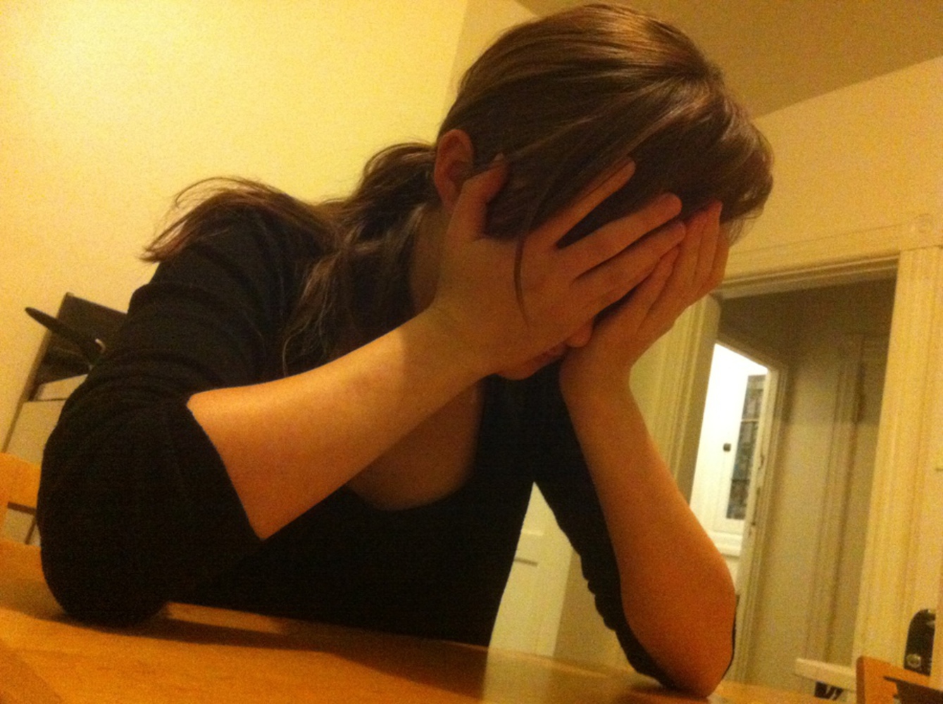
Apart from one shot of a pipe in Gates, the human emotion compositions were the only photos taken inside rather than in natural light (on a cloudy day). They have a noticeably warmer quality, though I'm not sure that would come through in black and white. The emotion prompt for this was "embarrassed," though I'd call the result something like "shame." I thought this pose was interesting because usually emotions are conveyed through facial expression, but in this case the body language alone is enough to communicate it. I think the angle adds a bit more drama, exaggerating her lean, and putting her squarely in the foreground with everything else squeezed in around and behind her. Apart from the small parts of stove and toaster, which are slightly distracting, the only strong darks are her clothing and hair, which further sets her apart from her surroundings. The brightness of the light through the doorway is also perhaps too extreme and a bit distracting, but not too much so. Unlike what would be typical for a portrait, she's turned away from the main source of light in this room, which goes along with the act of hiding in embarrassment.
All photos taken for this assignment can be viewed here (must use andrew account): https://drive.google.com/a/andrew.cmu.edu/folderview?id=0ByNdHBj2861ydlZPeTZQaFdCTVE&usp=sharing
You can upload files of up to 20MB using this form.
