Outcome
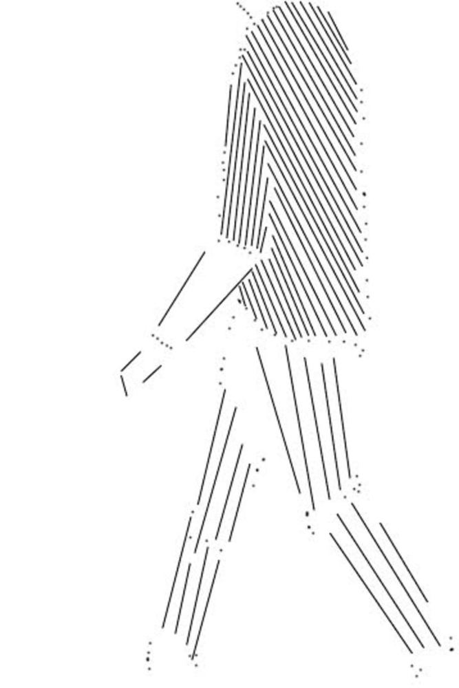
I approached representing this image using dots and lines by considering both the contrasting colors in the image, and what it was that gave me a sense of movement.
I noticed that his shirt was much darker than the rest of the image, so I made it appear darker by having lines close together. However, this part of the image is not the part that emphasizes movement. This is shown in his arm and legs. I used in a different direction than the rest of his shirt to show that his arm is moving separately from his torso, swinging as he walks. I also used lines to give a vague outline of his arm and hand, showing how his arm bends at the elbow as he moves.
Next, I focused on his legs which is where most of the movement is present. His pants are a much lighter color than his shirt, which means lines more spaced apart. I also made sure to arrange the lines in a way that elongates his legs, showing that they are the part of his body that are moving against the air, to move forward. These lines are almost vertical to give this effect of “pushing against” his surrounding space. When I was finished creating this composition, I noticed how the lines in his legs remind you of his muscle moving as he walks. I feel as though this is very interesting as it shows how I am, in a way, capturing the basic form of a person walking in a natural/biological sense.
I mostly used lines for this composition, since I felt that they give a feel of movement and the human body. However, I did use some dots as well to emphasize movement around his knees, ankles and waist, and also his shirt as it moved.
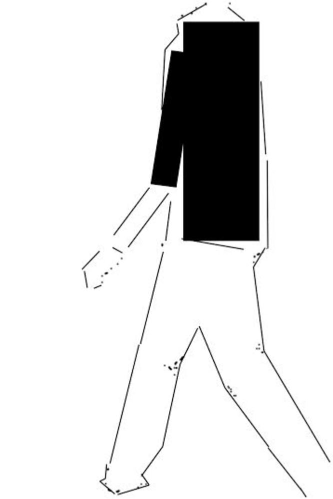
In the version using shapes, I used a couple of rectangles to really capture the contrast between his shirt and the rest of the image. This emphasizes the center of the image, causing it to have a well distributed balance.
Also, I used lines that were more connected than in the previous composition to give the shape of his legs as he walked. Again, I used dots to emphasize movement around his knees, ankles, and hand.
I feel that my composition using just dots and lines was more effective in capturing the image and movement as a whole. Using the rectangles to represent his shirt gave a very stiff result which almost resists movement-- an effect I do not want. I also really liked how the lines in his legs reminded me of muscles and bones moving. However, the composition that used shapes did more effectively capture the contrast in the original image.
A Human Emotion
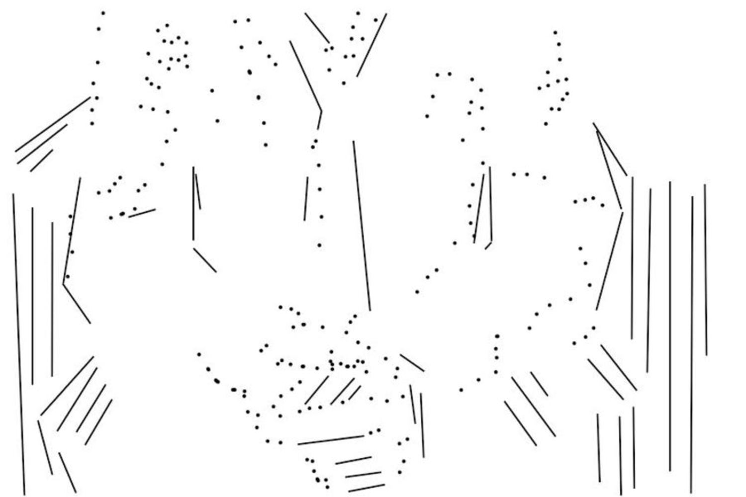
In my approach to representing this image with dots and lines, I again focused on the contrast in the image, and also on what it was that gave the image the nervous feeling I was aiming for.
Observing the original image, I noticed how the subject is framed by the dark chair. It was also brought to my attention (based on feedback) how the photograph could be improved if the subject was lighter, to draw a viewer’s attention to his chest and hands more. So, I chose to take this approach to capture the image better.
The result shows more lines around the subject to capture both the arms of the chair and his dark pants. However, around his chest and hands, I took care to have the lines emphasize the shape of his body, but not overpower him. This makes the subject appear lighter. I used dots, which are quieter than lines, to give an idea of the wrinkles of his shirt, and how his hands are clenched. I also have more lines and dots bunched together around his hands to draw a viewer’s attention there, as they are mostly what indicate the feeling of anxiety. In addition, most of the lines are nearly vertical, and so draw a viewer’s attention downward to where his hands feature lines more angled toward the horizontal.
I feel that this composition is pulling downward slightly, rather than being totally balanced, because of the presence of more dots and lines toward the bottom of the image, and because the arm of the chair is slightly more pronounced on the right side. However, I think this may be a good thing, since it adds to the anxiety of the image.
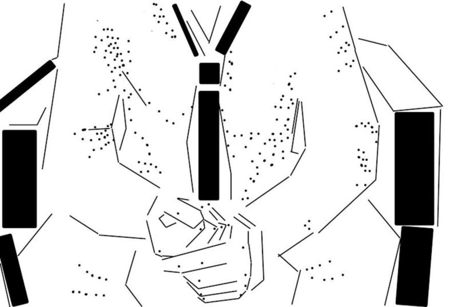
I approached this composition similarly to the way I did for the human body in motion, using shape to emphasize contrast in the image.
The black rectangles on the right and left emphasize how the chair frames the subject. The rectangles representing his tie are used to draw your attention to his chest, and then downward to his clenched hands, creating the feeling of anxiety. Also, using such thick shapes on his two sides give the effect of them closing in on him, since he is made of only thin lines. It also can be thought of using sound, the way Kandinsky describes it: the rectangles are louder than dots and lines, and so they overpower them.
In this image, I used lines to give a stronger outline of his body shape and his hands than I did using just dots and lines, so this image is quite a bit less abstract. This also shows more how the subject is tensed and leaning forward, nervously wringing his hands. I again used dots to emphasize wrinkles in his shirt, using more this time to add more depth to the image.
I noticed that this image feels more balanced than the one with just dots and lines, possibly because of the addition of rectangles drawing attention to his tie.
A Man-made Structure
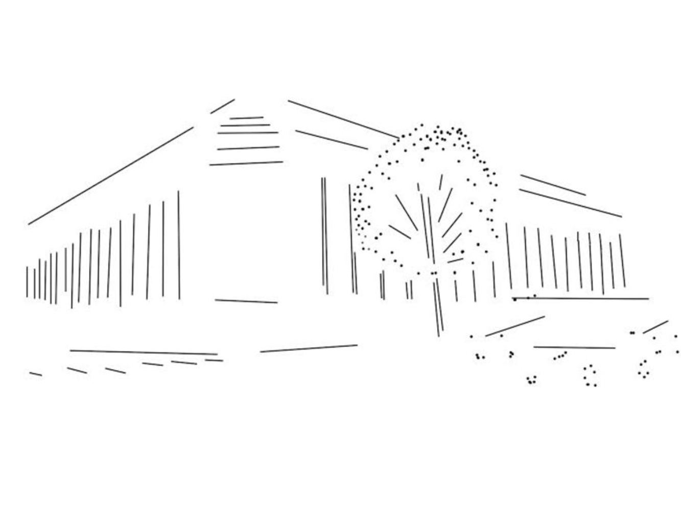
When I looked at this picture, I knew I wanted to use lines to capture the shading between the columns of the Mellon Institute, and also to give a vague sense of the structure of the building, while still keeping the strong, dignified feeling that the building conveys.
I used lines to create depth and perspective the way the original photograph does, having the vertical lines decrease in height, and move closer together, as they become further away from the photographer. These vertical lines give a feeling of strength and height, as the building does. I also used a combination of lines and dots to represent the tree and cars to the right of the building. The dots capture the quiet softness of the tree, and also the tires of the cars running smoothly on the road, while lines capture the stiff tree trunk and bodies of the cars.
Finally, I felt that it was necessary to include the crosswalk on the left side of the building, which I represented with a few short lines. (Perhaps the crosswalk together with the columns closer together create more activity on the left which counters the greater amount of objects and movement on the right side of the building.)
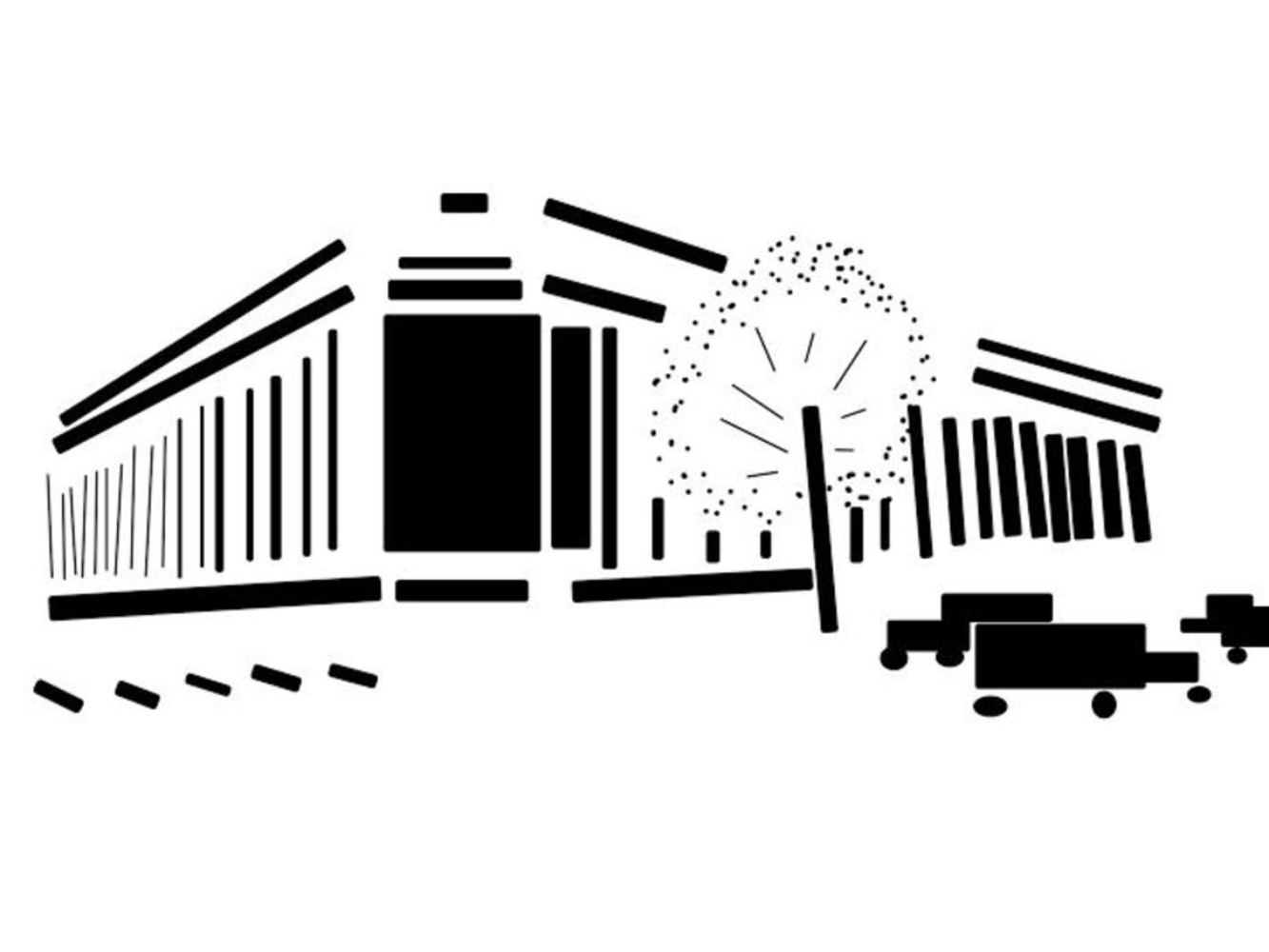
In this composition, I used rectangles to put a greater emphasis on the shadows between the columns, also creating depth and perspective. I also replaced most lines with rectangles to make the building feel more strong and stable, an effect I was aiming for even with the first composition, using only dots and lines.
The large, solid rectangle at the corner of the building really grounds the building. It does this because a rectangle creates more sound than lines and dots, and so overpowers the image, drawing attention to the corner (the support of the building) which is strong.
I again used dots to represent the leaves on the trees, indicating the softness of the leaves in contrast to the sturdiness of the Mellon Institute.
However, I took a quite different approach with the cars, representing them with rectangles and circles. This acts to balance the image a bit though because of the large solid rectangle at the corner of the building, located slightly to the left of the center. This, together with the cluster of vertical lines between the columns (notice that the corresponding cluster on the right is broken up by the tree), forms a great deal of dark shapes which the cars counteract.
Conclusion
During this assignment, I discovered the importance of considering many different aspects of an image, including contrast, balance, and message, in order to capture the essence of an image in a simpler way. I also discovered how much of a difference a rectangle can make versus a line, though they seem so similar.
It was definitely challenging to represent each image using simpler forms, but interestingly enough I found that I usually prefer the result with just lines and dots over the one with lines, dots, and shapes. I found that lines and dots are more delicate, and so they allowed me to more easily create the perception of movement (like the human body in motion image), and other detail I might wish to convey. However, adding shapes to the equation caused me to think a great deal about what basic shapes make up the human body and other objects and structures.
You can upload files of up to 20MB using this form.