The Phenomenon:
"The finest clothing made is a person's skin, but, of course, society demands something more than this."
No matter who we are, we all must decide one thing when we wake up - "What am I going to wear today?".
For some it might not matter what they put on, but for some there is a lot of thought that goes into dressing every day. There could be many factors that go into that decision, like the temperature, the weather, and the activities that are taking place on that day. In a way, our clothing choice is a small representation of ourselves, like our skin - a window into our lives that even the most distant strangers can get a glimpse of as they pass us on the street.
Although there is so much information about each of us contained in the ways we choose to dress, it is easy to perceive this information and then forget about it shortly after, because there is so much of it all around us and it is incredibly difficult to keep track of what we see (too much visual information). Thus, I think it would be an interesting project to keep track of this data and see what possible trends could be observed on the CMU campus.
The Goal:
The goal of this data visualization project is not to prove any claim about different environmental factors and the effects they have on dress code, but just to provide the data to the community, and then let them infer about what correlations there could be.
Also, I think it would just be interesting for individuals to be able to look at the clothing that they themselves are wearing, and how it compares to the trends of clothing around campus at that time.
The Idea:
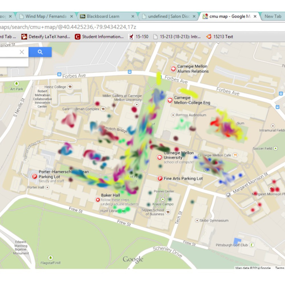
Although implementation may be hard to enforce, the idea is for students to download an app to their smartphones. This app will allow students to document what types of clothing they are currently wearing, and also what color it is as they are getting ready to go out. Then, as long as GPS tracking is enabled, their movements will be recorded all around campus (anonymously). This information will all be accumulated into a central system that plots these movements on a single map.
Along with clothing data, the app will also take into account:
- Time of day
- Temperature
- Weather conditions
- (Maybe) general locations of on campus events
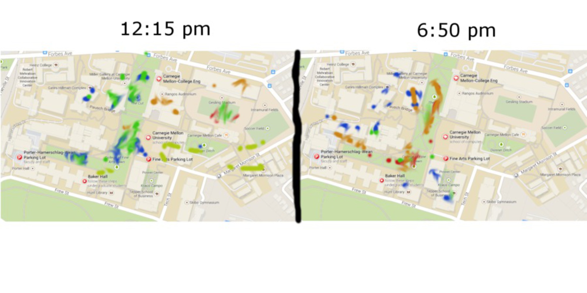
After all of the information is gathered, one will be able to view an interactive map display showing how people wearing different clothing are moving around campus (either online of at on campus display terminals)
People will then be able to choose to filter the data by color or types of clothing, and also compare two different maps based on time of day, or temperature, or weather conditions (e.g. map of color movement in the morning vs. at night, or map of people wearing dresses while it's sunny vs. while it't raining). By allowing this filtering, people can choose to look at which potential trends would interest them.