For this image, I took a literal approach at representing the original photograph. I wanted to experiment with Kandinsky's idea of temperature and color of lines. Kandinsky suggests that the vertical lines are warm and white, whereas the horizontal lines are cold and black. In the original photograph, I have a rather well-lit, light-shaded foreground for the object and a darker background. I also tried to emphasize the main focus of the photograph by using thicker lines and repetition of the straight lines at equal intervals, which serves the purpose of "quantitative reinforcement." (Kandinsky, 95). The lines in the background are more sparse and lack uniformity; I wanted to use this to counterbalance the heaviness and uniformness of the center of the image. Finally, I used dots to represent the shadow because I felt like the shadow was important to the composition in the photograph despite it being often ignored. While dots by themselves are silent, they create an amplified sound when combined. Overall, I am not entirely convinced that the contrast in color between the foreground and the background is shown, but a distinction is made. I think this composition has a similar calmness and balance to the original photograph.
Outcome
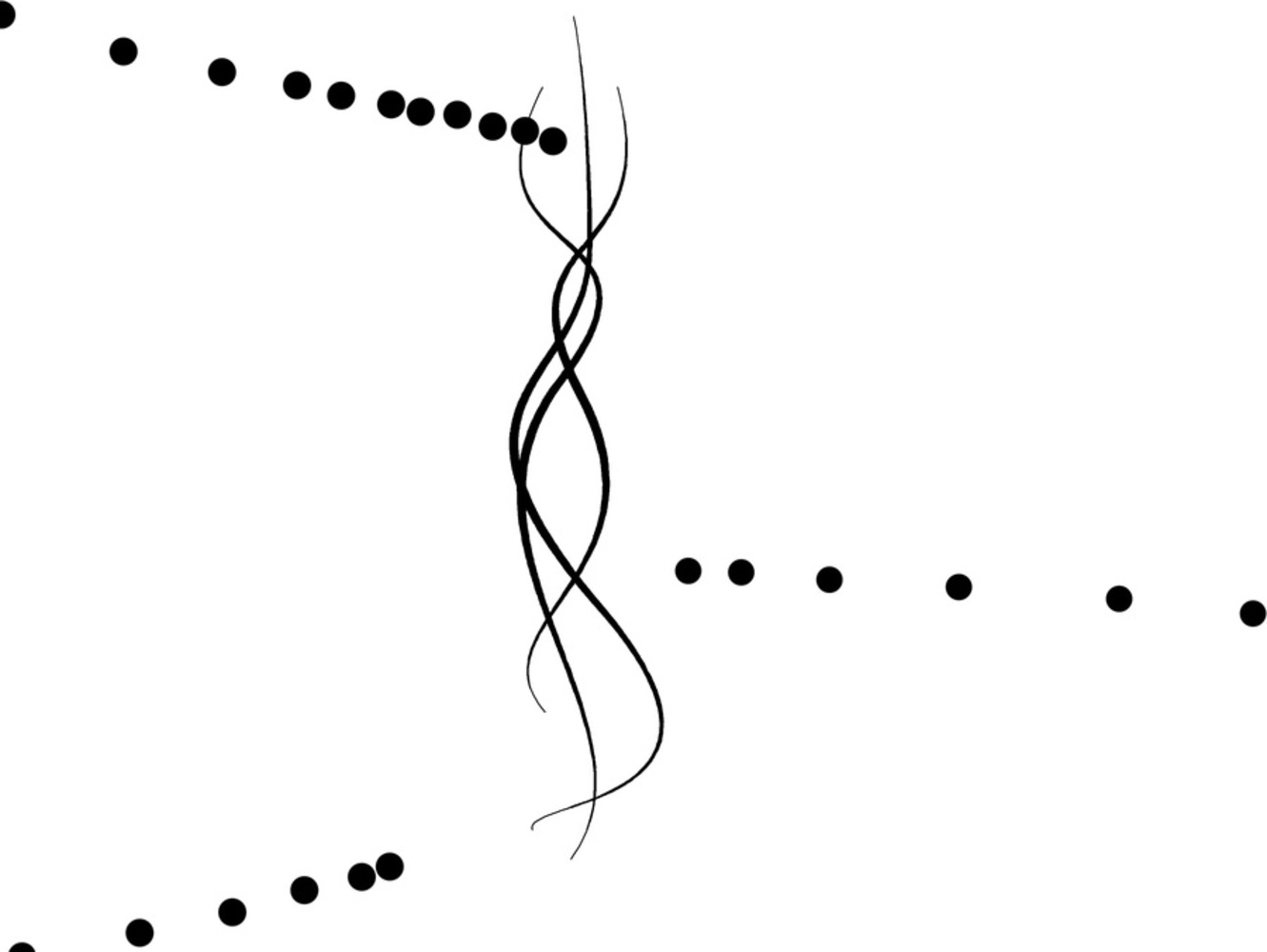
For this composition, I used straight lines to represent the moving hand and dots to represent the motion of hitting the keyboard. I chose the two representations because lines have motions (and "potentiality for endless movements") and dots have brief sound as Kandinsky describes, which I thought are appropriate to represent the motion of hitting the keyboard. I used lines for both the nonblurry fingers and the blurred fingers in the original photograph, but made the lines for blurred fingers thinner. I wanted these lines to be thinner because, in the photograph, the blurred fingers appear to be more light-weighted. The lines also create directionality towards the dots. The dots vary in size, representing the different volume of sounds when the fingers are hitting the keyboard. I left the rest of the composition empty to emphasize on the motion itself and remove any distractions, including the keyboard. I really like this composition; I feel like it creates motion in the limited 2D space with only lines and dots, which is the original focus of the photograph.
Human Emotion
Out of all the compositions with only dots and lines, I felt like the human emotion one was the most difficult. The limited set of geometric elements made it difficult to literally recompose the original photograph. Instead, I decided to be more creative about this composition and focus on the upward happy energy that the photograph was presenting. I used curved lines to represent the messy hair the subject had in the photo; she had just finished her programming assignment after a few hours of intense focus, and she was relieved and happy when I took the photo. The curved lines are similar to what Kandinsky describes as geometric curve-like, which creates a sense of ascension. However, they are not as tense as straight lines are, making the entire composition more relaxed. The overlapping of the three curved lines intensify the weight and rhythm, but "they carry within them something soft and velvet-like." I kept the lines vertical because of their warmness, another attempt at displaying happiness. The three sets of dots coming in from the edges look like lines coming towards the curved lines. I made the spacing smaller as they approach the middle to create directionality towards the middle. Overall, I like the balance and softness of the composition. I feel like I can do more to make happiness more apparent, but I am not sure where to start.
Dots, Lines and Shapes
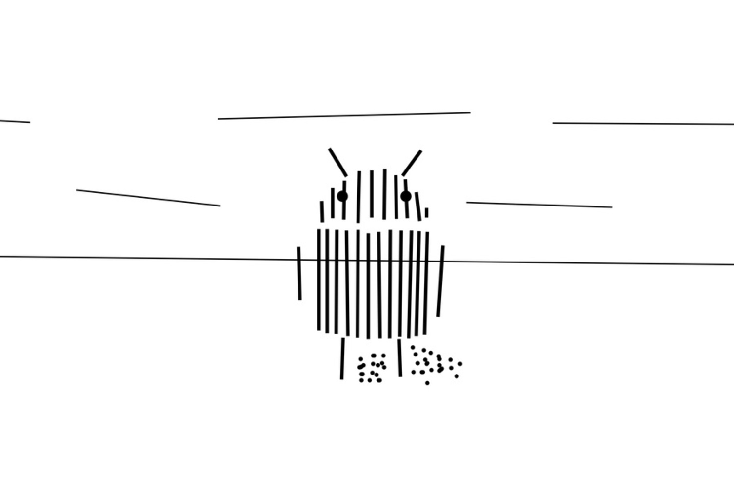
Man-made Object
In this composition, I wanted to contrast the man-made object with its background in a more obvious way than I did with the points and lines composition. Using shapes, I colored in all of the man-made object, signifying its smooth and artificial texture. On the other hand, the background sofas are represented by dots. While each dot has a relatively quiet sound, the random combination of many dots of different sizes gives off noise and imperfectness, similar to the rough texture of the sofas. The horizontality of the dots keeps the composition cold. The randomness also creates more space above and below the dots, giving the composition room to expand. I find this composition really interesting in that the shapes themselves are almost silenced by the dots in the background. The shapes, and consequently the main subject, became the resting point for the eyes. I think there are more things that I can do to make the subject more stand out and the background less intruding, such as making the dots expand from a center horizontal line rather than appear randomly.
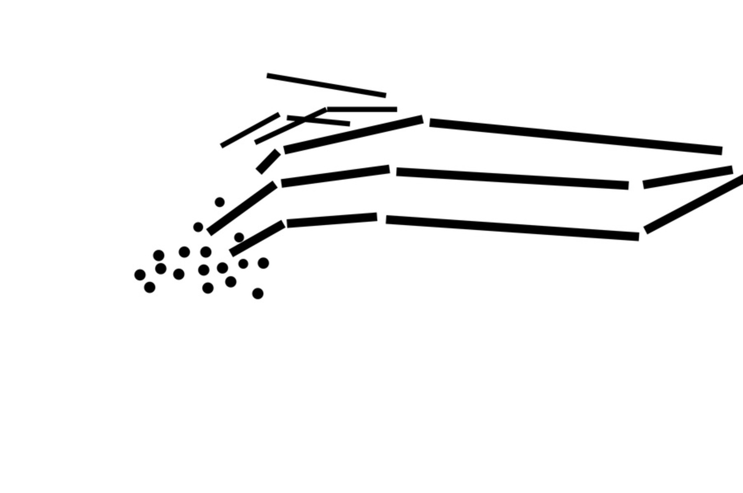
Human Motion
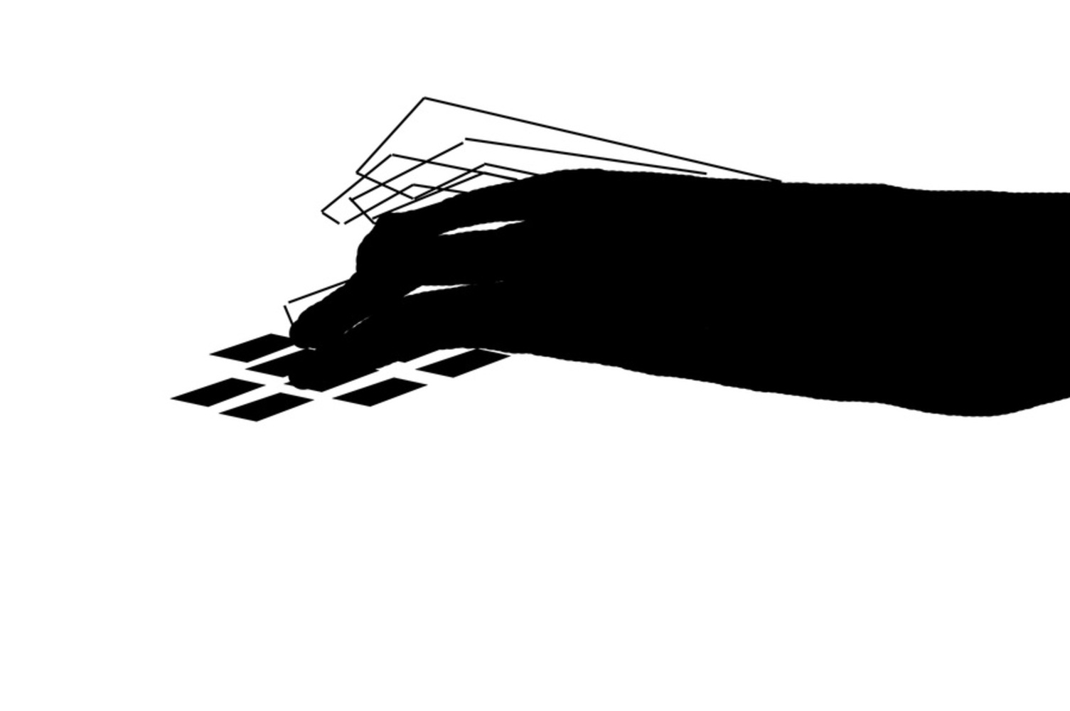
In this composition, I also focused on how to make movement appear. I created an organic shape for the hand, but used lines to trace out shapes of the moving fingers. I also used diamond shapes to represent the keys on the keyboard, but I only showed the ones closest to the fingers. I filled in the hand with black to keep it heavy, since it corresponds to the hand that does not appear moving in the original photograph. The moving fingers, on the other hand, are not colored. The whiteness of the background, then, becomes the color of the shapes; these shapes are warm and seem to want to break free from the hand. The heaviness of the colored-in hand weighs down the bottom of the composition to constrain the unlimited freedom of motion. I think the Points and Lines composition is better than this one, because I feel the diamond shapes do not have sounds as succinct as dots. Even though they are more representational of the keyboard, I feel like some motions are lost.
Human Emotion
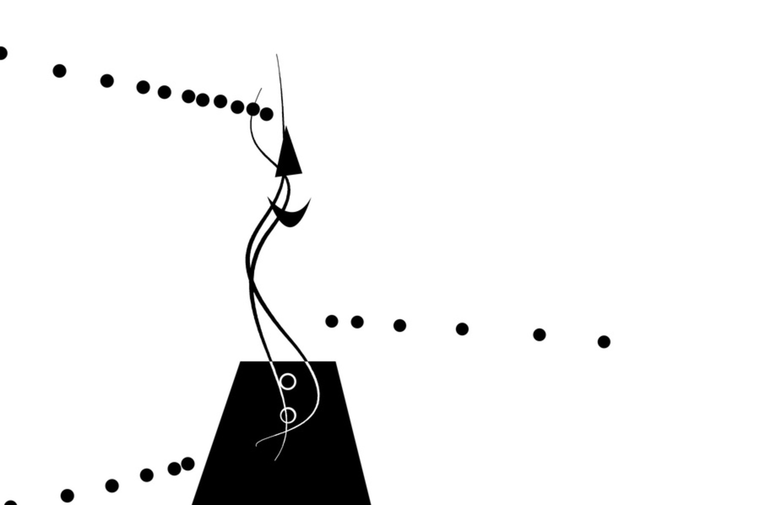
In this composition, I kept it mostly similar to the points and lines composition, but added a few more shapes in an attempt to provide more upward energy. Adding to the warmness of the composition, I added the acute triangle; Kandinsky believes that acute angles are yellow and warm. The triangle is also in a mostly upward orientation pointing upwards. It otherwise represents the nose of the subject. The half-moon shape represents the smile. The trapezoid on the bottom represents the sweater the subject is wearing. Because trapezoid is essentially an incomplete triangle, I feel like it also adds to the upward energy without being intrusive like a triangle. It made the curved lines appear to grow out of a heavier space upwards. I feel like the shapes made the composition more complex, but I prefer the simplicity of the points and lines composition.
You can upload files of up to 20MB using this form.