Back to Parent

Outcome


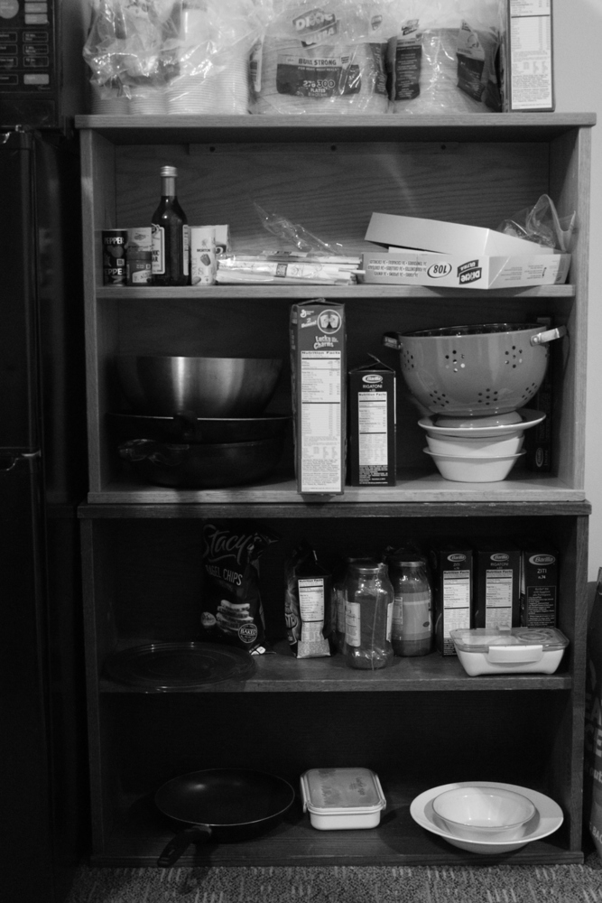
I took a pretty similar approach with each of my compositions. In general, I tried to emulate the basic form of the subject in each photograph, and fit the lines and dots to the form. Also, with most of my pictures, I interpreted points as the parts that your eyes stop briefly on as you scan the picture.
 

Img 2348.jpg.thumb
Show Advanced Options
Shelfd t.thumb
Show Advanced Options
Shelfshapes.thumb
Show Advanced Options

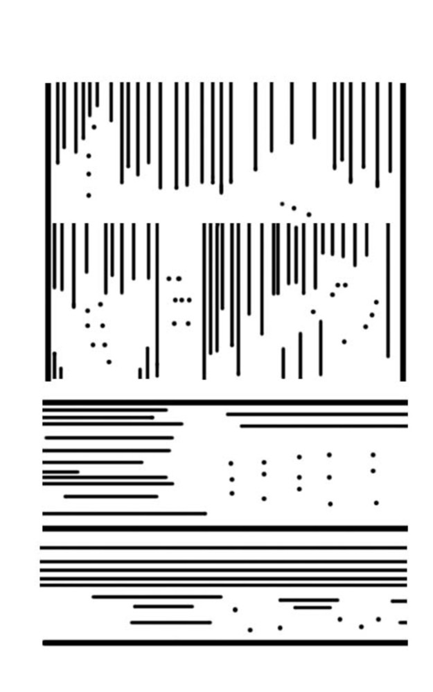
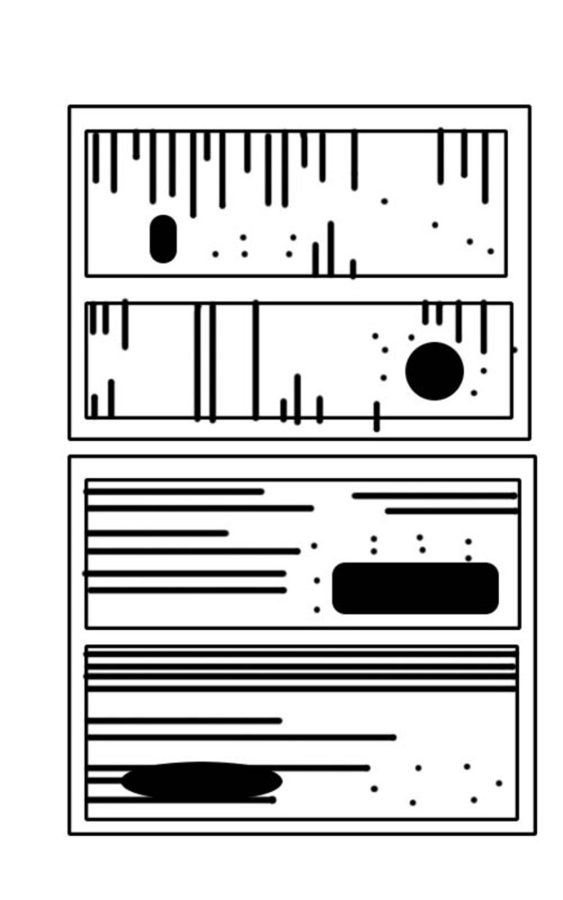
For the man-made object, I chose this shelf, but I also wanted to focus on the organization of the objects within the shelf. Following the concepts in the Kandinsky reading, I used vertical lines for the lighter, warmer parts, and horizontal lines for the darker grounded parts. This actually worked quite well, and I was quite pleased with the effect. There was a distinct difference between the top and bottom parts of the shelf, as shown in the picture. I used the dots and shapes mainly to draw attention to certain areas with interesting shapes and patterns. 

Img 2291.jpg.thumb
Show Advanced Options
Ryand t.thumb
Show Advanced Options
Ryanshapes.thumb
Show Advanced Options

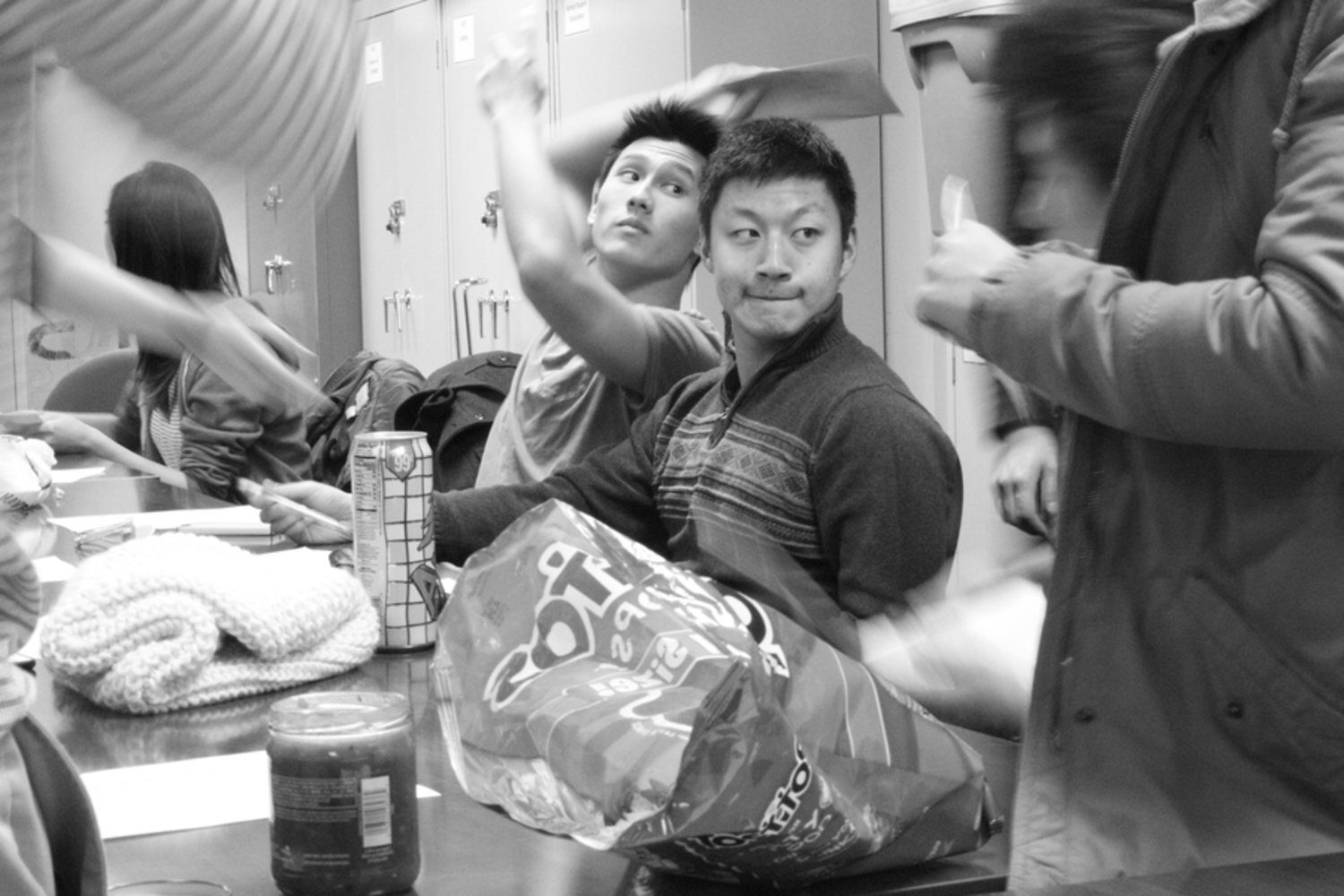
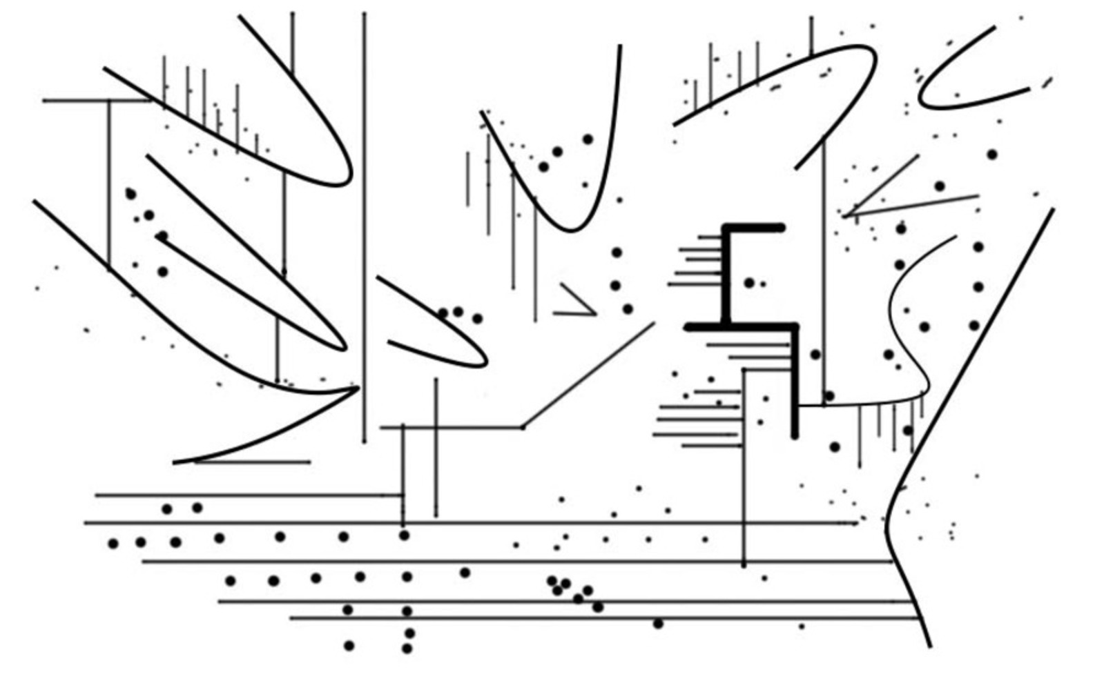
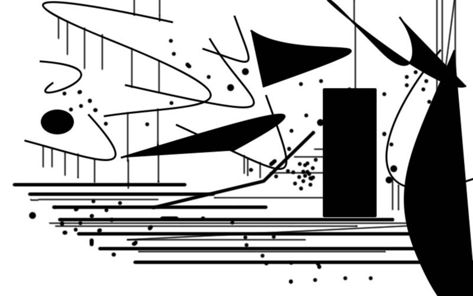
These are my compositions for human movement. Similar to the first set of compositions, the horizontal and vertical lines serve the purpose described in the Kandinsky reading. However, in these pieces, I included angular lines in order to emulate movement. Kandinsky described how acute angles give a feeling of activity, while 90 degree angles usually represent calm and sturdiness. Therefore, I use rectangles and straight lines for the motionless subject in the center, while the curves and angles represent all of the movement around him. 

Img 2331.jpg.thumb
Show Advanced Options
Kathleend t.thumb
Show Advanced Options
Kathleenshapes.thumb
Show Advanced Options

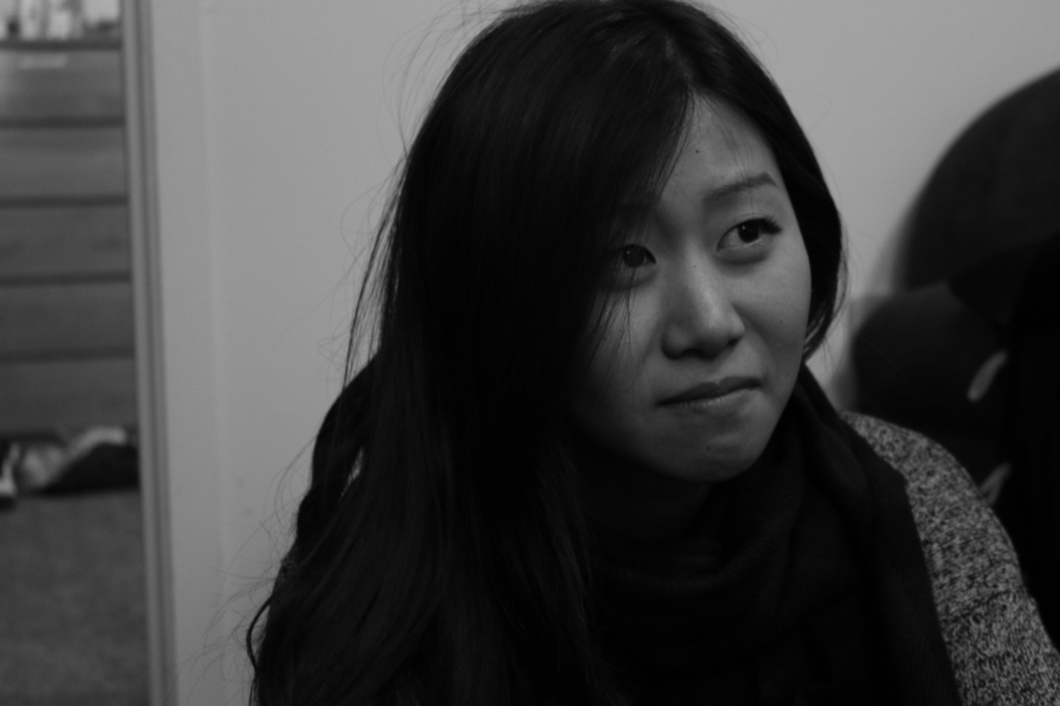
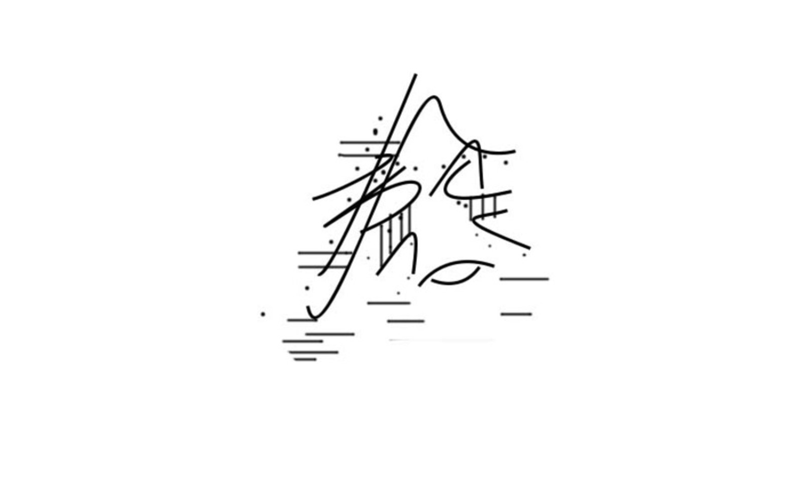
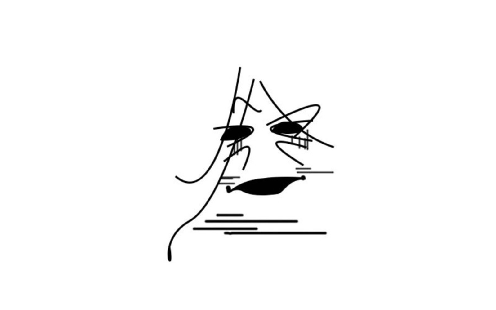
For my human emotion composition, I used a lot of the techniques from the previous two pieces. The subjects face is split into top and bottom, with the top side being more lively, while the bottom side shows more of a grimace. Therefore, I used more angular and vertical lines around the eyes, and more obtuse and horizontal lines around the mouth. I chose to ignore everything in the background so the focus would be on the facial lines only. 

Drop files here or click to select

You can upload files of up to 20MB using this form.