I teach aerial silks at the Pittsburgh Dance Center. Every week I have a handful of classes, taught on two rows of silks with about a dozen dancers. Some times the efforts are organized and coordinated, for example when we all gather to work on a new movement or trick. Some times it is a wild free for all with people climbing up down the silks at their own pace, moving through small routines or figuring out new moves for themselves. Each individual class has its own pace, its own story, that is often missed because the focus is on participation and there is rarely anyone other than me in a position to observe.
Outcome
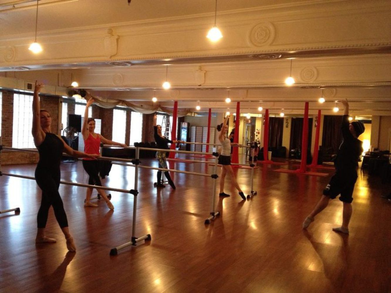
An image of the studio where I work. The foreground holds a ballet class and the silks are hanging in the background.
My students work incredibly hard, and that effort and commitment is as beautiful to me as any piece of art. In this project, I hope to bring out and share a glimpse of that beauty with the world.
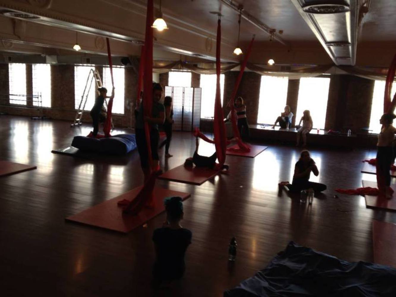
A picture of a beginner class in progress. This is one of those 'free for all' moments with bodies everywhere!
Data and Design
My goal is to share the heart and effort of my students throughout a class, and so I will focus on two main data points: heartbeat and skin temperature. Each student will have a dot on the page that pulses with their heartbeat and changes color with their skin temperature. The dots of each person will be captured at various points throughout the class, and time will be the horizontal axis. When I dot is captured, it will be placed at the appropriate time and continue to have the same heart rate and color after placement.

An example image of my data visualization. From left to right, this class cycle (showing only temperature in the form of color since heartbeats are not shown by the static image) shows a class that starts slow, maybe with some demonstrations, then works hard in the middle before wearing themselves out and starting to cool down towards the end.
I love the symbolic connection between sharing their heart and literally sharing their heartbeat. The heartbeats will also change drastically through out the class as they move through difficult sequences of movement, marathon routines, getting their ankle unstuck when they mess up, watching their friends' technique, and laying on the floor in exhaustion. These bursts of energy punctuated by calm are meaningful, but only when they are all shown together do they tell the full story.
Skin temperature is also meaningful because it changes not only between effort and calm but as the class goes on. Early in the class, there may be a lot of fast, hot dots. Later on and further into the piece, when people are exhausted and drenched in sweat, going for their final big push their pulse may be fast but cold. This shows all of the effort and energy they pour into their practice.
Together, these data points across an entire class will tell its story. Most of the way through, you may see each pulse slow and get cooler as the students watch a demonstration of the new move we learned that day or a frenzy of heartbeats and a sudden spike in temperature followed by calm after they try something new and difficult for the first time.
Connections to Readings
By removing everything but the individual data points and showing them moving through time together, my method of visualization does not distract from the data but makes it accessible in a way that would otherwise not be possible. You no longer need to be a dance teacher to understand the feeling of the room or the progression of the class.
The video we were assigned talks about how you should embrace the complexity of data and use it to show more meaningful insights. In this project, I was able to gather data from many sources and of multiple types and pull them all together into a cohesive image that provides a view you would not otherwise have. They also talk about showing your data in a way that does not distract but rather reveals, which falls in line with the image of a class as opposed to a room full of people.
I used the concept of a time series as a natural organizational dimension from the reading, as well as a few other concepts. The idea of 'small multiples' applies because if you can understand one point in time, the whole graph makes sense. I also used the idea of incorporating layers of detail. If you step back, you can see a broad overview of the class, and when looking closer you can see individual people and their efforts.
Some of the examples given were also incredibly beneficial. My project is very interpretive, and it pulls in the concepts of human connection and artistic representation of very clinical data. My concept is somewhat similar to the Pulse Room in that it pulls and shows heartbeats, but it is also close to Data Art in that it is pulling together a cohesive picture from many points of data.
You can upload files of up to 20MB using this form.