Back to Parent

Outcome


Background:

When I first set foot upon the Carnegie Mellon University campus in Pittsburgh, I was shocked yet relieved to see the diversity of the people around. From students walking to class to the tourists and teachers, it was honestly not what I have expected. Growing up in Silicon Valley California, we have our fair share of diversity in terms of race, culture, hobbies etc. However, when CMU piqued my interest, I was nervous that being in the mid-east, I might not able to adapt and enjoy myself. This feeling quickly vanished through orientation week and I was able to see how people from so many people from different part of the country, even across the globe, gathered here to learn. This is the catalyst for which I decided to focus this assignment on.
Project:

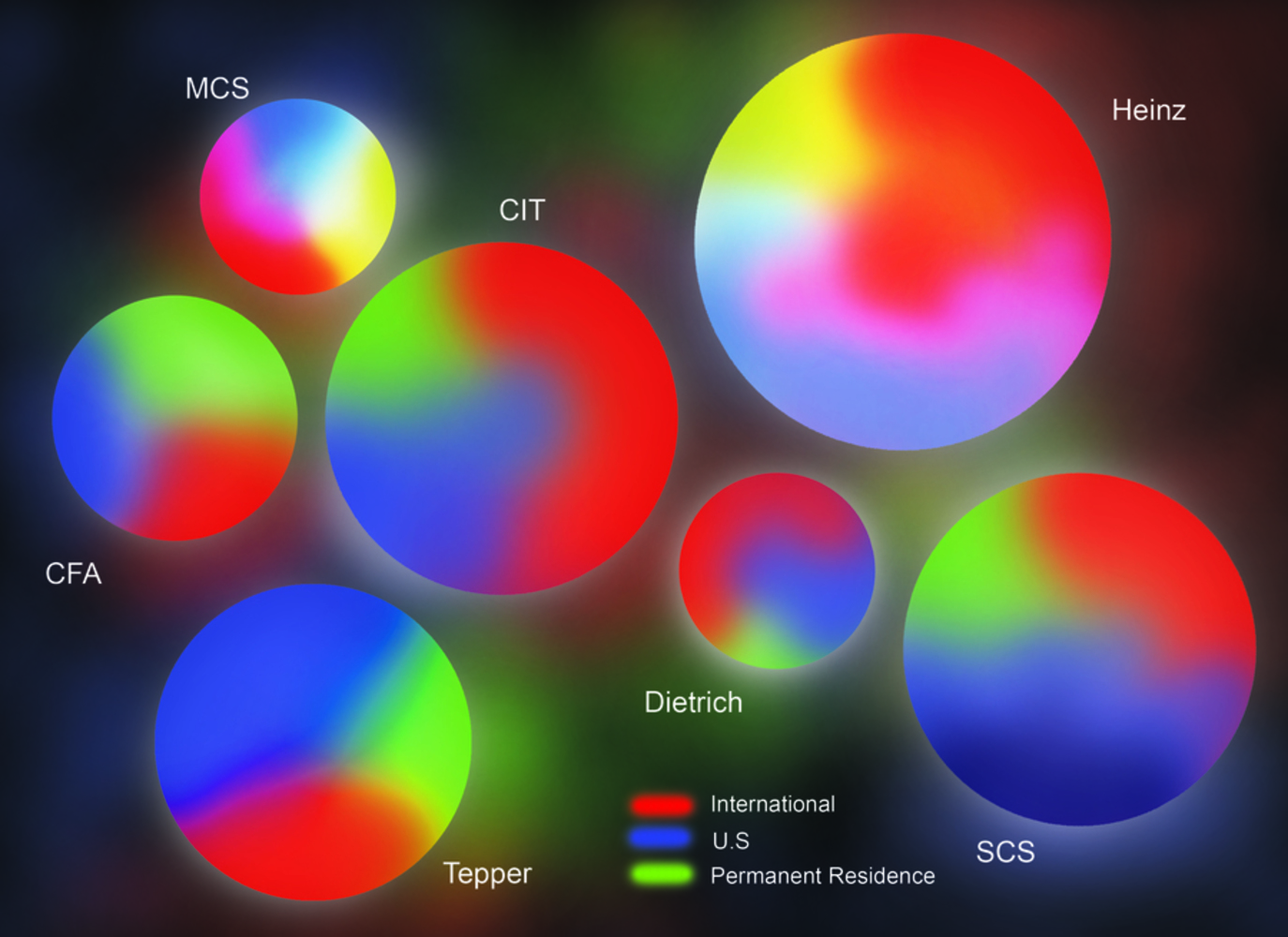
My goal for this assignment is to display data regarding CMU's various data, and the students enrolled in it based on their citizenship and residency status. I will comprise my chart with a bunch of gravitating circles, representing the most popular majors and departments of CMU. Inside these circles with be a gradient between 3 colors; representing international, permanent resident, and US citizenship. My focus will be on the masters program and not the undergraduate program because it contains a more balanced group. The gradient will be constructed proportionately and slightly varies from one circle to the next. The immediate correlation can be seen by the various spectrum of light. The sizes of the circles vary as well depending on the popularity of the major as a whole, the more enrolled students, the bigger they are.

Feedback:

The feedback I received on Friday is mostly positive, but with most of the concerns regarding the way I am going to compose and represent my data. But contrary to the concerns, finding the data I wanted was probably the biggest issue. I had to e-mail the department heads in order to get the data, and even then, it wasn't exactly what I had in mind. The visualization part came to me pretty fast as I am used to representing data in artistic ways, though a lot of the suggestions in recitation guided me to where I am.

Connections:

-The initial spark to my idea on the form of visualization came from the Google Ripple application as mentioned in the class video "Visualizing Natural and Cultural Phenomena".

-In a way, my project can be compared to Laurie Frick's data art, as it uses a collection of similarly organized data and represent it with slight variations.

-Since my idea fitted many axes of information within one simple individual object, it fits Tufte's principle of graphic excellency.

-I decided to use purely self-made images of only shapes and colors to represent my data as humans are naturally understand it faster (Tufte 20).

-The use of the composition of color and shade of my project also resemble the cancer map of the US, along with its theories about how people's attention are drawn and how  it uses people's intuition to immediately get the information across.


Circle.thumb
Show Advanced Options
Drop files here or click to select

You can upload files of up to 20MB using this form.