Symmetry
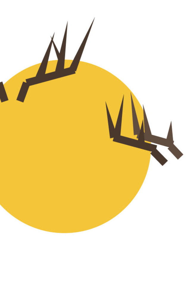
For this composition, I focused on symmetry across the vertical central axis. I depicted the concept of deers with only antlers, because antlers are unique to deers and grow symmetrically. I placed the pair of antlers perfectly symmetrical across the central vertical axis by composing one side then reflecting to get the other side. I used triangles at the tips of the antlers to represent upwards growth, since antlers grow at the tip. The bases of the antlers, on the other hand, are thick, solid lines, which provide support. The tips of the each antler all point in the same direction and the sizes vary predictably, emphasizing on the regularity of the composition. I also chose the background color to be uniform to not distract from the antlers. I chose orange as the background color, since orange is the color of a prototypical deer in my mind. I had a difficult time deciding whether I should add more features to the composition, such as circles to represent eyes or triangles to represent the face of a deer, but anything I added seemed extraneous to the composition. Overall, I feel like this composition is successful in representing a deer with only simple shapes and colors. I agree with Dondis that a symmetric composition is very static; it feels like the deer in the composition is not alive and moving.