Back to Parent

Outcome


Games are important to me. They provide me with an escape. They make me worry less and compartmentalize my stress, letting me pragmatically approach solving my own problems.  And, finally, they provide a beautiful metaphor to our lives. When I'm online surfing the Steam Store, I want to know what will connect me to Pierre in France, or Shota in Japan. What will game get me connected with the world? And who is doing it?

This means that we can analyze specifically a few data streams about gamers:

1) Who's online

2) What they are playing

3) What genre that game falls in

4) On a total scale, what percentage of the total population they fall into

Luckily, this question can be answered pretty simply: with a graphic visualization that allows gamers to see what's the buzz in gaming about the world.

Steamapp%283%29.jpg.thumb
Show Advanced Options

As seen above, users will be able to see the most prevalent genres of game, gathered from Steam's service via the Steam API.

Show Advanced Options

The user also will be able to hover over certain portions to show that subject and prevalence.

As seen can be seen, the visualization can even pinpoint what modes other players are playing, if applicable to a certain game.

This specific representation lets user see the percentages intuitively, which would give them a better understanding of what they might want to play based off of the community. It also expresses graphical excellence through its intuitive use of the well-know pie chart, and its interactive hover system which allows users to compare different pieces of the data.

Steamapp%282%29.jpg.thumb
Show Advanced Options

My representation of the data is forceful in that I am cutting out superfluous things, such as a small population of people who are using devkits, or game modes that are not interactive on a multiplayer. I am solely trying to express which games a player can enjoy with others.

When  first thinking about this project, because I made this graphical representation interactive, I was straying away from the heart of the project, and more towards app development: my group thankfully kept me from doing this. As well, my group helped me figure out how I would group games.

In development, I also wanted my data to express to the users specifically what I wanted to get across, as opposed to the current data stream that Valve utilizes:

Steamapp%286%29.jpg.thumb
Show Advanced Options

In Tufte's writing, he notes how people are more naturally drawn to the larger and darker pieces of the visual representation, especially in the cancer death rate map of the United States.  My representation also employs this technique, as it can be seen that people are more drawn to the larger bars on the graph, and the little sprites of less popular games kind of blend into the form and are even harder for users to focus on with the hover ability.

Viegas and Wittenberg specifically spoke about straying from this point plotting representation to map online traffic flow:

Steamapp%287%29.jpg.thumb
Show Advanced Options

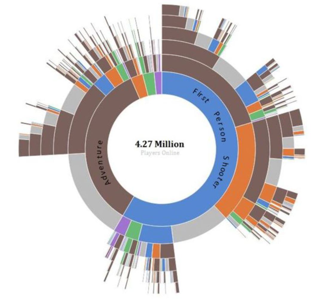
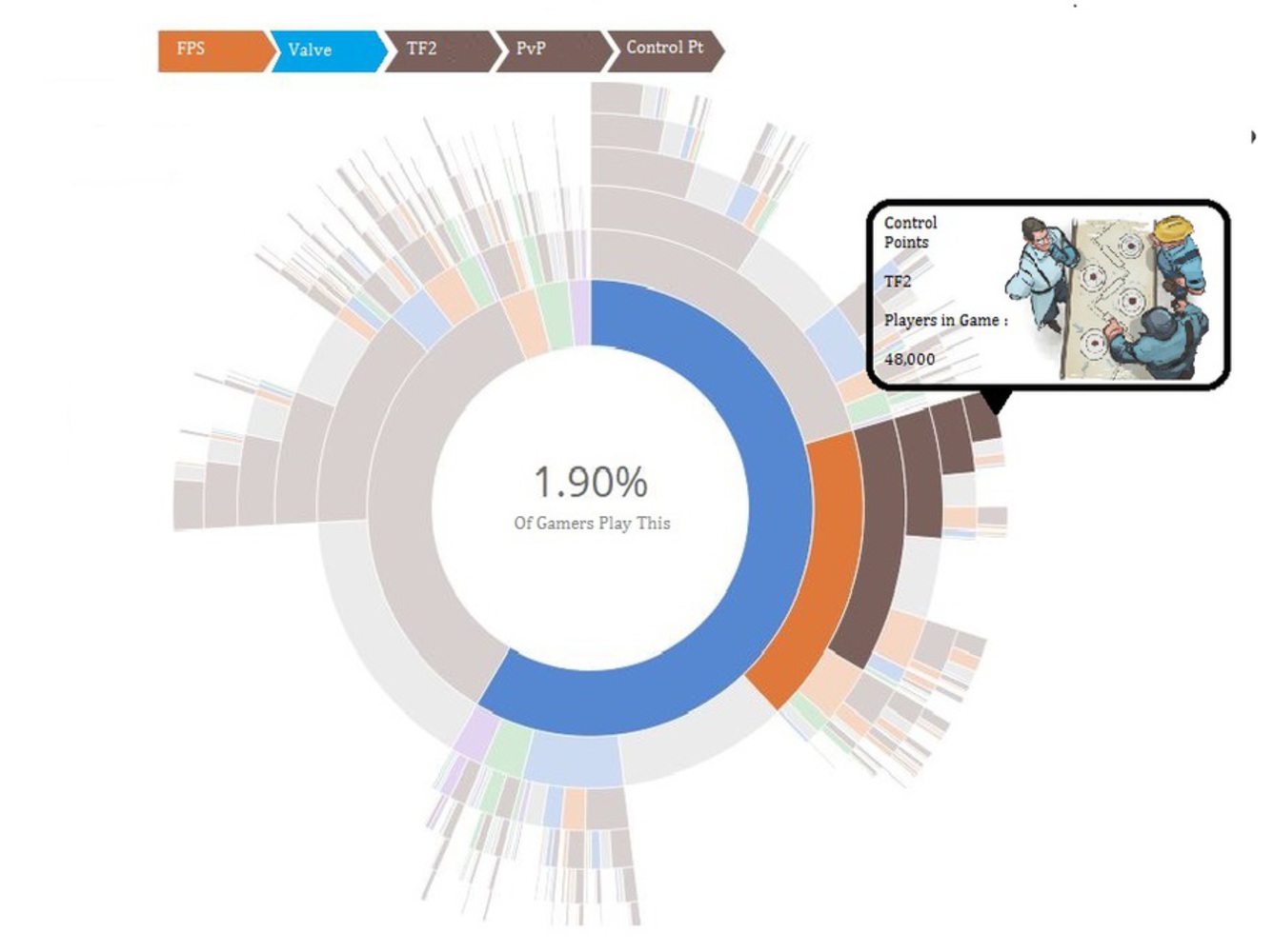
As is seen, it's not intuitive for the user what each specific point is representing.  In the same vein that Viegas and Wittenberg built their data visualization on google+ posts and reposts, I have created an easy way to view the traffic of online gamers.

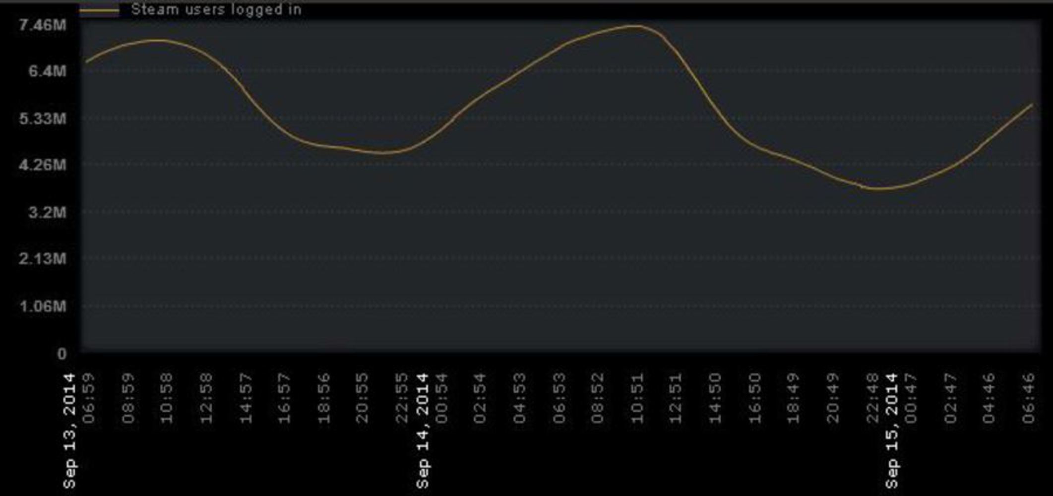
Many of the visual representations we have seen in our readings are aggregate values of data, but as humans we are more about processing information as it is given to us over time. Since it is planned as an updating system, its changing nature should actually make online activity more coherent for viewers: coherence of large data is a quality that Tufte highlights with visual excellence.

This representation of course, while only showing the specific data I want it to, also gives the user less of an interpretive representation, and more of a data-driven one.  Its incorporation of size to show numbers in the data is much like Minard's graph of Napoleon's movement through Russia.

Yet, it does air on a more artistic side, much like Laurie Frick's data art.  Though it is not easy to at first see the connection, look more closely into how data art is an exhibit of data where viewers can go around and peruse which specific items they would like to see.  My graphic operates in much the same way with the hover ability, as this allows viewers to see the details of each piece of data.

Though all these relations to the readings and other visual representations are nice, what I really like to focus on with this project is the fact that its focus is Human Interaction.  The graphic itself is interactive, and it highlights the enormous amount of people that log onto their computers and connect to the world. Personally, I don't appreciate how taboo gaming is (even among many in the artistic fields), and I hope that representations like this one could show people how great a tool of information and interaction it is.

Drop files here or click to select

You can upload files of up to 20MB using this form.