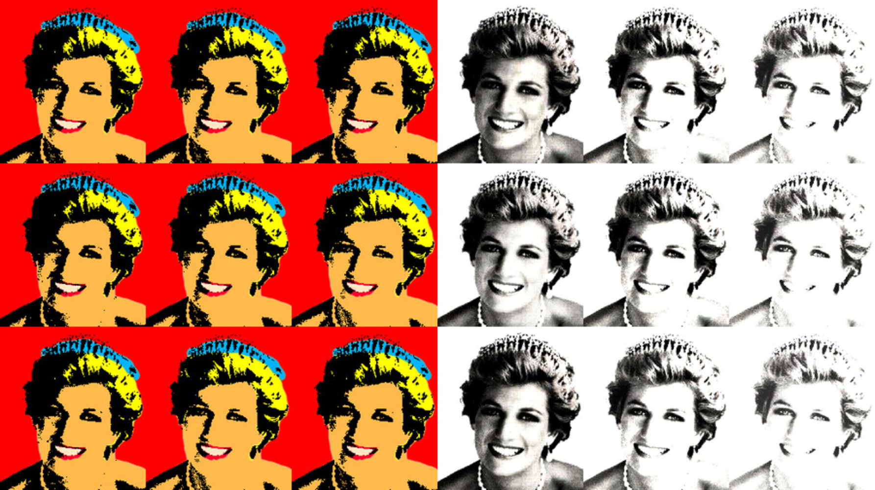
For this composition, I chose to focus on a famous person who, like Marilyn Monroe, had a very contrasting outer image and personal life. Princess Diana had a very positive image while she was married to Prince Charles; she was well-known and loved by many for her compassion and charisma. However, her life was plagued by depression, eating disorders and marriage problems, due to her status and the spotlights on her from the mass media. Her death was unexpected, and like Marilyn Monroe's, spawned conspiracy theories.
In my composition, I tried to emulate Warhol's Marilyn Diptych (1962). I used bright colors for the left side of the composition, emphasizing on the eventful life of Princess Diana. I chose the main colors to be warm colors because of people's perception of Princess Diana. The red background also adds uncomfortable weight, which is my way of representing her pressure of being at the center of the spotlight. I made variations in each of the repeating images to replicate the variations from mechanical production of Warhol's artwork. The sudden change from the left side to the right side is abrupt, representing the sudden death of Princess Diana. On the right side, all the images are black and white, an indication of death. The images become lighter as they lie towards the right, like how Princess Diana fades away after her death. However, they do not fade all the way to nothingness because Princess Diana remains an icon in the current time. Overall, I feel like my composition is successful in depicting Princess Diana's life. I really like how significant the contrast is between the left side and the right side, and I think it makes viewers think about the relation between Princess Diana's outward appearance and her inner struggle.