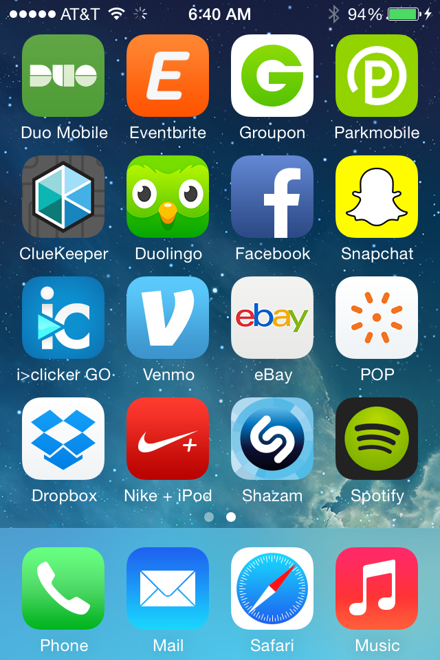
A lot of Warhol's art centered around logos and visual representations of a brand. When I think of branding, I typically think of the many young startups that are competing for attention in the tech world, trying to make a name (and an image) for themselves by seeming fresher and hipper than all their competition. I wanted my composition to convey the general sense I have of the same-iness of their logos and brands: bright, flat, symbolic, streamlined, softly curved. It occurred to me that app icons would be a great way to do this, as they tend to be a concentrated version of the company's branded image, and they're kind of like the "packaging" for the apps we use everyday and are accustomed to seeing in rows on our devices, very similar to what the Brillo boxes or soup cans were in Andy's time.
At first I thought I'd just gather a bunch of icons that I thought resembled the archetype I had in mind, so I started looking several up on the internet--apps like uber, tindr, linkedin, and others that targeted my approximate demographic: the young and tech-savvy 20-somethings with expendable income and free time. Then when I was considering how many to gather, I thought I should get however many filled up a typical iphone screen, and it occurred to me that I could gather the icons on an actual screen and use that as the whole image.
