Curatorial statement:
"How Far We've Come" is an interpretation of the song of the same name by alternative rock band Matchbox Twenty. The artwork is composed digitally using Photoshop. It explores themes of human progress and destruction, asking for reflection of "how far we've come" and why we, the humans, are where we are as a society.
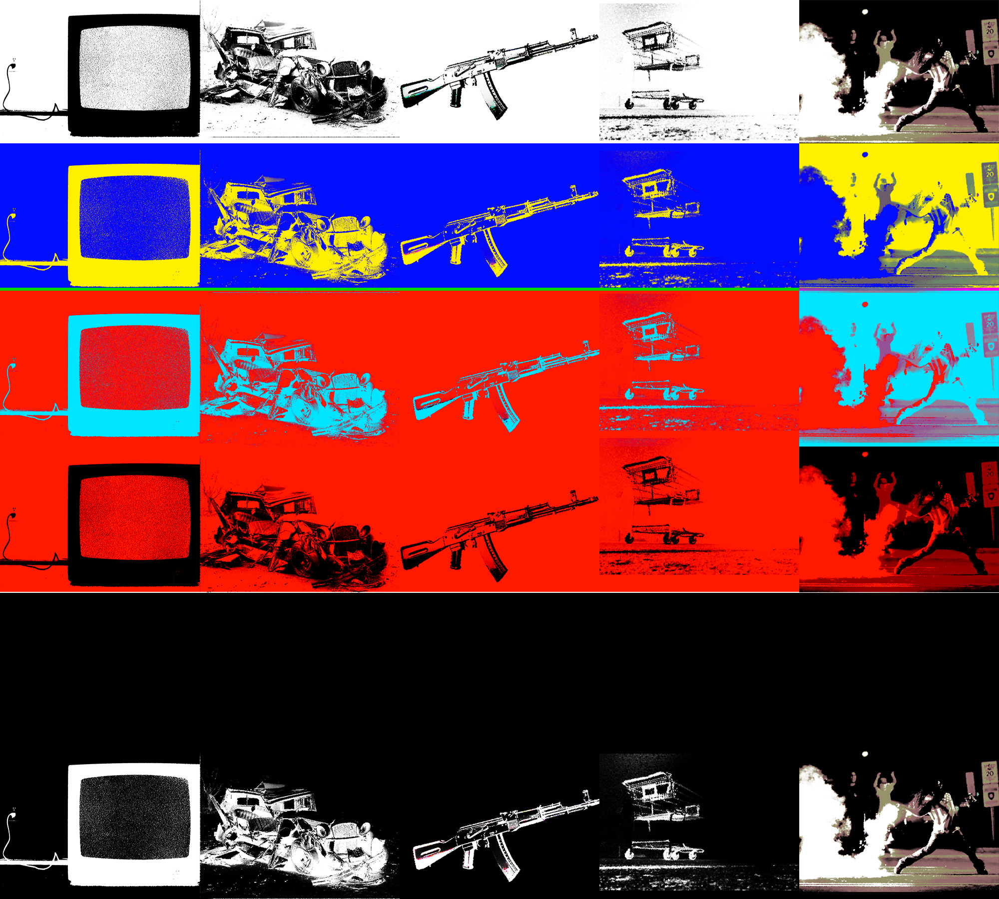
Using the techniques of pop art, "How Far We've Come" uses bright basic colors and repetition to highlight some of the ideas - TVs, cars, guns, consumerism and riots - that we have desensitized to but is very relevant to where the world is today. The artist Anna Tan wants to show that nothing is either good or bad; there is a multitude of colors associated with everything humans do.
The artwork is also planned chronologically vertically. While the lightness on the top represents the innocent responses people have when the ideas were first introduced, the descent into blackness represents both the negative sides that become obvious as time goes on and the variety of responses people start to have. The empty row is the time of reflection and destruction. The final row of the negatives of the original photos is a look back at the past to see "how far we've come."
Account of the process:
My outcome adopts a Warhol-style approach to photographs. I overexposed each photograph, giving it strong edges. I also added grains to imitate the idea of imperfectness inherent in Warhol's technique of silkscreening. I used very bright colors to elicit a response from the viewers. The photographs are repeated vertically, both echoing the song's repetition of the theme "how far we've come" and provoking the viewers with intentional desensitization. The fact that every photograph is different in each row, however, corresponds to the different and unintended effects the ideas in the photographs have and the different ways we respond to those ideas. The horizontal arrangement dominates the vertical arrangement, because I wanted to use the coldness of horizontal lines to emphasize on the devastating element of the song.
The first row of black and white photographs represents how we often first perceive a new idea - either black or white. These responses are often simple and uninfluenced by external forces. The blue strip contrasted with the yellow filling, a combination of both warmth and coldness, an idea introduced by Kandinsky. The subjects are yellow, corresponding to how we might find these ideas to be positive to human progress. The two red strips are much heavier than the previous two, increasing in the seriousness and coldness. The black strip is the coldest part of the composition, void of any photographs. I wanted it to represent emptiness, corresponding to the lyrics "the world is burning to the ground" and "there's nowhere to run to." It also is a time where we become desensitized, and we no longer care about how we perceive the ideas. I wanted this space to be a space of reflection for the viewers. The final black strip uses the negatives of the first row, emphasizing on how contrasting our opinions on the same ideas have changed drastically.
The black strip with no photographs is there to offset the balance and predictability in the composition. The lack of patterns for the colors is also to create a more spontaneous feeling to the artwork. I wanted to create tension by doing so; the composition itself should evoke a feeling of uneasiness. Drawing from Dondis reading, spontaneity is "an emotion-fraught technique," provoking the viewers.
For the placement of the photographs, I chose to place the TV on the leftmost column because when the composition is read left to right, the TV is read first. The TV played a big role in how we perceive the other ideas and in the desensitization of the other ideas, so I wanted to give an impression that the TV is changing the colors of everything else.
When I presented my initial idea for the composition, it was suggested to me that I should focus less on the big events in human progress but the smaller objects that have big effects. The comments also suggest that desensitization should play a bigger role in the composition. Instead of depicting devastating events like the wars, I chose instead to step back and focus on what I am desensitized to in my everyday life, the mundane disturbances. The fact that the song makes me consider the good and the bad of human progress that I have taken as granted made me choose these specific photographs.
Reflection:
Looking at this composition, I know that the colors are very important. I know that the heaviness of the color red and the coldness of the color black are essential to this composition because of the space each takes. I notice that my eyes would fall to the black emptiness in the composition, and know that is because my eyes prefer a place to rest in the midst of the busy composition. I question why the artist chooses the specific colors and locations for the subjects. I look at the composition both vertically and horizontally, trying to see if there are additional meanings to the composition hidden in the arrangements. I can tell some of the parallels to Andy Warhol's style. I think the composition is successful in representing and evoking a reflection of where we are now as a society, because of the power of the colors and the subjects. I would prefer if the arrangement was considered further to enhance the message further. Before this semester, I had little to none experience with analysing visual art. I would probably think that this artwork makes me reflect about the roles of the ideas presented, but I wouldn't be able to tell that it is not just the choices of subjects that elicit these responses. I would think it is disturbing, but would not be able to pinpoint where that feelings come from. I would not look very deeply into why the colors are the way they are or reason about why the artist chooses the placement of the subjects. I might not even spend more than 10 seconds looking at the composition because I would not feel like I could understand it. Having learned about artistic techniques, I can now see much more intention of the artist and understand the feelings I get when I look at an artwork. Understanding how an artwork can be structured, especially by reading Kandinsky's book, allows me to be know what I am looking for in an artwork.
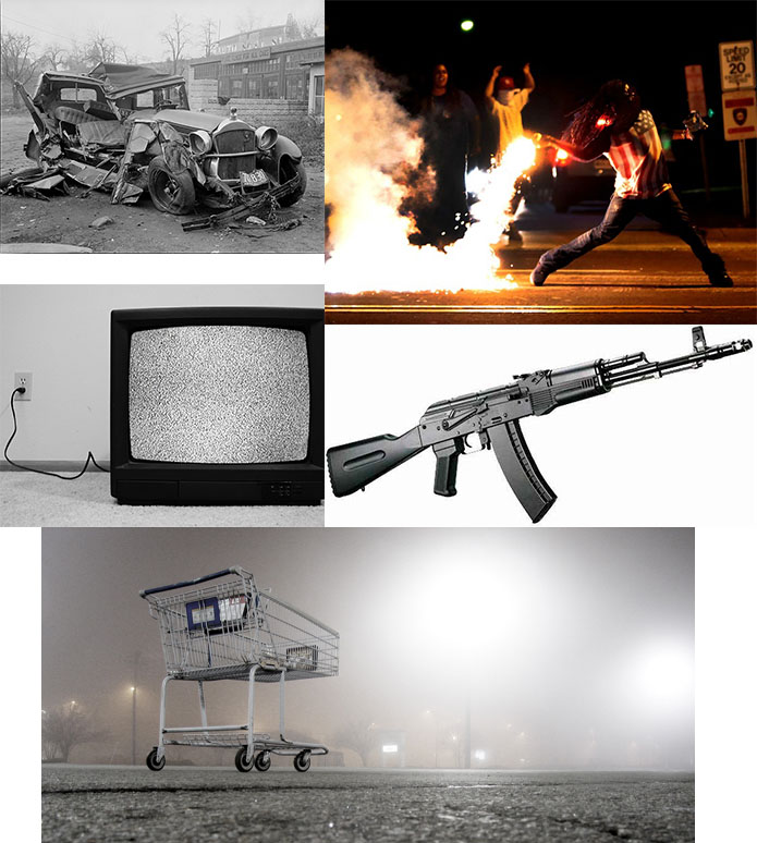
The images used in this composition: