Back to Parent

Outcome


For my musical piece I've chosen the song "Severus and Stone" by Radical Face. You can find it here (lyrics in description): http://youtu.be/JFgE7ELxEvA


This is an outline of a short film I would imagine going along with the music:

0: intro

0.21: winter treetops against overcast white sky. pan to snow drifted against them at the base of each trunk, howling wind blowing wisps of it through the air.

0.44: someone in a firelit cabin loads logs into woodburning stove. door and windows rattle with each gust of wind.

1.00: a boy lies sick in bed. pale, thin, sleeping restlessly with uneven breaths.

1.13: younger brother in the bed across the room lies awake worried about him. pan to candle on the table between them, a small clock. pan to snow blowing outside windows, frost creeps across them as darkness falls within room (candle burns down). pan back to sick brother, now still; clock at "just after midnight."

2.06: sick brother opens eyes calmly, looks around a bit and rises. "severed rings" appear around his head: several concentric circles of ghostly light slowly rotating behind him like a saint's halo in old paintings. he smoothly climbs out of bed, and there's a shot of his feet not quite touching the floor as he walks out of the room.

2.27: young brother's eyes spring open anxiously. he looks to the door, which is ajar, and there's a series of quick, short shots: young brother's feet hitting floor as he jumps out of bed, he throws open the door of the cabin, he stumbles into the woods outside.

2.49: flashes between younger brother running through forest, trees whipping past, snow flying with each footfall; and sick brother, who places his hands on a snow-covered tree with a forked trunk, slips up to sit in the crook, spreads arms out along branches to hold on as wind picks up even more, and speaks his lines (quietly, as if to himself, eyes downcast, but then raising them with a smile at the end) while snow gradually blurs out any sign of him.

3.11: closeup of younger brother's pale, cold face as he wakes up, then shot to show he's got the blanket from his bed clutched around him but is curled in the front yard just off the porch of the cabin. Shot of the blue sky; then his profile rises into it as he stands up; he turns slightly towards the doorway, in shock; then he looks out at the woods, numb.

3.39: shot zooms out and up, looking down at the brother from above, showing clearing around house, gently spinning until it's looking out over woods in front of house. pans over it, a footprint trail in the snow comes into view, and camera follows it to a tree like the one the other brother climbed in the dream. both brothers are sitting in the branches with their backs to camera, looking out over a view we can't see.


The song obviously has a strong narrative already. Since there's only a couple days to finish this composition, a video is probably unrealistic, so I have some decisions to make about how best to represent it with something more simple. A short comic in simple style (like Maus) might be feasible, or I could make one elaborate image similar to the one below, with the sick brother as the central (Christ) figure and halos behind him, snow-covered trees to either side, and his brother in the snow below.

http://i.stack.imgur.com/6UBfv.jpg


Ideate001.thumb
Show Advanced Options

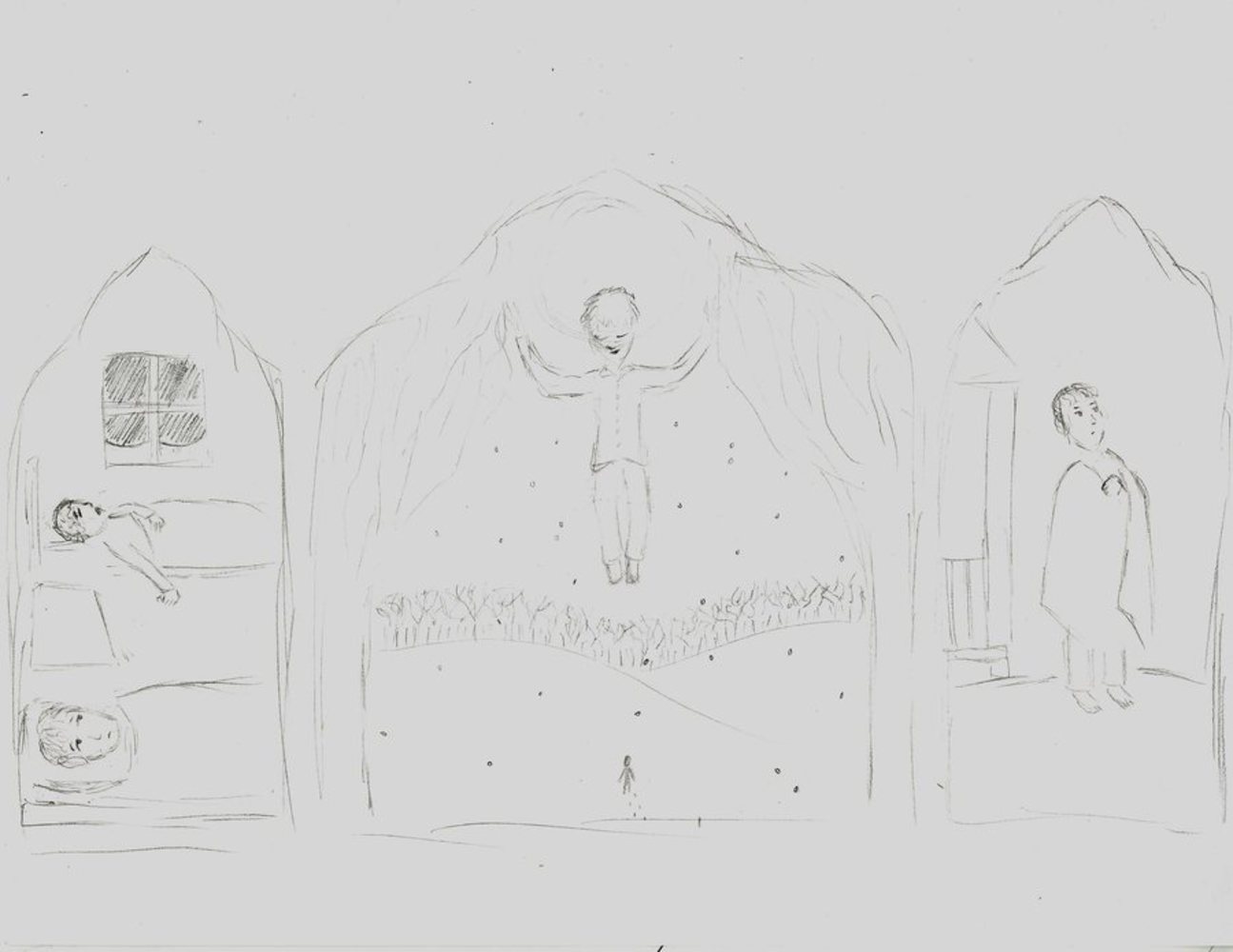
As a compromise between the comic and single image ideas, I decided to go with a triptych, a composition of three scenes. This is a sketch of my plan for the piece; the final composition will created in photoshop by piecing together several photos, paintings, and images from the internet.

The scenes are chronological from left to right, with the center being larger as it depicts the main part of the narrative. The smaller panels to either side are kind of the introduction and conclusion; the first sets the scene with the sick brother, and the last shows the end of the story with the younger brother on his own.

The leftmost panel will have an orange tint, like the room is light by a fire or candlelight, and the rightmost will have a slight blue tint and be set against a bright, clear, blue sky. The center will have very low color saturation, being almost grayscale, as it's taking place outside in the middle of the night. Not only are these colors appropriate to the scenes, but blue and orange are also complementary, so I think having just a bit of these colors at either side will balance the overall appearance and not distract from the actual images and forms. The general lack of much color is also appropriate since (a) the whole story is set in the middle of winter and takes place mostly at night, and (b) the music is fairly simple and mostly focused on lyrics, without a huge range of sound or many layers.

Ideate triptych 1 of 3
Show Advanced Options
Ideate triptych done.thumb
Show Advanced Options

Account of the process:

Since I'm not great at drawing (or not as good as I would need to be for this project), I came up with the idea of piecing together the scenes I imagined from the vast array of images that can be found online. This is similar to Warhol's use of photographs from magazines that he then recolored and modified slightly for his own purposes. I kind of felt like a director casting parts in a play; for each visual element I had planned to be in the composition, I simply identified the item I wanted and typed that phrase into Google to find what the majority of humanity (at least the computer-owning part) "saw" when it thought of that object. Of course, then I had to select one image from the offerings that fit into the piece--it had to be shaped and positioned properly. It was like finding a compromise between the artist's vision and the public's reception.

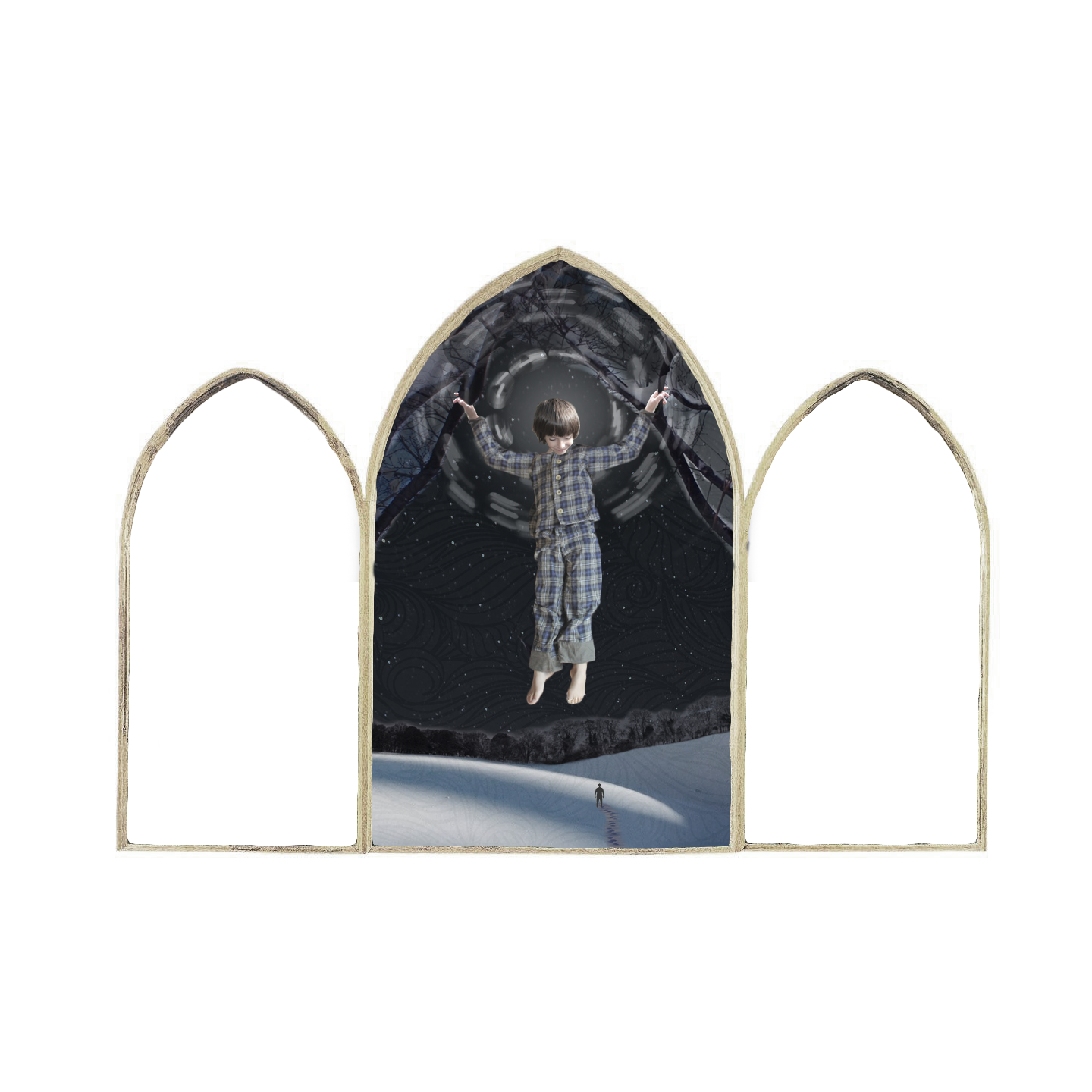
The first image above is the triptych with the middle panel complete. This panel alone took no less than 15 unique images to piece together, and it's somewhat apparent from the inconsistent lighting, but I blended them as well as I could and I'm happy with the result. The branches repeat the upward arch of the frames, helping focus even more on the brother's haloed head. There's a pattern overlay because I wanted something to show the wind, which is mentioned in the song lyrics and represented by vocals in between the lyrics at certain points. I think perhaps an actual photograph of snow blowing in wind would be more effective--the pattern doesn't quite fit the overall photographic style. It's also missing the snowflakes from my planning sketch, so perhaps replacing the pattern could kill two birds with one stone.

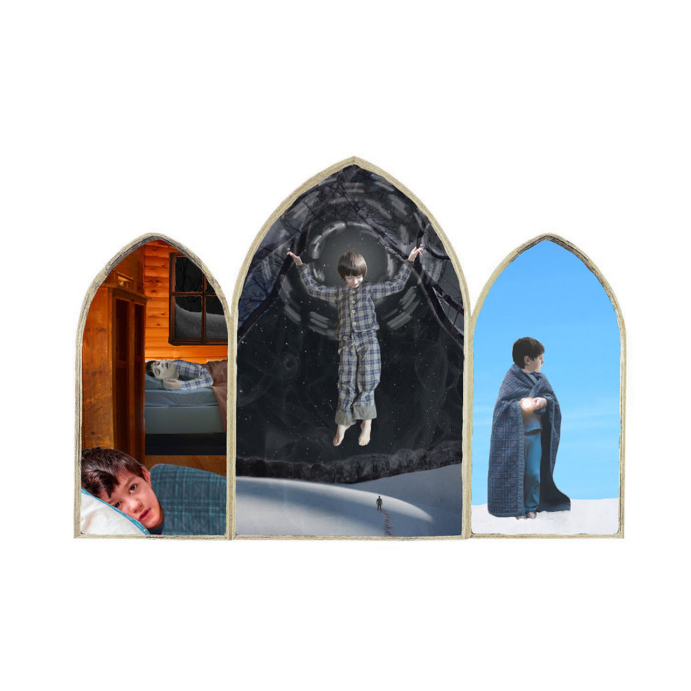
The second image above is the completed piece. Overall it looks a bit too patchwork for my taste--there's probably settings I could toggle for the whole thing that would bring the colors back together a bit, but I'm not sure what that might be.

I changed the "wind" in the center panel to steam, which suits it much better. I ended up using some blue in the left panel, which changes the color balance, but it was needed because the blanket had to be blue as it is in the last panel, and the sick brother needed cool colors because he's described as pale in the lyrics. I'm happy with the effect.

The people were really challenging to put together because we're very sensitive to faces and anatomy and can easily spot when something is "off." It was also really difficult just finding pictures of people in the right poses, and people who looked enough alike to portray the two brothers, let alone the same brother across panels.

Curatorial Statement

This piece is the artist's representation of the song Severus and Stone, by Radical Face. Using photographs collected from the wealth of images online, she constructed a triptych of three scenes, corresponding to the three major sections of the lyrical narrative. The religious imagery evoked in the presentation (particularly the frame, which is borrowed from the San Giovenale Triptych, and the halo and Christlike positioning of the child in the center) recalls the spiritual impression of the music, with the personal quality of folk and the angelic choir that appears throughout. 

Reflection:

Overall I'm really happy with the result, although it took a lot more time than I had expected it to take when I started out. It probably would have been faster if I had been more familiar with photoshop. I think if I had seen this before I took this class, I would have been put off by the piecemeal appearance of the collected images, but now it makes me think of "cool" pop art prints.

Drop files here or click to select

You can upload files of up to 20MB using this form.