The song I chose was the famous theme song from the movie Requiem for A dream, Lux Aeterna (Latin for eternal light). It was originally composed by Clint Mansell. It has many different versions, but the one that people are more likely to have heard is the orchestrated version arranged by Simone Benyacar, Daniel Nielsen, and Veigar Margeirsson for The Lord of the Rings - The Two Towers movie. Below is a recording of that version.
Outcome
First of all, I'm going to have to break down the song I chose. What I actually want to represent with the song, is the sense of grandeur that the song invokes in you. It slowly builds up to it over time, and then fades back into a quiet lull, as if preparing for the next storm. Its a song that clearly distinguishes between the strong, fast parts and the calm, slow parts. Thus, I want to make a composition that also has this distinguishing feature, with different components having different weights, but still being balanced overall. The color and lighting both help to achieve such an effect, by having sources of light to represent the chorus of the song, and the areas around it being the pre-chorus.
This song can also be split up into 3 parts, with each part lasting approximately 2 minutes. Each starts off with a pre-chorus that is calm and slowly building up to its stronger counter-part, which it then ends off with. However, each part has a slightly different tone and beat has well. Also, when I was listening to this song, the emotions I felt at each part were different. During the first part, it is the first time that the sense of grandeur comes through in the song, and the dramatic tones instantly give of a chilling effect. But as the second part rolls around, the listener is prepared for the tone, and the buildup has been grim so far. The second part comes off as a journey, filled with sorrow and drama. The third part would be the climax, almost entirely made up of strong, fast elements. Despite having similar chilling tones, there is a definite sense of warmth as we listen to this part. The song is coming to a close, and there is a feeling of resolution.
In the end, I realized this song had two major concepts that I wanted to convey. One was that grand overarching feeling of brilliance you get when listening to it, and the second is the different emotions stirred up from the 3 different parts. I decided to make 2 compositions and merge them into 1 as the first involves combining all the elements of the song but the latter would relate to breaking them up. The final composition would show both separation and combination.
A sense of grandeur to me is something that is invoked by nature, especially after seeing the works of Ansel Adams. And so, I decided to make a composition with clouds. Clouds because I plan to use light and clouds have a very visually appealing blending effect with light. I've also seen many drawings where different colored clouds bring about completely different scenes and emotions. To this end, I decided to use Terragen, a photorealistic scenery rendering software, that has been used in films like Ender's Game and Tron, to come up with a suitable image to visualize this song with.
Account of Process
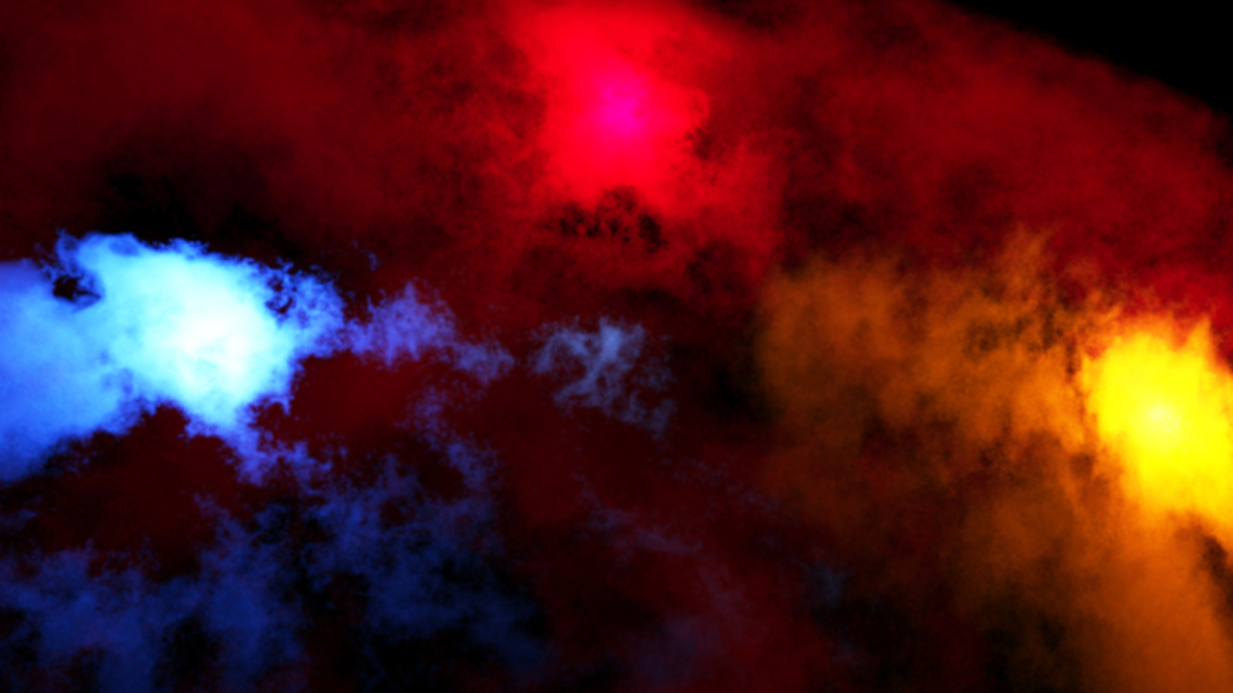
This composition represents the 3 major components of the song, each one represented by the 3 differently shaped clouds. In deciding which colors to use for the clouds, I followed Josef Alber's teachings on looking at the relationship between the colors and how different groups of colors affect people's perception. Many of his glass assemblages were useful when I was trying to decide what colors to use. Works like "Rhenish Legend", "Figure", and "Untitled" gave me a lot of information about color placement to work with. It was important that I choose colors that gave off the right emotions. The first part needed a chilling, yet bright emotion, while the second part needed a more grim, angry one. The last part, would need a warm color. For each, there were several choices, but I ended up going with blue for the first part, red for the second, and yellow for the third. One of the reasons was due to the popularity of the red-blue-yellow primary color scheme among painters. These 3 colors are in balance, and after going through Arnheim's readings, I think that in all of my compositions thus far in this class, balance has been the foremost thing I have been aiming for. Also, going from blue to red and then to yellow is also the same scheme that fire follows, when going from the hottest to the coolest flame. I wanted the image to be red left-to-right as Arnheim suggests, and I was hoping that this fact might influence people to do so sub-consciously. The 3 colors also fit the emotions each part conveys. Blue has a chilling effect but still has a brilliant hue. Red is the color of blood and always symbolizes anger, while yellow has a warm tonality and is also the color of the sun. Thus, these colors fit perfectly.
Next up, are the 3 light sources. Each light source is meant to signify the strong, fast chorus of each of the 3 parts. The parts shrouded in darkness are the pre-chorus elements and their being in darkness is meant to depict the calm, quiet lull. As we get to the strong part, I symbolize the grandeur of this part using the light. These were basically points of light. I also tried to arrange the position of the clouds and the light sources such that they are in balance with one another. With 3 points, you can form a triangle and so, I tried to place them such that an Isosceles triangle could be made out by connecting them. This was once again, simply just for the aim of creating balance in the composition.
There are also some other significant elements to this work. The red cloud seems to extend throughout the whole composition in the background, whereas the blue and yellow clouds are on top, and reside within a certain area. I crafted them in this manner because to me, the middle part (the red cloud) is the bridge connecting the beginning and the end. As I mentioned before, the second part of the song feels like a journey, and thus I wanted the red cloud to connect throughout the composition, and act as the connector between the blue and yellow clouds. In addition, the blue cloud seems to fade away as we go from left to right. There are still small patches of blue in the middle, but they completely fade out as we go further right. This is because in the song, the chilling effect we get at the start subsides as we get to the middle, only to be replaced by other emotions. As such, I wanted to depict that by having the blue cloud slowly decrease in size and fade out as well.
In my initial draft, I simply had a light source there to add lighting to the photo, but in my feedback, it was mentioned that having an element to represent the chorus would add depth to the composition. In addition, the idea of having the light act as a pulsing light like the kind you see in thunderclouds was brought up as giving more visual appeal to the composition. I liked both suggestions so I incorporated both into my composition as mentioned above.
Account of Process
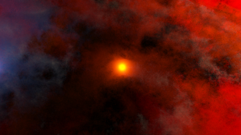
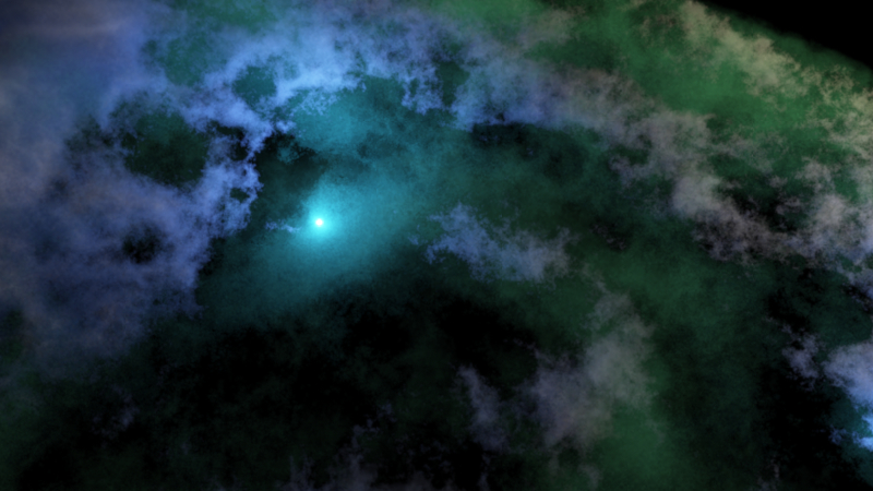
This work is meant to signify the song as a whole. The composition was also inspired by the meaning of the song's name in Latin – eternal light. The point of light in the center is supposed to signify such a light. Despite being surrounded by dark, ominous clouds on all ends, it still shines bright. The light itself represents the strong element of the song. Most people have never heard the full song; only part of it in various trailers since the song's inception. That is because the song is most famous for that small part, about a minutes worth of some of the emotional and strong music ever. That is what the light source is meant to signify. It is in a way, the eye of the storm, surrounded by the clouds that make up the rest of the song, all the calm bits as well as the buildups.
Orange-yellow clouds seep through the entirety of the background, and can be both seen as coming out of and going into the light. The orange clouds are meant to signify the pre-chorus elements which occur both directly before and after the chorus. As such, the clouds are supposed to be seen as both emerging from and returning to the light, as the light is the chorus. The blue cloud in the top left corner acts as a direct contrast to the red one on the bottom right. This was meant to be a sort of balance, with the two counteracting each other. These two clouds show the two conflicting elements in the song, the slow and fast parts. I chose red and blue, partly because that pair looked aesthetically pleasing against the orange-yellow clouds, but mostly because most people tend to think of red and blue as opposite to each other (red team-blue team concept using in many games and even army/security training). There are also greyish, ash-colored clouds wafting around to give the red and orange clouds more substance. I used one of Josef Alber's suggestions here in that even placing a small pint of color alongside other colors can affect the hue and perception of those colors. In this case, the grey clouds give the red clouds a more volcanic-red color. With the light source in the middle looking like the mouth of a volcano seem from the top, the overall effect of the color of the clouds became even more pronounced.
In both my compositions, I used lights and freely flowing cloud shapes but one of the main aspects of both are the points of light. Kandinsky kept on iterating on how simple points and patches could serve make a photo, and that was what I tried to achieve with this composition. With this song, lines and concrete shapes felt like they would not be able to do it justice. As such, I went with points instead, which have boundless array of color, form and variety.
In my feedback, it was suggested that perhaps a more volcanic-red color with ash clouds would fit the theme of the song, due to its Lord of The Rings origins. I tried it out and I felt like it was definitely true for parts of the song. However, it wasn't symbolic of all aspects of the song yet so I added in the blue cloud to symbolize the parts of the song that were still calm and served as the buildup.
Lux Aeterna, Latin for Eternal Light, is one of the most famous compositions of the 21st century. Originally composed by Clint Marshall, a fully orchestrated version was arranged for by Simone Benyacar, Daniel Nielsen, and Veigar Margeirsson for The Lord of the Rings - The Two Towers. This is the version that the artist, Roy Koganti, was most inspired by, and thus chose to craft a visual composition for.
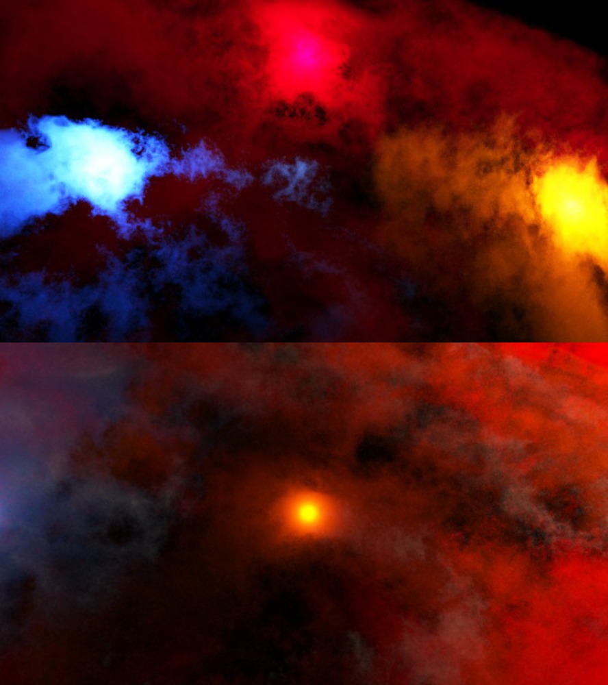
Hoping to share with others the same sense of grandeur and emotion he felt from this song, the artist worked on two separate compositions that eventually became a singular pair for Lux Aertena – Separation and Unification. While both serve the same intent, they do so in two wildly contrasting manners.
Inspired by the works of Ansel Adams and the awe-inspiring photos of nature he took, the artist uses clouds and light to compose the two art works. To achieve his desired effects, the artist makes use of Terragen to synthesize the clouds and compose the works.
Separation is meant to depict the subtle shift in emotions that a listener goes through as he listens to the song and does so using distinct colors for different clouds. Unification signifies the grandeur of the song as a whole, unifying the different elements of the song together with a feeling of brilliance. Stemming from the teachings of Josef Albers, the artist uses placement, light and different colors to invoke the desired emotions in viewers. The artist also uses points extensively, with different form, color and relativity.
This pair of artworks aspires to help the viewer understand and appreciate the song even more by using the same techniques of separation and unification as in the compositions.
When I first look at Separation, my eyes instantly fell upon the patch of light on the blue cloud. The 3 patches of light all stand out, but the blue one caught my attention first. From there on, my eyes slowly wandered on, from left to right, to the patch of light on the red cloud and the one on the yellow cloud. This follows with Arnheim's notion of left and right, where people are much more likely to have heightened attention to the left side, while having more articulate vision of the right.
The patch of blue light feels very ice-cold, and yet at the same time has a sense of beauty and glamor to it. As my eyes moved over to the red cloud, I felt a sense of grim foreboding, almost as if something bad was about to happen. My attention did not instantly shift over to the red light, but rather, they seemed to follow some sort of invisible path from the blue cloud to the red cloud, heading right through the darker regions first and then, almost as if drawn to the light, heading straight up. It feels like a journey through the art work, and this part of it felt tense. As I looked at the red patch of light, I definitely felt a darker breed of emotions at work here. It seemed almost alive with energy, but dark and stormy at the same time. As my attention moved on, my eyes once again were drawn to some invisible path from the red cloud to the yellow one, going right to the top right area of the photo and then heading down to the yellow patch of light. The yellow cloud is interesting in that despite going through the darkness to reach the light as well, there is a warmth about this path. It feels like the climax of a story. Perhaps not a happy one but there is a sense of finality and resolution, and acceptance with it that and my spirits felt almost lifted as I looked at it, especially after the red cloud.
As I take in the photo as a whole again, I definitely see the idea of a journey being played out across the photo, with the blue and yellow clouds representing the start and the end respectively. The red cloud seems to connect both and extends throughout the background, giving it the role of the body. Overall, it almost feels like a depiction of an epic saga of sorts.
Unification was a wildly different experience. My eyes were instantly drawn to the only source of light, the main point of yellow shining brightly in the center of the piece. It almost seemed like a mini-sun, with the same blend of colors but its size made it seem more like the moon instead. As I look at the cloud surrounding it, I get a sense of grandeur, calm and storm. It feels counter-intuitive to have both calm and storm but the contrasting effect of having the light blue and volcanic-red clouds diagonally opposite one another results in such an outcome. The orange clouds below the red and blue clouds have an interesting effect of seeming to both be emitted from and heading into the light. It feels like the orange clouds are both giving energy to the light and feeding off its energy. The light in particular is interesting because when I remember the song and play in back in my head, the light looks and feels animated, pulsing with energy as I look at it. Perhaps this is an effect of being surrounded by the various colors that it is, especially the orange, thus affecting my perception of it. Either way, I could relate the strong elements of the song with the light by the end. The rest of the composition seemed like a buildup to the light, almost like a storm around it, giving it power.
At this point, when I look at both images, I can feel the emotions and the sense of grandeur they convey. Before this semester, I think that those same feelings would have be invoked in me. However, I would not have been able to give a concrete explanation as to why. When it comes to Separation, my eyes would most likely still head from left to right, following an unseen path from the blue to red to yellow lights. I think the blue cloud would have the same chilling effect and the red would seem dark and stormy to me. But the yellow cloud might have seemed out of place to me back then, as I usually associate yellow with happiness, but it does not feel like a happy journey or narrative at all. Now, I would realize that the warmth coming from the yellow does not signify a happy ending but rather acceptance and resolution. There is still darkness in there, symbolized by the darker regions of the cloud, but light as well at the end of it all. I would also have believed that the picture as a whole looked like it was in balance, but I would little to no idea why. I would not be able to realize that the interaction of the colors, the placement and visual weights of the clouds, and the triangular position of the lights all contribute to this fact.
Unification would be a similar story. I would look at it as a whole and see the center light source as the main focus of the piece. I would then look at the clouds surrounding it and view them as complementary to the light, meaning to give it substance. As a whole, I would come out with the same feeling that the light represented the strong element of the song somehow, but I would not really be able to answer how. Also, I might feel that the blue cloud was a bit out of place with the colors of the other clouds. I would not have associated the red cloud as a contrasting counter-weight to the blue one.
The reasons for this are pretty simple when I think about them. Previously, I had no previous experience to draw upon when making these observations, nothing to compare them to. I didn't know many of the concepts such as weight, the importance of balance, the interaction of colors, and many more that have now increased my visual literacy. Now on the other hand, I can see the meaning behind shapes and colors, why certain components of a piece might be composed in that manner and I can glimpse into a bit of the intent the artist had behind that composition. I can decrypt such compositions with greater depth and accuracy than before as a result of the class, and that has also helped me to encrypt my compositions with my intent in much more abstract ways than before.
You can upload files of up to 20MB using this form.