Simon & Garfunkel's "The Sound of Silence" has long been once of my favorite songs, and it has a pretty clear message which ties in to a number of things we've discussed in class, so I thought it'd be a great choice to base my piece on. The Sound of Silence is all about "the inability of people to communicate with each other, not particularly internationally but especially emotionally, so what you see around you are people unable to love each other," as Garfunkel put it. Given that the module is focused on visual literacy, which is all about being able to communicate on a deeper level, it seemed a very appropriate fit. I was intrigued by the "neon god", and how that relates to the McLuhan reading. Where art tries to make communication better, technology opts to try to make it easier. This gives us many more tools to communicate, but none of them better than real human interaction. However, we allow technology to change us so easily that our ability to communicate can be hindered by technology, as we will choose to communicate in the manner which is easier for us than choosing the manner which allows us to convey the most. While the effects of this can be seen in the facades we create for ourselves in social media and other forms of less personal communication, I decided to focus on television obsessed culture, since it is really the grand-daddy of these issues, but it is old enough now that we can look at it more objectively.
Outcome
Research
Pop art and television have always been pretty close, as we saw in the documentary on Andy Warhol, but finding something similar to what I have in mind has been rather difficult. Lots of criticism of television culture can be found in comic strips and the like, but I'm having trouble finding it in fine art. This could possibly be because it's a tad cliché, but it's possible I could try to use that to my advantage.
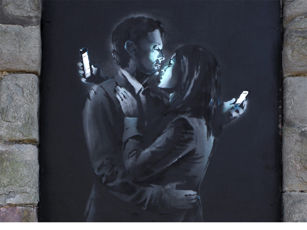
It seems Banksy has done something with similar ideas, however. Per feedback, I looked into Bill Viola, but his work all seemed very religion based, which I wanted to move away from slightly as I felt it was overpowering what I was really trying to talk about. I also had to do some research to decide on colors for the second round of compositions, where I found a number of articles about "drunk tank pink" being a calm or pacifying color. I found this surprising as pink is basically a shade of red.
Initial Ideas
I went through a number of iterations of my initial idea before arriving at one that I think has the most potential to be expanded on. These are all sketches of my ideas in photoshop. The final piece will also likely be created in photoshop, but I will probably use primarily brushes and go for a washed out water color look with pencil for detail.
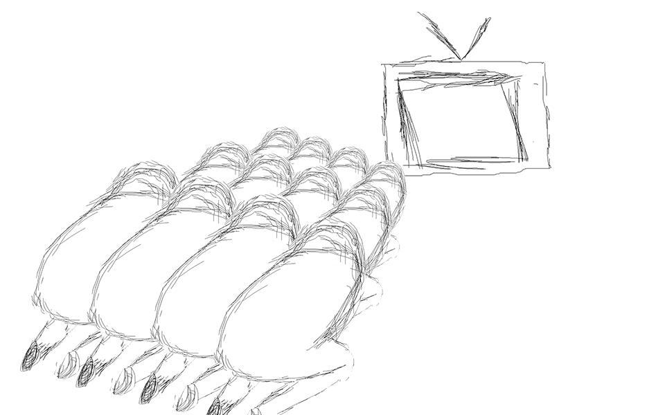
This was my original sketch, but it felt overly cliché, and I didn't feel like it was talking about communication. It felt like it was more about idolizing technology, which isn't really what I was going for. I was trying to use repetition to create a feeling of people just being faces in a crowd when you never take the time to get to know them, and the television was positioned to try to create instability and make the image feel uncomfortable.
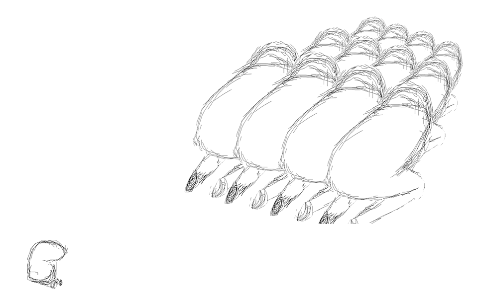
From there, I tried to refocus it on communication by adding a smaller being and trying to make it look sad and ignored. I removed the television entirely in an attempt to avoid making it about worshiping technology, opting to be more broad. However, having nothing there removes the context, so it's less clear what exactly the large beings are doing. I also lost that feeling of instability from the previous composition, which was unfortunate.
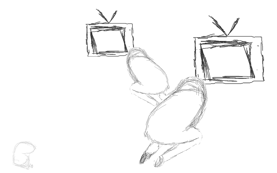
I didn't feel just adding the tv back was going to be enough, so I decided to drop the number of larger beings down to two, creating a feeling of a family type unit, positioning them such that they were completely ignoring each other as well, and positioning them for instability. I also wanted to play with contrast to give the televisions more weight, and to give the small being the least amount of weight to drive the observers eyes towards the televisions and away from the little being. I liked this one the most, and felt it had the most potential for the final piece.
Feedback
The feedback was extremely helpful, and lead to some pretty significant changes that helped a lot. For starters, just about everybody said to drop the TV's with a couple suggestions to adopt cell phones since they really embody singularity and isolation, and the second composition was generally liked more than the third. It was suggested that I drop the smaller being as well, as it didn't really add much. It seemed like the religious vibe was a lot stronger than I intended, as I was really more focused on communication, so I decided to make the obsession or worship of technology a little more subtle by having each of the beings holding a cell phone in a manner reminiscent of praying. However, since many usually hold their cell phones in this way, it is much more subtle than the kneeling in the previous compositions.
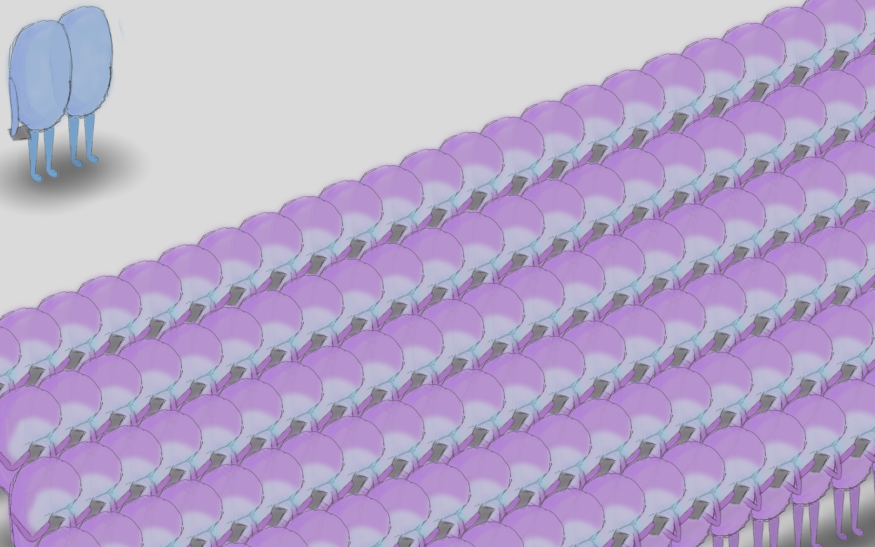
I didn't want to fill the whole page with them as I thought it would make the image unbalanced, so I decided to give a reason for the viewers eyes to shift there. For this I decided to represent Simon and Garfunkel, looking on at this silent mass as they "prayed to the neon god they made." However, I received more feedback that they weren't really necessary, and since I received the same feedback about the smaller being in the second sketch I decided it was probably sound advice, which is how I got to my final composition.
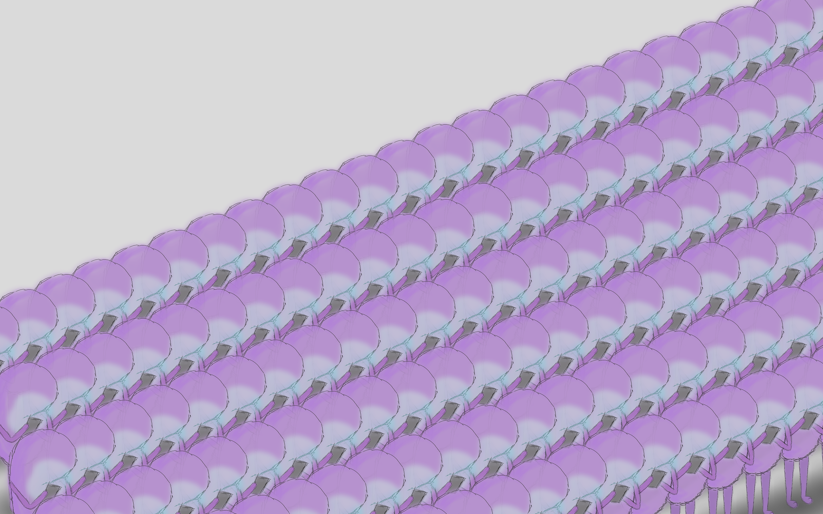
It was a pretty simple change, but I think it makes the whole thing slightly more insidious. Instead of the Simon and Garfunkel providing a means for the viewer to look at the problem from the outside, the viewer is forced to be inside the problem, looking past the entire, almost as if avoiding making eye contact with a stranger.
Analysis
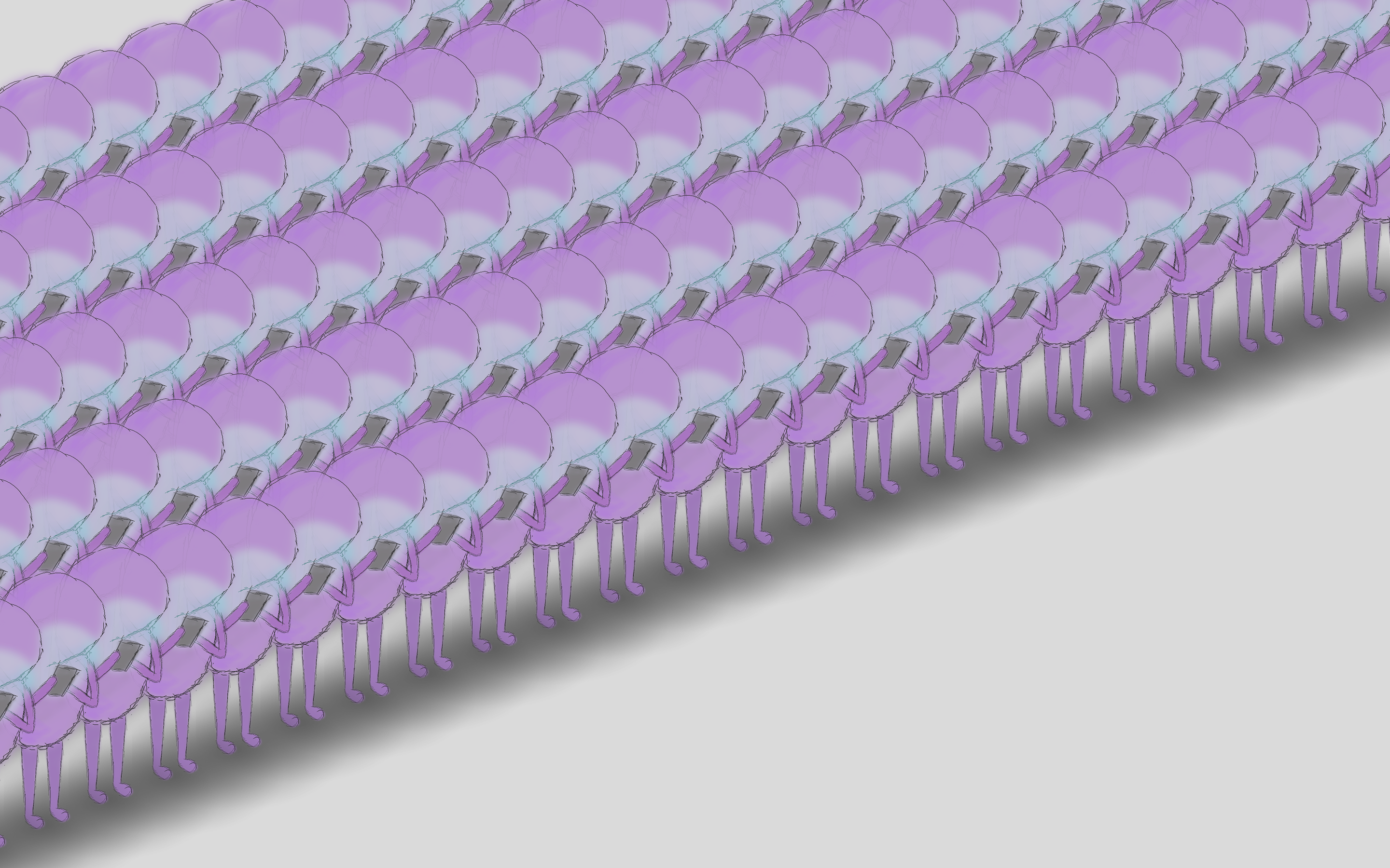
The repetition and lack of detail in the individuals in the crowd, slight transparency to each, and the positioning so that the brightest point is behind the crowd in order to draw the viewers eyes past them are all used to represent human contact being ignored. The reason for this is shown between the hands of each of the beings, as they hold it in a stance intentionally reminiscent of praying. The color is chosen to be similar to "drunk tank pink" based on some research on color, and is intended to be calming, making the individuals seems docile and passive. The line work is meant to juxtapose this; it is messy and gestural to create a vibrational energy and sense of unease. Overall, I'm pleased with how the final piece turned out, and I think it conveys what I intended fairly well. The feedback I received was immensely helpful in this, is the initial sketches were approaching what I was trying to achieve, but still a long ways off. I definitely think it would be interesting to see where I would have ended up if I had brought the final three pieces in for the Friday critique, but I suppose more iterations will almost always make something better.
"Neon God" by Jacob Slone is a response to Simon & Ganfunkel's "The Sound of Silence". It is a critical look at technology and how it affects our communication. Though technology can make communication easier, does the quality of this communication remain the same? If not, what does that say about us that we would rather communicate more easily than communicate more clearly?
The artist attempted to reproduce the feelings of isolation among masses by using symbolism with the cell phones, and by creating a crowd of indistinguishable, featureless beings that are almost transparent. These, accompanied with the compositional choice to draw the eyes past the crowd are used to mimic the feeling of looking past everyone in a crowd, avoiding to make eye contact so that you don't have to stop and speak with anyone, make this isolation feel like it has been chosen by the viewer.
The unstable composition and messy, gestural line work are used to create a feeling of unease, and are juxtaposed by the pacifying color palette in an attempt to make the piece feel somewhat insidious.
Overall, it is the goal of the piece to make the viewer think more critically about their relationship with technology and how it affects how they communicate.
You can upload files of up to 20MB using this form.
