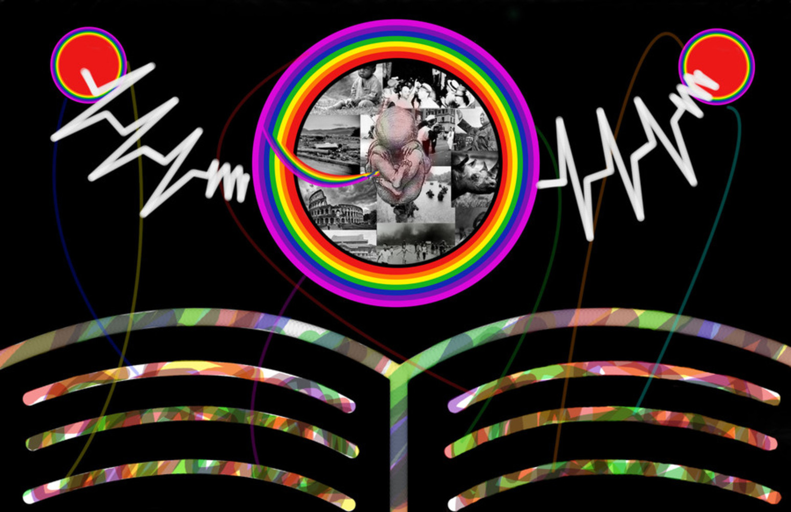
After hearing more opinions and reflecting back on the second draft, I came to the conclusion that there was just a bit too much going on in the composition. The book was very colorful, and the excess lines kept drawing the eye all over the picture, making it hard to focus. The wombs were also just a bit too vibrant, making it hard to view the content inside of them.
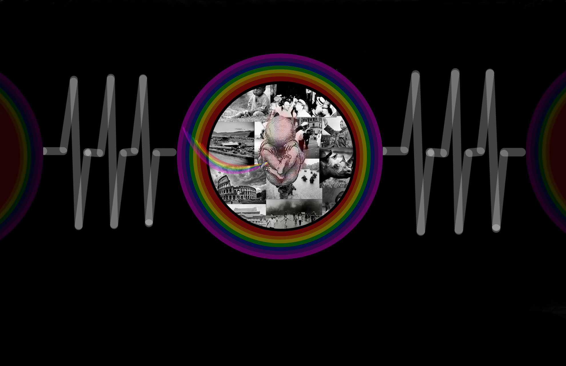
In this final composition, I decided to take out the book altogether once again. Although I would have liked to keep it, I couldn't quickly find a way to integrate it in a way that didn't seem out of place. Instead, the focus is placed back onto the central womb and fetus. I also reduced the opacity on the womb so that it is a bit easier on the eye, and gives a much softer feel to the composition.
The images stayed the same because I wanted to keep that wide range of elements. There are good things and bad things that happen in the world, but we are all a part of the world that has been created as a consequence from those things, and we should live knowing about them.
I kept the heart monitor readings in order to tie back to the three beats discussed at the beginning in the first prototype. This ties to the rhythm and repetitiveness of the song, and speaks to the cyclical nature of life. I also kept the two fetuses off to the sides, connected by the beats to represent how the way in which we live our lives will affect those around us and lead to the creation of a new, different world.
There are also some things that I didn't address earlier which many were confused about, so I will go into more detail now:
The reason why I placed the placed the images inside of the womb rather than outside is because the fetus represents us through all stages of our lives, not just a literal fetus that has yet to enter the world. We are constantly developing as we learn more about the world that we live in. There are no pictures outside because in the world we exist in is a world that resulted from everything that has already happened, and that is the world we see. The space outside of the womb represents the world that has yet to be created by the actions of those in the present. For this reason I also chose to make the background black, giving a sense of void.
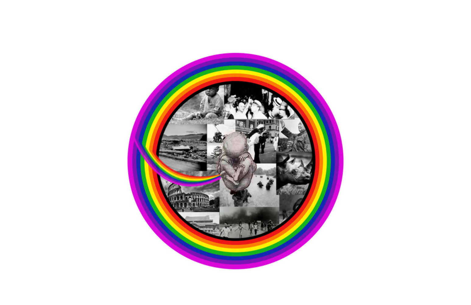
I chose to make the womb using all colors of the rainbow because it represents the visible light spectrum and more generally, sight. The pictures are black and white because they represent the raw information that we have presented to us. It is through our own sight that we give meaning to these events, and so that is why the color is feeding through the placenta, imbuing the originally black and white fetus with certain hues, turning it into a unique individual.
Curatorial Statement:
Children of the Earth is a composition based on the song, Children of the Earth by Ayur. It is a depiction of life and the world that we live in. It combines the power of photographs and computer composition to tell a story of us as people - as children of the earth. We are depicted as a fetus, something that is in a stage of rapid development and growth, because we are always growing and learning regardless of who we are. There is an overwhelming amount of information available to us in the world now, and when we expose ourselves to it and interpret it, we become saturated with new colors and become new people. We are all connected by a certain rhythm of life, and as we live and die in this cycle of life we influence others and create a new world for them to grow in.
Reflection:
1) How do you respond to the piece now?
I think that this piece conveys its message proficiently (although there is probably some bias there). When I look at the composition the first idea that pops into my mind is life, with the fetus and the heartbeats. I feel the weight of the pictures within the womb, and the expanse of information represented by it, but I get the sense that the fetus is not in danger, but rather absorbing the information and growing. After trying to compose this, I feel like I can appreciate the effort that goes into even simpler compositions more than before.
2) How would you have responded to this piece before this module?
Before this module I never really knew how to look at art. I had actually gone to the Carnegie Art Museum in the summer because I was here for summer courses, and I would look at paintings and images very briefly before skimming the curatorial statements and then moving on to the next exhibit. I don't think I would have taken the time to analyze why certain objects were more opaque than others, and why certain colors and shapes were chosen for the piece. I probably would have looked mainly at the pictures because I could relate to them a little better than the rest of the composition.


