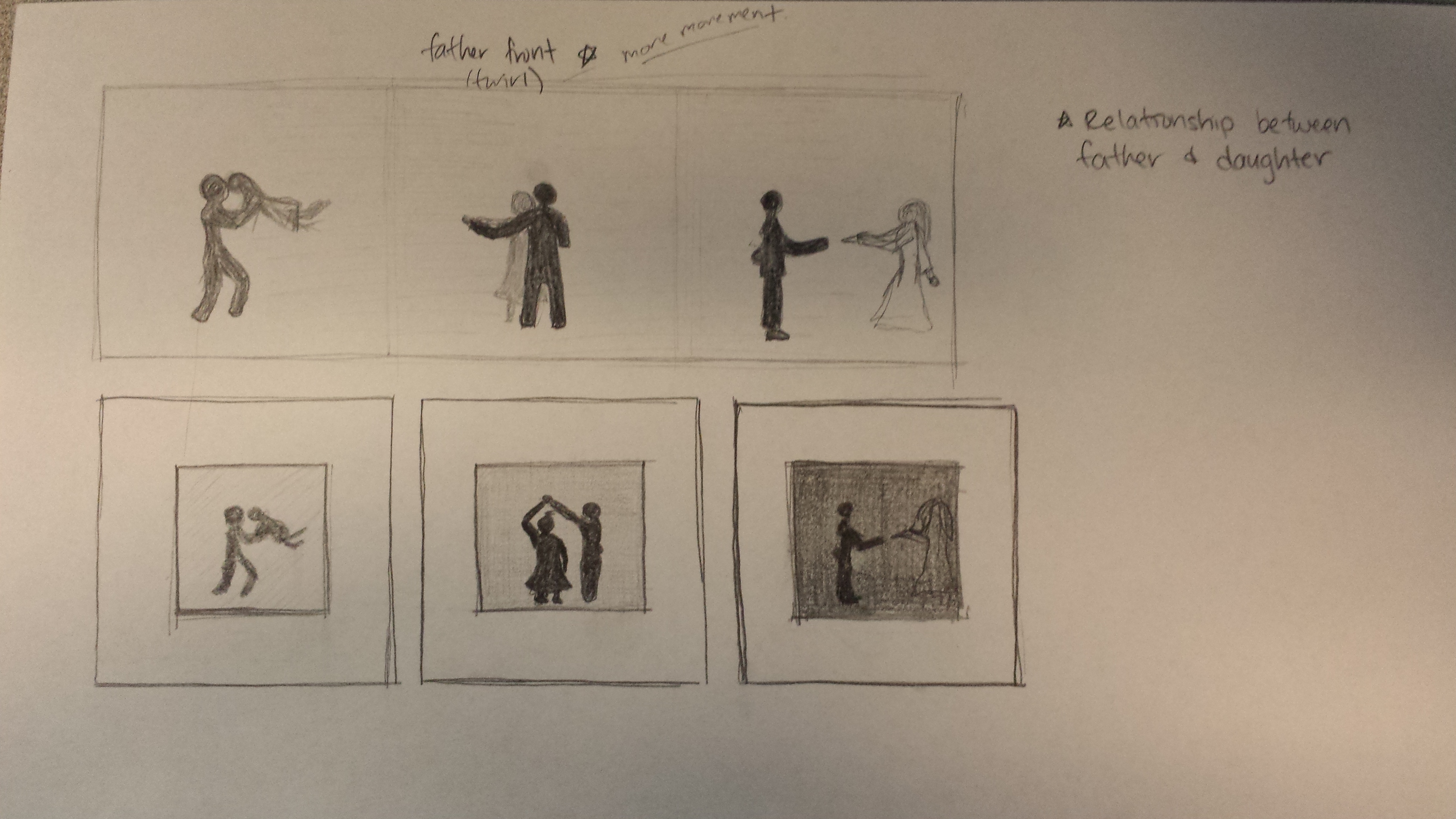
In the end, I chose to have a single composition because after looking at my prototype, separating the moments allowed each composition to be able to stand on it’s own. While they would have been juxtaposed next to each other, each composition in it of itself told it’s own story rather than having the story moving from one composition to the other.
After the initial ideation, I received some feedback and critiques from my peers. After discussing the advantages and disadvantages of working in black and white or color, I was challenged to create a color composition. I knew that some factors I would have to consider were the overuse of colors or using too many colors and choosing a fitting color palette.
Kevin suggested that I look to Kara Walker for inspiration in how she tells a story with her silhouettes. After doing some research, while I particularly enjoyed her pieces, the way she integrated different characters and elements together in a single composition gave me the impression that there were a multitude of stories going on at a time. In one corner two people were interacting intimately as someone else watched on from a tree that another person was sitting under and so on and so forth. Her pieces had such a rich scene happening simultaneously while I simply wanted to capture and preserve shared moments in time between the father and the daughter.
One comment I thought was really useful was to somehow show or represent the relationship and the love between the father and the daughter over time. Initially, I only had silhouettes of the father and daughter dancing together which would show that the daughter was growing up but it didn’t speak much about the love that the father felt for his daughter. It would help to show this because when the viewer gets to the end of the composition, they would understand the bittersweet feeling of letting your daughter grow up.
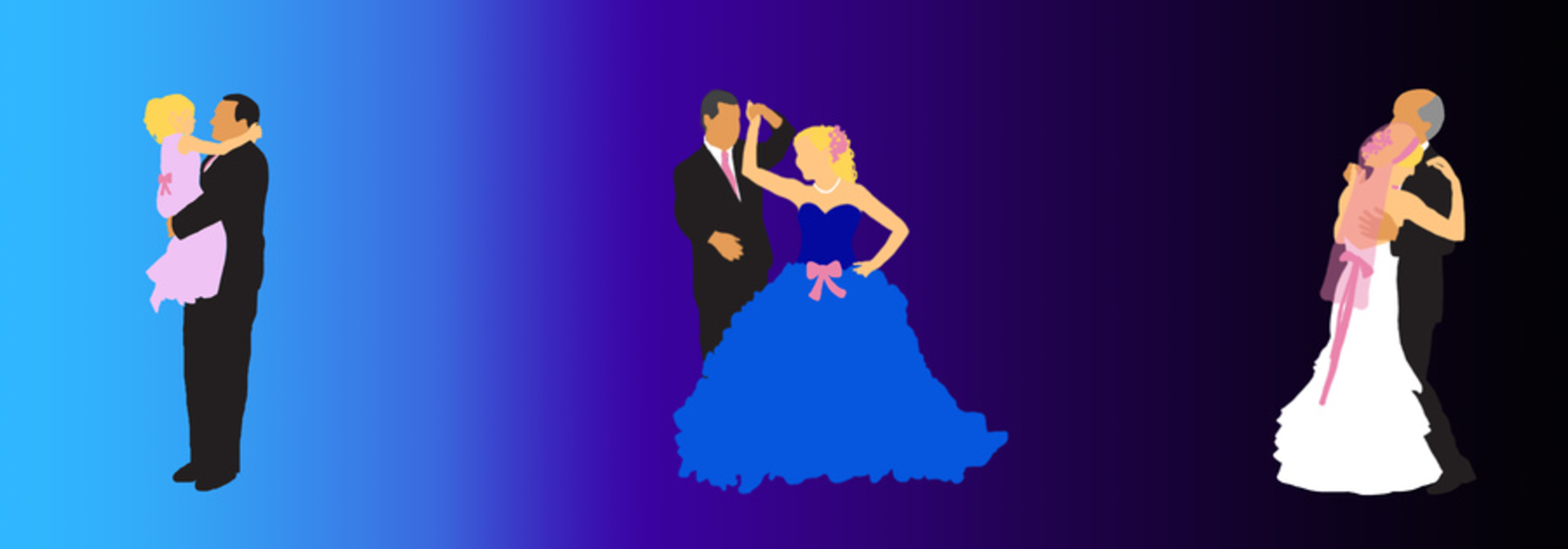
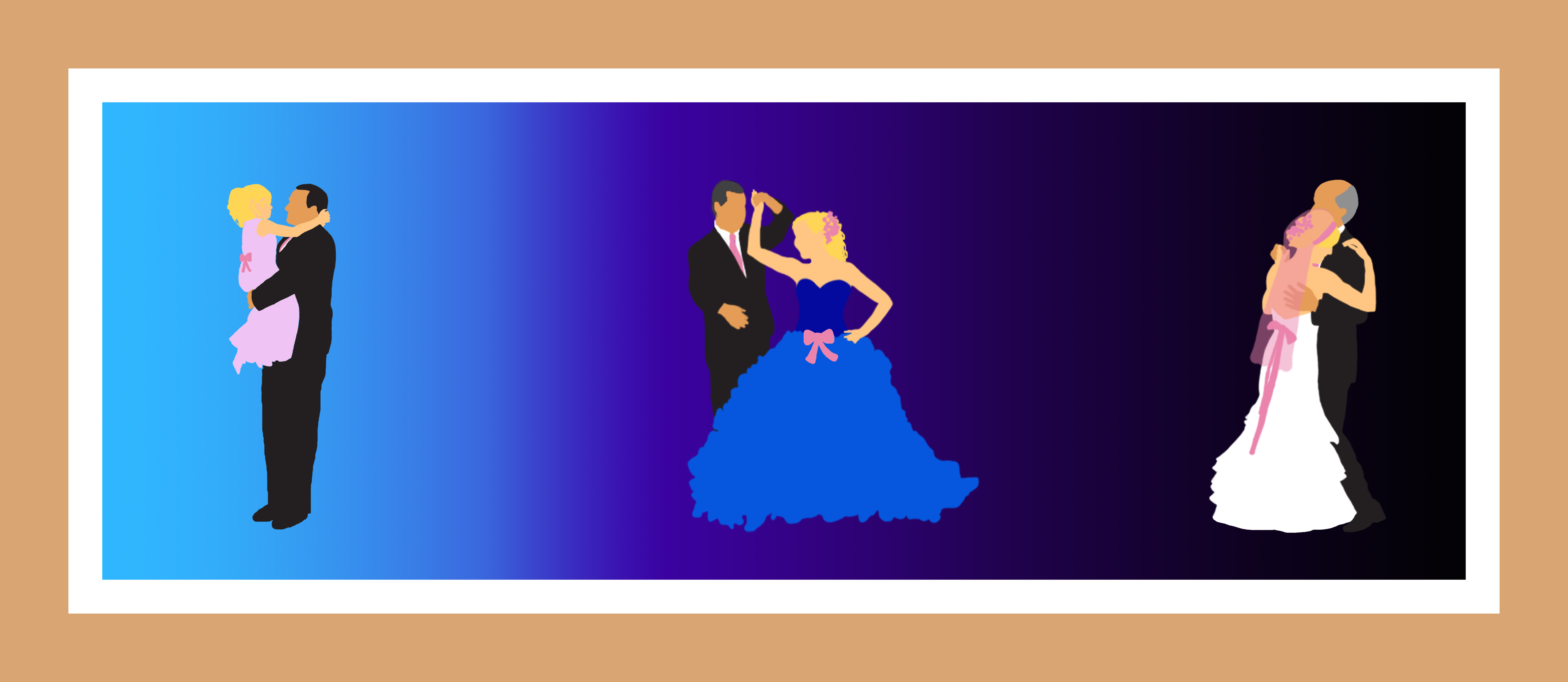
From that comment, I came up with the idea of having some kind of constant accessory that was present in each moment. For example, the father would have a pink tie and the daughter would have a pink bow. The issue with that was that there would be too much focus on the bow and people might treat the bow as a “cherished object” rather than representive of the love and relationship between the two. Instead I chose to add onto the pink accessories each time to show that the father continue to give more and more of his love to his daughter. In the second moment where the daughter is a young woman, she has the addition of a pink hair accessory along with her original bow and in the final moment, her wedding veil is the same pink as the rest of her accessories.
Another comment that was made was about the use of color gradients and because I was debating between keeping it black and white vs. in color, if I should transition from black and white to color to show that time was passing.
I definitely wanted to have some kind of color gradient in the background, but rather than going from black and white to color, I went from color to black and white. The reasoning is that I felt that the colors should fade away at the end of the composition (in this case they don’t fade but there are no longer any pointed colors besides the pink) because that is when the relationship would fade in the sense that the daughter is no longer his little girl.
In terms of working with colors, I knew for the adolescent stage of the daughter’s life, I wanted to use pastel colors to represent a childish demeanor which is why the background is a pastel blue and the dress is a pastel pink. For when the daughter is a young adult, I thought about a high school prom or formal and how it usually takes place during the night and so I chose a dark purple. For when the daughter is getting married, I saw how I had gone from a light blue to a dark purple and so I experimented and tried to continue going darker. In the end, I was happy with the result because I saw that the father’s black suit had began to fade into the darkness leaving the daughter in her white wedding gown as the standout in the moment. I thought that this was an effective tactic because I was so focused on how the father loses his daughter (because that is what the song was about) but seeing this made me think of how it goes both ways – the daughter is losing her father too. I also made the father’s hair become grayer through the composition
The result turned out like the following:


