Back to Parent

Outcome


Phenomenon

When we just got into college, we are not used to the new life. For most of us, time management becomes very difficult. We cannot balance our life and study very well which leads to bad consequences like "Freshman 15", which is putting on 15 pounds of weight in the freshman year. And not only for newcomers, almost everyone are facing time management problems everyday. Shall we go to the party or stay at home and finish our homework? Are we planning our work ahead or leaving them at the last moment?All these decisions affect us not only in short term like meeting deadlines but also long term like our health conditions. 

Why meaningful

Personally, I did a very bad job in time management in Freshmen year. I always procrastinated and tried to finish the assignment the night before the deadline, which leads to anxiety and lack of sleep. Also, I did not spend enough time in exercising and actually achieved the "Freshmen 15". Therefore, I am very concerned about time management and my life pattern, I started to record the things I do everyday and find out the reason why I put on weight, why I did a poor job in finishing the assignment and why I felt stressful all the time. I changed my life pattern and I become more organized and live much happier than before. So I believe it is very important to reflect on our life pattern to find out the reasons of our problems in order to make better decision to improve our life. A notable anthropologist called Paul Krassner defined happiness as to have little separation as possible between work and play. Do we balance our life properly? Are we feeling happy or tired everyday? These all has to do with our life pattern. It influences how we are going to optimize for our happiness and success.

Design

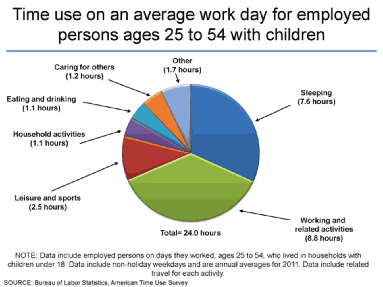
The following graph is an official statistics from Bureau of Labor Statistics. It shows that the average work time for an adult is roughly 8.8 hrs. And it is not hard to see, sleeping, working and other each takes about 1/3 of a day. 


Pic 1.thumb
Show Advanced Options

Also, according to the studies shown on the Nation Sleep Foundation, 7-8 hrs of sleep each day is best for our health. Considering other factors like health problems, different people may have different modes of balancing life, but broadly speaking, the 1/3 division of day time is a good way to show our life pattern. This project is supposed to be a mobile app that collects time division data from the user everyday (like synchronize from schedule or calender)and generates a graph which shows the life pattern of the user, so the user can reflect on the way the spend time in the long run. I will use three different colors to represent work, sleep and other activities. Work will be red, sleep will blue and other will be green. I am using RGB color mode rather than CMYK, that is, adding the colors together will not make the color darker or become black. And if the day is exactly divided by 1/3, that day will be white. The following graph explains the different between RGB and CMYK.


Cmyk rgb.thumb
Show Advanced Options

 The graph will be shown as a bar graph, showing the color of each day. From the continuous color change of the graph, we can see how much tension we have that months. And we can also zoom in to see more detailed information. The following graph will be an example of the project.


1.thumb
Show Advanced Options

When we click 8, or the color bar above 8, we can zoom in the see more detailed information, and when we click different part of the pie graph, like when we click w(work), we can see how long and what do the user spend on work that day. The color for the bar graph is basically the combination of color from the pie graph.

8.thumb
Show Advanced Options

This graph can be helpful and interesting, since life pattern various. For example, we may have procrastination pattern like the following, no red bar in the beginning and the bar get more and more red towards the last 4 days, which means the user leave a work that requires a long time to do in the last four days instead of planning ahead.

PROCRASTINATION PATTERN

2procrastinate 1.thumb
Show Advanced Options

Relate to the Reading

In order to accomplish graphical excellence for my project, I have a clear purpose for the graph, showing the life pattern of user and might help the user to figure out the following questions like why do I feel sleepy all the time? Do I procrastinate on work?Why do I put on weight?How productive and efficient am I this month? Should I continue to live like this or should I change a way to spend my time? Also,when the user is recording what they do that day help them raise the awareness of time management. To add, this graph shows the data accurately, the color helps to clarify the time division and the color can indicate the mood of the user that day. And presenting lots of data of time division in a clear and simple graph and the continuous color change makes the data look more coherent, which also helps the user the compare the data just by looking at the different colors. This map also has a broad view and and detailed structure. Help users not only to get a broad idea but also can refer to specific information. From the Reading of Viegas and Wattenburg, it indicates that forceful point of view is a powerful visualization of data that guides the viewer to a particular type of conclusion. I try to accomplish this in my project by using color scheme, since color is related to mood, red color normally gives people stress and tension while blue and green look more soothing.

Furthermore, my ideas are influenced by the time-series graphs from the graphical excellence reading, like the shifting balance of trade by the difference between the import and export time series graph designed by J.H. Lambert. It shows the pattern of the shifting balance of trade , using different colors to represent import and export, plotting them in a long period of time to show the pattern. I used the similar technique the show the broad view of time balance over time. My project is also related to the map of outgoing mail of the U.S. House of Representatives, which is also a time series map, showing a period pattern which help us to find a factor that influence the phenomenon. The goal of my project is to discover pattern and find out the reason that influence the pattern. Also, my design is also connects to the map of conductivity of copper, similar to comparison between temperature and conductivity, I have contrasting color for work and play.   

Feedback from team discussion

Last Friday during team discussion, my teammates suggested that I could use different color for work, sleep and other to generate a graph similar as heat graph. For example, when one day the user spend most of the time in working should be represented by a red peak in the map, the red color shows the tension of that day. And a day with mostly exercise may be represented by agreeable green. I found this suggestion very helpful, and therefore I incorporated the color idea in my design.


Show Advanced Options
Drop files here or click to select

You can upload files of up to 20MB using this form.