I find that too few people actively look for happiness in their life, whether it may be in their work or maybe even their relationships. Happiness is key in enjoying this short life to its fullest and yet sometimes it is not their top priority. People tend to overlook positive moments and dwell longer on the negative aspects of life. I would like to shift this outlook on life and hopefully encourage people to realize the significance of being happy. Through this data representation, I would like to make the people actively search for their own sense of peace and happiness.
Outcome
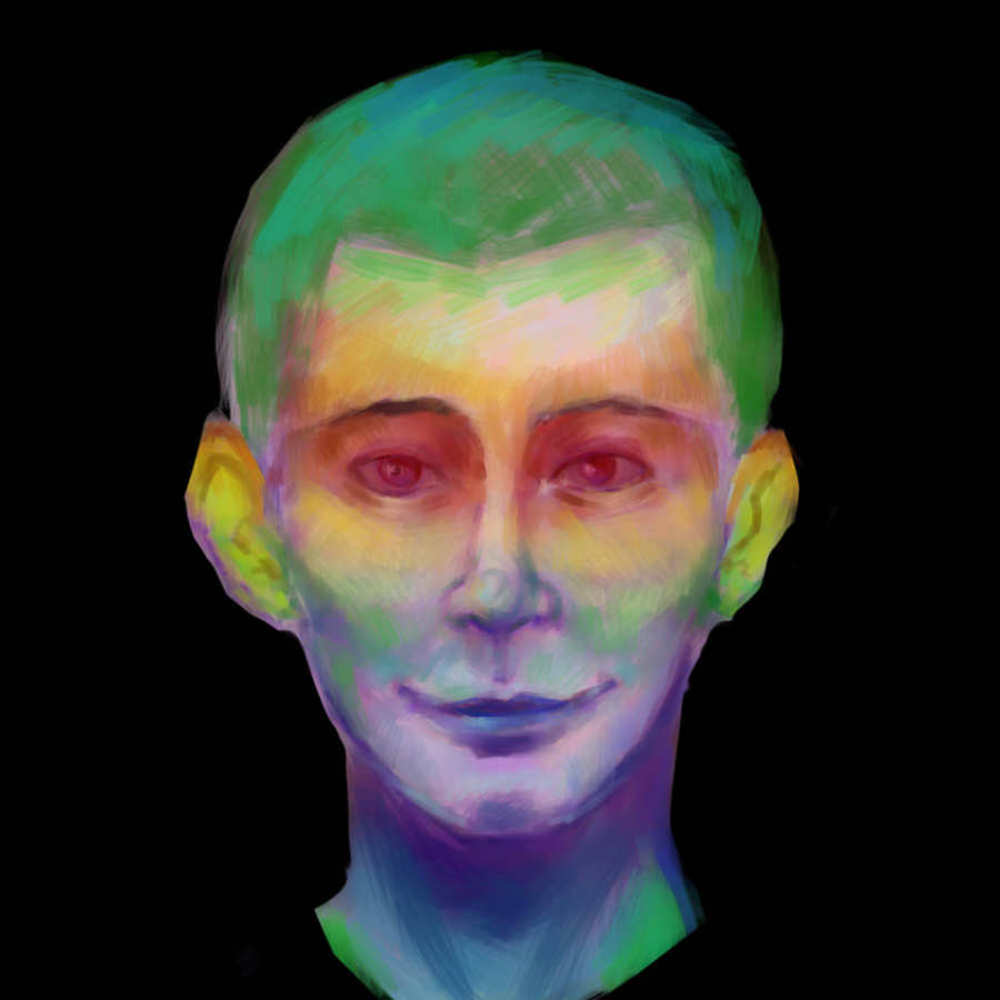
The collection of the data will be fairly simple. I will distribute surveys that ask with which senses make them do they process happiness the greatest (i.e. when they see something that makes them happy, when they hear something that makes them happy, etc.). I will collect this data and create a heat map of a head with colors ranging from red to blue. If most people tended to say a certain sense made them happy, a part of the face will glow red, indicating which sense it is. If it is not as significant to those being surveyed, that part of the face will be more towards the blue on the spectrum. For example, if people were to say that seeing something that made them happy was better than hearing something, the eyes would glow more towards the red than the ears would.
Through my data representation, I would like to emphasize the importance of a "forceful point of view." Viegas argues that the creators that use this idea "recognize the power of visualization to express a point of view." By creating a visual that leaves a strong impression when looked at, I will hopefully succeed in inciting and immediate reaction to this display. According to Tufte, in order to attain graphic excellence, one must "induce the reader to think about the substance" rather than the numbers and methodology behind it. Keeping this in mind, I hope to achieve Tufte's graphic excellence by carefully choosing these colors, the aspects I am measuring with and the overall shape of the representation to incorporate this perspective on visualization.
The choice of colors is supposed to resemble the heat and the cold. Heat is usually associated with warmth and comfort whereas cold is usually associated with bitterness and uneasiness. I also chose to use a human head as the base for this heat map in order to emulate a sort of intimacy with the viewer and the display, not unlike the idea behind the "Pulse Room." By having this head as the main visual, the viewer can relate to it and almost see themselves within the piece. Just like the "Pulse Room," I would like to immerse the observer into this piece and allow them to be reminded of their happiest experiences.
In order to establish this relationship even further, I chose the senses as a way to represent happiness because of how deeply rooted and instinctual they are in the physical body. These simple senses are the significant foundations of how we perceive and feel happiness. These aspects are very personal ones and are taken from data collected from each person. This concept is similar to Laurie Frick's Data Art in which she created "human data portraits" in order to create an "intimate understanding and expression of self through data." With my display, I expect to also allow for the viewer to better understand themselves and what makes them happy in order for them to realize and shift their perspectives on life.
You can upload files of up to 20MB using this form.