Background:
Around this time of the year is when many CMU students begin to seek summer internships, whether through TOC, TartanTrak or other methods. It seems hard, however, to get a good grasp on what it is like to intern at different companies. The long lists of reviews on Google, the varied descriptions from friends and the general list of where people go for the summer often offer either too much or too little information and are difficult to be efficiently parsed. As someone who is also looking for an internship, I wish there is some way for me to visualize internships at different companies and have enough information and a clear way to compare them.
Data Streams:
The data streams I will focus on include the all summer destinations for individual students and possibly alums, as well as their satisfaction with the internship on a scale of 10. I will distribute surveys to all students and have a chronological list, with the corresponding year level, of the places they worked at in the past and give each place a score. Once I have captured enough data, I would like to know for each year, how many people were at each company, what is the distribution of score for that company, and where people from that company went the next year. The reason I chose to do a survey is because I can possibly combine it with CMU’s own summer internship surveys; these surveys are often well-responded and sent to everyone, which is exactly what I want. I would be able to get a large sample size for my data and represent where people intern as accurately as possible.
Visualization:
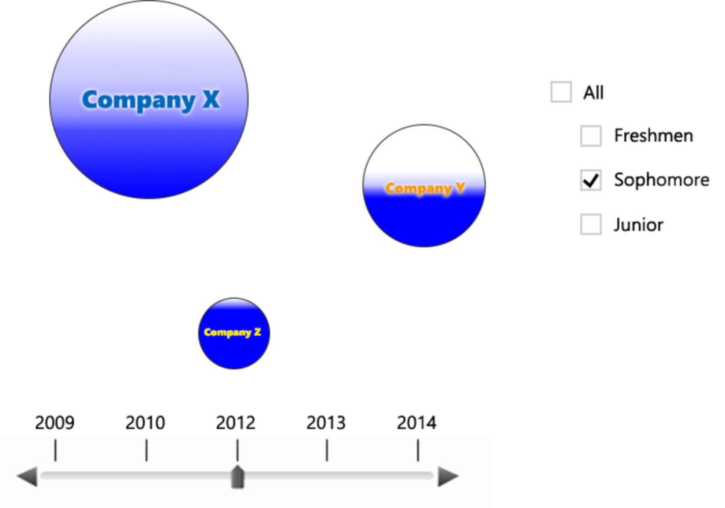
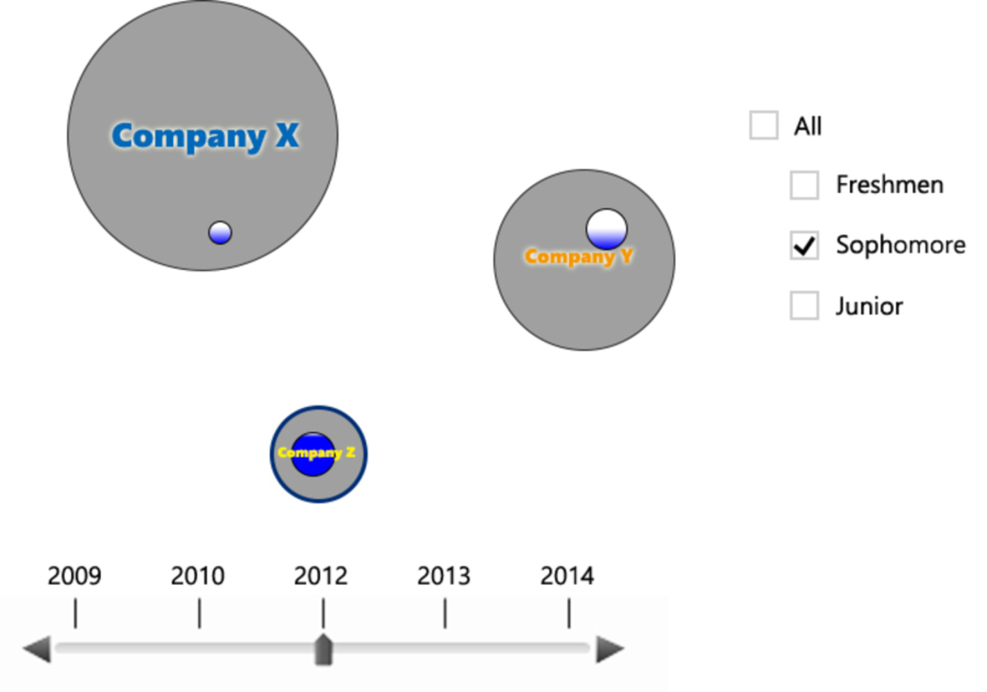
The visualization will both have visual outputs and viewer inputs. It will have different circles representing different companies. The circles would be organized according to the industry such that technical companies are closer together. For each circle, there is a gradient shading which represents how satisfied people are with the company’s internship; the bigger the darker area is, the more well-like the company is. There is a slider in the x direction for different calendar years, with which a viewer can interact and get the amount of interns at each company visually. There is also a list of different year levels the viewer can choose from to see what internship might be more well-liked by people of his or her year level. If the viewer hovers over one circle, he or she will get more detailed statistics about the company, including the exact number of interns for the chosen year level and calendar year and the average rating they give to that company. If the viewer click on a circle for company X, the circle will break down into smaller circles and move into other circles with animation to represent where interns at company X in the selected year went to the next year. All the original circles will be grayed out but adjusted to the sizes of the new year. The size of the smaller circle in company Y represent the number of people going to company Y the next year. The color of the smaller circle will be similar to the original circle, with ratings for company X represented with a gradient. When hovered over, it will show the percentage of the original circle that moved to company Y. If possible, I would also like to include an animation over the entire timeline of where people are going; it would be interesting to see how the movements have changed over time and possibly reveal the growth and preference change in some companies.
Why:
By making the visualization, I want to show people the diverse choices that CMU students have and make a more informed choice when applying for internships. While subjective description of an internship can be used to determine which internships are better, numerical data, such as the return rate for a company, the number of people working at a company and the number of people satisfied with the internships, gives a more clear view for students. I want viewers to focus on the size of the circles as well as the gradient in each circle; a very dark circle on a white background is usually more visually attractive than a light circle, so a company that is well-liked would pop out. I also want to encourage people to look at the relationship among the satisfaction people had at a company, the return rate for the next summer at that company and the size of the company, and explore any causal relationship among the three variables. The choice to use a more digital format that allows viewers to interact with the visualization is for presenting multiple layers of information without overwhelming the viewers all at once. It allows for a general overview as well as a more detailed view if the viewer desires it.
Principles of Graphical Excellence:
The data I chose to present if of interest of many students; either we are Google searching for internships or going to the TOC, there are often too many choices but too little time and resources for students. My visualization attempts to make complex data with multiple variables easy to visualize and understand, using colors and space to make the viewers focus on specific details of the visualization. My visualization saves ink and space by allowing viewers to reveal more information by interacting with it; the amount of ink is dependent on how much information the viewer wants. The data we collect are both numerically and visually represented, and the area of the circles stay true to the amount of people the circles are trying to represent.
Forceful Point of View:
My visualization uses contrasting shades and different sizes of circles to give the viewer always something that pops out or something that has details that he or she would look at. I hope that it embodies the data art’s forceful point of view as it lets viewers to discover causal relationships and facts that would not have been noticed otherwise.
Connections to Readings:
1. One of Viegas’ examples of visualization, the Wikipedia history flow, uses shading to represent the age of each piece of text in a Wikipedia article. My visualization also uses color as a dimension; it uses darker color to represent satisfaction of an internship and lighter color to represent dissatisfaction. Rather than making the lighter color to represent a positive characteristic, such as the high quality of the text in Viegas’ talk, I chose to make the darker color represent the positive characteristic because it forms a bigger contrast with the background and directs the viewer to the darker regions of the visualization.
2. Similar to the Napoleon Map, my visualization showcases the relationship between change over time and change in direction of people's movement. The size of the band in the Napoleon Map is analogous to the sizes of the smaller circles broken apart from the main circle when a circle is clicked on. These smaller circles also move towards other circles, giving a sense of direction.
3. On page 19 of the Tufte reading, the New York City’s Weather graph is described by the author as a “distinguished graphic successfully [...making] comparisons between different parts of data and [telling] a story.” My visualization also attempts to do these. By using showing multiple variables, such as the ratings and the sizes, in space, my visualization encourages people to connect these variables together with causation. It also tells a story by showing the movement of people (parts of a circle) and giving a timeline.
4. Similar to the small-multiple relational graphs (Tufte 37), my visualization allows the viewer to see the changes in the number of people and ratings of companies in different years, although rather than showing each time all at once, my visualization tries to save space by extending time.
Like Viegas’ Ripples, my visualization uses circles to represent part of the numerical data and to be organized into larger clusters according to their corresponding companies’ similarities. Using the size of the circle to represent the amount of some data people care about is intuitive to most people, and thus using different sizes of circles seems like a reasonable choice to represent companies. The ability for the bigger industry circles to intersect also provides a lot of flexibility in the placement of these company circles; unlike bar graph where it is hard to categorize any variables with multiple categories, a visualization with circles allows a circle that represent, say Microsoft, to be both a software company and a hardware company (among other categories).
Group Feedback:
My group gave me some very useful feedback about what data I should include and the ways to represent the data. My initial plan was to build a bar graph with smaller bars representing companies stacked on top of each other into a big bar, and graph it across different years. While this gives a good view of where people are going, it is hard to see the relationship between companies and nearly impossible to show the movement of people. My group thought that the return rate is probably one of the most interesting piece of data that I can show because it is not something easily found on the web. They also helped me formalize my goals for my visualization; they gave different ways that my visualization can be used by students and how it would help them.

