I have chosen to look at analyzing data involving video game usage, specifically figuring out when people are most likely to play video games and what factors determine what games a person chooses to play. It is meaningful to me because I am a pretty big gamer so I find it interesting to see what goes through someone’s head when they elect to play a video game. Practically, if developers could figure out what encourages people to play video games, they could better target those qualities when developing future products. I want to communicate my outcome a large set of data including as many factors as possible without becoming cluttered, including time, mood, genre of game, single player, local multiplayer, or online multiplayer, console, PC, or portable.
These information choices affect my goals because they give me a wide set of data specifically related to gaming usage without becoming overloaded. This data would probably be best self-reported, where a large group of users monitors their own playing habits over an extended period of time. This would all be collected into one central location and used to generate the display.
I feel like the best way to present this data would be as a filterable calendar, with drop down menus to indicate settings for mood, demographic, and type of game. The colored rectangles indicate additional data. In the picture below, any genre is selected. Thus the different colors indicate different types of games. That way the user has access to all of the data but it does not all clutter the screen at once. By selectively isolating and controlling for certain variables, it would be possible to gain insight into why a person would choose to play a first person shooter over a strategy game, for example.
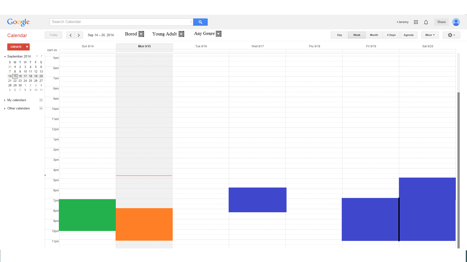
This embodies Tufte’s principles of graphical excellence, it avoids distorting what the data has to say, encourages comparison of different sets of data, and allows for examining data at different levels of detail (Tufte 2). It embodies a forceful point of view because unlike most art, the data itself is indisputable. If my chart says that 5 people played role-playing games on Saturday afternoon, then they did. The interpretations are up for debate of course, that is why they are interpretations. But the data in its raw form is absolute, creating the “forceful point of view.” This connects to the idea of the display trees discussed in the Viegas presentation, by providing a framework for users to analyze data that they collect themselves. They allow for a graphical display and for filtering based on criteria to create different insights. I had considered formatting this as a time series chart as Tufte described, but then I decided that the calendar makes the display more intuitive and easier to understand. Also I feel like trying to display this kind of data on a time series chart could become cluttered very quickly, something I felt was a problem in some of the example time series graphs in the Viegas presentations. Instead, I modeled my presentation after the treemap presented by Viegas with the collection of colored rectangles with parameters that can be customized as necessary. Finally, like the cancer death maps provided in the Tufte reading, this allows for a multitude of similar graphs to be created and compared to generate insight into when and why some people will choose to play video games.
I was feeling under the weather so I did not attend lab on Friday although I personally met with Jake Weiss to discuss my ideas and receive criticism. He helped me flesh out exactly what data I wanted to collect and how I would display it, relating to the readings.