My visualization is composed of a series of parallel rings. In my prototype, they look like simple bars, but I imagine them to look more 3 dimensional in the actual visualization Each ring represents a component of food. This includes not only protein, veggies, and seasonings, but also things such as technique, period of popularity, etc.
Outcome
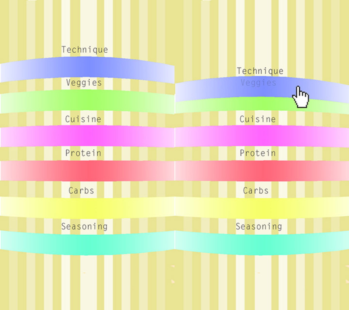
The user can interact with the display through simple gestures. Clicking and dragging can reorganize the rings, while swiping left and right allows you to browse through the components within each ring. You can also add and delete rings if you choose. At first, if nothing is selected, the rings will look like a continuous spectrum. But each ring is actually made of individual bars.
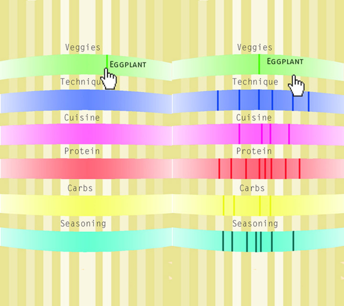
Hovering over the rings will allow you to access components of the ring, and double clicking allows you to select the component at the cursor location. Once a component is selected, it should rotate to the middle, and all the rings should show some dynamic animation where all components move to a different location (further or closer away from the center depending on relationship to the selected component). This movement is based on data from the numerous recipe websites that can be found on the web. The more recipes where the keywords appear together, the closer the components will be to each other.
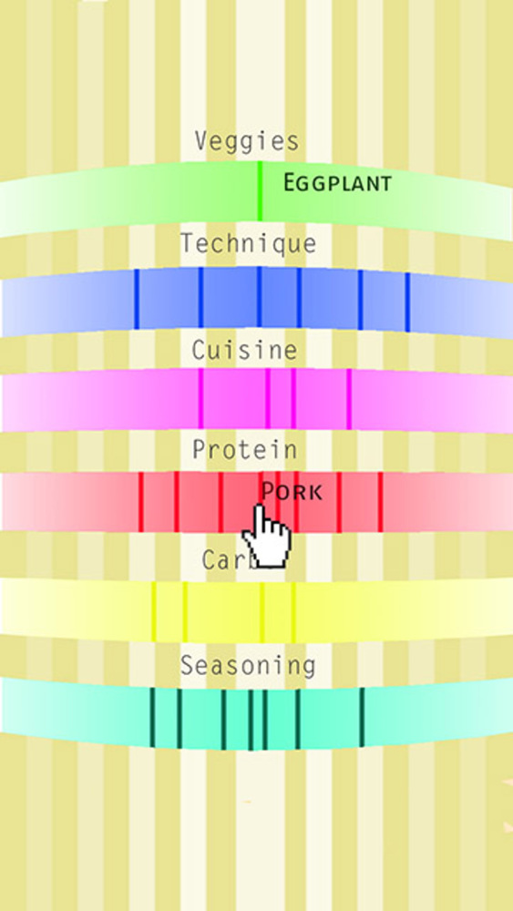
For example, if we pretend that eggplant and pork are used together in a lot of dishes, the pork stripe should appear closer to the center. After selecting one component, users can then go to another ring and select another component. The rings will then reorganize once more based on the two selected components.
I think that this visual representation is coherent with the principles of graphical excellence. It definitely shows the data, and it does so in a way that is intuitive for the user. This visualization doesn't actually leave out much, but rather only shows certain portions of the data at once. Also, the whole point of this visualization is for the user to compare and contrast the different components of each ring and their relationships.
As for the interpretive side of this visualization, my goal was to present a sense of the delicacy and refinement in the cooking world. Although we start with a huge sample space, the options quickly shrink when even one component is selected. This is why cooking can be so difficult, and why it takes so much training and talent to be a world famous chef. This is the point of view that this visualization embodies.
I found it hard to connect my project to the Tufte reading mostly because I did not design the visualization based around differences in geography or time. However, it does produce some of the same effects as several examples.
1. In the cancer maps, we were able to infer the reasons for certain phenomena based on the combination of the data sets. For example, the high rates of bladder cancer among white men in new jersey was caused by the large chemical industry in that area. Similarly, we can deduce certain facts about cultures or time periods based on the food combinations that correlate with these variables.
2. As pointed out by Tufte, data visualizations such as this are only possible because of the technology used to produce them. I am able to show so much more data than I would be able to otherwise.
3. Laura Frick's Data Art turns data into patterns and shapes. I take a similar approach in my visualization. The pattern produced by clicking on each component is unique and reveals the nature of that component, and how we as humans interact with it. For example, I imagine chicken to have a dense pattern across all rings, as it is such a common ingredient. Yak meat would produce a very different pattern.
4. Similar to how the wind map showcases the powerful qualities of natural forces, I am also trying to draw appreciation for the everyday phenomenon that is cooking.
5. In the real world, I'd like this visualization to closely reflect the user's everyday life rather than a whole culture or a time period. In a sense, when someone interacts with the interface, the rings will change to represent the cravings of the individual. Although this visualization does not produce the intimacy or sense of mystery that Lozano-Hemmer's Pulse room does, it takes a similar approach in recording something very personal and very "in the moment".
You can upload files of up to 20MB using this form.