Back to Parent

Outcome


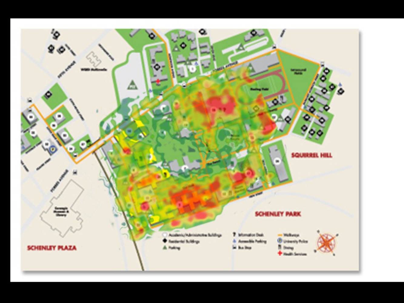
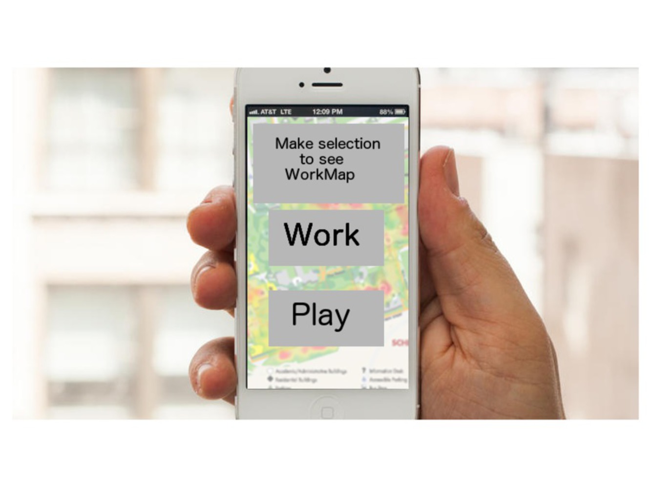
Examining the Work/Play Relationship

I want to examine the relationship between work and play in the areas that we inhabit. I am interested in where people spend time doing formal work and where they spend time doing recreation.

It is meaningful to me to see the societal dynamics of where and when work gets done. In a place such as CMU when time is a commodity that must be managed carefully, I think it would be interesting to be able to visualize this information.

Heat Maps

Ultimately I would like to see and to show the dynamic of work and play on the CMU campus and in other areas. I would like to express this as a heat map where a place where people are doing work would be represented as a “hotter” area (and places where people are playing or not working would be cooler).

Heat maps are usually used to represent activity of some kind (ex. either frequency of clicks on a website, or the amount of time that a soccer player spends on an area of a field). They can be easily examined at a glance, but also upon closer inspection lead to interesting information. 

Cmu heatmap.thumb
Show Advanced Options

By using a heat map to represent and visualize where people work, we can easily see simple, common patterns (such as a lot of work will probably be happening in Hunt or Gates), but we might also be able to discover more subtle or surprising patterns of work/play. How much work happens in dorms or off campus? Or outside? On the weekends?

On top of a heat map, it would be effective if this heat map was not static, but would change in real time and track where people are currently working and playing. The user could also see the history of the heat map and see how the heat maps looks on different days or times of the year.

Capturing/Analysis of Data

Data gathering could happen through a couple different means. The most straightforward approach is to have a survey sent out asking people when/where they spend time working and playing. A more exciting method would be to have some kind of background app on your phone and/or computer that monitors what the user is doing to the best of its abilities to determine roughly whether the user is working or playing. For example, if the user is using her computer and she is on the Blackboard, or some course website, work is probably happening, while Reddit, Facebook etc. indicate the absence of work usually. Furthermore, if the user has the phone on the person, and the phone detects that the person is in some kind of movement, this also indicates that there is no work.


Demo phone workmap.thumb
Show Advanced Options

All this data could be gathered and analyzed and culminated into the final heat map.

As humans, we work, or do something involving work, almost every day. I think consciously planning to do, and then finally sitting down and doing work is something that is very human. Working, and all the planning that comes with working, is a shared human experience.

So, apart from being informative, this work heat map can be a window into how a community decides to do this everyday activity. It can tie the individual working habits of one person to the overall habits of the community, whether it be the CMU community, or the human community as a whole.

Feedback

At first I was not sure if I wanted to go through with this idea as it seemed kind of boring (work=boring) and I’m still not sure if this really would illuminate some interesting patterns, or if it would just affirm the obvious (people do work in Hunt etc.).

However my group suggested that it would be interesting to not just do a static heat map, but one that would change through time. This could show some interesting patterns. They also suggested that I do it not just at CMU, but in other places, and this could also lead to interesting comparisons.

I think this feedback revamped the idea and gave it more dimensions that make it more meaningful and effective. 

Drop files here or click to select

You can upload files of up to 20MB using this form.