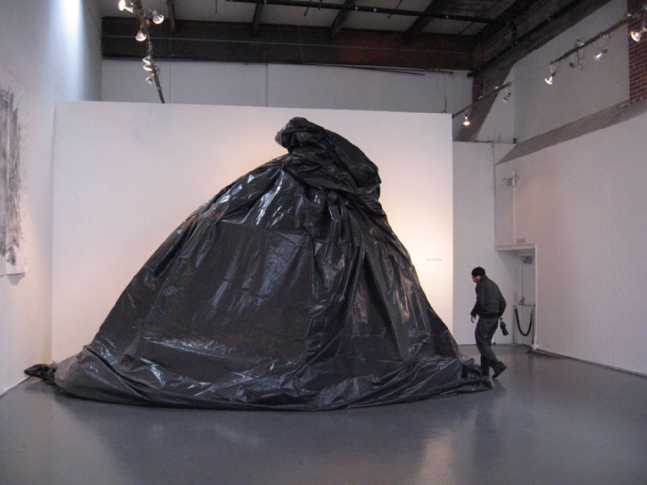
Back to Parent

Outcome


Background

The topic I chose to visually represent was the amount of money that production companies spend to create movies along with a comparison of their return on investment. The reason I chose this topic is because my brother is a walking factsheet on various movies and he would always tell me how large the budget was for a particular movie and I would always be shocked at the amount of money that was put into producing that movie. I wondered whether people were aware of how much money is being spent in the entertainment industry in creating movies and how much of this entertainment culture we as movie-goers are feeding into.

Observations on Data

After consulting various resources on movie spending, I was not too surprised to find out that generally, movie budgets are becoming increasingly larger. This is especially true for successful movie franchises like “The Pirates of the Caribbean” and “The Dark Night”. What was interesting to see was that in the general case, the greater the expenditure, the net gross for the film also seemed to increase as well. I thought this was even more interesting because it really shows how we as consumers buy into (and essentially become a part of) this trend for movie budgets. If a production company spends more money to create the movie as well as market the movie, people seem to spend more money to watch the movie as well. However, when comparing the budgets and return on investment, proportionally, the movies with the greatest return on investment were those that were notably not as popular or those that would not be considered “Blockbusters.” Such movies include “Paranormal Activity,” “The Blair Witch Project,” “Super Size Me,” “Night of the Living Dead,” etc. Because these movies didn’t have a large production cost to begin with, their return on investment was much greater if the movie proved to be successful.

Visual Interpretation and Implementation

To represent this data, I wanted to create an installation similar to Laurie Frick’s Data Art. My idea was to have people walk through a physical representation of movie budgets and their returns by having a side-by-side comparison of the two as mounds of objects. The first mound of objects would be props or objects from the movie to represent where the money in the movie budget is going to – an actor’s chair perhaps to represent how much the actor was paid for a particular movie, the wardrobe, a part of an expensive car, etc. The next mound would be proportionally larger than the first and would represent the return on investment of the movie with a pile of movie ticket stubs bigger. By having a large ticket stub pile, I hoped to evoke the same “in your face” type of experience similar to Chris Sollars’s “Pile of Trash” installation.

Trashbagfrontperson.thumb
Show Advanced Options

Each high-budget movie would be presented in chronological order so that the installation observers would see as they walked through that with each passing year/decade movie production spending is increasing – and even more so, the amount of money consumers are spending to watch it. To further add an emotional effect, I wanted to host this installation in abandoned movie theaters across the U.S. (my research focused solely on movie productions based in the U.S. as most production costs are generally much smaller outside the U.S.) My hope is that as people walk through this installation, they will be more concise about the role they play in perpetuating this trend of increasing movie budgets because by the larger mound of ticket stubs, they can see that they are buying into it. In general, I also just want people to be more concise about how much money is being spent in the entertainment sector. I hope they this will make people think more about how they’re spending their money and how much they are willing to pay for entertainment.

Village theater.thumb
Show Advanced Options

Analysis

1) One of Tufte's Principles of Graphic Excellence is that Graphical Excellence is the well-designed interpretation of interesting data - a matter of substance, statistic and design. In this project I hoped that this encompassing visual interpretation was enough to represent this data

2) Like the Cancer Maps Tufte refers to, this design and visualization is not without flaw. Because it is a sample of the top-grossing and top-budgeting films, it looks past though movies that have done very well on their own without an extravagant budget (compared to the movies being represented)

3) In a way, this is a Time-Series map because the movies are placed in chronological order as you walk through in the hopes that the observer would sense a pattern as they moved through the installation and come to a certain conclusion

4) Like Playfair, this interpretation has a comparison for added effect. Rather than just showing you the budget for the movie, it has a side-by-side comparison of the budget intentionally placed there to make the user think about how money is moving in this industry.

5) This installation connects to each person individually much like the Pulse Room installation by Lozano-Hemmer even though it does not react to you and you cannot manipulate the data.

Drop files here or click to select

You can upload files of up to 20MB using this form.