Disclaimer: Note that I'm no artist whatsoever, I know almost nothing about art in general so my reaction to his art and my production may be extremely basic.
Outcome
Artist
Willem de Kooning was a Dutch-American Abstract Expressionist (between the 1940's and 1950's was when this art style was booming). He was born on April 24, 1904 in Rotterdam in Holland, and he died on March 19, 1997 in East Hampton in New York. While he was considered to be one of the most prominent Abstract Expressionists of his time, he did not like sticking to that label and the label's definitions. For example, he was heavily influenced by Cubism (so painters such as Picasso). He also kept figures in his paintings unlike other Abstract Expressionists. While he had these figures be his subjects in some of his paintings, he still was able to abstract them away and blend them into the background of the canvas. He is apparently known for painting with "angry vigor", but at the same time he was careful and precise about his pieces, and "he is thought to have possessed the greatest facility and polished techniques of painters in the New York School". He was also known for leaving his paintings with a sense of incompleteness about them "as if the forms were still in the process of moving and settling and coming into definition".
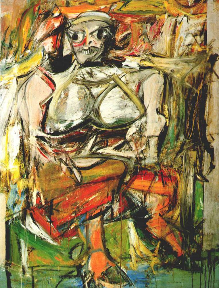
One of de Kooning's most famous paintings is Woman I, which is the main reason as to why I selected it. I want to focus on a painting that captures Willem de Kooning's essence as a whole.
This piece looks like it has a random assortment of colors and shapes that somehow create the image of this woman. If I only look at sixths of the picture at a time (ie only seeing the bottom sixth), I can’t even tell that there are legs or arms or breasts (but I can for the face) in the painting because they just look like shapes to me.
The colors seem to fade into each other while still being prominent in their own spaces. While there are a good amount of lighter colors, I get pulled into noticing the darker colors more, and that leaves the tone to seem heavy, dark, and angry. The darker colors seem to outline to woman.
The shapes look as if they are very much rounded polygons.
The colors and shapes don't seem to be like random spots of paint like in some of Pollock's paintings. They seem carefully constructed even though their outcome doesn't look as such.
Response
This painting certainly helps me understand why people say that his paintings feel incomplete and like he painted them with angry vigor, yet using careful precision and techniques. When I first saw the face, I literally immediately jumped back a little. It just looks 'creepy', dark, and scary, almost evil in fact. It's not because of the facial expression the subject is making, but I think it's because of the shapes and colors that make up and surround the face.
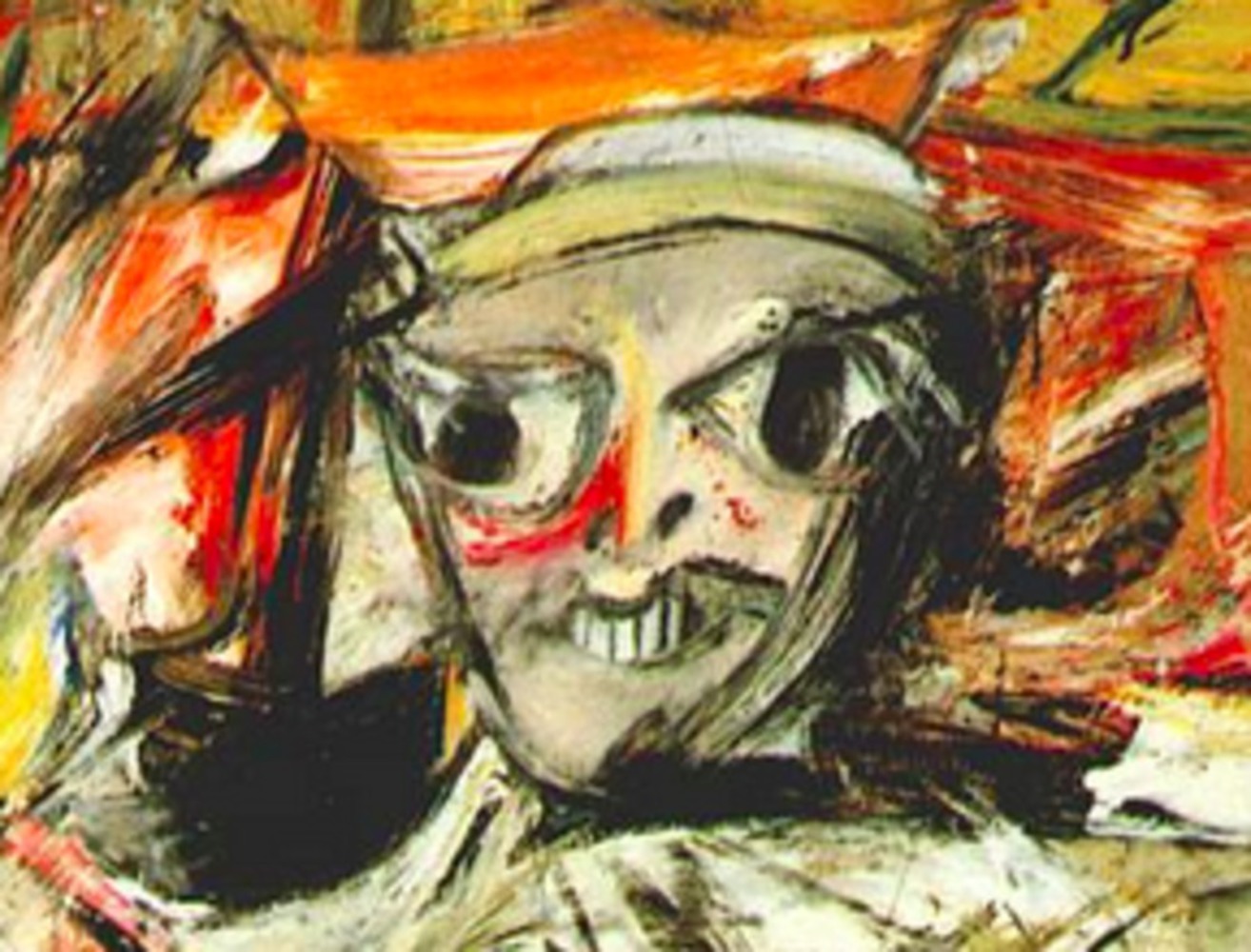
On second thought, the fact that the face looks distorted also disturbs me.
Honestly, whenever I see a piece of art that looks 'good' to me, I wonder how someone was able to create it because I really just do not understand. That's exactly how I feel about this painting as well.
The fact that she looks like she's siting and crossing her arms makes it seem like she's maybe holding a baby taking care of it even though I don't see a baby. Maybe she's trying to take care of a baby she's lost, and that's why she looks distorted.
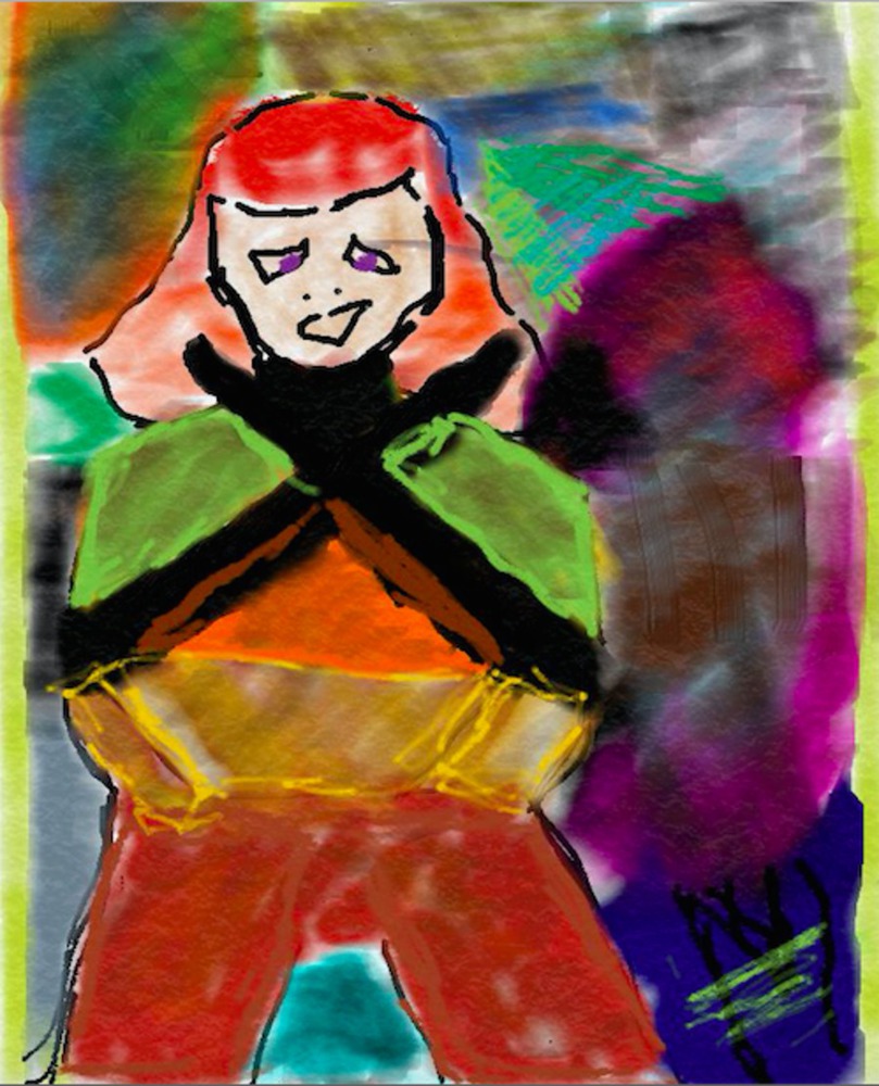
This is my product. I created this using my Windows Surface RT and the Adonit Jot Pro stylus, and the windows app called Fresh Paint. (Excuse my "artistic skills".) I did not want to create a collage of his paintings, or take a photograph and edit that, I wanted to try creating something with my own hand.
What I was trying to create was a digital painting that had dark undertones comprised of rounded polygonal shapes put together such that when viewed as a whole, the subject would be clear, but when viewed in sixths, that would not be so apparent. I was also trying to use random colors and to go for a distorted look so that when combined with the shapes and the undertones, one could see that it's sort of a dark looking figure.
Reflection
I don't think I captured the themes and the style of the work accurately but I think I made a good attempt given that I had an hour and that I have extremely poor art skills in general. But even though I don't think I accurately captured the themes and the style of the work, I think that my painting and the description below it plus the thought process I put into it at least shows my understanding of Willem de Kooning's Women I.
I learned that it's extremely hard to try and replicate something done on a canvas in a digital setting. I'm sure people can do an extremely good job at it, but like animation, one can always tell what's real life and what's animation. I also realized that getting the realistic effect of 'scratches' and 'paint dripping' on the painting is new impossible without a great photo app.
I don't think I would've done anything differently if I had the chance because I think I did well with my abilities and showed what I was trying to do and what I had in mind with my production.
You can upload files of up to 20MB using this form.