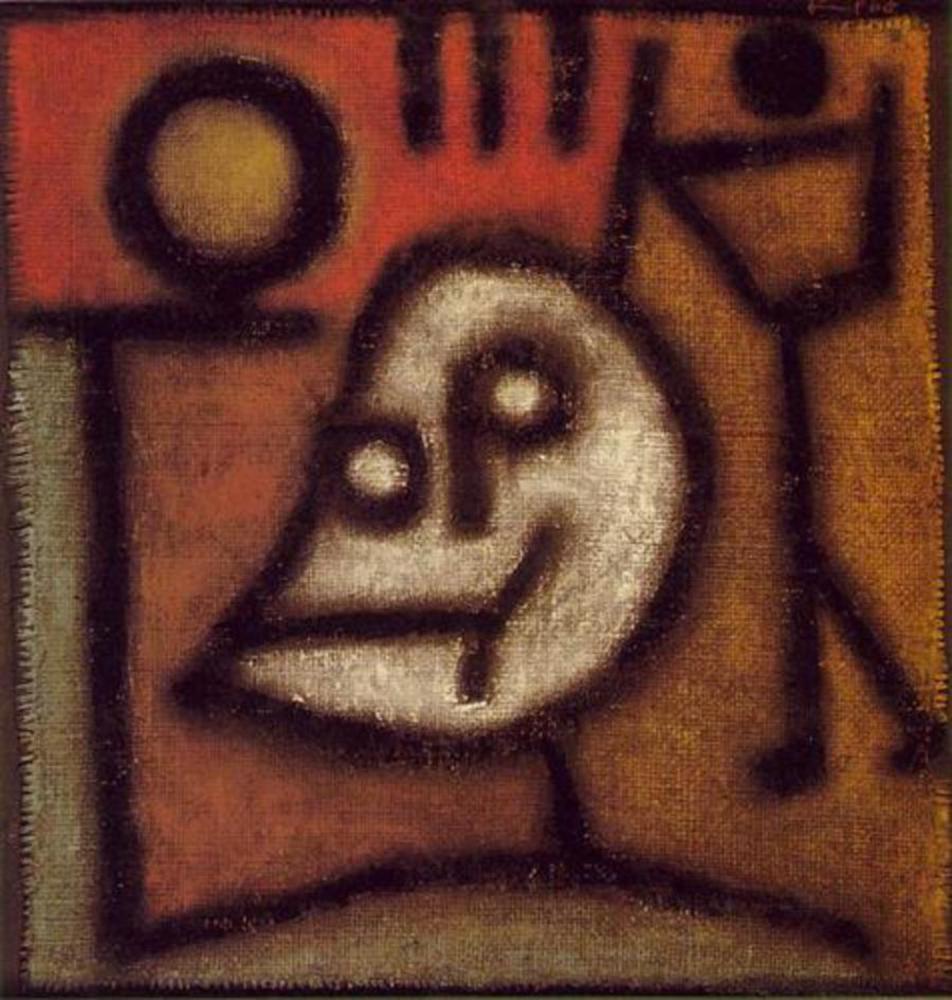
Back to Parent

Outcome


Death and fire 1940%281%29!blog.thumb
Show Advanced Options

Artist

Paul Klee contributed over 9000 works over his lifetime. The main types of art that he created were expressionist, surrealist, and cubist, a predecessor of abstract art. An interesting thing about Klee was that he was born to two musicians and had background in both musical and visual art. He emulated the art of children, which were full of raw emotion and free from any past preconceptions of what art should be. He experimented with color theory and used colors to his full advantage in some of his works. He also experimented with hieroglyphs and liked to include symbols such as musical symbols or words in his works. The media he used varied greatly. He used "oil paints, watercolors, ink, pastel, etching, etc.," on "canvas, burlap, muslin, linen, gauze, cardboard, metal foils, fabric, wallpaper, and newsprint" (Kagan 26). Klee even made plastic hand puppets for his son. A theme that reoccurs in his artwork is music, unsurprisingly. Klee mentioned in a journal once that "the more horrifying the world becomes (as it is these days) the more art becomes abstract" (Economist "Shape-Shifting"). He chose visual art over music because he found that music had more constructs people must follow.

Work - Death and Fire (1940)

Paul Klee created this expressionistic work just a few months before his death on June 29, 1940. He began experiencing symptoms of scleroderma (changes to skin, problems with organs) around 5 years prior to his death; however, the disease was only given a name 10 years after his death. Either the pain became too much to handle or his ability to make artwork was influenced by his disease and caused him to allude to his own death. His previous works are much more complex and abstract; whereas here, he uses language ("tod" in German is "death" in English), a clear representation of his idea, and simple colors to portray death. His prior works include deep exploration in color theory and works that require more technique with his hands as well as surrealist works. However, Death and Fire consists of simple shapes and does not have the same technique of shading and was probably something he could create in five minutes so that the pain wouldn't overwhelm him. He created this work with oil paints on a piece of cloth made from jute. 

Response

At first, I thought that Paul Klee had somehow just decided to draw something really simplistic and slightly gruesome. The symbolism and drawing technique all resemble his other works (which I looked at while researching him); however, the colors just didn't seem like they were complex enough to be him. After a further dive and finding out that he was actually suffering from a disease and had passed away in June of the same year the work was created. He didn't need to embellish the artwork with numerous colors and whatnot. Even so, the colors all complemented each other to form a gruesome depiction of impending death. The essence was that he was approaching death. The symbolism was much more important, especially if his body was inhibited by pain or other symptoms from the disease. Death and Fire made me sad, that he suffered from the disease to the point where he could tell that he would die soon. The dark black lines were also like desperate strokes onto the cloth, as though Klee were desperately trying to get his last words out before the disease overtook him completely, like the figure approaching on the right of the work.

Product

Because Paul Klee created this on jute, I decided to use an old-paper-esque texture tutorial to recreate the cloth texture. It probably wasn't accurate, but it served its purpose. I wanted to recreate his usage of dark, thick, bold lines and choice of simple yet expressive colors. The combination gives a grimly feel, as though doom is impending. The white in the face gives a ghostly feel to the person in the center of the image. The jute gives a texture that amplifies these effects. I wrote "tod" in English, but "death" was too long, so I chose to go with "die." I also though that putting it at the top as well in the face would create a stronger deathly message. I used my Bamboo Capture tablet to create the lines and chose a brush that would give it a slightly similar texture to the strokes that Klee had. Below is the result of my recreating Klee's work.

Deathandfire.thumb
Show Advanced Options

Reflection

It may be that my artistic talent is absolutely terrible, but I believe recreating his work digitally cannot do Klee justice. The lines you can draw digitally are too clean, in a sense. There is a desperation in Death and Fire on cloth. The medium on which he used oils also helps to build the image and art. Meanwhile, a digital recreation can only hope to emulate that sort of desperation. Sure, I can draw thick lines, but they don't really capture the same emotions Klee's thick lines capture. The fact that it was created digitally already takes away from the meaning. Though it may not have been deliberate, Klee's choice to use cloth, to me, was like a last wish. If I were to do it again, I'd probably actually try to recreate the cloth texturel, but that would require more Photoshop knowledge on my part. Also, my color choices here were probably too bright and cheerful for the subject matter. However, in the process of recreating Klee's work, I experienced a bit of what Shahn called the inner critic and the artist working together. I had to deliberate on how to showcase Klee's work again in a way that others would be able to recognize Klee in my recreation.

Drop files here or click to select

You can upload files of up to 20MB using this form.