Back to Parent

Outcome


Paul Klee

Paul Klee was a German painter with an incredibly interesting background. (Not even mentioning the war,) here's the short of it: starting out with black and white abstract depictions of scenes (no greyscale whatsoever), he notably commented on never needing to use color before eventually focusing on color more with his work than anything else. After a trip to Tunisia, he began to create artwork that involved beautiful color palettes expressed through glass-like mosaic squares. Then, as his health worsened and he began to face death, his work darkened with it.
The Work: Contemplating

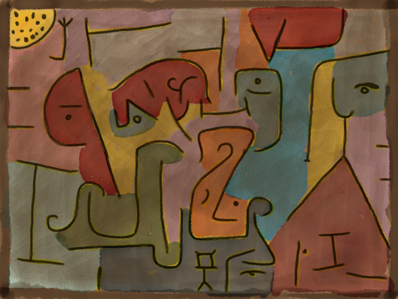
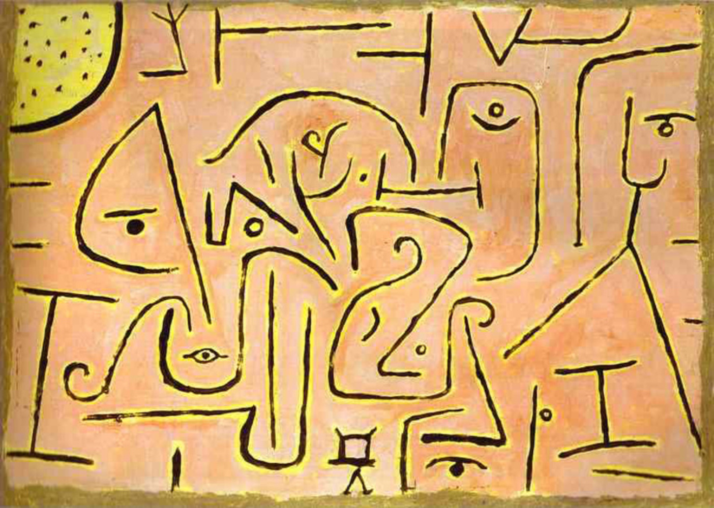
I specifically chose Klee's Contemplating (1938) because it expressed many of the qualities found throughout Klee's later work: pastel colors with defined edges and recognizable features hidden within bold strokes. The faces and shapes found throughout this work are, personally, oddly comforting. I found this work particularly interesting because, unlike most of Klee's work, large blocks of color or scenes into the abstract were not the foreground, now replaced by a wireframe. This work, within two years of his death, took the form of much of his later works -- unhappy faces contorted or hidden amongst bold strokes of pale or darkened colors.

Paul klee contemplating.thumb
Show Advanced Options

Product

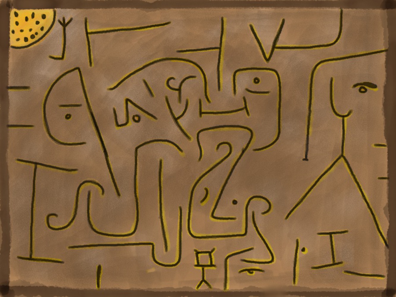
One hour to capture the essence of Contemplating? I got my iPad out and started sketching it out. Twenty-five minutes later, I ended up with this:

Img 0004.png.thumb
Show Advanced Options

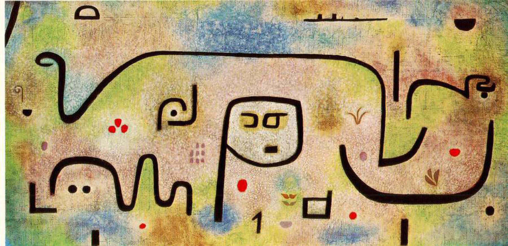
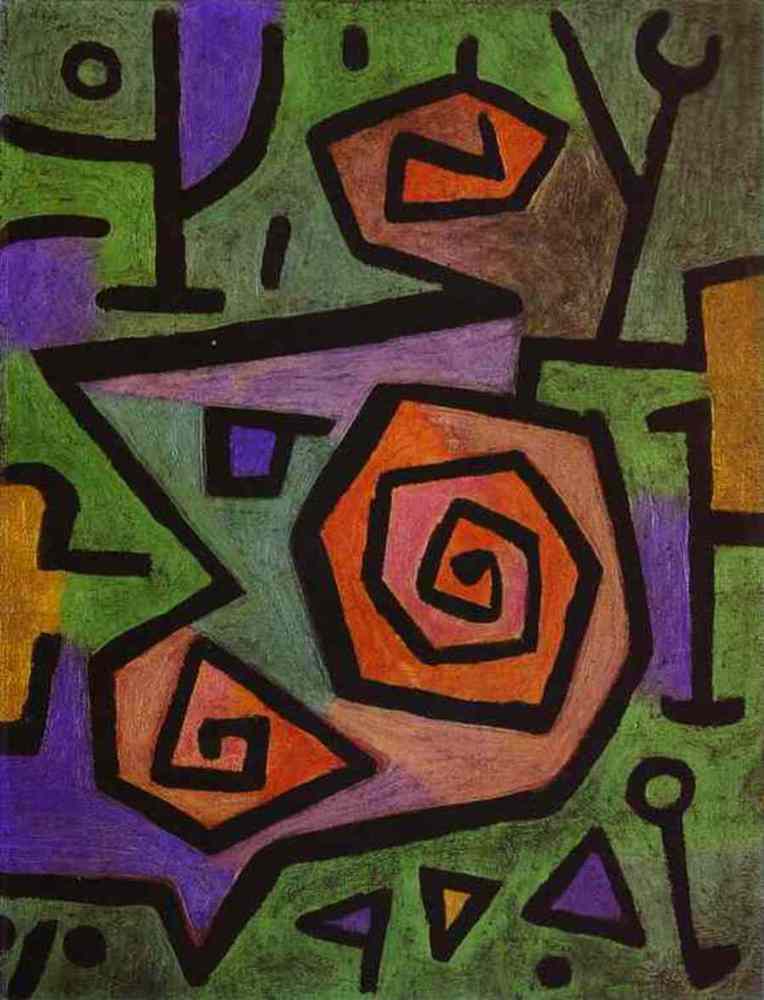
While my colors were off and my tones a bit darker (due to my iPad's screen being brighter and of higher contrast than that of my desktop), I feel that I got the sense of the image and its basic form pretty well. Then, I decided to see where recreating this in the work of Paul Klee took me. I quickly looked at some of his earlier works. Paul Klee is known in particular for his experimentation and knowledge of Color Theory, yet my chosen depiction had none! In the time left, I decided to step back in time and infuse some color from works like these:

Paul klee  insula dulcamara.thumb
Show Advanced Options
Heroic roses.thumb
Show Advanced Options

Both contained the same stroke style and bold shapes, but had an interesting twist of color that his later works seemed void of. So, I quickly picked a few colors and went at it:

Img 0005.png.thumb
Show Advanced Options

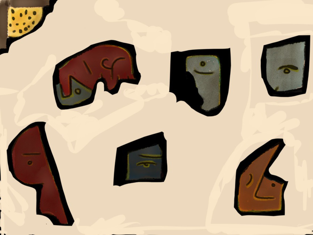
There. In solid blocks of homogenous colors according to a central palette, I added color to the entire image. Then, I noticed how much more interesting I found some parts of the painting than others -- faces coming out from the seemingly random lines and squiggles. I also thought that the painting was a bit too busy now with so much color. I set out to get rid of some of the "unimportant" bits.

Img 0006.png.thumb
Show Advanced Options

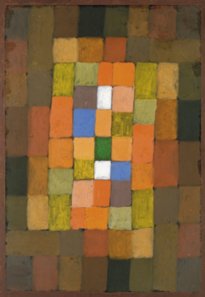
Cool -- so I found the pieces of the painting which I found more interesting. Now, though, as long as I was being so destructive in my recreation, I thought that I could include even more -- Klee is widely known for his works that express through color more than shape, using rectangular squares as the building blocks of emotion for his paintings. Some examples I looked at quickly include:

Klee3 285x413.thumb
Show Advanced Options
Red green architecture yellow violet gradation by paul klee.thumb
Show Advanced Options

So, I decided to fill the now empty space with some more colors from that same palette. I also noted that some of his work includes a distinct fade-to-black around some areas, in stark contrast with the single-color tones and sharp edges otherwise found in his paintings. I came up with this:

Img 0007.png.thumb
Show Advanced Options

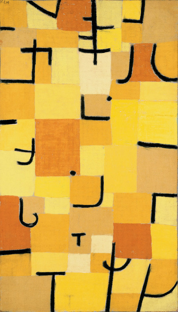
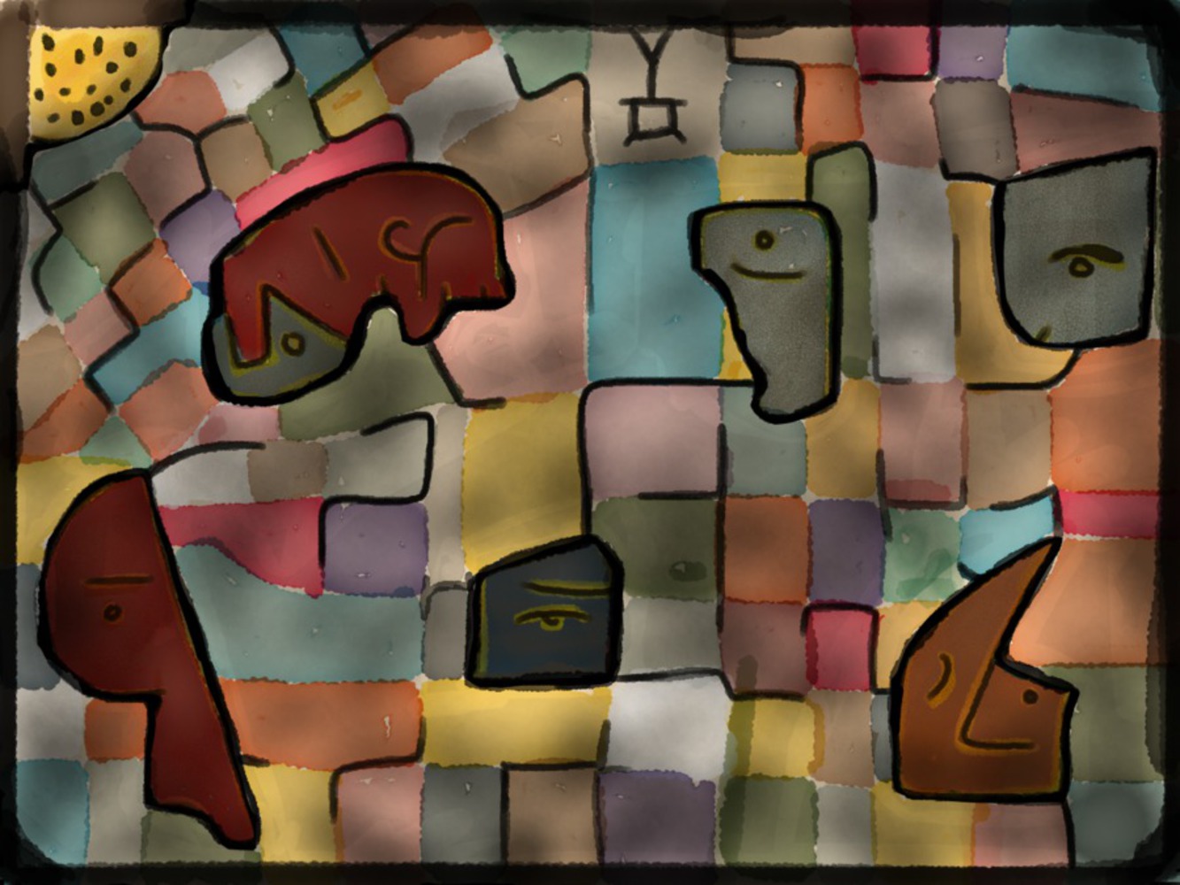
I was nearly approaching the hour, and I felt like I had many of the parts of Klee that I wanted to include in this mash-up, but it seemed like they didn't fit well together. I took inspiration from the following painting and finished up:

Paul klee zeichen in gelb 1937.thumb
Show Advanced Options
Sketches   9.thumb
Show Advanced Options

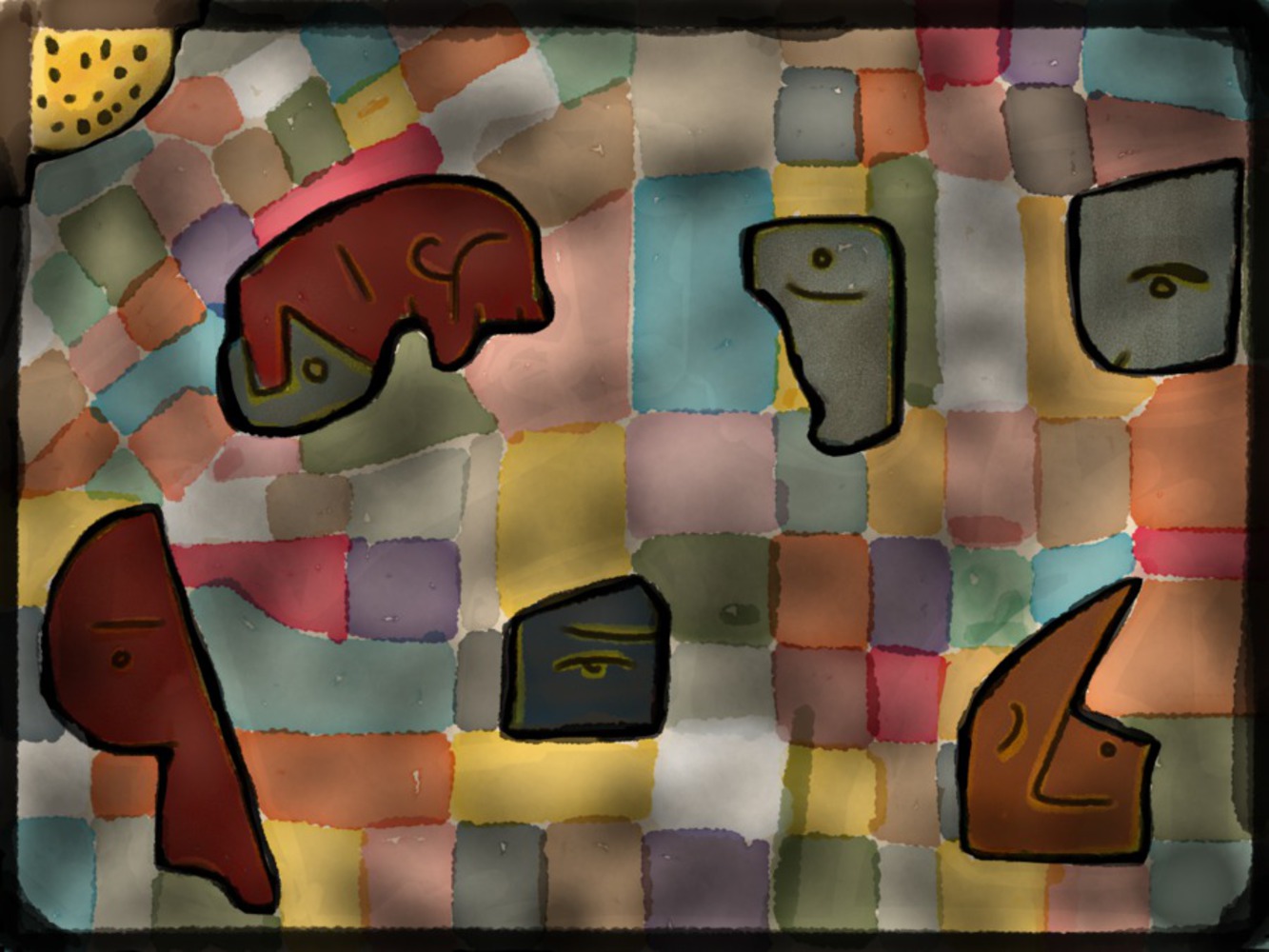
I was at my hour here, but I noticed that the colors I chose seemed to be more random than the choices of Klee. As the background of the original work (Contemplating) was fairly brown, I decided to mute the colors back a bit to try and make the whole work a little more cohesive.

Sketches   10.thumb
Show Advanced Options

Reflection

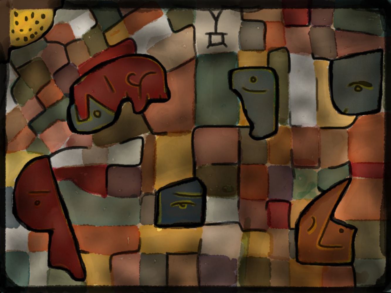
62 minutes later, I ended up with this. I wanted to fuse the strong lines of his later works with the glass-like appearance of earlier ones, in the muted tones of the work towards his death. It's more complicated than most of his work, but I think that it includes important aspects of many phases of his life expressed through his paintings. So that's it: Personifying Contemplating. (Sorry if it's very dark -- it's brighter on my iPad).

Drop files here or click to select

You can upload files of up to 20MB using this form.