Back to Parent

Outcome


Number 8.thumb
Show Advanced Options
Black pouring   number 7.thumb
Show Advanced Options

Artist:

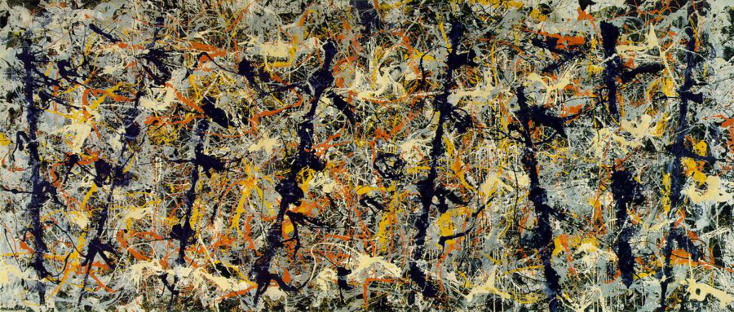
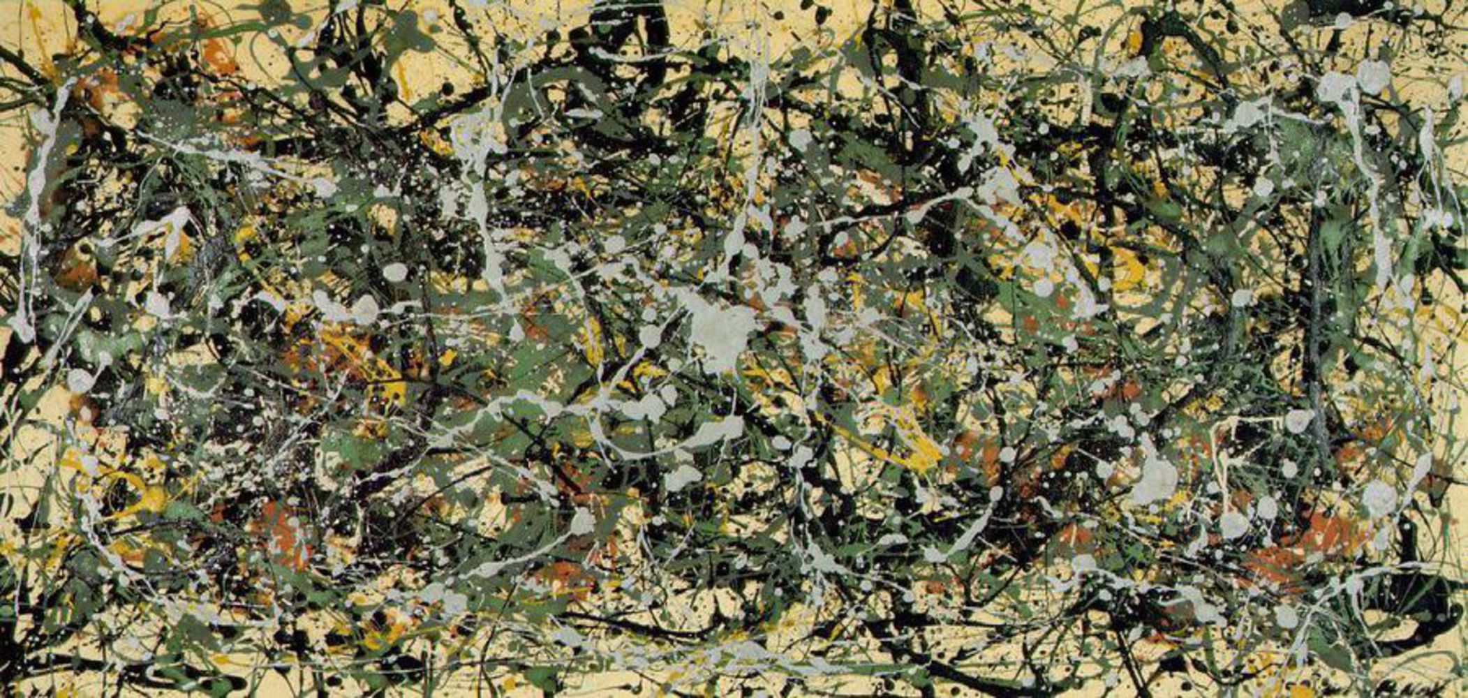
Jackson Pollock was one of the main influences of the Abstract Expressionist Movement and was famous for his drip paintings on large canvases. He was born in Wyoming but moved around the country with his family. As a child, he was very interested in Native American culture and critics cite this as the reason for the colors he chooses and the overall look of the work. 

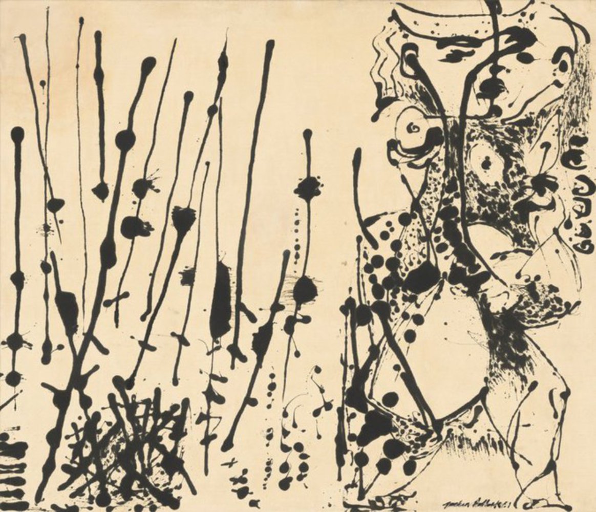
Pollock focused more on American artists and surrealism in his early career before beginning to draw inspiration from European modernism paintings. In the 1940s, Pollock premiered his drip paintings, large scale paintings created by pouring paint onto a canvas usually attached to the floor and then using trowels and sticks to add depth and texture to the artwork. These drip paintings were done on large scale canvases that gave Pollock's work a sense of un-focus and was seen as an example of All-over painting. Pollock struggled with alcohol abuse and often went to see therapist who told him to express himself through his drawings. Pollock constantly questioned his art and its reception and he began to explore darker colors. He premiered an exhibition of black pourings on un-primed canvas, called "Black Pourings" which met little success. 

Jackson Pollock's career ended when he died in a car crash in 1956.

Blue poles.thumb
Show Advanced Options

Work:

Blue Poles, also known as Number 11, is an art piece created by Pollock near the end of his career. At this point in his life, he was beginning to look deeper into his artwork and was in the midst of heavy alcoholism. I chose this piece because it signals to me the change in Pollock from his very popular work of drip-style paintings to the unpopular black pourings he created at the end of his life. 

Blue Poles was created in the drip-style that Pollock is famous for along with the use of footprints and shards of glass. He used the same style that focused on the entire canvas rather than showing a subject, however the piece is held together by the use of long navy blue lines that run vertically throughout the piece. Unlike earlier works, Pollock uses darker and duller colors than his other works which use more vibrant colors. 

Response:

I have always really loved Jackson Pollock paintings, for the fact that to each person they mean something slightly different and because even though it looks random, every splash of color seems deliberate. Knowing more about Pollock has allowed me to see this painting in new light. Knowing that he was binge drinking at the time of this painting, makes me interpret and think of the painting as chaos, crudely stitched into submission. It makes me feel that life can sometimes be a mess but we get through it anyway. I think this painting is slightly different to other works made by Pollock because unlike other Jackson Pollock work the viewer focuses on the dark blue lines that run throughout the piece.  I also really like how even that it uses light colors, which can be seen especially around the borders, the piece is still seems slightly dark to me. 

Product:

I created a recreation of Jackson Pollock's painting Blue Poles using Adobe Photoshop. I achieved this by creating multiple layers in Photoshop, viewing each layer by itself separately, and using the track pad to take one color from the panting and attempt to recreate the drip style. 

A problem with the painting in my opinions is because its digital the layers completely over shadow each other rather than mix like in Jackson's Work. Also because I was not using a Photoshop brush that mimicked what paint looks like when it drips out a can, the strokes are very clean and don't have the exact texture of the painting. Another problem I faced, was that the feeling that I achieved with my piece doesn't match Pollock's. The colors in my piece seem brighter than him and it looks less composed. I think with some time and effort one can recreate the Jackson style but I think one of the things that makes Jackson's pieces superb is their scale over a large canvas, the texture of the paint, how its not smooth over the canvas, and the addition of other objects that aren't paint. These three things, or the feelings associated with these things are not easily replicated by a digital work.

Screen shot 2015 09 28 at 5.58.58 pm.thumb
Show Advanced Options
Blue poles rendition.thumb
Show Advanced Options

Reflection:

I learned a lot about Jackson Pollock and learned how difficult it is to create the work correctly.There was a lot of detail that went into Pollock's work which was hard to recreate in an hour with Photoshop. I fee like the colors, though I took them from the painting, don't seem to match and my recreation and the original give off different vibes. 

If I had to do the project again, I would try and use more layers , confine my use of  the brighter colors from the entire work to more towards the center and I would have looked longer for a paintbrush that matched the drip-style Pollock used. I would also attempt to more closely replicate Jackson's blue lines. 

I think I was able to recreate the themes and style slightly but not fully. Like I said previously, I think its hard to capture the feeling behind a Jackson Pollock painting using digital media in such a short time span. 

Drop files here or click to select

You can upload files of up to 20MB using this form.