Artist:
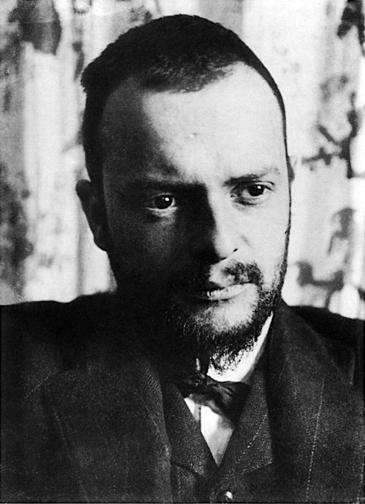
Paul Klee (1879-1940) was a Swiss and German Modernist artist, whose work spanned various styles, themes, and mediums.Outcome
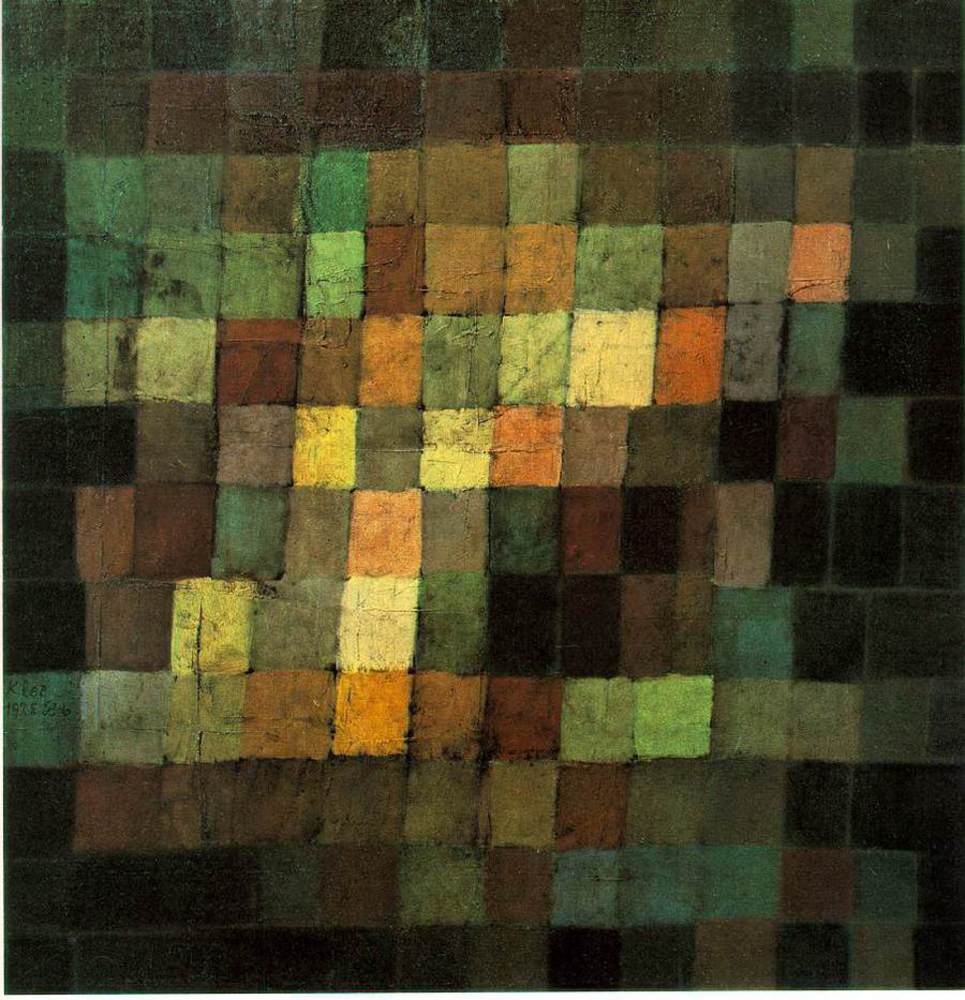
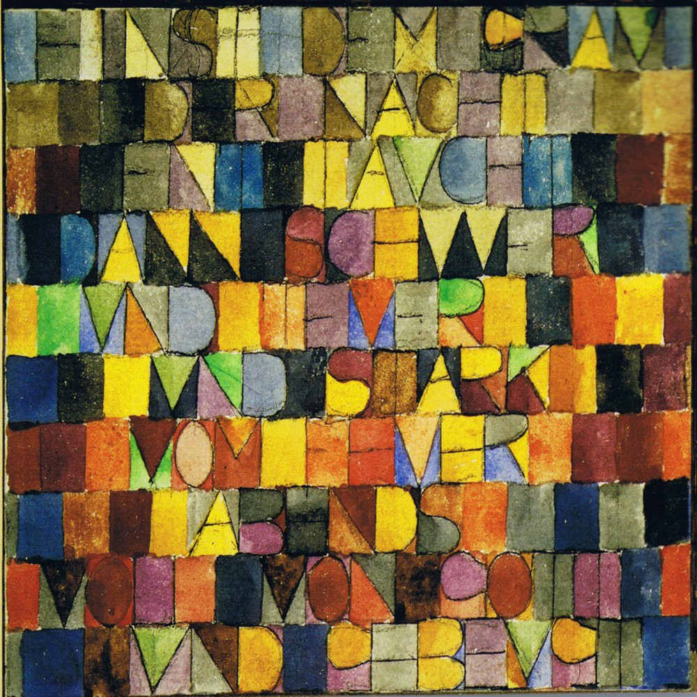
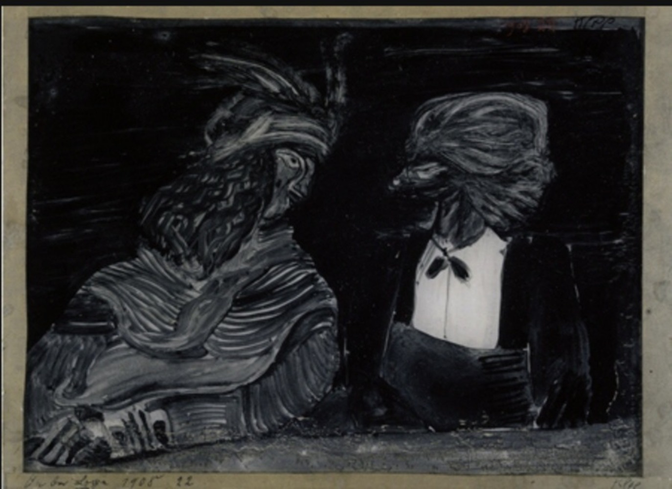
His artwork had a childish look to it, contrasting against his often grotesque subjects and dry humor. Klee’s parents were musicians, and Klee was as an accomplished violinist. His artwork reflects his musical interests, with poetry and literature also being recurring subjects. This can be seen in his works that are reminiscent of musical scores, and those that incorporate writing.
Work:
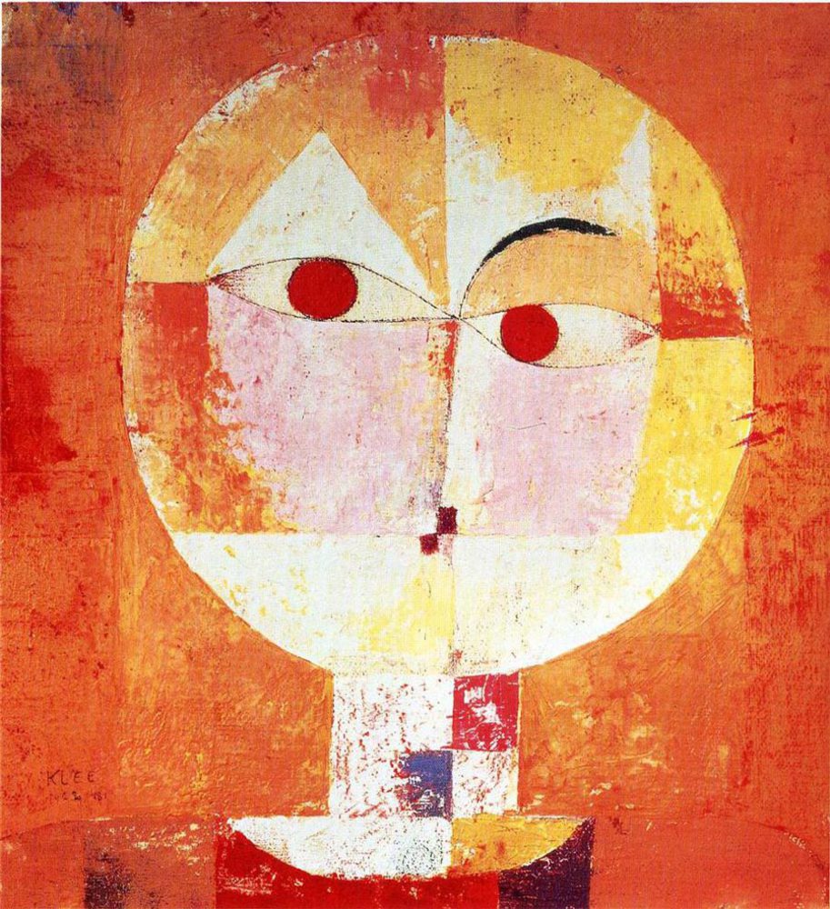
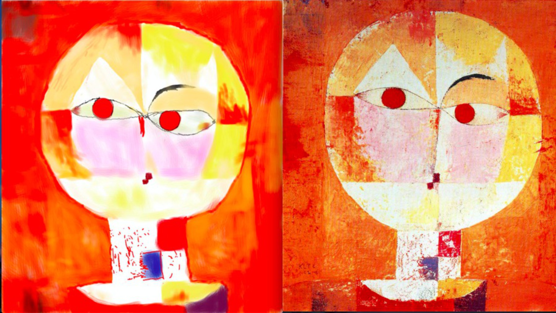
I chose Senecio, which was a piece done in 1922 when he was at Bauhaus. Done after his revelation with color, the piece uses various colors and his signature rectangular shapes. The reds, oranges, and yellows work together to give the painting a warm feeling, with the blue in the neck and darker color in the shirt anchoring it down. It’s also is reminiscent of a child’s painting, due to the subject’s round face and simple features. Klee’s humor shows with the face looking like it has an eyebrow raised.
I selected this piece because I thought it had a lot of characteristics associated with Klee’s work in his mature years, thus being representative of his style as an artist. It has a layered and thought out combination of colors, simplistic shapes and lines, and a humorous subject.
Response:
When I saw this image, the first thing I noticed was the circular face which I thought was almost moon-like. It’s very prominent and in the center of the painting with a lot of white in an otherwise mostly orange/red background, which draws your eyes to it. At first glance the shapes and colors seemed very simple, but the more I looked at it the more calculation I could see. Maybe because I saw the image after I read about Klee’s deep connection with music, I felt like the painting had a certain rhythm and tone to it. Perhaps due to the contrast in color between the lightly colored and more vibrant parts and how the large red eyes look like they’re looking into the viewer’s, I felt like it gave off a fast paced beat the alternated between high and low notes.
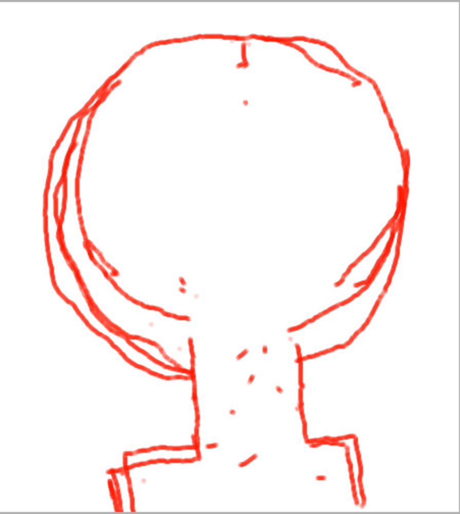
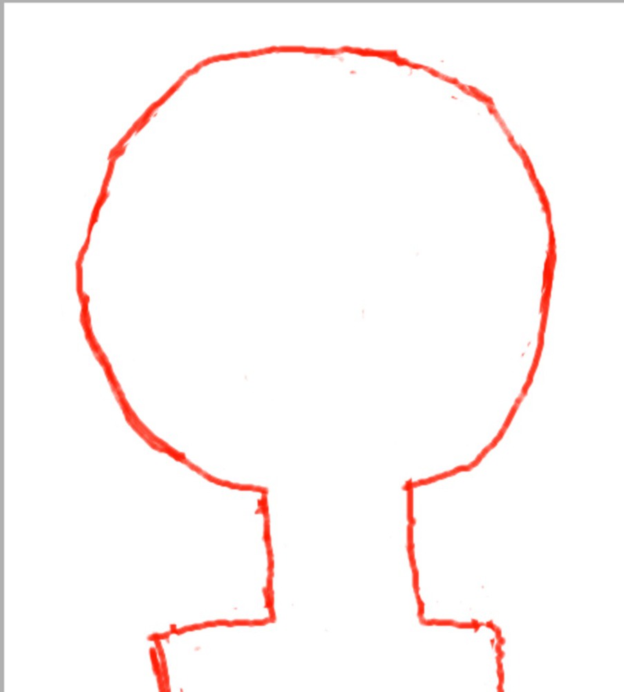
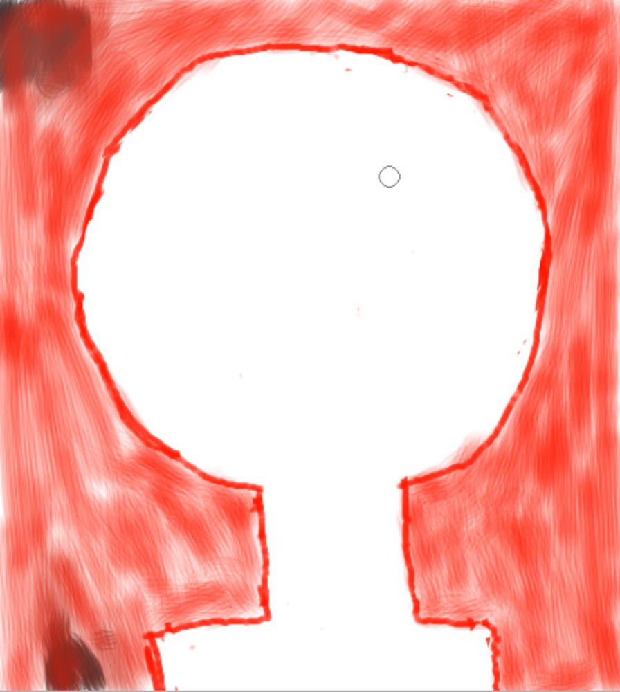
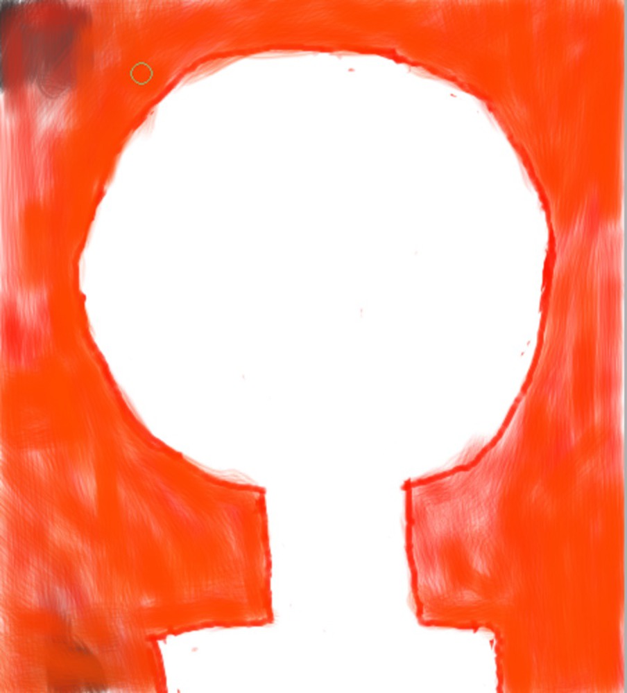
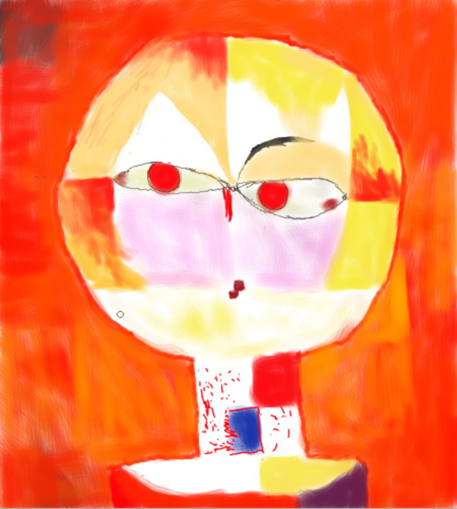
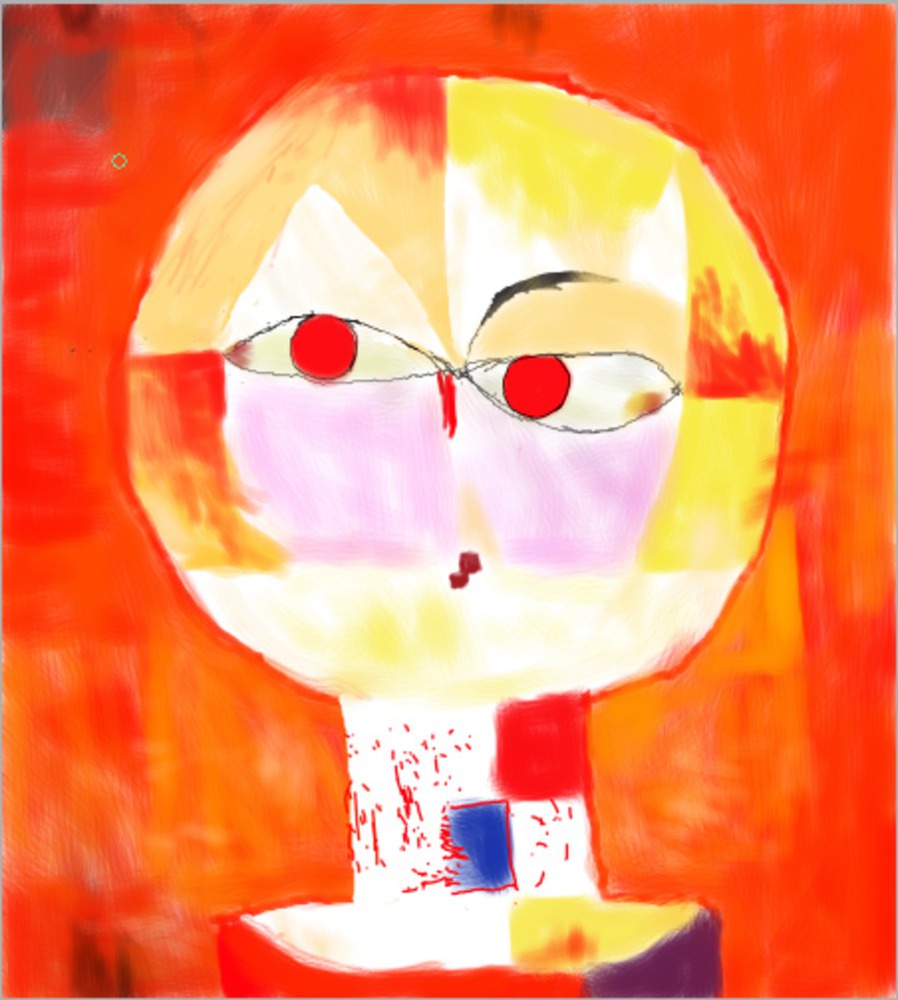
After I got the background to a place I was satisfied with, I moved onto the face. The eyes were definitely the hardest part, and I couldn't get the balance quite right. By now 30 minutes had passed, so I just settled on the eyes and moved on to coloring the rest of the face.
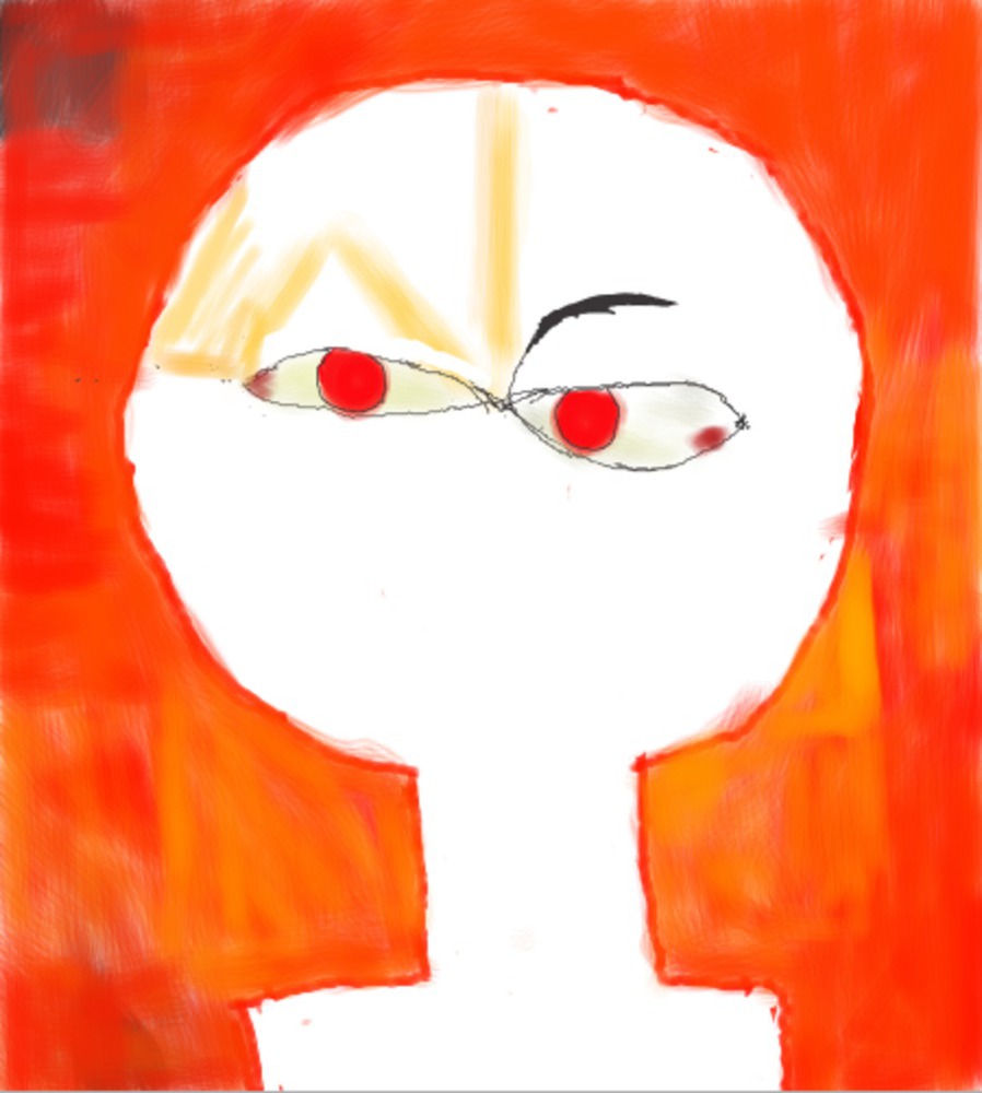
Yay! Final product is above.
Reflection:
I learned that it’s really hard to reproduce a piece of art completely. Klee’s technical level is obviously high, but aside from that using a different medium and working under a time constraint made it difficult. If I could do it over, I would figure out how to use the digital tools I used better. For example, I would figure out how to change the opacity, and how to make the brushes look grainier. Having better control of how the cursor moved when using the tablet would have made it easier to use the stylus. Making a draft of what I was drawing with some light lines first might have been a good idea as well.
I think I captured the general feel and colors of the painting, but my rendition doesn’t have the same character and expression as the original Senecio. It also lacks depth in terms of the colors I used, and isn’t as well balanced. It doesn't have the same type of speckled texture in some parts, and lacks brushstrokes to the extent of the original. It has kept the style of looking like a child made it though.
You can upload files of up to 20MB using this form.
