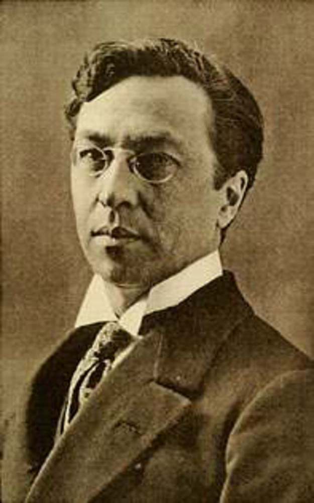
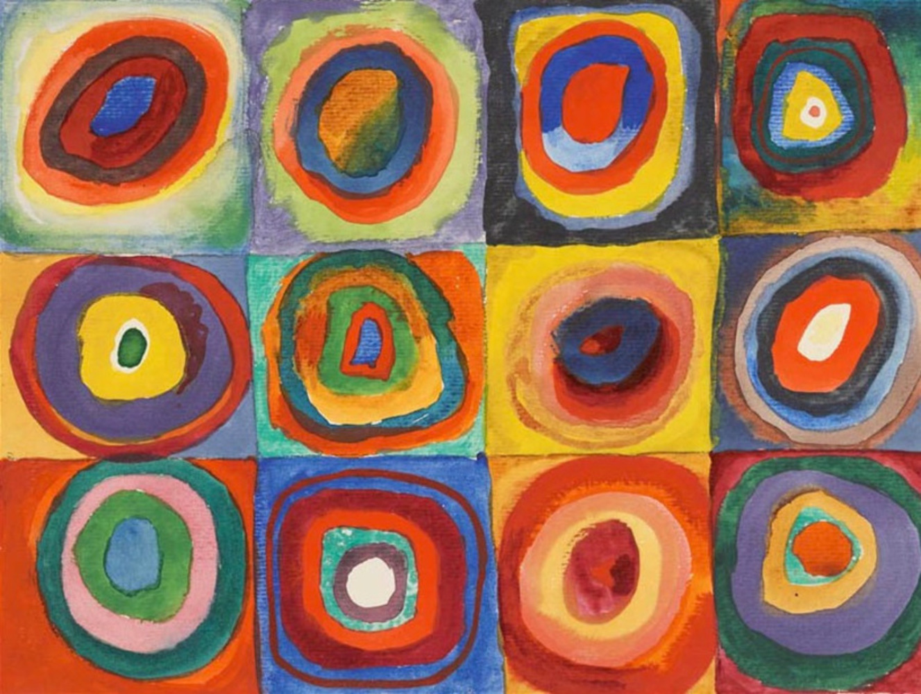
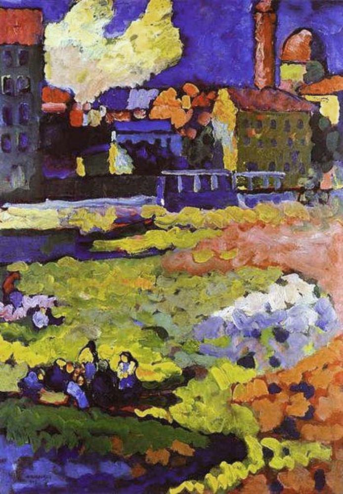
Artist: Wassilly Kandinsky was a Russian painter. Kandinsky has a very distinct abstract style, though he makes slight tweaks between works. However, I've noticed that all of his paintings use bright colors, most often the primary colors. While some of the paintings have a dull and somewhat subdued look to them, none of them have a dark theme overall. The shapes he makes tend to be recognizably geometric in nature, though there are are also many of his works, including his “improvisations” that have no definite shape. Even his works depicting scenes from everyday life, are made using primitive shapes and simply strokes, clearly without a focus on detail or realism. While his works had many distinct themes including a horse and its rider, the apocalypse, landscapes, music, geometry, and scientific, all of them seem to share these qualities.
Outcome
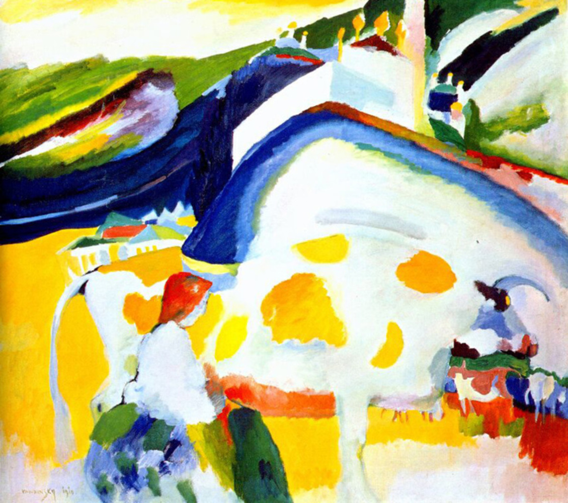
Work: The Cow(1910) is a piece made with oil on canvas. I picked it because it raised questions for me. True to its name, it depicts what looks to be a cow and the woman possibly milking it. True to Kandinsky's style, he does not use realistic colors in depicting any of the elements of the painting. He has an even balance of cool and warm colors, but very little dull and neutral ones. There is also variation in how the colors interact with one another on the canvas and how Kandinsky is using that to draw different things. In certain parts of the painting, the colors blend together smoothly, but in others there is a very clear divide between two colors. I realized that this may be related to the specific element he was painting. For example, there is what seems to be a castle and a village in the background. Both these elements use orthogonal shapes and have clear color divides with other elements. However, the the cow and the woman use more organic angles and their colors bleed in with the surrounding landscape. This may be to illustrate a divide between life and the products of society.
Response: I had many questions when I first saw this work. For example, there is what appears to be a horn like protrusion coming from the head of the cow. Then, why would the woman be milking it? Also, there seems to be a large city or castle on the hill overlooking a small village. Who is living in the castle, and who is living in the village? Is this based on a real place? Also, there look to be a handful of shapes behind the cow, that resemble some other animals, including a fox and an elephant. Are they in fact animals? If so, what are they doing there? If not, what was Kandinsky trying to depict?
Product: The work I created, I have entitled “Circles in a Square”, in reference to Kandinsky's works: “Squares with Concentric Circles”, “Circles in a Circle”, and “Several Circles“. It is simply the picture of a series of colorful circles inside a white box, on a black background, with several gray lines passing through the circles and each other. There is also a band of color going through the box in the style of “Circles in a Circle”. I made it using the image editing program Gimp.
Reflection: I learned much about Kandinsky's history and how it influenced his art. If I were to do anything different, I would definitely have researched more on the terminology to describe the specific styles Kandinsky is using throughout his career. Also, I'd be less bad at Gimp. I think I captured very shallowly the style Kandinsky used for his geometrically themed paintings, though due to both the difference in medium and my inexperience in my medium, I wasn't able to emulate either Kandinsky's brushwork or his work with color.
You can upload files of up to 20MB using this form.
