Back to Parent

Outcome


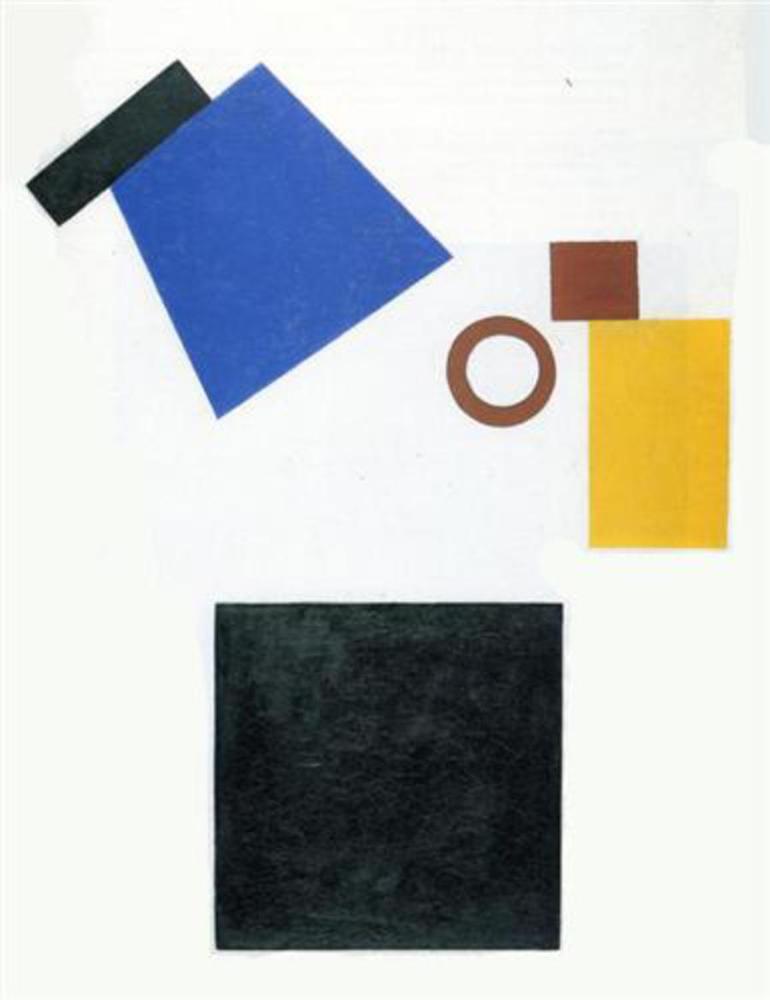
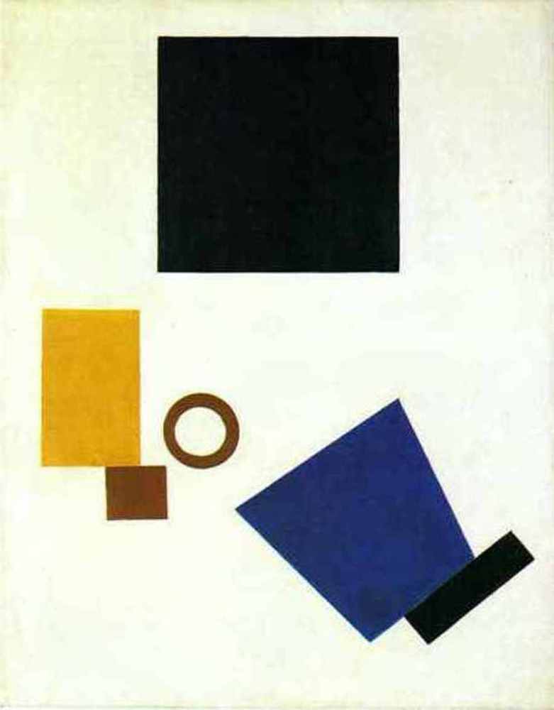
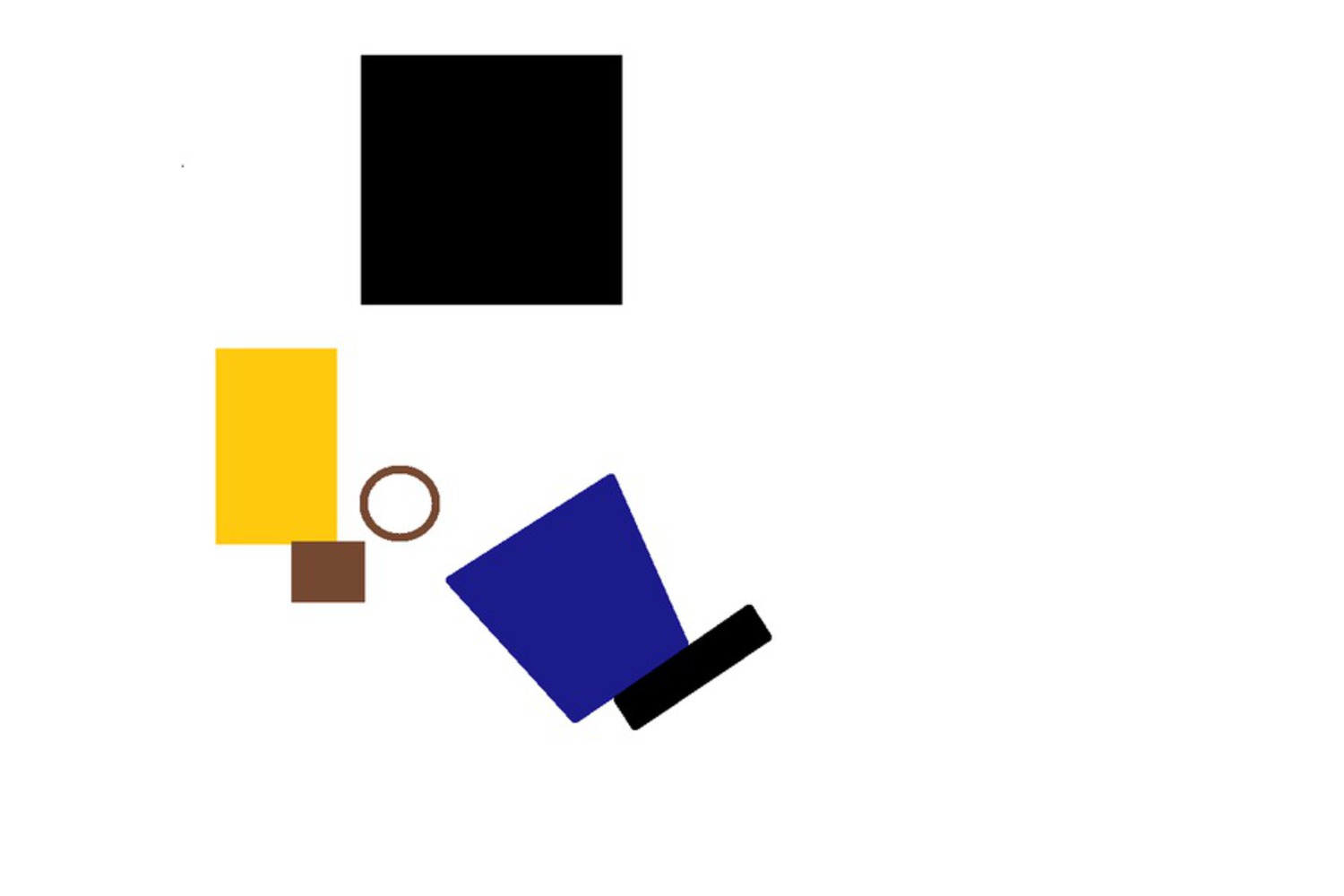
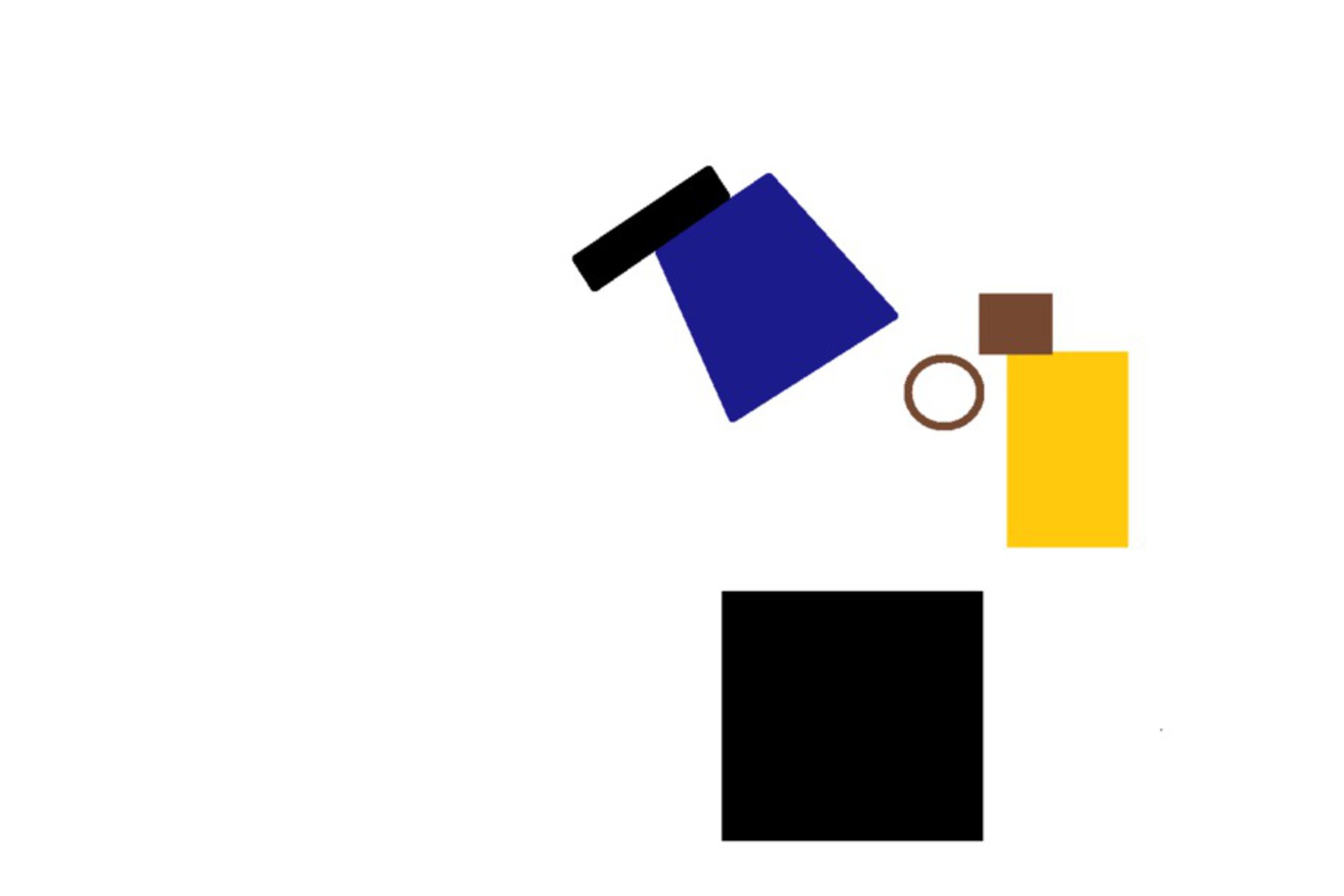
Artist - Kasmir Malevich

Kasmir Malevich is a pioneer of geometric abstract art and orginator of the the avant-garde Supermatist movement. He concentrated on the exploration of pure geometric forms (squares, triangle, and circles) and their relationships to each other and within the pictorial space. His Supermatist compositions proclaims that paintings were composed of flat, abstract areas of paint, they also served up powerful and multi-layered symbols and mystical feelings of time and space. "No phenomenon is mortal," Malevich wrote, "and this means not only the body but the idea as well, a symbol that one is eternally reincarnated in another form which actually exists in the conscious and unconscious person."

Work

Suprematism two dimensional self portrait 1915 1!blog.thumb
Show Advanced Options
Tumblr inline mhtbbvlhgg1qz4rgp.thumb
Show Advanced Options

Kazimir Malevich, Self-Portrait in Two Dimensions, 1915

This is an oil painting on the 80*62cm canvas. It is a grouping of six geometric shapes, including four rectangles, one ring and one trapezoid. On the top middle, there is a black square. A yellow rectangle is situated on the bottom left of the black square, along with a smaller brown ring in parallel and a smaller brown square in perpendicular. The blue trapezoid and the black short-long rectangle are situated on the bottom right of the painting. Their orientation is a bit different from others with the longer side of trapezoid facing towards the to-be intersection of the big black square and the yellow rectangle.

During his solo exhibition in Berlin in 1927 the artist hung this work upside down. I am very interested in exploring the messages the image conveys when it is displayed in two orientations. Besides, I found it intriguing how the ring is playing an subtle role in making all the shapes work together - creating a dynamic and harmony. And the third reason I chose this work is because it is titled to be a self-portrait, establishing a more direct link between this work and the author's style, thought and personality.

Response

When I first saw this painting, I wasn't connecting the pieces/geometric features with the facial features, partly because I didn't understand the title which is originally in Russian, and partly because all the previous work I was looking are objects. And when I started to understand it as a face, many ways of interpretation come to my mind. The black square might be the hair but it can also be a hat. The blue trapezoid might be the neck but it can also be collars. The ring can be the eye but it can also be the mouth. When I saw the one upside down, the imagination gets more complex. The comparison between the two ways of display redirects me to the facial expression from the overall paining instead of the individual shapes on it. The first one seems to be calmer and the portrait seems to be nodding and thinking while the second one seems to be more up-lifting - surprised and talking loudly. The last thing that resonates with me is unexpectedly, the colors. I wasn't paying attention to the choice of the color until I have finished all of the other thought/imagination/interpreting process. To see it vertically, the darker color seems to be on the edge and it goes brighter towards the middle. I think it works well with the overall composition. And the bright yellow is definitely standing out from blue, brown and black. 

Reproduce.thumb
Show Advanced Options
Reproduce rotated.thumb
Show Advanced Options

I used the Paint application on the my windows laptop. I started with just creating the outlines of each shape, hoping to get the composition down first. However, that didn't work out because first, it's hard to control the color and second the relationship looks very different if the objects are solid or unfilled. So I started over, drawing and filling one shape by another. For the black square, yellow rectangle, brown ring and square, I just used the built-in shape brushes in the application. I didn't realize that we can't rotate a shape by arbitrary angles in Paint. I was planning to create the trapezoid from a square but because of the limitation of my software, I had to create the trapezoid and the black rectangle line by line. I also found it challenging to get the angle of the trapezoid right. Apparently, the trapezoid is not perfectly symmetric, and I discovered more details in the relative positions between the blue trapezoid and other shapes around.

Reflection

I figured this was going to be easy painting to imitate but I was wrong. The subtle variances' in size, orientation and relative distance from one another was by far extremely difficult to imitate. Digital tools in some way can help us with it but in another ways cannot. I turned on the grid guide when I was drawing it on my computer. It was super helpful in that I can measure the distance between objects in a much smaller unit. However, the limitation of software - not being able to rotate objects by arbitrary degrees, not having variant thickness for a ring and so on, creates a large barrier of how we can adjust our painting and experiment with compositions. Furthermore, the order of the painting is also very important. I chose to paint the big square first, which turned out to be a good idea since it's easier to relate smaller objects to big ones than the other way around. Overall, I think I have captured the theme and the style. Without looking at the original work, someone can still get similar message from my painting with the same title.

Drop files here or click to select

You can upload files of up to 20MB using this form.