Back to Parent

Outcome


Show Advanced Options

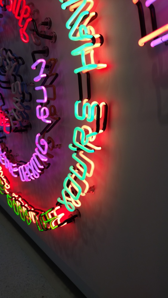
The work I chose to experience was Bruce Nauman's Having Fun/Good Life, Symptoms (1985). It is an installation of fabricated neon text in 2 spirals, with the spiral on the left reading "FEVER AND CHILLS  DRYNESS AND SWEATING  NORTH AND SOUTH  EAST AND WEST  OVER AND UNDER  FRONT AND BACK  UP AND DOWN  IN AND OUT" and the spiral on the right reading "I LIVE THE GOOD LIFE  I'M HAVING FUN  YOU LIVE THE GOOD LIFE  YOU'RE HAVING FUN  WE LIVE THE GOOD LIFE WE'RE HAVING FUN  THIS IS THE GOOD LIFE  THIS IS FUN".

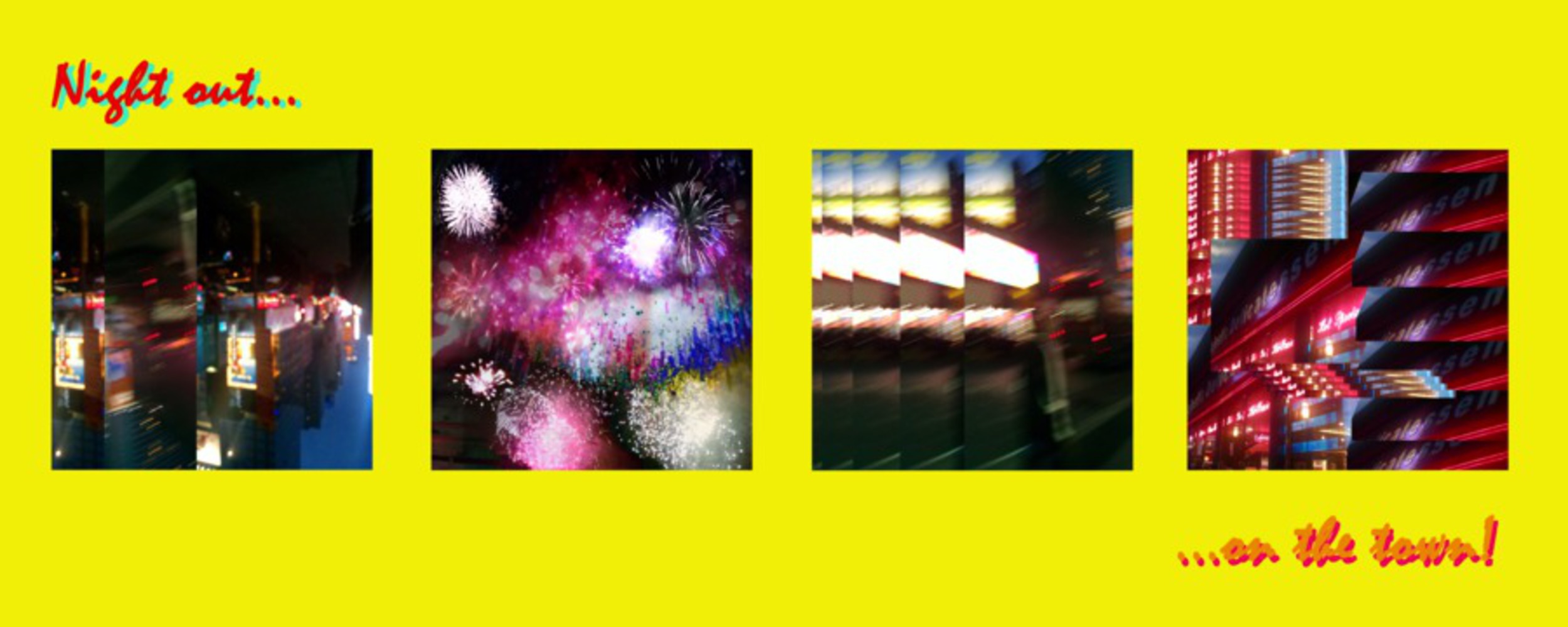
At first glance, the piece seems out of place in the gallery next to the art that is static and doesn't give off light (although they were just as colorful). It is flashing, glowing, and buzzing. It catches your eye from across a hall. It is as much advertising the experiences it describes as it is commenting on them. (see pics below to get a feel for the vibrancy of the work) The piece is also quite expensive, using dual layers of color for each piece of text.

At the most basic level, I chose this work because I'm very visually attracted to the bright glow of neon signage. It calls to mind for me the urban and flashy - kind of like walking through Times Square for the first time, when you're too starstruck by all the signs to care about the hordes of people. In particular, the use of color and spiral positioning of the text is very compelling, like you're being drawn into the ideas the flashing work is presenting. The words themselves also seem to indicate that to a degree - both swirls move from personal experiences to more abstract ones. 

Img 20151004 132616165.thumb
Show Advanced Options

             Notes from Reflections

Img 20151004 173155704.thumb
Show Advanced Options
Img 20151004 173202763.thumb
Show Advanced Options

Product

I chose to construct several mini-collages of photos I took while living in Brooklyn. These images were taken on the fly, often blurry and leaving more of an emotional impression of the moment than a clear depiction of what was happening. The choice to repurpose these throwaway photos of blurry streets, delis, and fireworks comes from both the banality of "bad phone camera photos" as well as the high cost of living in NYC and being able to capture those images. Most of the photos were overlayed in some way, most with visual repetition of the same image, with particular segments rendered confusingly. I tried to pull some of the "dizziness" I felt looking at the spiral into the collages. The text, "Night out...on the town!", references the cliched glitziness that Nauman's work expresses. I furthered the connection by trying to echo some of his color choices in the layers of text.

The parts of the experience of Nauman's work that I aimed to capture most were the vivid, glowing color contrast, the cliched phrases, and the glitzy expense juxtaposed with the common. 

*Used Photoshop CS6 for editing/placement.

Night out on the town.thumb
Show Advanced Options

I think I captured the experience I felt viewing Nauman's work - I learned a fair bit about incorporating "found" images (in this case my own) into a new work as well as how to analyze contemporary works that I tend to enjoy simply for their aesthetic value. I'm slightly displeased with the image edits I used, and I wish I had been more effective at bringing out the ideas expressed by the "Symptoms" side of the work, but I did accurately reflect the ideas and emotions that I experienced. If I had to make another attempt at this, I think I would have split my work into two images, one reflecting the "symptoms" side (though just as vivid) and one reflecting the "good times" side instead of trying to merge those experiences into one image.

Drop files here or click to select

You can upload files of up to 20MB using this form.